
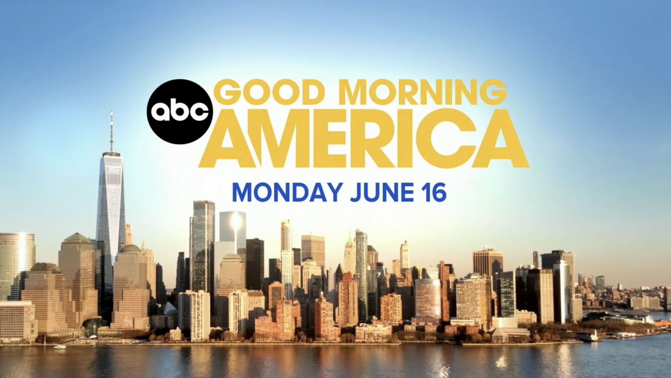
‘GMA’ switches to lighter and brighter graphics, logo that pays homage to its legacy
Weekly insights on the technology, production and business decisions shaping media and broadcast. Free to access. Independent coverage. Unsubscribe anytime.
Along with a new set, ABC News‘ “Good Morning America” unveiled a new graphics package and logo on June 16, 2025.

This package replaces the 2022 package designed by Vivid Zero.
The new design features a familiar layout while switching to a different shade of blue.
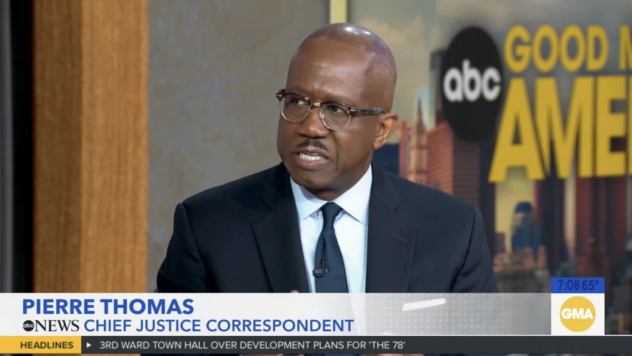
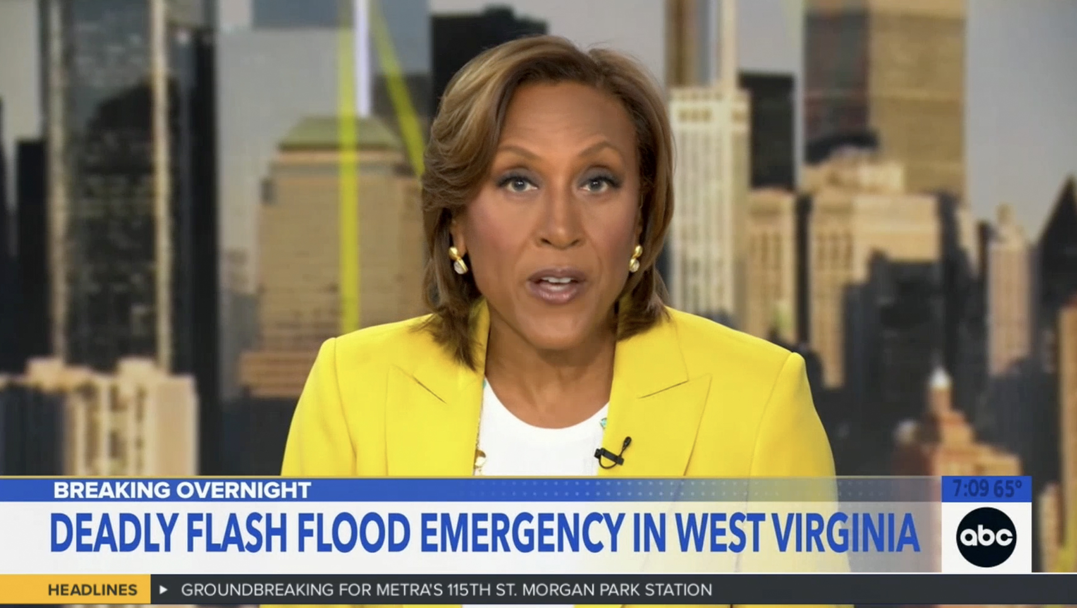
Other changes include changing the primary banner area background to white, which fades out on the right side. A narrower blue tier with repeating dot background sits above this with a thin yellow accent line above that.
When introducing talent, however, the banners become all white, with the dotted texture filling this space. Separate layouts exist for the opening headlines, teases and other uses.
The bug continues to occupy the same footprint, but switches to a white background. For the animated loop, the “GMA” circle emblem remains, though the version where it shrinks slightly to make room for the show’s lengthy website address, goodmorningamerica.com, has been removed. It still rotates through both the ABC dot by itself and with the word “News” below.

The network also dropped Avenir as the primary lower third banner font, switching to Proxima, which is also used on “ABC World News Tonight.”
Instead of the more circular-centric animations used before, sliding blue, white and yellow bars now feature heavily in much of the animation in the new package, including wipes and banner entrances, exits and transitions.
Overall, the new graphics, which were also used on “GMA3” that day, appear to be targeting a lighter look with more white used, while also switching to a more traditional blue.

The show’s opening takes the bar elements and imagines them as glass panels with varying transparency, which feels somewhat reminiscent of some of the background elements used on “WNT.” A flatter version of the bars are also used for looping background elements, such as behind mug shots or boxed tosses.

There is also a more intricate background with glassier panels, light bursts, dotted patterns, and a warm wash that appeared during June 16’s “GMA3.”
In addition, there is also an updated announce. Previously, it read as:
“Live from Times Square … it’s (day of the week) … good morning America.”
The announcer now says:
Live, from ABC News headquarters in New York City … it’s (day of the week) … good morning America.”
Previously, the show’s open was actually just a quick fullscreen wipe that would typically reveal an exterior view of the Times Square studio with the camera panning to the large electronic billboard showing an animated logo loop.

Now, the show runs a slightly longer fullscreen open before wiping to a wide view of the set. While ABC did incorporate exterior shots from around the Disney building, including using aerial drones, on debut day these did not appear as part of the open and were reduced by the next day.
For “GMA3,” the reference to Times Square was also removed from the opening VO. The show is also simply referred to as “GMA3” instead of “the third hour of ‘GMA'” in the open. ABC appears to be phasing out the “What You Need to Know” part of the show title, removing it from the open even before the move but still using it in select “news you can use” segment anchor intros.

“GMA3” also uses a split screen layout for its first tease headline.
[new logo]
“GMA” also unveiled a new logo on June 16.
Designed to play homage to a past logo from around 2002, the new design features a distinctive feature — the “A” and “M” are squeezed together, with part of the left leg of the “M” cut off the the diagonal stroke of the right side of the “A.”
It also moves “America” to its own line, making it larger, while “Good Morning” sits atop of it.
The ABC globe dot icon is tucked into the arrow-like space formed by the left side of the “A” and lower left curve of the “G” instead making it full height or centered vertically against the wordmark’s footprint, a choice that hints at the notion of a rising sun.
![]()

It uses a similar, if not the same, geometric sans serif as the old logo, which typically stacked each word of the title on its own line.
ABC continues to also use the “GMA” letter as an alternate logo, including on social media and its website. “GMA3” continues to use a similar look with the “3” added.
Editor’s note: Screenshots in this article feature WLS’s ticker and time and temp overlay, which are not present in the national feeds and may look different on other ABC stations.

tags
ABC, ABC News, GMA3: What You Need to Know, Good Morning America, logo design
categories
Branding, Graphics, Heroes, Network Morning Shows