
‘Good Morning America’ unveils brighter, streamlined graphics

Weekly insights on the technology, production and business decisions shaping media and broadcast. Free to access. Independent coverage. Unsubscribe anytime.
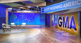
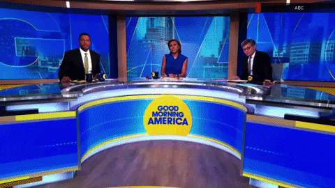
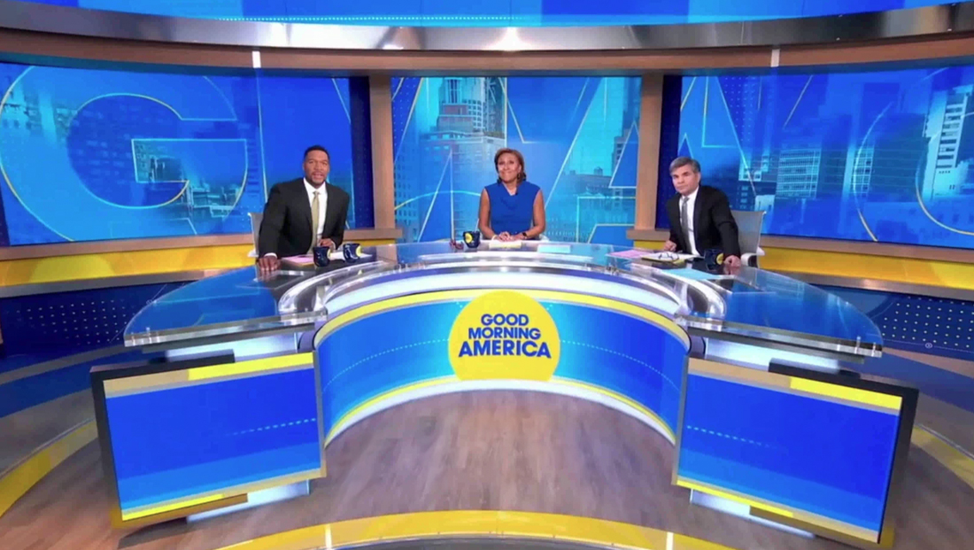
Exclusive and first on NewscastStudio: In addition to debuting an overhaul of its second-floor studio, ABC News‘ “Good Morning America” also introduced a brighter and cleaner graphics package on Monday, March 28, 2022.
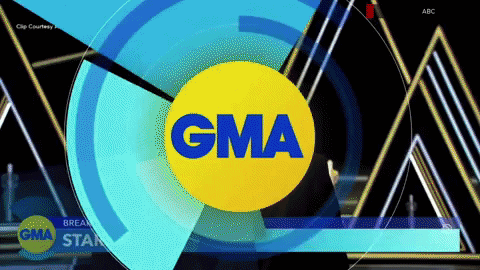
With the new design, the network is keeping its distinctive “Good Morning America” logotype and “GMA” icon.
Working closely with Alan Ives, ABC News’ senior vice president of marketing, the network set about creating more of an “evolution than a revolution,” Hal Aronow-Theil, creative director for “GMA,” told NewscastStudio in an exclusive interview.
“We wanted the new look to play well on social media, and to younger viewers, but not alienate our core audience. So when viewers tune in it would still look like ‘GMA’,” he explained.
ABC worked with Vivid Zero and its own in-house graphics team to create the new package, with an emphasis on brighter colors and streamlined layouts, said Aronow-Theil.
The color scheme utilizes lighter and warmer blues and a richer golden yellow that plays throughout the whole redesign, the network notes.
“The look is cleaner and less cluttered but the majority of elements and franchises still look like ‘GMA,'” noted Aronow-Theil.
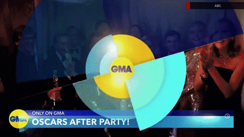
The circular ring motif introduced in 2019 has been significantly simplified and the hashmark element added them have been removed in favor of dots and small plus and arrow icons with a thin outline.
Concentric ring elements remain but no longer rely on gradients as much, giving them a cleaner, crisper look.
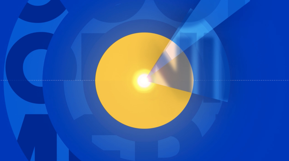
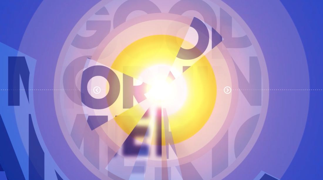
The show has also introduced a new element — fan-like segments that radiate out from a center point. Applications range from segments of different lengths arranged around a focal point to a quadrant-like layout. In some applications, they strongly suggest the notion of sun rays.
These are used in animated wipes and transitions but can also be incorporated into on set video wall graphics and fullscreens.
Another reference to the sun appears after the cold open when a yellow circle that becomes the “GMA” logo seemingly appears to rise out of the anchor desk — conveniently directly above the iteration of the logo that’s being fed to the LED on the front center of it — to become the first in an animated wipe before the tease headlines start.
During the teases themselves, stories cycle through a semitransparent half screen splash screen before a rotating effect reminiscent of clock hands created the thin line to one side of the overlay, twirls around to reveal the tease in full screen with two tiered banner below.
The “GMA” logo is in the lower left and features animated rotating wedge segments.
The show is also upping the emphasis on the abbreviated version of its name, with oversized outlines in a variety of applications used throughout on-set backgrounds using a gradient effect.
Many of the on set graphics, including the “video on video” “walk and wander” floating camera shots still use the existing first floor set elements, which include a myriad of LED arrays.
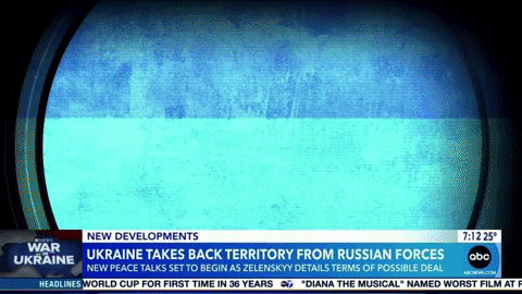
The graphics for these panels, however, have been updated to the new look and an in-package fullscreen on Ukraine also appeared to have take on the new look with a unique take that added dots to the ends of rotating circular lines.
The first floor space continues to use the temporary curved wall with three video wall segments but with updated graphics blending Times Square imagery with the oversized “GMA” lettering. The graphics on the curved and flat segments fronting the anchor desk have also been updated, with the show logo front and center.

The mostly blue graphic in the desk features a dashed line with yellow borders.
The basic layout of the show’s lower third insert graphics remains the same, including having the option to insert a topical image or logo to the far left as well as a slightly smaller top tier for labels such as “New this morning” and “Happening now.”
ABC is switching from Proxima to Avenir as its primary typeface in lower thirds, though stations can still use Proxima in the time and temp bug, or “chip,” as ABC calls it, according to guidelines provided to affiliates and obtained by NewscastStudio.
Proxima is a popular font in TV news graphics, which some would argue has lead to overuse. Avenir has much of the same clarity as Proxima while also having some unique letterforms.
“We’ve used Avenir on other projects and felt it was a nice update from Proxima, although they are very similar,” noted Aronow-Theil.
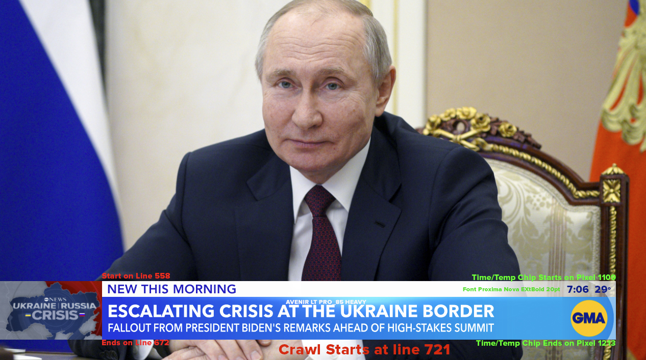
This sample graphic, provided to ABC affiliates and obtained by NewscastStudio, shows guidance from the network about the positioning and typefaces used in the updated lower thirds. Affiliates need this information to update the local ticker, time and temperature over the network feed, which leaves these spaces ‘blank’ on its feed to accommodate these elements.
The lower third redesign will not require stations to relocate or update the local news and weather tickers that are often inserted over the network feed, though some may opt to.
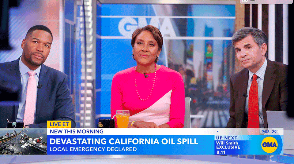
In this animation created by NewscastStudio, the ‘War on Ukraine’ graphic, taken from a past ‘Good Morning America’ broadcast, is shown alternating with a sample graphic, with the sample California oil spill text provided to ABC affiliates and obtained by NewscastStudio. This highlights the slight changes in positioning.
Stations have, however, needed to make adjustments to the time and temperature most insert at the local level because the lower third is extended slightly closer to the right side of the screen, forcing the time and temperature to move over with it. This change also entails making the background behind these elements semitransparent thanks to a gradient.
Meanwhile, the bug is no longer boxed and instead simply rests on the far side of the updated blue banner background with a curved accent capping it out on the far right.
The topical graphic position in the lower left has become slightly narrower, which also allows the show to insert the “coming up” teases that had starting popping up in the far left topical graphic box in a new location to the left of the bug.


tags
ABC, ABC News, Alan Ives, GMA, Good Morning America, Hal Aronow-Theil, motion graphics package, Vivid Zero
categories
Branding, Broadcast Design, Broadcast Industry News, Featured, Graphics, Network Morning Shows