NBC updates promo, snipe design with new take on feather shape, a bit less color
Weekly insights on the technology, production and business decisions shaping media and broadcast. Free to access. Independent coverage. Unsubscribe anytime.
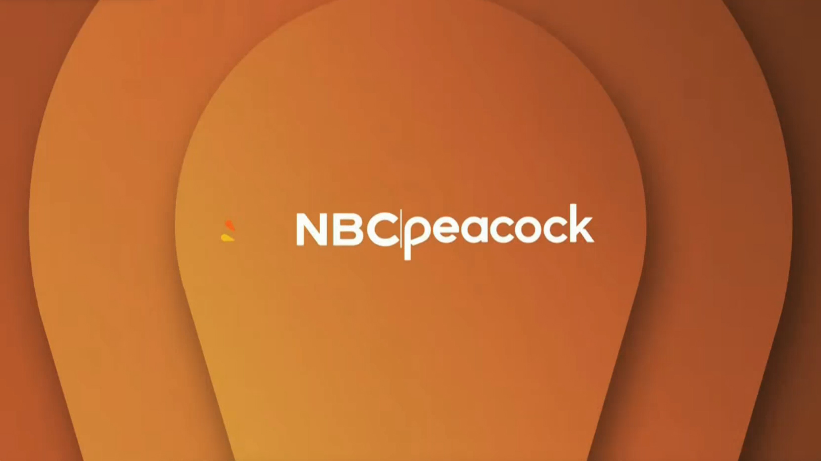
NBC has rolled out an updated look for promos and snipes that focuses on a new angle for its iconic peacock feather shape while also toning down some of the more colorful parts of its previous concept.
Most of these changes began rolling out around Jan. 5, 2026, skipping New Year’s Day and the handful of days between it and the following Monday. This was the same week many NBC shows began airing new episodes after several weeks of repeats or preemptions due to special programming.
At the core of the 2026 redesign is the notion of repeating, nested peacock-feather shapes positioned vertically, much like a map marker, along with some tweaks to how color-gradient washes are used.
The updates did not include replacing the “curtain raiser” vanity card that the network typically airs just before most network entertainment and sports programs start, instead opting to maintain the design introduced in 2022. This look, meanwhile, was inspired by the network’s decision to redraw the NBC peacock icon and update the network wordmark that same year.
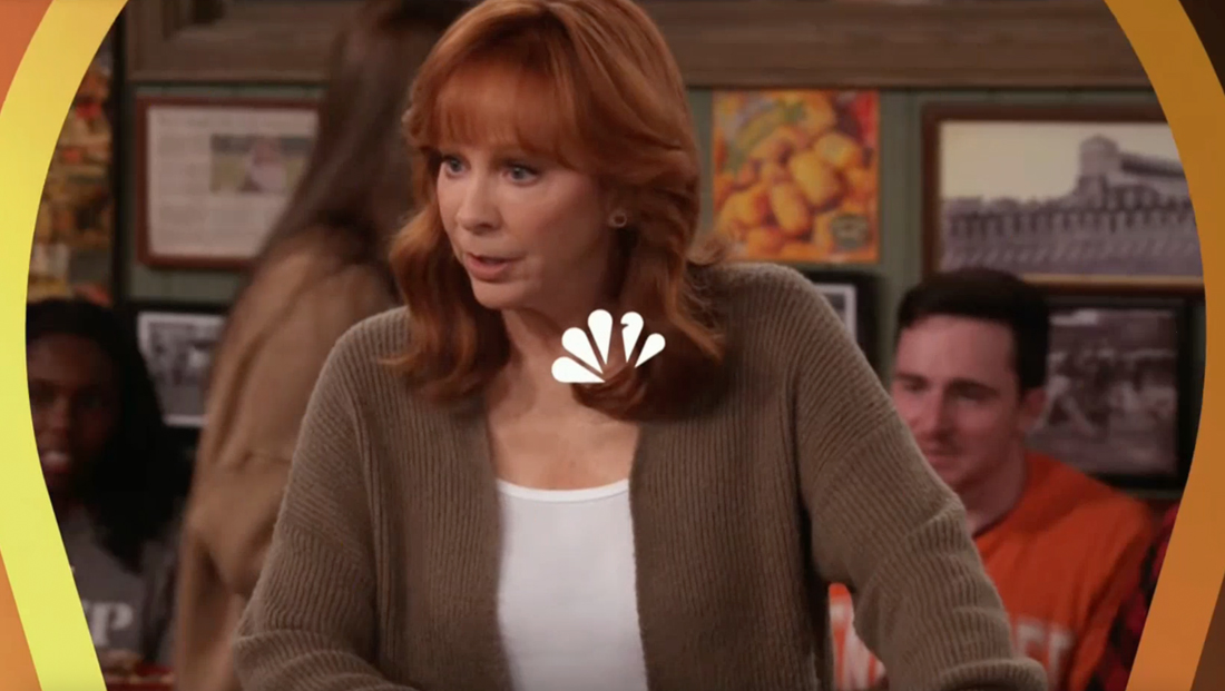
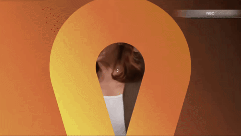
Starting in 2026, NBC began positioning a peacock feather outline vertically with nested shapes serving as animated elements, including as windows that lead into and out of show clips.
Most entertainment programming now starts with a quick view of three layers of the shape opening into a scene, while a monochromatic NBC peacock unfolds in the middle.
This approach notably removes the logo of NBCUniversal’s streamer Peacock from the start of most promos for NBC shows, which previously was included prominently at both the beginning and end of the spots.
The 2026 promos also appear to remove the additional reference to an “NBC Original” that typically followed the logo duo.

For the past several years, NBC and other broadcast networks have been tagging scheduled shows as “originals” (or some variation) while labels such as “special presentation” were used for one-off events, a move that appeared to, at least in part, latch on to streamers’ use of “original” and similar words.
NBC appears to have taken a step back from this, which removes one on-screen element that often felt visually repetitive.
Dropping the “original” graphic also helps make promos, which can feature their own visual styles, including different typography, logos and colors for each show, make the spots feel more like they are promoting the network as well as the show, instead of just the show or episode itself.
The opening animation is on screen for less than a second. This does mean it’s harder to catch, but the oversized shape tends to create a strong on-screen impression that it still registers in the mind even if it’s not seen directly.
This element tends to pack more of a punch when the colors are on the brighter side.
Promos also have an updated ending animation that uses a reverse effect as the opening iteration, typically transitioning from the show logo to a colored gradient background fullscreen featuring both the NBC network and Peacock logos side-by-side in a look that’s reminiscent of the ones introduced in 2022.
There have been a few tweaks here — the preference appears to be use flat versions of both logos, with the beveled effect on the Peacock logo removed while neither receives significant shadowing or lighting overlays. The vertical line separating the NBC and Peacock logos also tends to appear as a solid color rather than a faded gradient.
The logos also feature subtle updated entrance animations for the peacock icon and stacked dots of color in the Peacock streamer logo.
The NBC peacock enters these scenes in a sort of radial flutter, while the vertical row of dots reveal themselves from top to bottom.
Like its counterpart at the start of most promos, this animation is also a “blink, and you’ll miss it” element, though slowing it down reveals it typically features at least two oversized peacock shapes with fairly prominent shadow effects.
Some versions of this layout separate the shape layers more clearly than others. Lighter colors tend to illustrate this better as well, with each of the three surfaces taking on slightly different gradient shades from the same general part of the color wheel.

Overall, the nesting of feather shapes created using a mix of gradients and blends links back to the concentric ripple animation found in the network vanity card.
Despite this, the colorful gradient backgrounds used in many promos appear to be a more traditional take on the gradient. Whereas the 2022 look introduced backgrounds with multiple sources of color shifts, most of the promos aired under the style appear to be more of a traditional linear look that goes from a light to dark shade of a color more or less within the same part of the spectrum.
Snipes
An example of the snipe look NBC used from late 2022 to early 2026, with a white peacock feather shape shown in the background. There’s also a subtle gray color wash overlay behind all of the elements.
NBC has also updated the snipe graphics to coordinate with the vertical feather approach.
In the 2022 look, snipes typically used a horizontal peacock feather shape serving as a sort of visual dock for whatever show-related imagery was placed on top tucked into the lower left of the screen.
This shape could switch colors to match the show’s branding and was backed up by a matching color wash to help the snipe stand out and improve legibility.
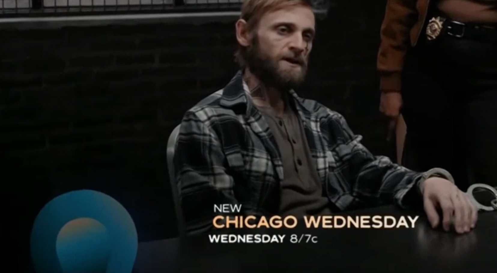
In its new iteration, only the rounded portion of the feather shape — rather than the segment closer to the point — now serves that role.
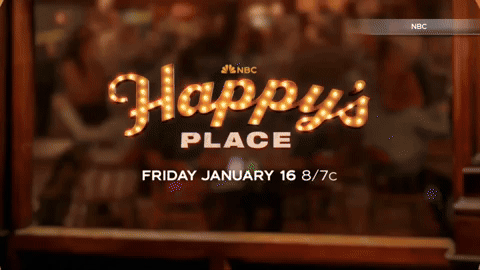
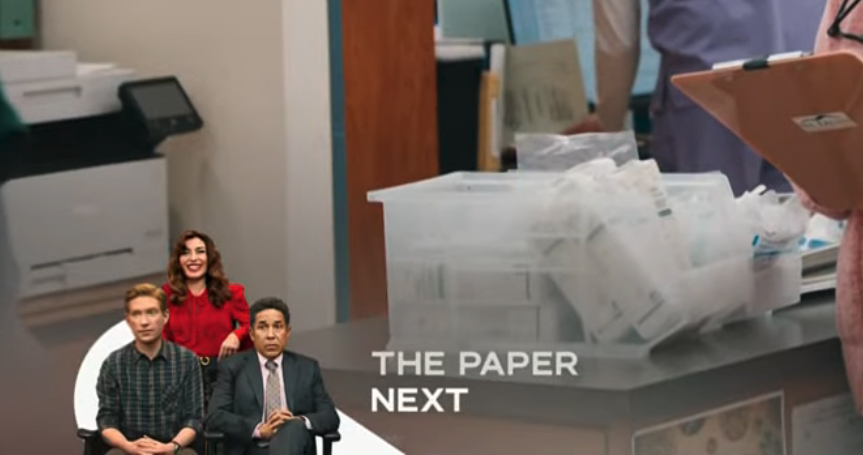
Snipes enter with their own take on the nested shape motif with the accompanying text, set in Tinker, subtly sliding in.
The exit animation is much more subtle, essentially just a quick fade with a slight slide effect.

The updated layout typically uses a black gradient background overlay to improve legibility, in contrast to the brighter-colored blending used before.

Gradients do find a place in the new look on the surface of the feather shape and show titles, though the exact look and brightness varies. The imagery in many of the snipes, which is often cast cutouts, often receives a color wash with the option to add an animated effect with a secondary color.
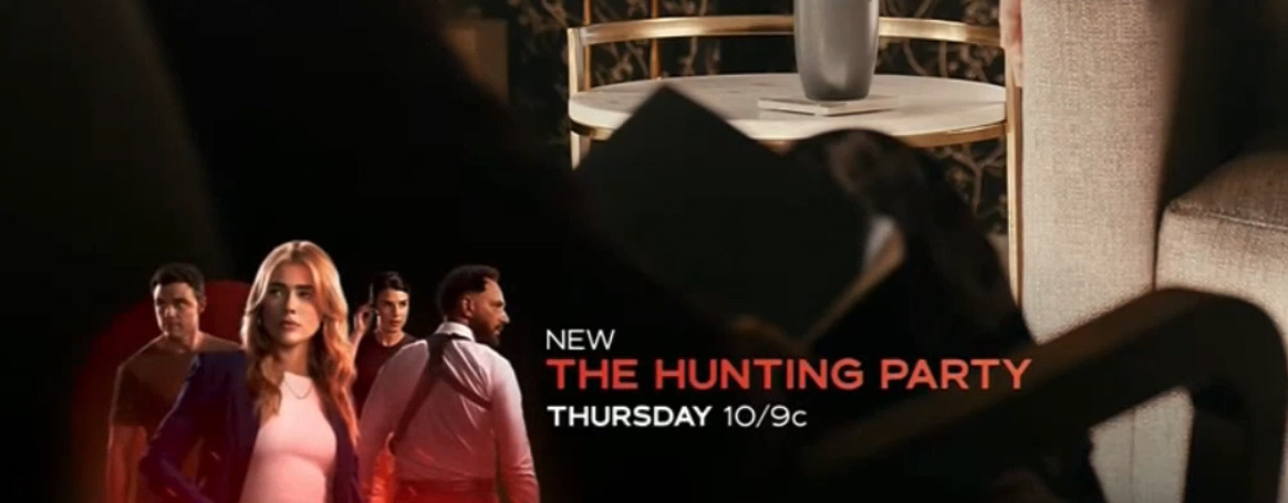
This approach has the net result that the splashiness of the snipes are toned down a bit from the previous look while still incorporating the color wash gradient effect which, in turn, ties back to the vanity card look while also retaining at least some of the color . Now, however, it is often used more to help set the mood of the show — such as deeper shades with hints of orange for “One Chicago” or bold red for “The Hunting Party.”
Bug
NBC also introduces some updates to the peacock bug animation, which still uses a similar motion effect as its base. However, the additional gradient effect has been removed, as has the final larger green feather.
It’s worth noting that the NBC is currently using a bug with the Olympic rings added, as it typically does ahead of its coverage of the games, so the animation could change slightly once it reverts to the standalone peacock.
Continuity
Overall, the updates to remove some of the additional gradient and color wash effects help keep the peacock feathers’ colors more consistent throughout. One small oddity with the 2022 vanity card is that, for a brief period, those feathers go through a quick series of color shifts.
This isn’t necessarily undesirable and certainly helps emphasize the colorful nature of the logo. NBC has also recolored the peacock in the past — including when its corporate brand standards dictated that a single, solid color peacock was used alongside wordmarks for its various divisions.
The network also, of course, routinely recolors the logo in single shades when the rainbow color scheme might not work as well, including in the opening animation sequence of the updated promo look. This is a common practice among networks and logo design in general.
However, by removing those elements, the vanity card now feels a bit less cohesive, though keeping some of the more eye-catching effects in the vanity card could also be seen as a strategic move to differentiate it a bit.

tags
NBC, nbc peacock, snipes, TV Promos
categories
Branding, Broadcast Design, Broadcast Industry News, Heroes, Network Branding, Network Promos