
NBC confirms it’s switching to a redrawn peacock logo, updated type
Weekly insights on the technology, production and business decisions shaping media and broadcast. Free to access. Independent coverage. Unsubscribe anytime.
NBC has confirmed to NewscastStudio that it’s rolling out universal changes to its iconic peacock logo and accompanying logotype.
The changes started appearing quietly throughout the fall of 2022 and then popped up in pre-Thanksgiving and Christmas-themed promos as well, but has yet to be fully rolled out, according to NBC.
Speculation about a possible forthcoming redesign has been circulating since then thanks to observant viewers noticing some of the on-air updates.
NewscastStudio worked with NBC to confirm the details of the changes.
“The NBC brand refresh is a love letter to audiences everywhere, driven by NBC’s innovative spirit while celebrating the network’s powerful legacy,” said Juliet Garrett, senior vice president, NBC Creative Design, NBCUniversal Television and Streaming, in an email interview.
Her team worked with Sibling Rivalry to complete the updates after initially having four agencies present different perspectives to the project.
The network will continue rolling out the new look throughout the rest of 2022 and into 2023, with a larger transition ahead of midseason premieres. The network later clarified that the new icon will be adopted across other NBC divisions, such as NBC News.
NBC did not specific a timeline for the wider adoption.

![]()
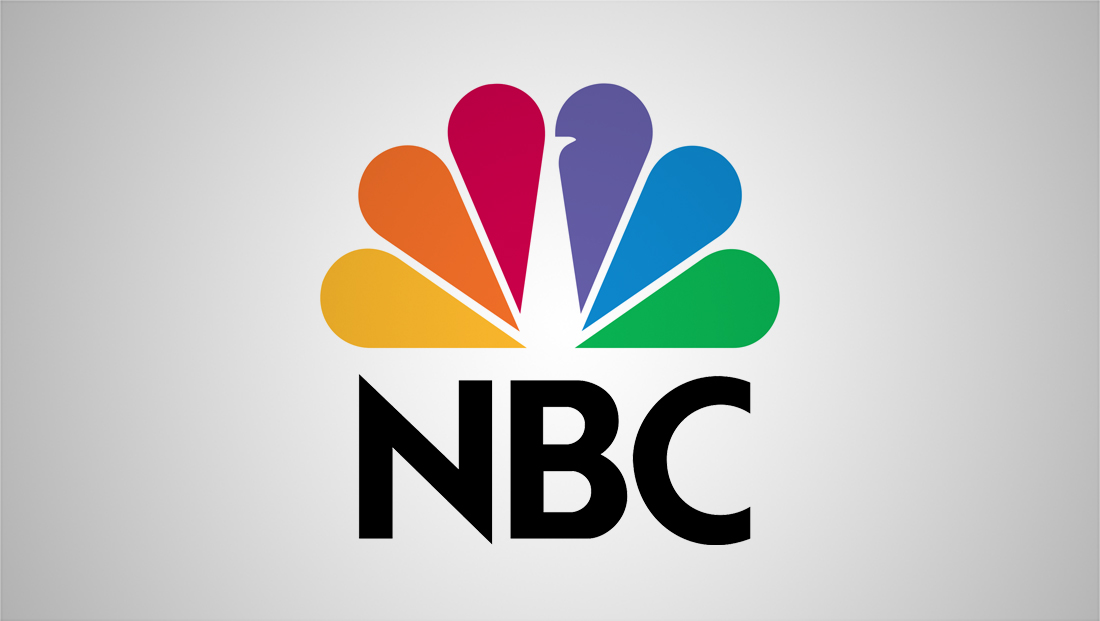
Changes include removing the white background from around the peacock’s colorful feathers, NBC explained to NewscastStudio.
The space between those feathers was also “balanced” out and the “beak” of the peacock in the purple feather was extended slightly to make it more prominent.
NBC acknowledged that the peacock has had a variety of different spacings in the past “to ensure (the) best look in any given case,” such as if scalability was an issue. Because of this, there have been versions of the peacock seen in the wild that looked similar to the new one.
While this latest version does have some similarities to ones used in the past, it was specifically redrawn with flexibility in mind.
“The new peacock style will be used singularly across all platforms since it is versatile, scalable and unique compared to prior versions,” NBC told NewscastStudio.
![]()
In addition to the physical changes, NBC is also updating the feather colors to better match with the six-dot stack that streamer Peacock uses as part of its logo.
Peacock, despite its name, notably does not use the NBC peacock as part of its logo design, but multiple aspects of the logotype and accompanying accents have nods to the shapes and shades found within it, notably with the colors becoming brighter.
“In modernizing the brand with quickly recognizable iconography and rich colors that reflect the spirit of our shows, we are enhancing versatility, allowing scalability and building consistency — while connecting to the newest member of our family, Peacock,” Garrett noted.
Again, there have been variations in the peacock coloring over the years and from medium to medium; for example, print applications have Pantone designations that cannot always be exactly matched in the RGB, CMYK or HSV colorspaces.
These types of inconsistencies are almost always inevitable with any branding effort.

Another significant change is that the network updated NBC Tinker, its proprietary sans serif font that’s spelled out the letters “NBC” (as well as appearing on the “NBC presents” vanity card introduced in 2018) under the icon for entertainment-related designs since 2013, to be bolder and with slightly wider spacing between letters.
NBC worked with Capacity Studios to create the font, which is influenced by Sweet Sans.
![]()
The typography update is a particular improvement— the previous lettering felt a bit like it was trying to make a statement but couldn’t quite make it all the way, perhaps because its stroke widths didn’t quite mesh with the shapes and spacing of the peacock icon.
In some ways, the bolder take on the logotype could also be viewed as a partial step in the trend of the using heavier typography for designs that hint at brutalism, though it doesn’t appear that NBC is going in that direction in other parts of its creative.
Dropping the glossy effect on the peacock was also a smart move as that look has gone out of favor with brighter colors and flat design become more popular.
By going bolder, the new NBC Tinker styling emphasizes, without a doubt, that the network is NBC — and the thicker lettering appears to mesh well with both the more generous spacing between feathers and the relatively heavy amount of visual weight their solid color portions take up.
When time comes for a complete peacock update across all divisions, it is likely to involve replacing physical and digital versions of the logo on countless sets, building signage, stationery, websites, motion graphics, show opens, social media platforms and even vehicles — not to mention having affiliates update their logos to match the redrawn peacock.
Fortunately, the relatively subtle changes made to the peacock make it possible for the two to live with at least some level of harmony to all except the most observant viewers.
In recent years, NBC (along with many other companies) has been shifting away from commercially-available fonts to creating its own, including Arthouse Owned for its owned-stations’ graphics packages, and Wordmark for MSNBC’s 2021 logo redesign. CNN was one of the earliest TV entrants into the custom font space with CNN Sans back in 2016 and BBC has BBC Reith, which debuted in 2021.

These fonts often draw inspiration from mainstream ones available (Arthouse Owned has similarities to FF Din, which the group had been using) but are modified to be distinct enough to be claimed, in many cases, as separate intellectual property and meet the needs and brand goals of the entity it’s designed for.
By developing bespoke fonts, companies and networks are able to ensure that their brands stand out feel more unique. It’s also often more favorable to pay the costs of developing a custom font than paying the often high licensing fees that would be required for nationwide network use.
The 1986 logo that used a modified version of geometric typeface Futura for the letters NBC. The look was notable for the sharp tips on the ‘N’s and relative open ‘C.’ Other network divisions also use the typeface, with modifications, including NBC News, which used a ‘W’ modified to look more like two overlapping ‘V’s. Today, the font still shows up on NBC programming, especially news.
The basis of the current six-feather peacock icon introduced in 1986 was designed by Steff Geissbuhler at Chermayeff & Geismar, significantly simplifying a series of peacock-themed designs that the network had used since as far back as 1956 as way to promote its shift to color programming and it being “proud as a peacock” to do so.
Over the years, the shape has had numerous iterations, with countless 3D, glossy and glassy effects being added and then removed, though not all of these designs became official logos, but rather would often be designated for a specific campaign or season.
Like many logos, there have also been slightly different icons developed over the years for specific applications such as a particular small or large scale or medium.
The peacock is often used in oversized form as a background element for network graphics and promotional materials, often with a focus on the shape of the feathers or the “head” of the bird.
Numerous physical interpretations of the peacock also exist. There’s an internally lit ceiling-mounted sculpture hanging from the west side of Studio 3A, on a set originally designed for “NBC Nightly News.”
In Washington, a seating area in the bureau features six movable segments, each the shape of a feather and padded with a cushion made from fabric with one of its colors. Shapes inspired by the logo have also appeared as floor decals, in anchor desks and more.
Large dimensional elements of the peacock are also found in both New York and D.C. sets for NBC News, as well as some NBC Sports sets.

The ‘Proud N’ version used from 1979 to 1986 that shows some hints at the shapes of the next feathers.
Prior to the six-feather version, several other iterations, with many more feathers, were used, including the “Proud N” lockup that began the suggestion of the petal-like feathers.
Correction: An earlier version of this story misstated the font NBC-owned stations previously used. It is FF Din.

tags
logo design, NBC, nbc peacock, NBC Tinker, Sibling Rivalry
categories
Branding, Broadcast Design, Broadcast Industry News, Heroes, News Promos and Sports Promos