
‘Today’ graphic a study in why contrast is key to readability
Weekly insights on the technology, production and business decisions shaping media and broadcast. Free to access. Independent coverage. Unsubscribe anytime.
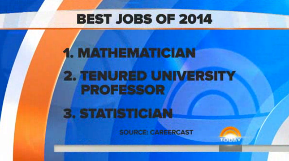
Someone at “Today” apparently missed the lecture about contrast in design school.
This morning, during a segment about the best and worst jobs, the show aired the fullscreen graphic above.
However, the choice of black text against the blue background made the text very difficult to read — in some cases more difficult than others depending on the users’ screen settings.
Since the blues used in the background rings are more toward the dark side, this left little difference in color tone and brightness between them and the black text.
Overall, the graphic ended up looking almost like a mistake — and a bit amateurish.
Might we suggest lightening up the background a bit or switching to white text with, perhaps, a subtle outer glow to improve readability?

tags
color, contrast, NBC, NBC News, Today, Today Show
categories
Featured, Graphics, Networks