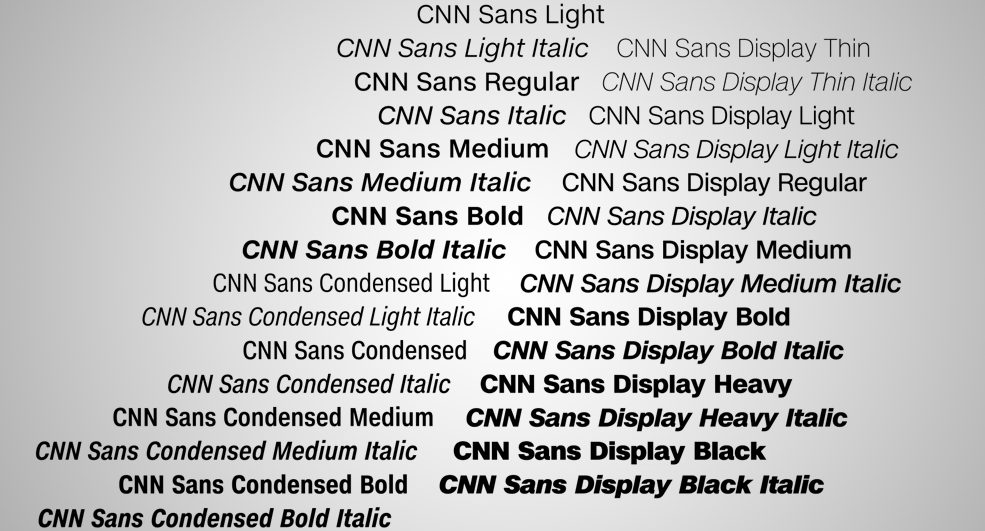
CNN now has its own font

Weekly insights on the technology, production and business decisions shaping media and broadcast. Free to access. Independent coverage. Unsubscribe anytime.
CNN has unveiled “CNN Sans” — a custom designed font that will be used across all of its platforms.
The font, which even by CNN’s own admission looks an awful lot like Helvetica, will be used uniformly across all of the network’s platforms, including lower thirds, the ticker, Web pages, promotional materials and more.
The font has already shown up on the cable network’s air, replacing the Gotham-style font that was used.

One potential advantage to the new font, besides the fact the network owns the license to it outright, is that it comes in over 30 weights and styles — so “smashing” the font in lower third banners to make headlines fix will hopefully be a thing of the past (or at least look a little better).
The network has already switched over to using the font on air and online, with a full transition expected to continue over the next year.
CNN is promoting the new font with an internal video narrated by correspondent Richard Quest, who enthusiastically extols the virtues of the font to the point of hilarity.
Custom fonts are not a new concept for brands and companies — Apple recently launched “San Francisco,” named for the city near its corporate headquarters. Meanwhile, Google switched its logo to the custom drawn “Alphabet,” which borrows its name from the new parent company formed for the search giant’s holdings.
CNN Sans is certainly clean and well designed, but it also lacks any specific character, unlike the aforementioned San Francisco and Alphabet typefaces. Since even the network itself suggests it’s a close cousin to Helvetica (or a myriad of its copycat fonts), the average viewer isn’t likely to associated it, even subconsciously, with the brand.
It would have been interesting to see CNN explore some more distinct characteristics for a font it no doubt paid a bundle for — perhaps finding a way to play homage to its iconic logotype’s curved lines.


tags
CNN, font
categories
Branding, Broadcast Design, Cable News, Heroes