
GloboNews rebrands, including new logo and motion graphics
Weekly insights on the technology, production and business decisions shaping media and broadcast. Free to access. Independent coverage. Unsubscribe anytime.
Brazil’s GloboNews has unveiled a redesigned on-air look for its all-news channel’s programming.
The relaunch, which began hitting air in August 2022, includes an update to the network’s overall logo design and is part of a larger Globo rebrand which has also rolled out to TV Globo and Globoplay.
![]()
The new design retains the circular icon that’s used in various Globo brands but switches the word “news” to all lowercase in a wide, clean custom typeface with more generous spacing than before. The new typeface, known as Globobrand, is used across Globo’s various properties.
![]()
Previously, the circular logo element was somewhat awkwardly shoved right up against the “N” in “News,” which itself was spelled out in a super-condensed, all caps style and could be a bit difficult to read — particularly the “N” and “E,” which were morphed together to share a vertical stroke. The “W” also included perfectly vertical strokes mixed awkwardly with diagonals and the upper right of the letter was awkwardly linked with the “S.”
In many applications, the shade of red use has also been shifted to a slightly brighter and fresh one.
![]()

The rebranding has also been extended to GloboNews’ opens, network stingers and lower third insert graphics but has so far not appeared on parent network TV Globo’s “Jornal Nacional” newscast.
The redesign takes advantage of the network’s red logo with various combinations of black and white, with canary yellow as an accent used in small doses.
Overall, the new look uses a flat, typographically-driven look with fluid animations and stylized photography with landscape and newsgathering references.

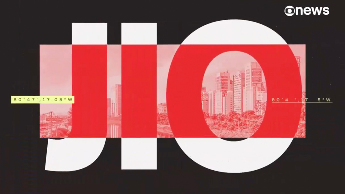
Microtext and repeating text is another common element found throughout, including the use of number lines for the nightly newscast “Jornal das Dez,” which is also known as “J10” and therefore has “10” highlighted.
Smaller text is also used for show hashtags and longitude and latitude designators, though many of the looks are kept fairly clean and don’t use as much repeating or micro text as some other current broadcast graphics packages.

Primary typography, including show titles, is set mostly in a clean sans serif with distinct letterforms and typically with tighter letter spacing — though none as severe as the old network logo. The typeface also has distinct and well-drawn accent marks, common in Portuguese, the network’s native language.

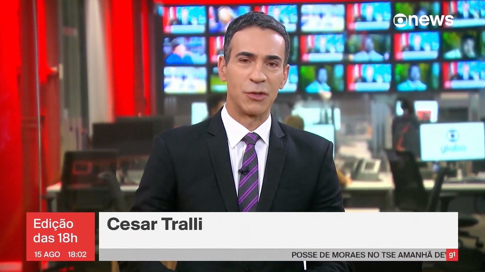
The redesign also extends to lower third inserts and bugs, which typically include a red box in the lower left of the screen for the show name, date and time.
Banners can include up to two tiers inside a dark gray box, while a lighter gray strip below is used for a ticker.
The ticker bar has a “G1” logo in the lower right inside of a small red box, a reference to the network’s news portal that combines content from across the Grupo Globo empire, including TV Globo, GloboNews, Radios CBN and Globo, newspapers O Globo, Extra, Expresso and Valor Econômico, Época and Globo Rural

An alternate design uses a very light gray with dark gray text.

tags
globo, GloboNews, logo design, rebranding, TV Globo
categories
Branding, Broadcast Design, Broadcast Industry News, Graphics, Heroes, Networks