
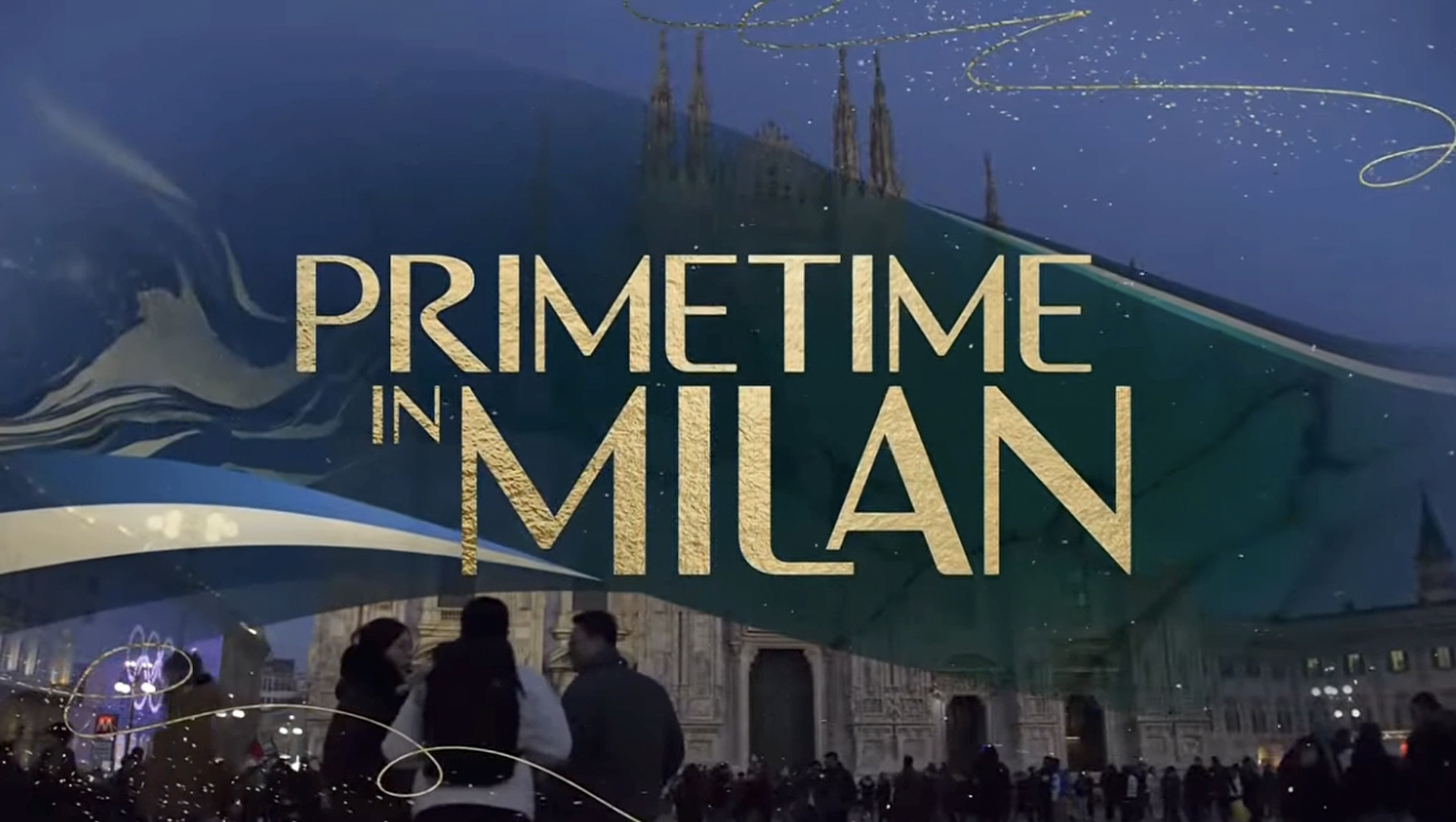
NBC focuses on duality of host cities in 2026 Winter Olympics graphics
Weekly insights on the technology, production and business decisions shaping media and broadcast. Free to access. Independent coverage. Unsubscribe anytime.
NBC built upon the flowing, textural and regionally-inspired design it introduced for the 2024 Summer Olympics in Paris to create a sophisticated look for its coverage of the 2026 Winter Olympics.
The broadcast design package is, at its core, meant to reflect the distinctive, far-flung geography of this edition of the Olympics, according to Dave Barton, vice president, creative at NBC Sports Group.
“Since events are held across the city of Milan and through a variety of mountain clusters along the Swiss and Austrian borders, it was important for us to create a graphics package that creates cohesion while still honoring the culture and details that make each region unique,” Barton noted to NCS.
A study of contrasts
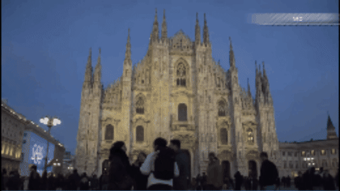
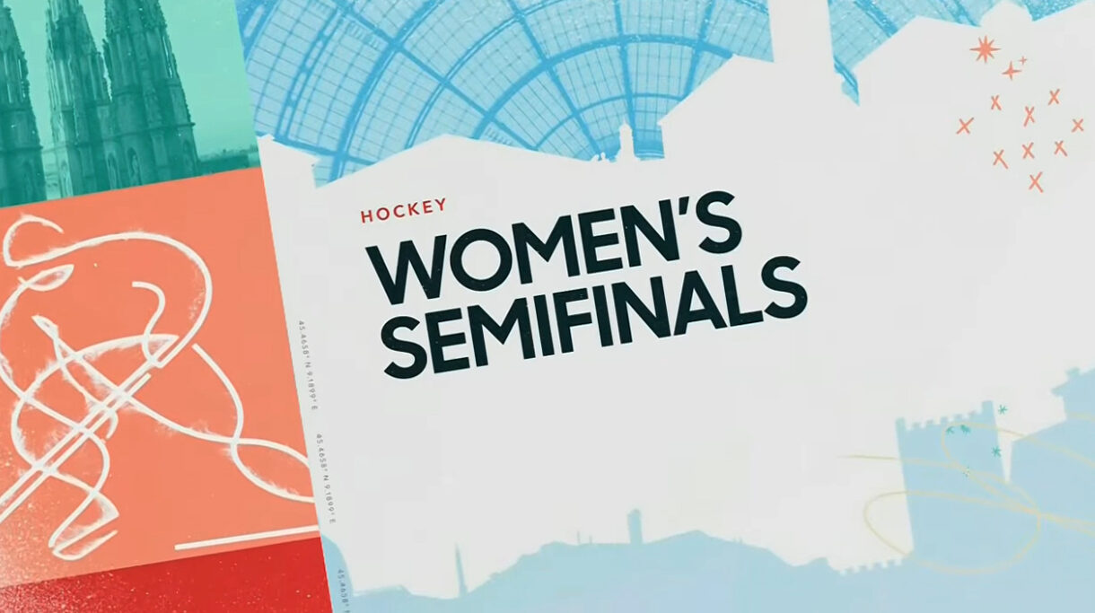
At the heart of the design is a visual dialogue between contrasts: The sophistication and modernity of Milan and the quiet, rustic beauty of Cortina and the surrounding alpine villages.
Throughout the package, regional textures, materials and color palettes are thoughtfully woven into the design.
Elegant fabrics and refined finishes nod to Milan’s world-renowned fashion and design heritage, while weathered wood and natural stone evoke the alpine warmth of Cortina.
These elements are unified by polished marble — an iconic material found throughout Italy — which serves as a consistent visual thread across all platforms. NBC leaned on a collection of marble imagery with varied veining and leveraged its geological, organic feel extensively. It doesn’t hurt that, depending on the exact pattern used, the textures can look like cracks in ice, rolling mountainscapes or drifting snow.

Gold accents elevate the entire system, appearing in motion graphics and layouts as a nod to the pinnacle of Olympic sports, with subtle drifting flecks of gold abstractly echoing falling snow.
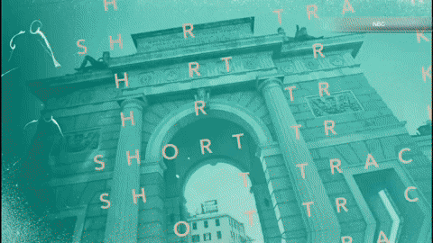
The package extends well beyond a core graphics toolkit to include a wide range of executions that include 2D, 3D and cel-animated elements. Its visual language draws inspiration from mid-century modern aesthetics, classic Italian travel posters and the bold dynamism of Italian Futurism — capturing the speed, energy, and momentum of winter sport.
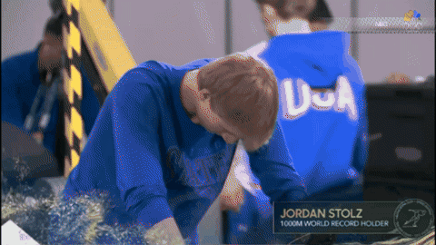
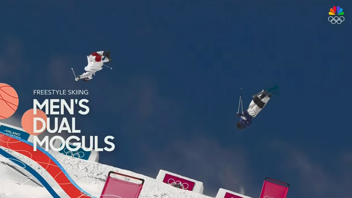
A central creative priority was to reveal the athletes behind the helmets, masks and protective gear common in winter competition.
Imagery and video captured at Universal Studios near Los Angeles — including headshots, editorial photography and portrait-driven motion — are seamlessly integrated into interstitials, opens, bumpers and insert graphics. The result is a more personal and human connection to the competitors at the center of the Games.
Resort-style maps
Another defining feature of the package is a custom venue map system designed to guide viewers across the various clusters.
“Instead of showing how separated these locations are from each other, we decided to take a different approach and present the layout of the Games like a casual ski map that you would get with your lift ticket, or an amusement park map,” said Barton.
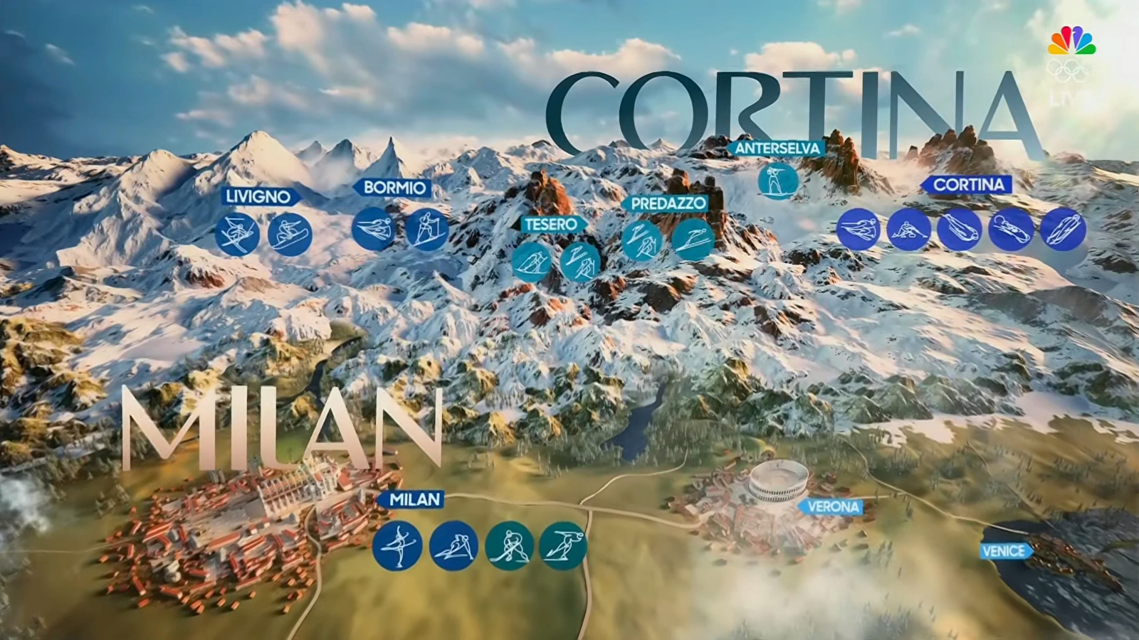
Just as those types of maps prioritize clarity and experience over strict scale, this approach helps audiences understand where events are taking place without getting lost in logistical complexity, according to Barton.
Color
While primary color palettes largely remain in the blue-green part of the color wheel, which is a common approach across NBC Olympics looks in general, elements can also be recolored, including the option to introduce marble and box elements more closely aligned with national colors.

While the 2024 look in France emphasized the custom pictograms created for each event using a “coat of arms” approach, each Olympics typically generates its own set of icons and, while the imagery was still used throughout the package, it wasn’t given the same emphasis as in 2024.
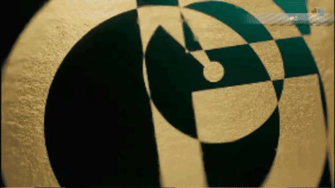
The Milan pictograms, which were created using a hand-drawn approach with dramatic slashes, make appearances throughout, often with hints of gold flecks and texture added to the strokes.
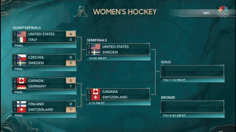
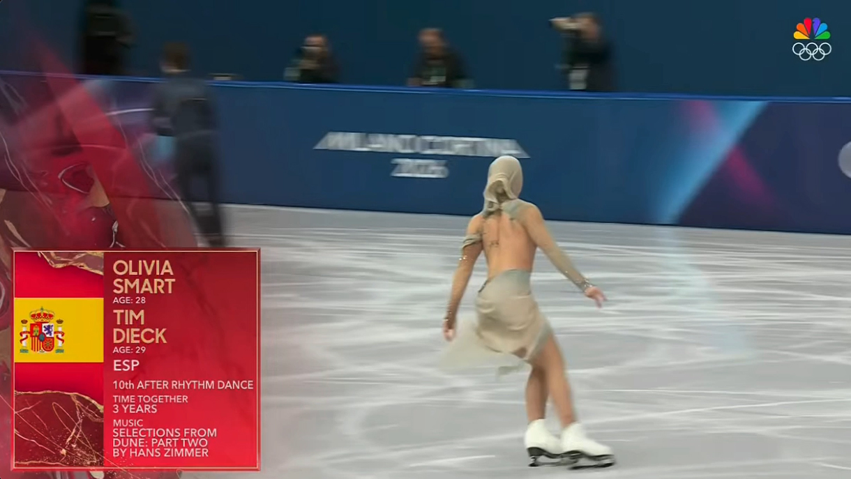
Insert graphics
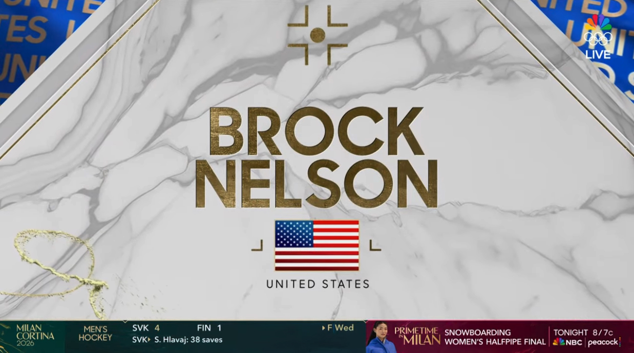
NBC’s insert graphics — ranging from talent identifiers to info boxes and sidebars to scoreboards — maintained a similar subtle scale and look as well, though the curved corner accents were dropped in favor of beveled, squared-off corners that feel like a nod to slabs of marble.

Like with Paris, the Milan graphics rely heavily on typography, including a geometric sans serif that takes a bit of a step back from the more humanistic fonts used in Paris.
The marble motif, meanwhile, largely took the place of the veins of gold introduced in Paris, while the notes of the flowing curves of the 2024 look can be distinctly seen in 2026.
Other sub-packages
Milan’s package also includes a blend of design elements for a variety of uses, including late-night programming and other situations where storytelling could benefit from a different approach, tailored to a particular sport’s key audience.

These designs use a combination of a broader color palette, more solid elements and an overall flatter feel.
In some cases, the curved motif is retained, while other designs replace it with a boxier, angled layout.
There are also options that bridge two or more looks, including combining hints of the marble texture with bolder takes on athlete photography and oversized gold event pictograms and, instead of the smooth, flowing animation, elements that move around the screen by seemingly skipping a few frames.
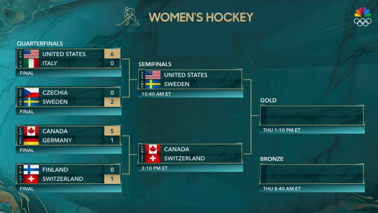
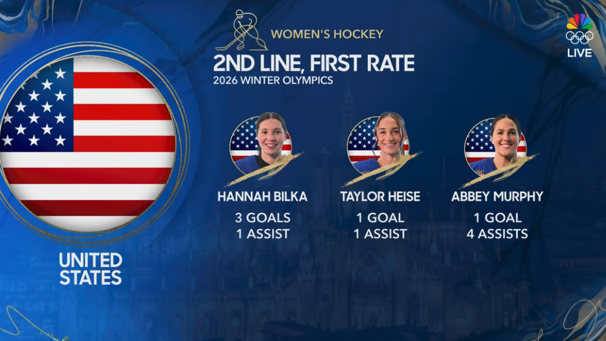
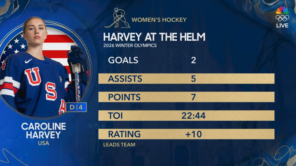
NBC opted to give ice hockey games an additional graphics package, reflecting the fact that NHL players were able to play in the Olympics for the first time in a dozen years.
This look centered on a lighter color scheme anchored by white marble textures imagined as the surface of ice. An intricate system of circular and linear shapes largely set in gold was also developed.
Diamond shapes were also incorporated heavily into the hockey look, which was used alongside designs from the primary package during coverage.
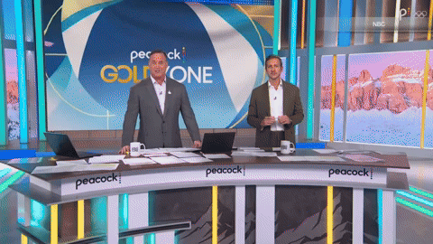
‘Gold Zone’ graphics
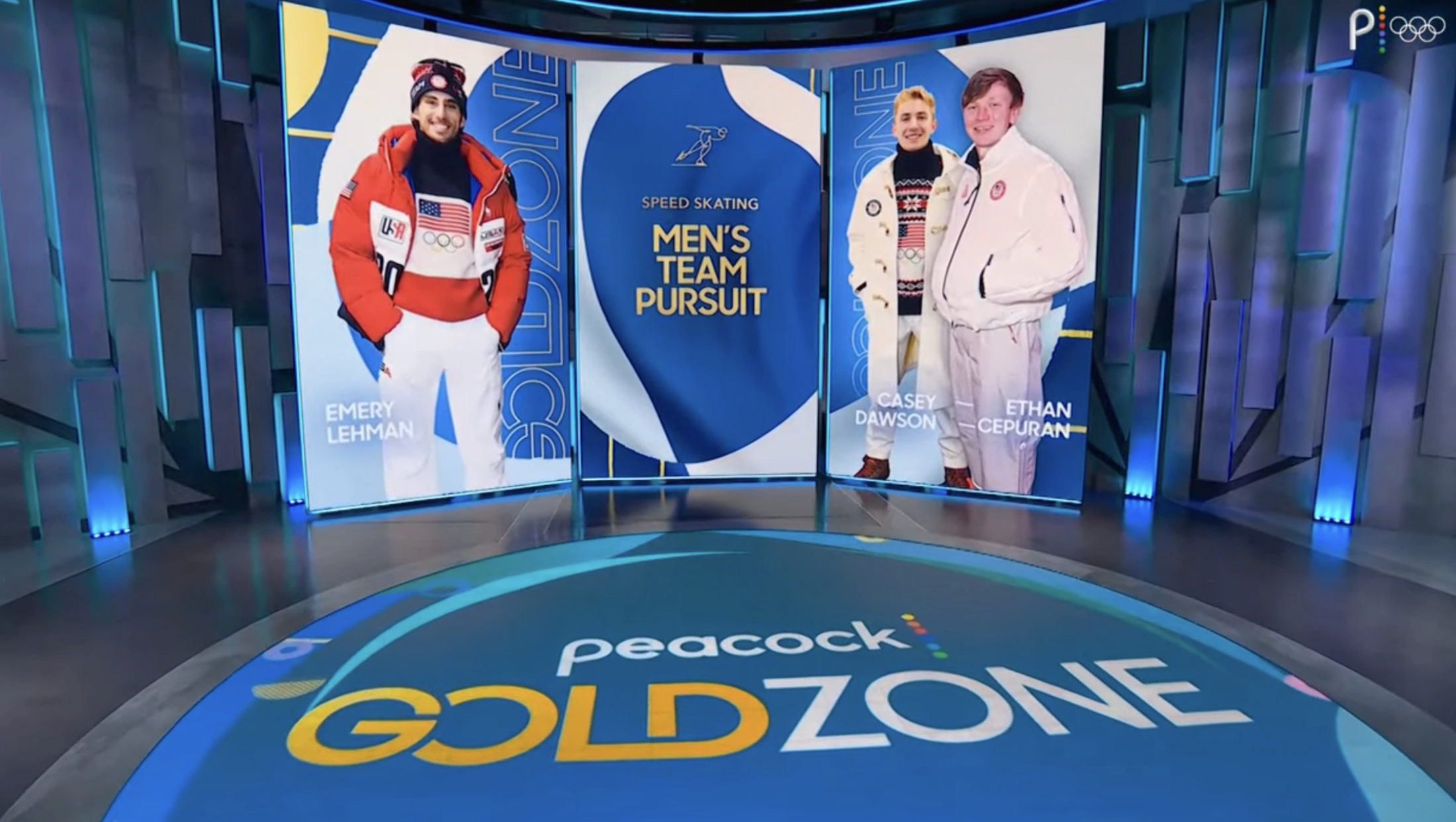
Peacock’s “Gold Zone” whip-around show also got a distinct package from Two Fresh Creative.

These graphics leverage a series of colorful, billowing textures and shapes inspired by fluttering fabric or the gentle curves of marble veining.
Animation also includes smaller circular and elongated shapes that move playfully across the screen.
The open also adds in stylized illustrations of athletes and regional landmarks before revealing a large iteration of the Peacock logo. The motion for this reveal takes advantage of the six stacked circular dots blended into the overall animation language, where they double as some of the smaller shape accents.

Like the hockey look, “Gold Zone” graphics are used side-by-side with elements from the main package, so the use of flowing shapes that hint at motifs in that goes a long way in creating cohesion.

Another take, often used when more eye-catching visuals are needed, includes a collection of larger-scale fashionable geometric patterns and marble veining in a broader spectrum of colors and boxed elements combined with oversized typography.

tags
2026 Winter Olympics, david barton, NBC, NBC Olympics, nbc sports, Two Fresh Creative
categories
Broadcast Design, Graphics, Heroes, Olympics