

Telemundo kicks off brand refresh led by new World Cup package
Weekly insights on the technology, production and business decisions shaping media and broadcast. Free to access. Independent coverage. Unsubscribe anytime.
Telemundo has rolled out a network-wide brand refresh along with a bold new toolkit for its upcoming coverage of the 2026 FIFA World Cup.
Created by Sibling Rivalry, the two systems were created to be “separate but distinct,” with the World Cup look forming the creative base of the network update.
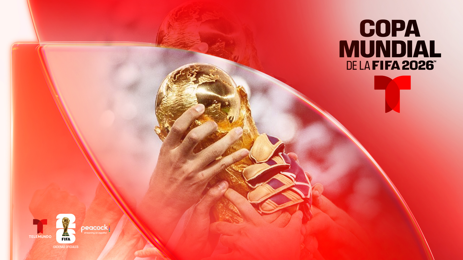
“For Telemundo, the goal was to build an epic home for Latino fans where the World Cup feels as big on screen as it does in their lives,” said Mikon van Gastel, co-founder and CEO at Sibling Rivalry, in a statement. “By triangulating Telemundo’s ambition, the audience’s reality, and the cultural moment, we could push past surface-level branding into a system that feels intentional and is built to last.”
The team took cues from the scale, passion and cultural energy of the World Cup to channel their work with that “epic home” concept translated into Spanish as “Casa Épica.”
This included a goal of showcasing how the World Cup is more than a sporting event and emphasizing its reach as a cultural movement, with the design crafted to capture “the energy, anticipation and shared experiences that surround the tournament across generations and communities.”
“As we head into the FIFA World Cup and a new era for Telemundo, we wanted a creative system that reflects the scale, passion and cultural impact of our brand today. This refresh gives us a modern and flexible identity built for our audiences across sports, entertainment and streaming,” said Claudia Chagui, executive vice president of marketing and creative, NBCUniversal Telemundo Enterprises.
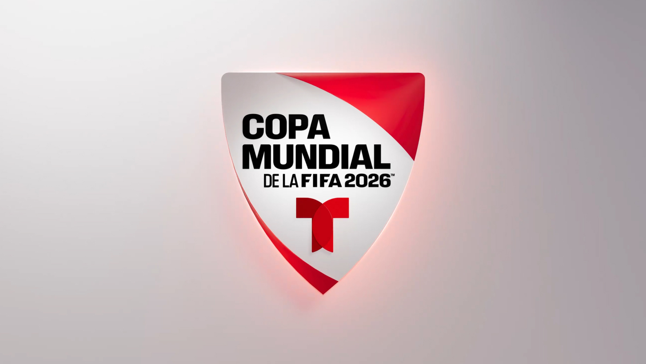
Telemundo had previously rolled out a shield-shaped Copa Mundial (“World Cup”) logo that echoes much of the network’s existing branding, especially in the lockup’s overall geometry.

The distinctive Telemundo “T” icon, with its overlapping curved and straight elements, remains and was used as a jumping-off point to inspire the broader look, according to a series of stills that Sibling Rivalry released in May 2026.
Much of the look uses shapes drawn from parts of the “T” icon to frame out imagery or typographic content and are often used to create distinct zones for various on-screen elements.
The entire World Cup design system is meant to be flexible enough to be used across multiple platforms and to adapt to a variety of uses throughout the massive tournament. Sibling Rivalry also engineered the branding so that it can be expanded over time.
“Even though this was a sports package, we didn’t think of fútbol as just a sport,” said Eduardo Palma, design director, Sibling Rivalry. “We thought about it as culture — the feeling of people coming together to watch, celebrate and root for their teams. That gave the work a different sensibility.”
In addition to the World Cup package, Sibling Rivalry also developed Nexo, the name for the creative system developed for the broader network refresh.
“Inspired by Telemundo’s ambition to serve as an ‘unstoppable U.S. Latino force across media and culture,’ the identity positions the network as a unifying destination connecting audiences through stories, voices and live moments that matter most to them,” according to the agency.
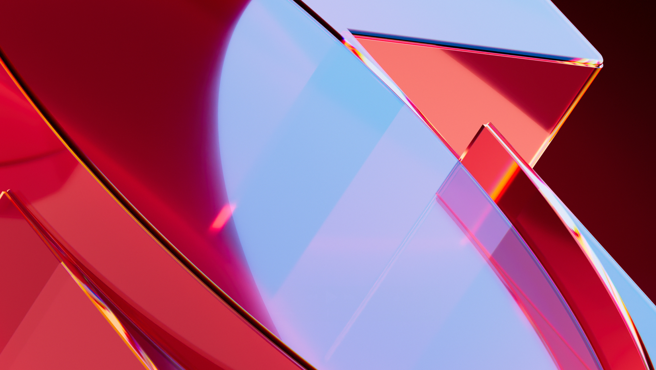
The use of glass effects speaks to the moment that similar takes on the look, including glass morphism and Apple’s Liquid Glass, are having in the design world right now.
In addition to this effect, the package also has a series of other options for highlighting content and creating visual interest in different and, in some cases, more subtle ways, including with laser-like borders and glow effects along with more textural elements such as bevels, etched lines and purposeful surface shadowing.
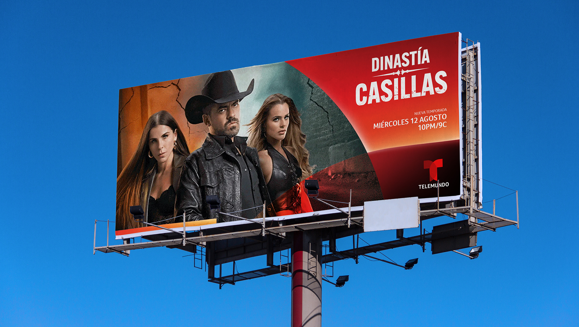

This, in turn, also leads to less glassy applications of the look. Many of these still draw on derived shapes that intersect, with color screens and gradient fills used to create distinct zones.
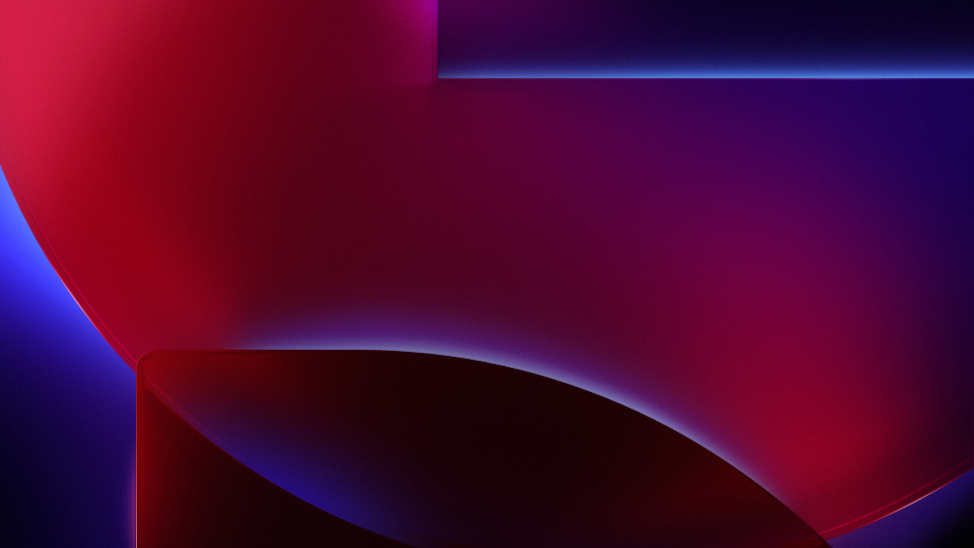
While Telemundo’s signature red still dominates the package, blues and violets already appear across the Telemundo family.
“A key challenge across both projects was creating a system that could feel culturally specific and emotionally expressive, without becoming reductive,” according to Sibling Rivalry. Ultimately, the design team collaborated with the network’s teams to create an “elevated” and “authentic” feel that would resonate with the brand’s audience.
“From the beginning, the goal was to make the work feel extremely Telemundo,” said Palma. “That meant moving away from generic ideas of what Latino design or sports branding should look like, and instead building from Telemundo’s own equities: its red, its logo, its energy and its role in culture.”
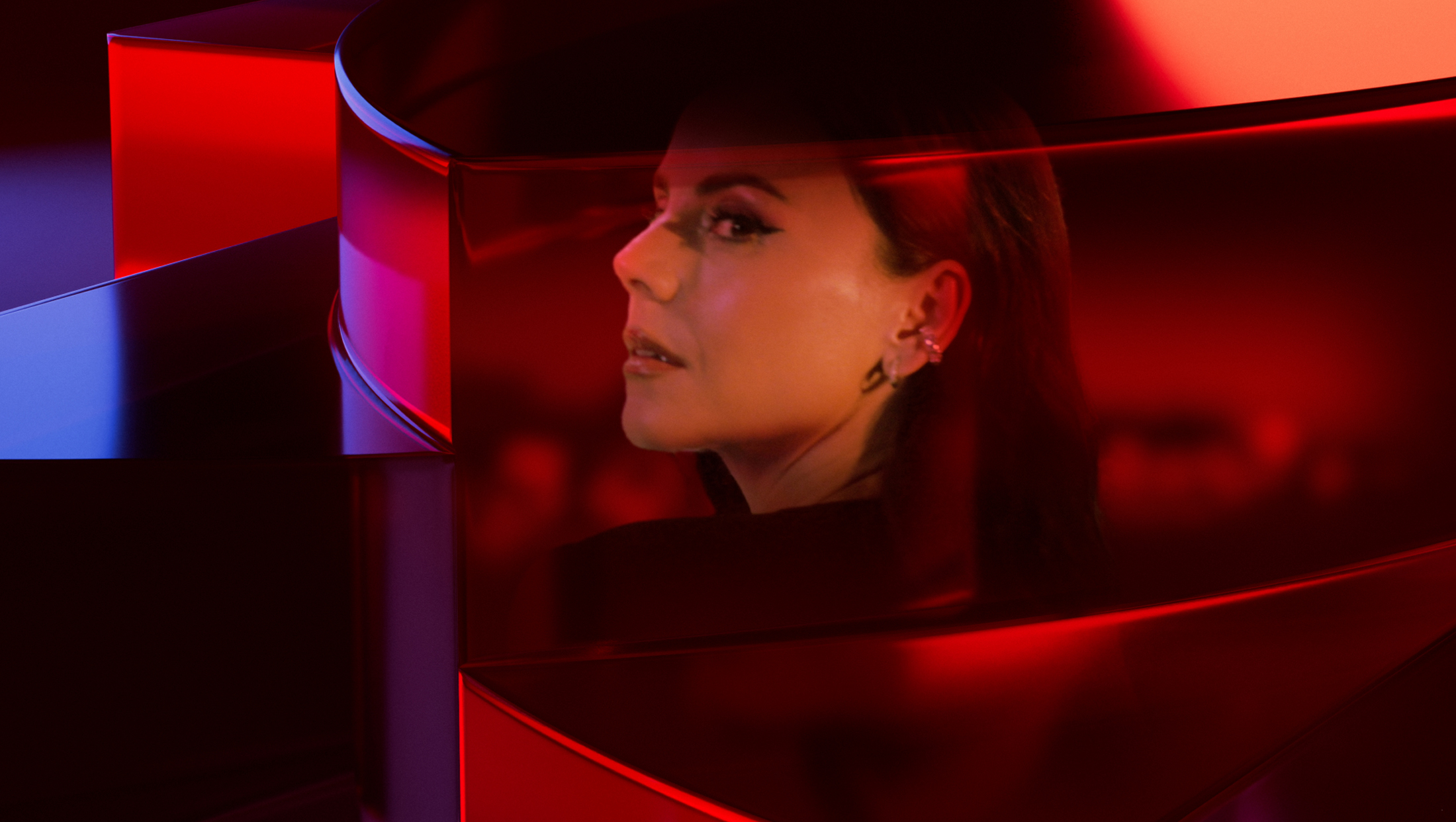
Reds are often shifted into the orange or rust range thanks to a combination of lighting effects, shading and gradients.
Sibling Rivalry also paid close attention to how color could be used to communicate across dayparts and genres.
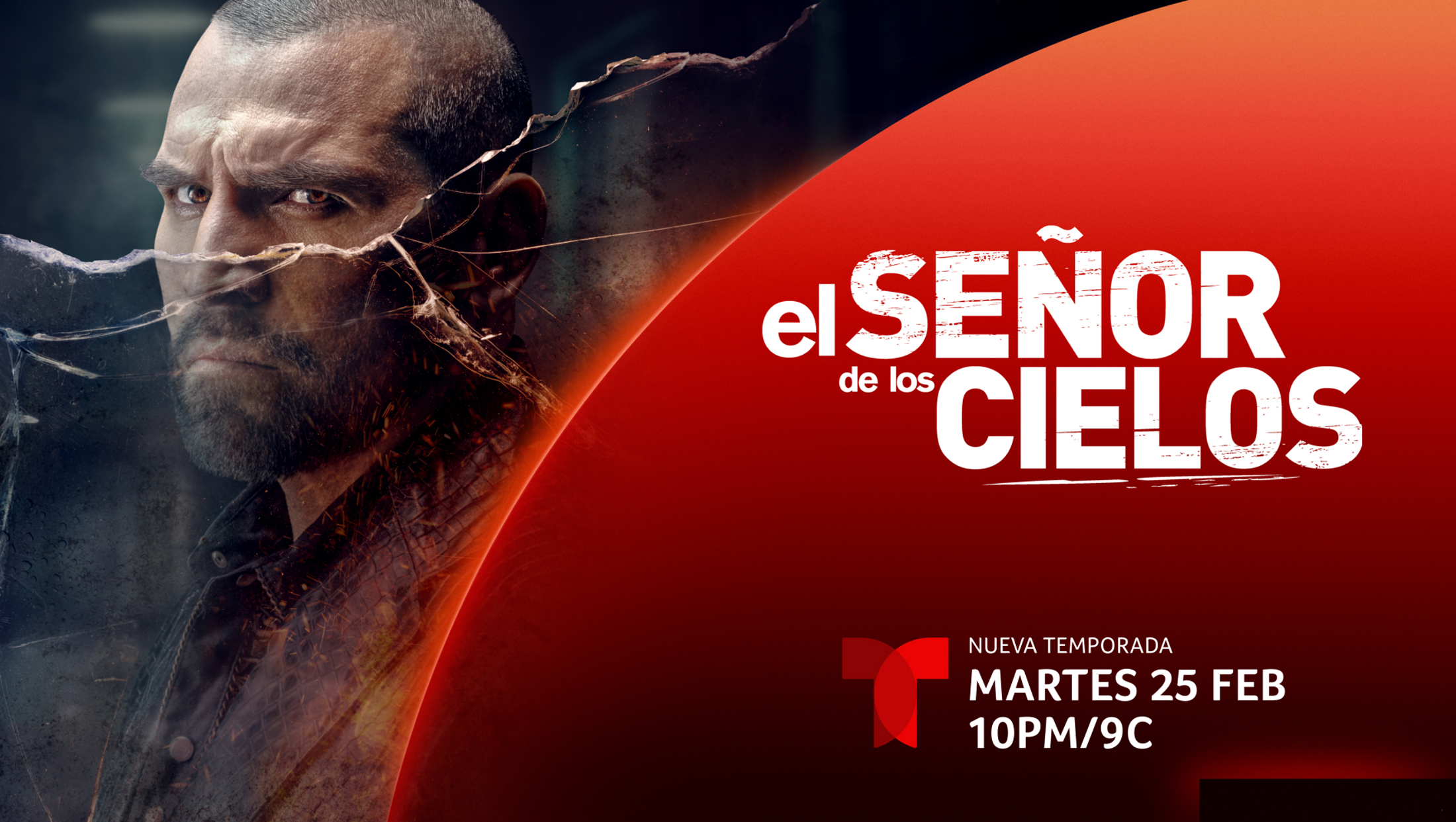
Different colors are added in when it makes sense for the story the graphics are telling — including team or national colors in the case of World Cup material.
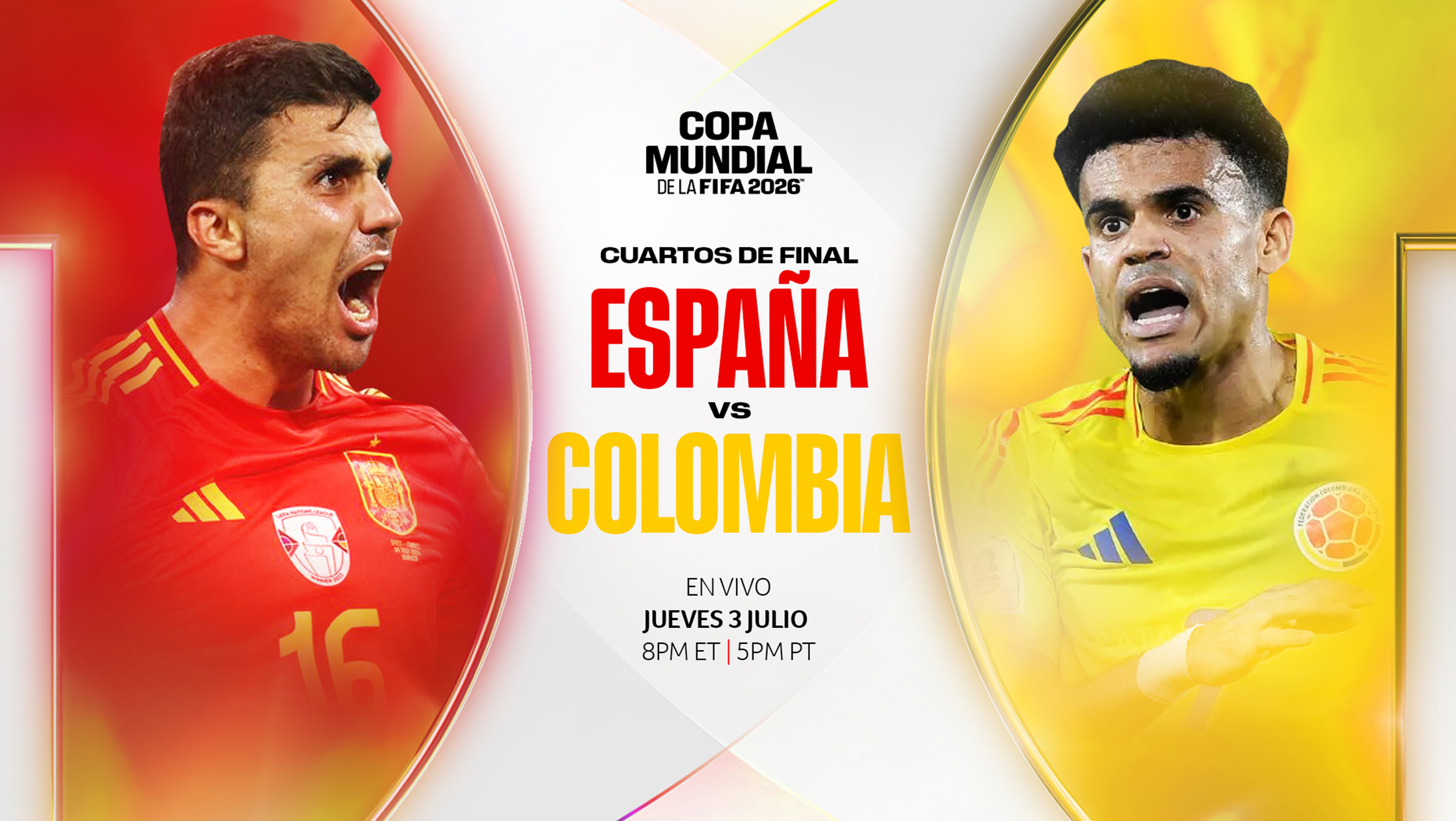
For example, dramatic player imagery can literally face off side-by-side, with each one placed inside its own part of a deconstructed take on the “T” icon. In this example, additional, more subtle color accents also make appearances in the places where broader circular background shapes meet up.
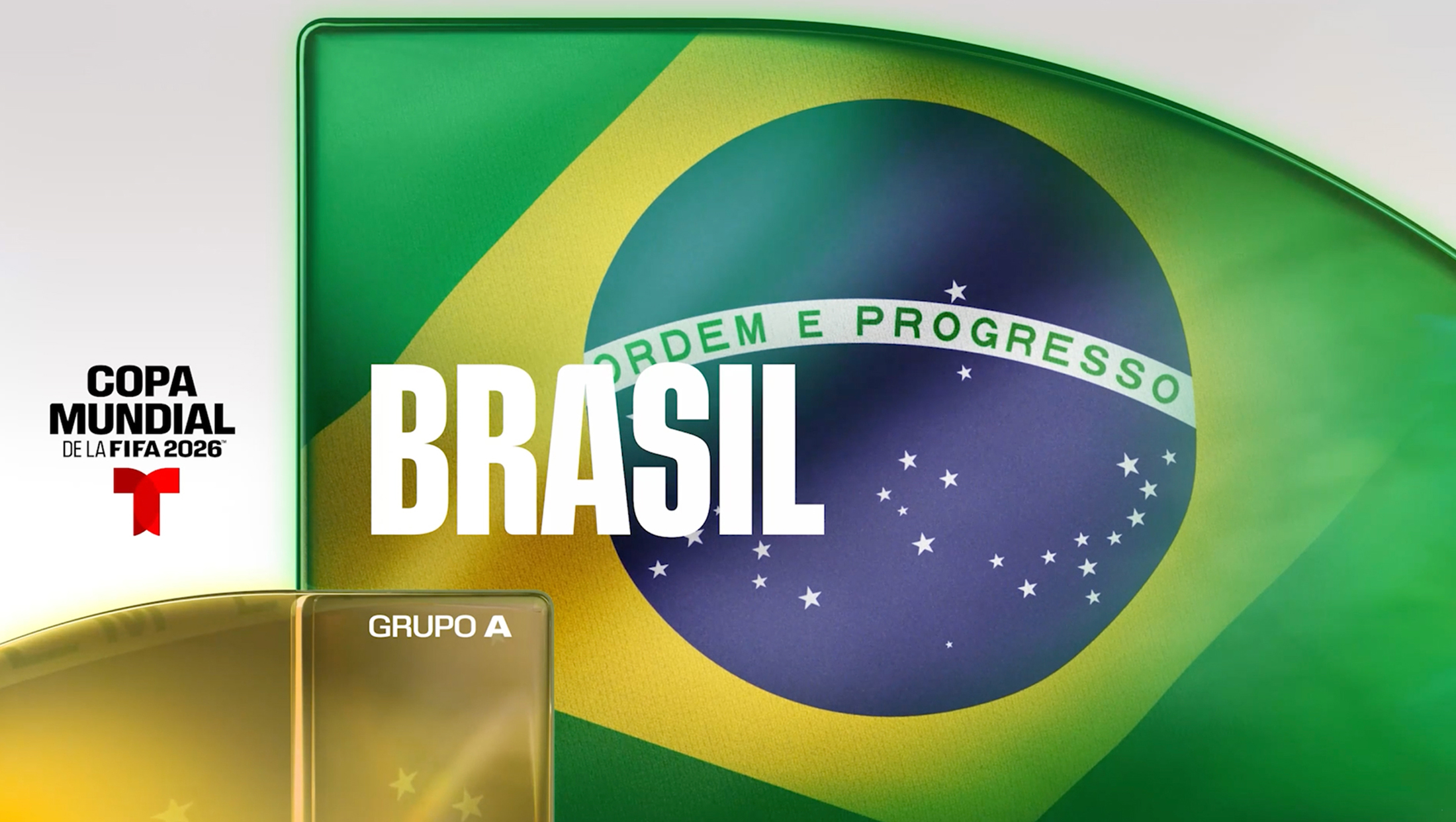
Other looks included in the preview provided by the network include more prominent examples of how shapes inspired by the “T” icon are used to, quite literally, form the building blocks of on-screen layouts, including the one shown above with a bold take on Brazil’s flag in the largest area, some additional flag imagery in the lower left part of the screen and the team’s group label in what appears to be a vertical block.
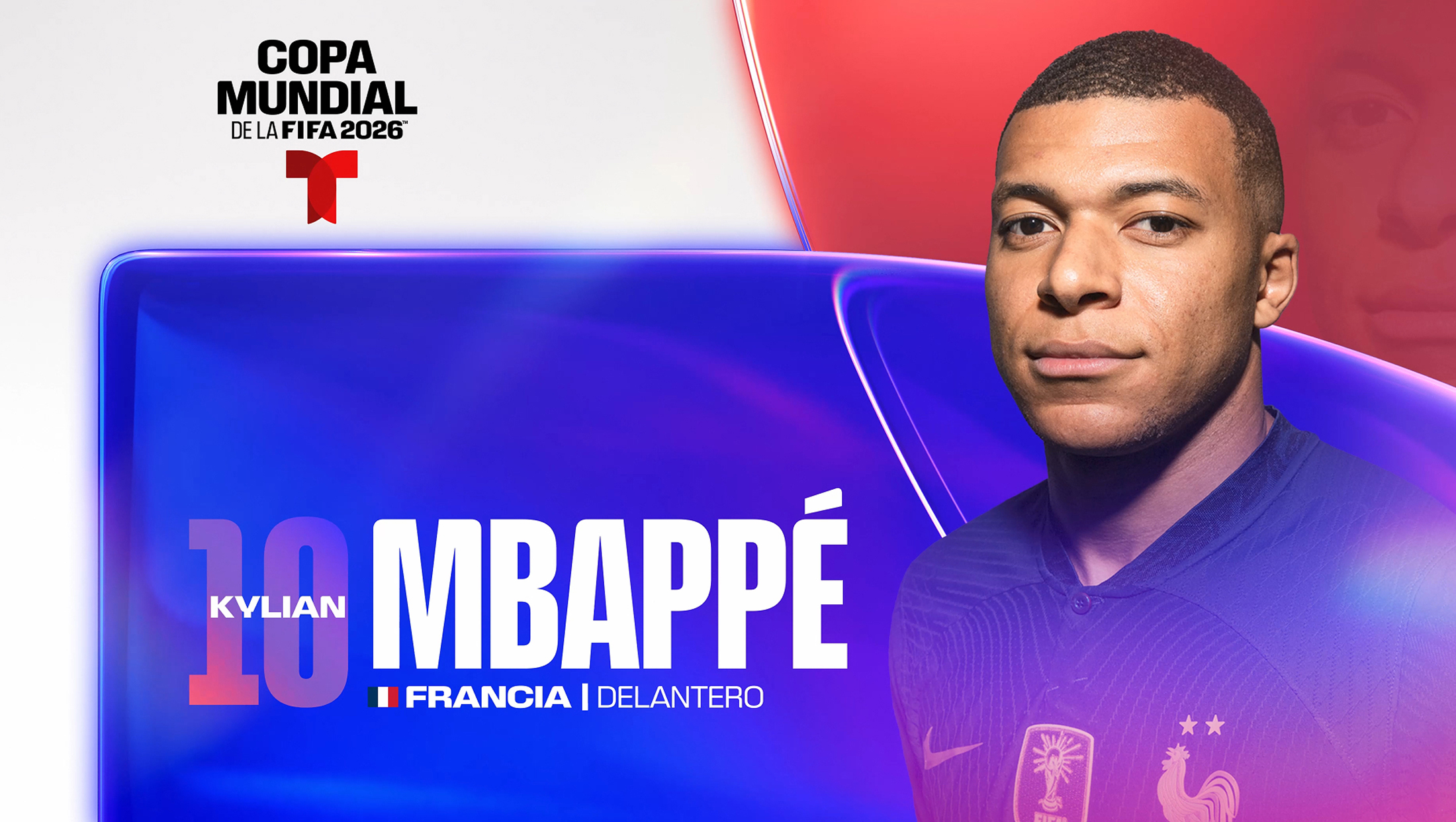
Players can also be spotlighted in similar ways, but it’s worth noting how different shapes are used to create a distinct layout — of which there are likely dozens more.
Looking beyond the 2026 World Cup, Sibling Rivalry refined Nexo into a full-scope creative toolkit that could be used to build deliverables for multiple genres, formats, mediums and screen sizes.
“We weren’t just designing a look, we were building a system Telemundo could actually use,” said Palma. “It had to work across everything they do — from sport to entertainment — and still feel cohesive and unmistakably theirs.”

tags
2026 FIFA World Cup, Branding, Claudia Chagui, Eduardo Palma, Mikon van Gastel, NBCUniversal Telemundo Enterprises, Sibling Rivalry, telemundo
categories
Branding, Graphics, Heroes, Network Branding, Networks, Sports Broadcasting & Production