

TSN builds World Cup motion package around the scarf as shared soccer language
Weekly insights on the technology, production and business decisions shaping media and broadcast. Free to access. Independent coverage. Unsubscribe anytime.
When TSN’s design team began brainstorming its broadcast graphics package for the 2026 FIFA World Cup, the group kept returning to a single question: What do fans from every country, every culture and every corner of the world bring to a soccer match?
The answer was the soccer scarf.
“That kind of became our jumping off point when we first started brainstorming,” said Stephen Gilmore, creative director of design at TSN.
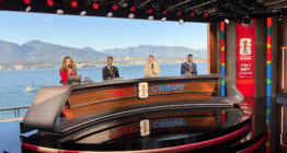
TSN, part of Bell Media, is carrying the tournament across its linear networks and Crave, the company’s streaming platform, with select games on CTV.
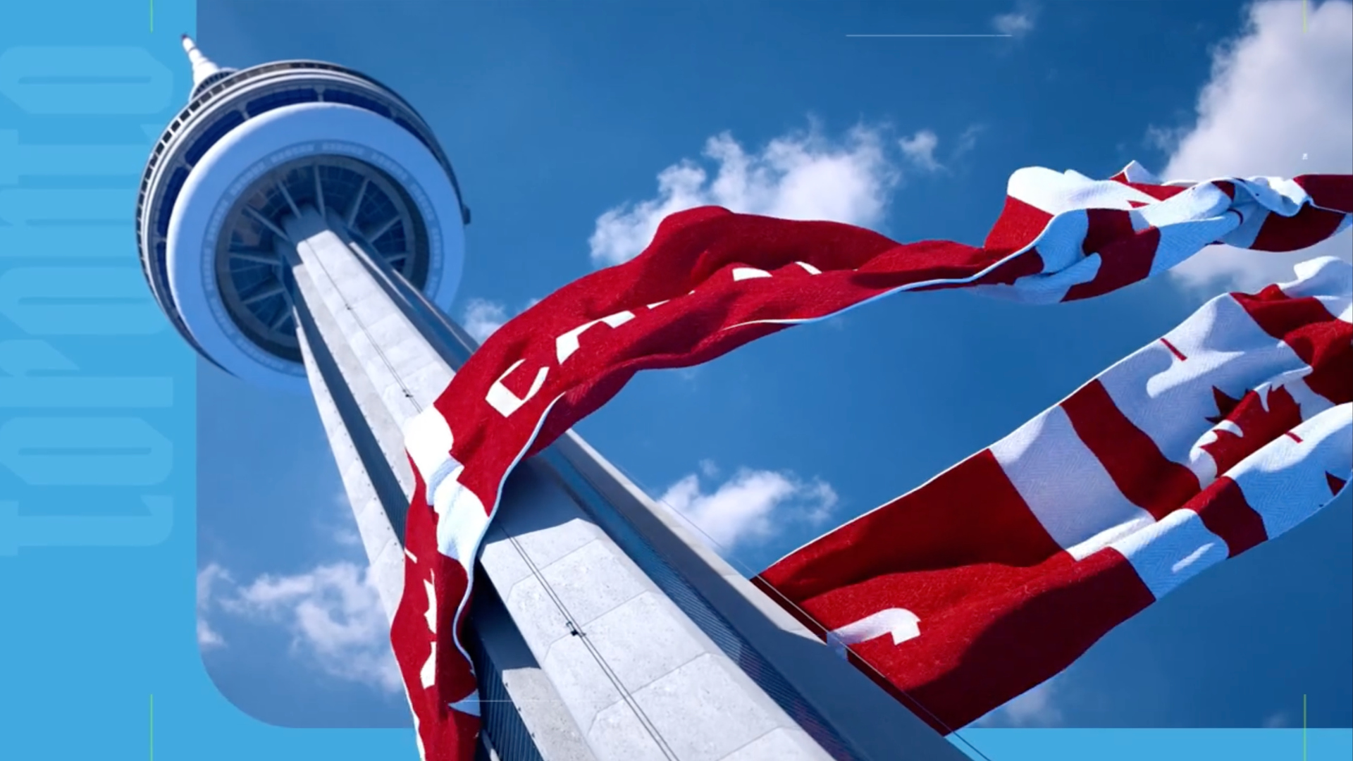
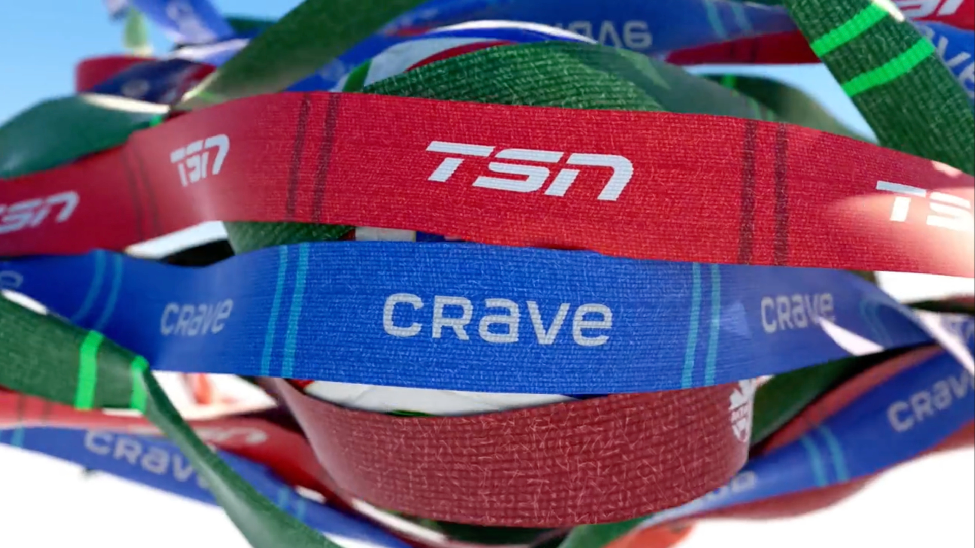
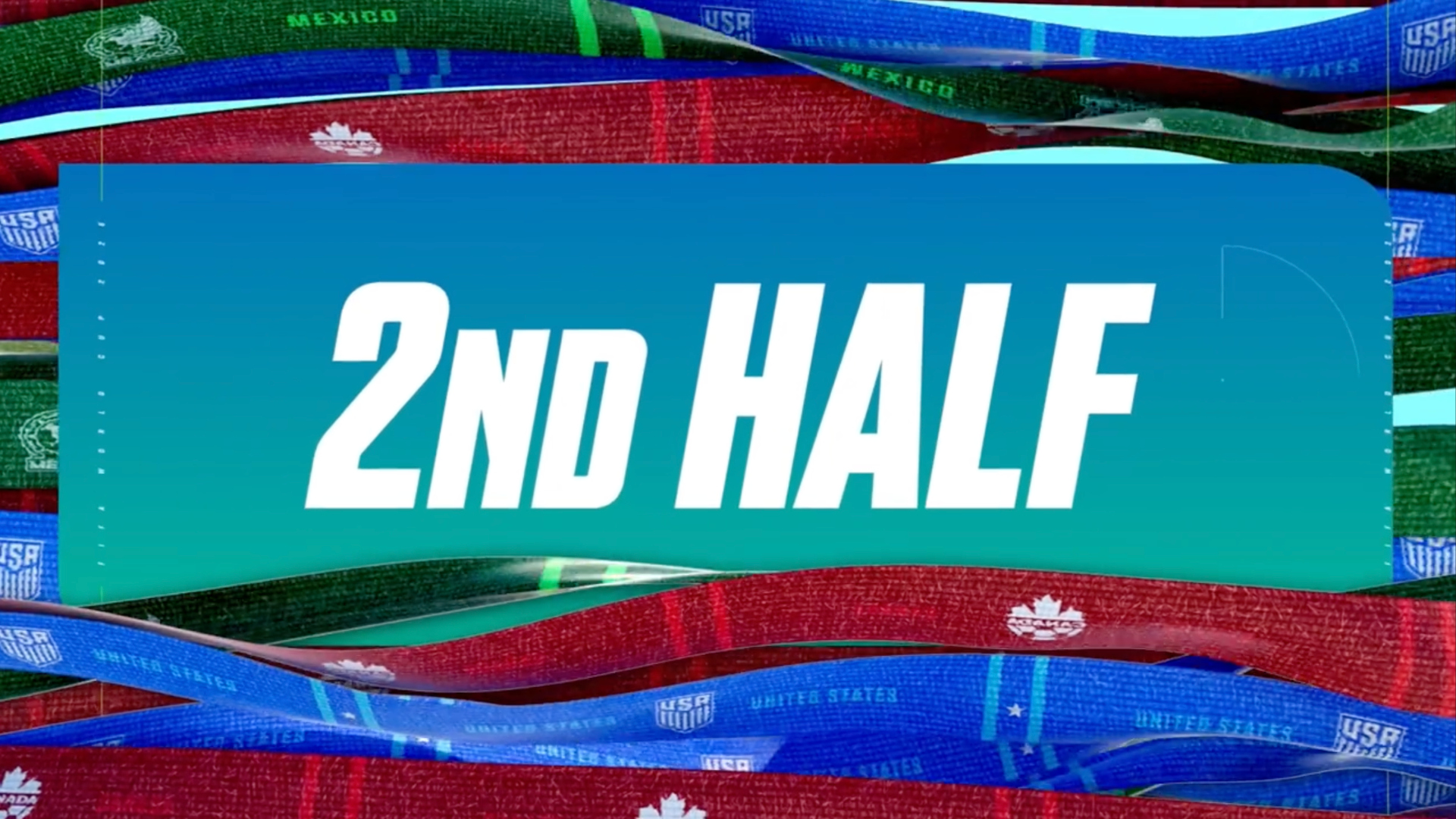
The scarf serves as the package’s central visual device, wrapping through landmarks and cultural symbols from the three host nations. Threads drawn from each country’s crest and national colors run through the design, connecting imagery from Canada, the United States and Mexico across opens, bumpers, transitions and promotional material.
A team shaped by the cultures it represents
The concept grew in part from the makeup of the team itself. Gilmore, whose background is Northern Irish, works alongside Matt Mamic, creative director of promotions, who is Croatian. Other members of the group have roots in France and Mexico.
“The thing that’s really cool about our team is that we’re all pretty diverse. It’s almost like Canada in terms of the population,” Gilmore said.
That diversity informed the creative direction. The package leans into specific landmarks to represent each host country.

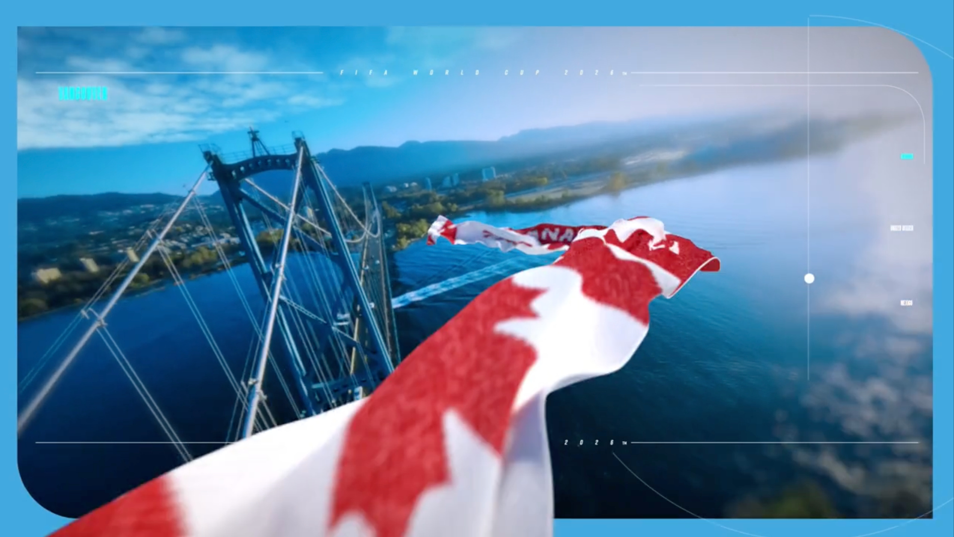
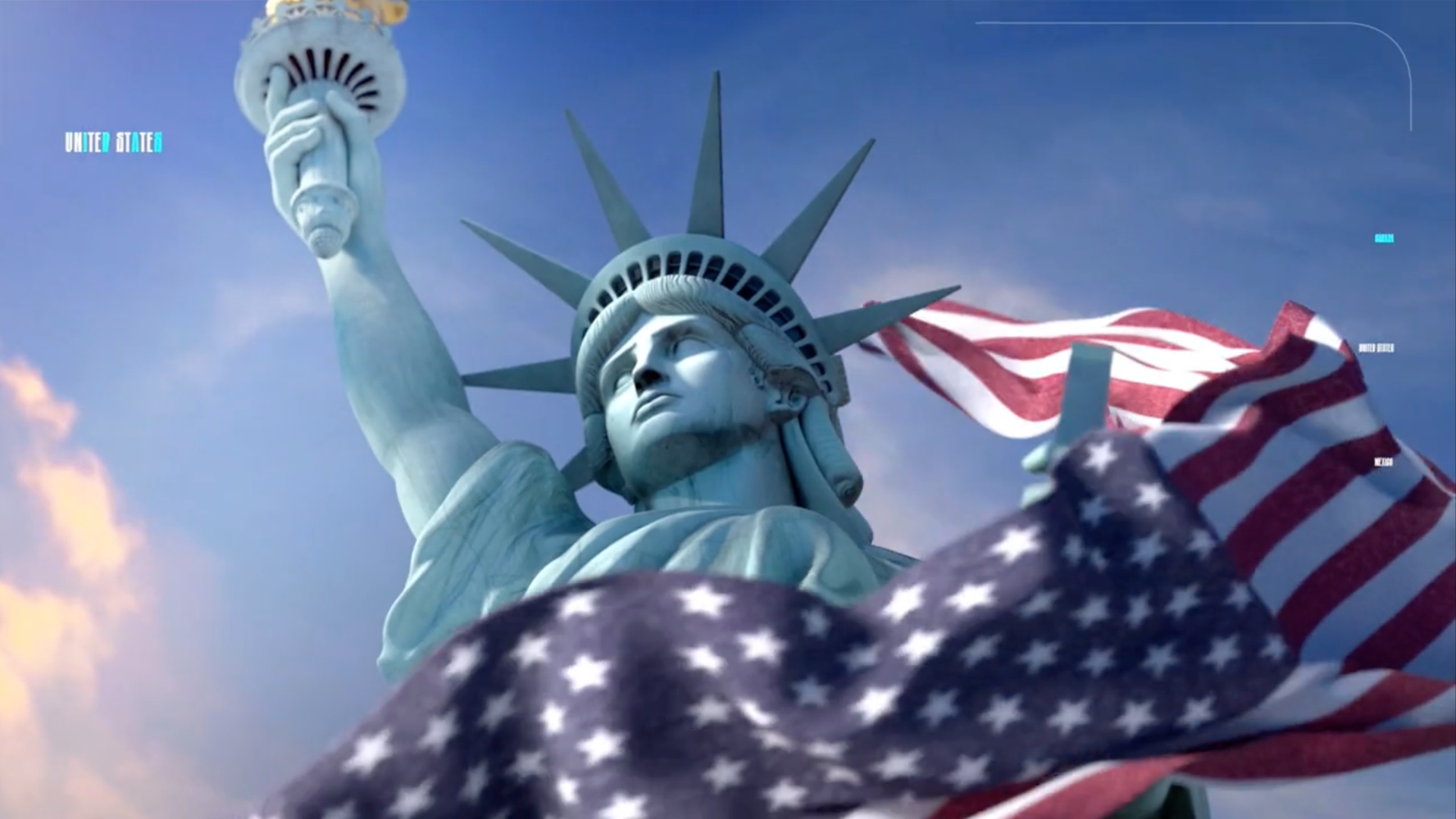
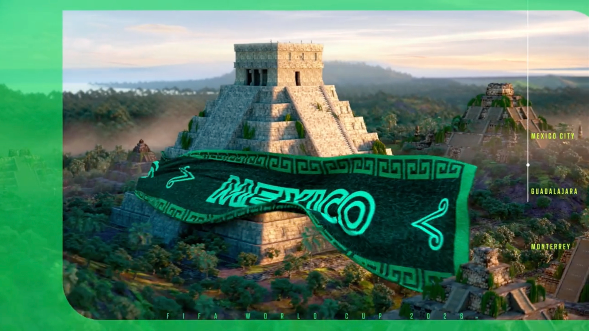
Vancouver’s Lions Gate Bridge and the Statue of Liberty anchor the North American imagery, while an eagle motif bridges the U.S. and Mexico, whose flags both feature the bird. A scene in the opening transitions from a bald eagle into Mexico’s coat of arms eagle, connecting the two nations in what Gilmore described as “a very cinematic look.”
Some of the initial storyboards leaned heavily into American iconography; however, internal feedback pulled the package more towards highlighting all three nations.
“Our initial worry was it was almost becoming too Canada-centric. And we really wanted to make sure that the package branched out to those different regions and embraced those cultures as well,” said Gilmore.
Designing for three countries instead of one
Past World Cups gave TSN’s design team a single national identity to work with. In 2018, the Russia package incorporated a Faberge egg that opened to reveal different teams. The 2022 Qatar package embraced desert imagery and regional cultural symbols. This year’s tournament, spread across three countries, presented a different kind of challenge.
“We found it a little bit more challenging in our concept development stage,” Gilmore said. “It just made for a bigger challenge being in three countries versus one.”
The team leaned on FIFA’s own visual identity system, which is built around a set of geometric shapes derived from the number 26, to provide connective tissue. The shapes appear throughout the TSN package in subtle applications, serving as a unifying graphic language across elements that shift between national imagery.
FIFA reached out to TSN’s design team early in the process, around the beginning of 2025, and pushed for a more integrated look between its own identity and the broadcaster’s package. That approach was new for TSN, which had traditionally built standalone graphics packages for previous tournaments with its own custom wordmarks.
“They were really adamant to really want to infuse as much of their package and their look into our package to have this really cohesive look,” Gilmore said.
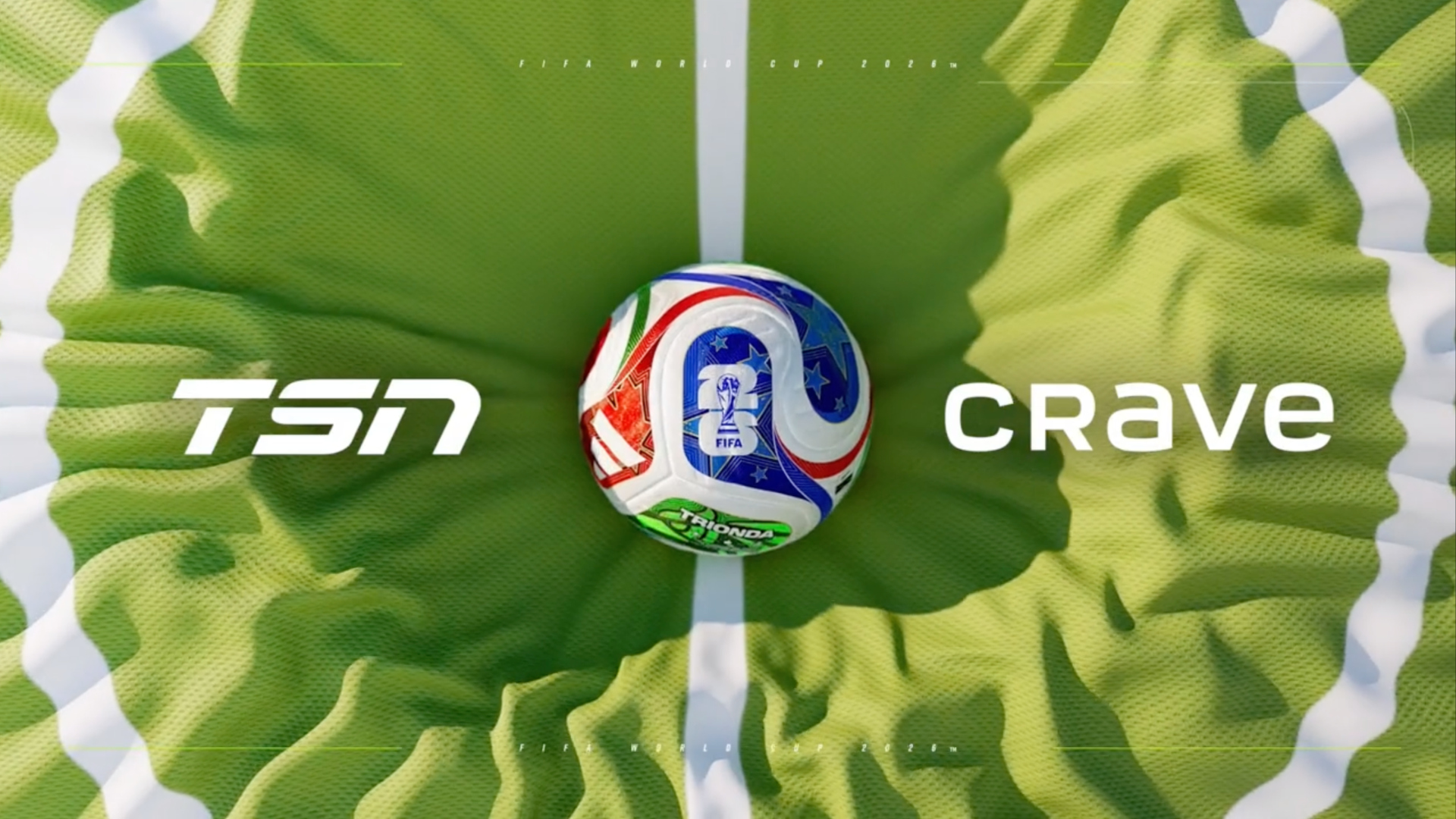

The team was initially uncertain. There was a desire to let TSN’s own brand identity come through. But as the collaboration developed, Gilmore said the group found common ground, particularly around the color palette. FIFA’s colors for the 2026 tournament are bright and saturated, which aligned with TSN’s longstanding preference for vibrant summer programming.
“When we talk about the World Cup, it’s in the middle of summer. You don’t want something very dark and ominous. You want to be very uplifting,” Gilmore said. “We were really lucky that FIFA’s colors were very vibrant, and we kind of carried that through into our package.”
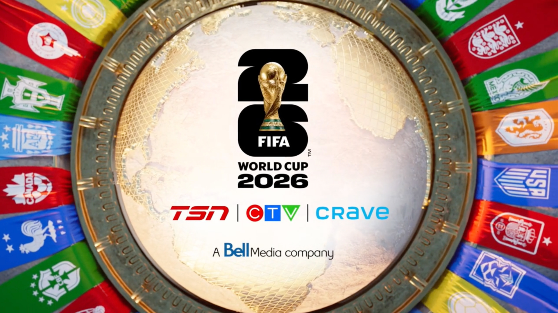
The tournament logo also became a larger part of the package than in previous years.
TSN had created its own wordmarks for past World Cups, but FIFA encouraged the use of its official logo, which incorporates the World Cup trophy. Gilmore said the logo’s built-in design system made it more than a standalone mark.
“They built more than a logo. They actually created a really cool system with their logo. So it became, the logo became the look, essentially,” he said.
Stitching 48 teams into the fabric
The expanded 48-team format added significant production demands. One designer, Thomas Bove, was assigned exclusively to embroider all 48 team logos into the scarf motif, a process that took months.
“His nickname after we were done was Thomas the Taylor because he literally stitched all those logos,” Gilmore said.
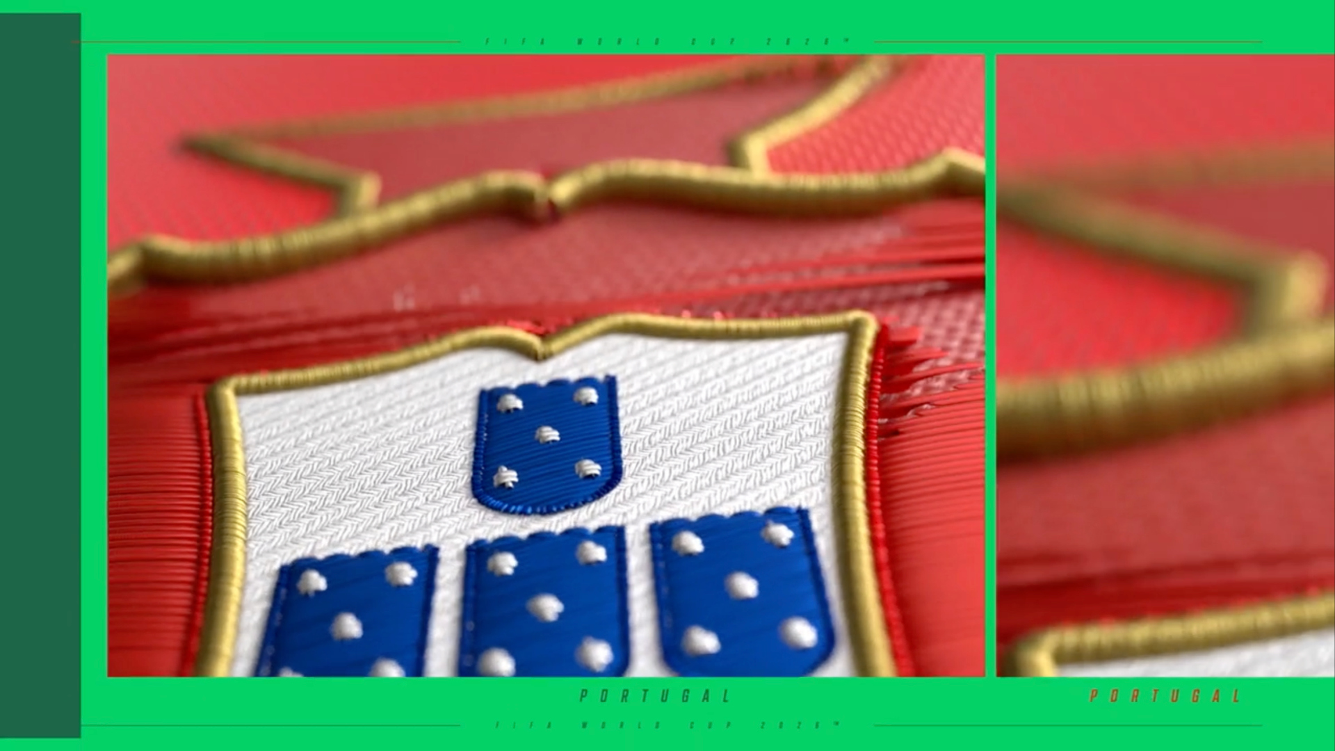
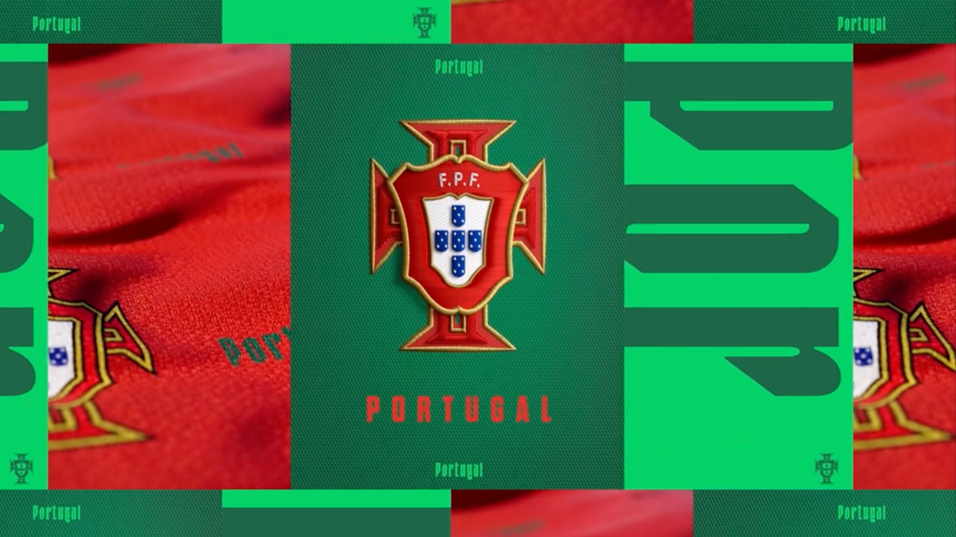
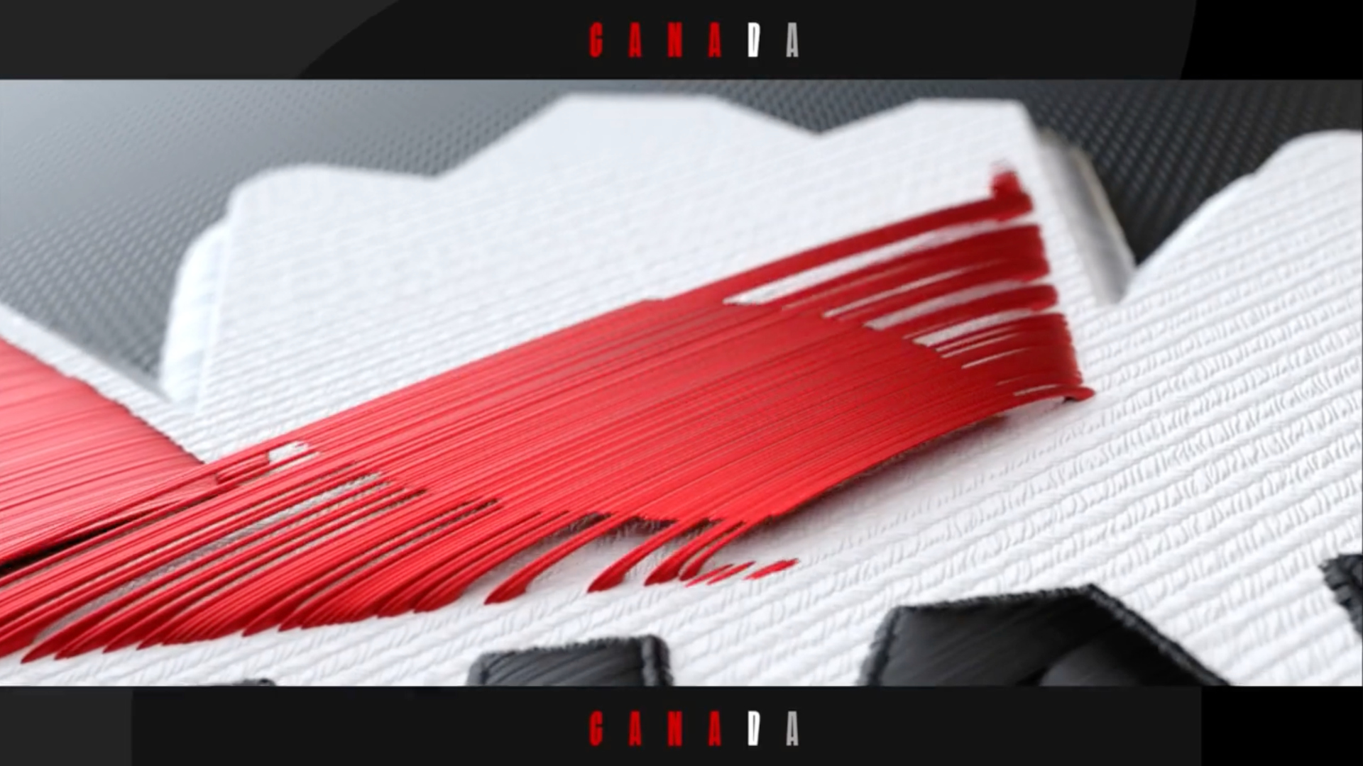
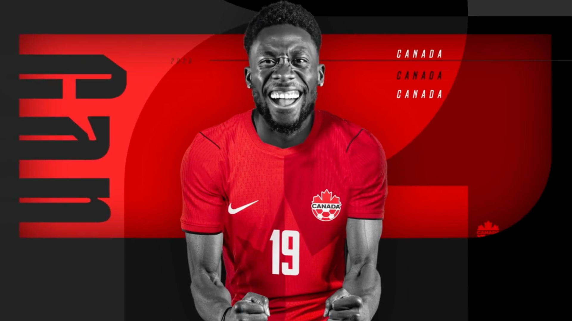
That embroidered asset became a building block for the rest of the package, appearing across promotional backpages, monitor graphics for the studio set, player name transitions and team transitions. The team produced between 40 and 60 individual player transitions using imagery photographed by FIFA’s team when squads arrived for the tournament.
The team transitions received particular attention. Gilmore noted they carry heavy on-air rotation, appearing between clips, during highlight packages and alongside analysis segments throughout every broadcast day.
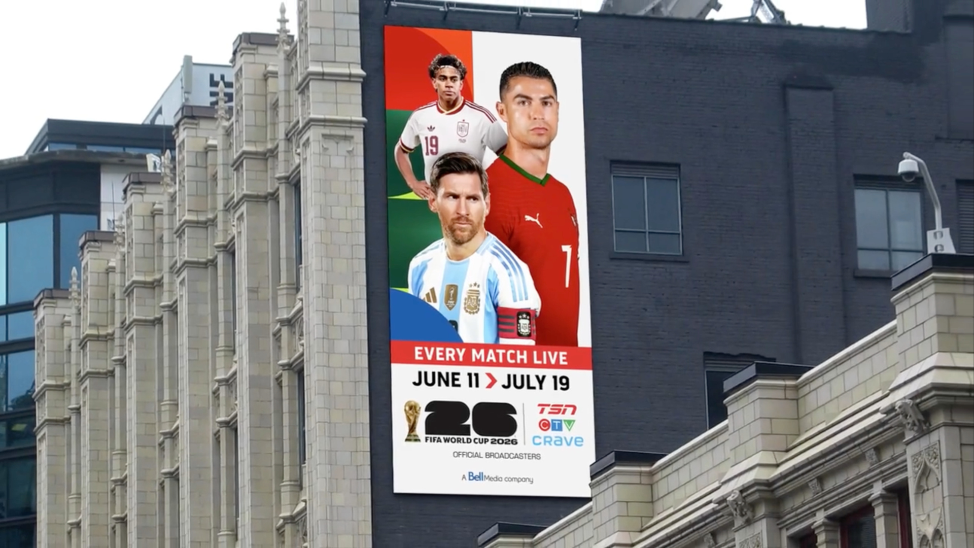
The visual system also extended beyond the broadcast itself. Mamic oversaw promotional assets including image spots, backpaint and menu boards, while out-of-home advertising carried elements from the broadcast design onto transit shelters and digital billboards across Canadian cities.
Blending 2D, 3D and live footage
Rather than building a fully rendered 3D opening, the team assembled a package that combines multiple production techniques. The main open includes 3D elements, 2D graphic design, live-action clips and motion tracking, with 3D models composited onto real footage.
“Matt and I, from our personal taste, we always like openings that are not all 3D. We really like to bring a strong design component into everything we do with a really nice combination of 2D graphics, 3D graphics,” Gilmore said.
One addition to this year’s open came from an executive note during early presentations.
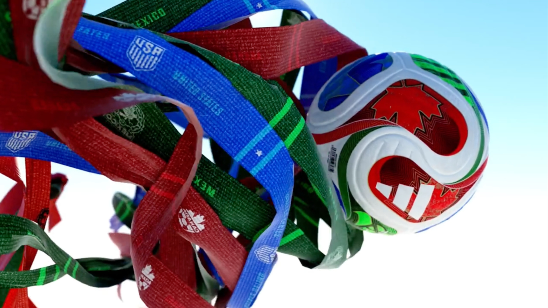
The original concept featured a gold 3D ball that could transition into a globe, symbolizing the tournament’s international scope. Executives pushed for the actual FIFA match ball instead. The team obtained the 3D model for the Adidas Trionda ball through FIFA, and it became a recurring element throughout the package. Its red, green and blue color scheme also reinforced the three-nation hosting structure.
The opening airs as many as six times per day during the tournament, Gilmore noted.
A small team working in-house
The entire show package was produced internally by a team of five designers, with one additional person handling the out-of-home creative. No outside vendors or agencies were involved.
Production was divided into two phases. The team established the visual direction and built storyboards over the summer of 2025, then presented to TSN’s executive team for approval. The project was paused from September through the end of the year while the group handled other assignments. Work resumed in January 2026, with the approved creative direction already in place.
“The great thing is we kind of hit the ground running because we had the look established. And then it was just a matter of bringing everything to life with motion,” Gilmore said.
For a tournament of this scale, the size of the group that produced it stood out. TSN did not contract any outside vendors or agencies to support the show package, the promotional assets or the out-of-home work.
“The really cool thing about this project is we did it all internally with a very small team of just five,” Gilmore said. “Sometimes you don’t have to go out of house to get that big overall look and feel.”
Gilmore and Mamic have now worked on three consecutive FIFA World Cups together. Gilmore called the tournament one of TSN’s “crown jewels” and compared its production demands to the Olympic Games.
“It was a huge project. A lot of people here worked on it, and now can finally watch it all on TV here in the broadcast,” Mamic said.
Project credits
- Director, Creative and Brand: Linda Masci Linton
- Creative Director, Design: Stephen Gilmore
- Creative Director, Promotions: Matt Mamic
- Lead Motion Designer: Matt Mamic
- Lead Designer: Craig Connaghan
- Lead Designer: Fernando Mascetta
- Senior Motion Designer: Diana Rodriguez
- Senior Motion Designer: Hsing Lu Li
- Motion Designer: Henry Tao
- Motion Designer: Thomas Bove

tags
2026 FIFA World Cup, Bell Media, Crave, CTV, Matt Mamic, Stephen Gilmore, TSN
categories
Graphics, Heroes, Sports Broadcasting & Production