

Telemundo builds World Cup identity around scale, motion and Spanish-language ownership
Weekly insights on the technology, production and business decisions shaping media and broadcast. Free to access. Independent coverage. Unsubscribe anytime.
For the 2026 FIFA World Cup, Telemundo’s design challenge was not only to support one of the largest live sports productions in television. It also needed to make the tournament feel distinctly Telemundo.
“It was very important for our audience and everyone that comes in and watches Telemundo for the first time that they recognize that they’re watching the World Cup on Telemundo,” said Jaime Peñalosa, creative director at Telemundo.
The network, working with Gameday Creative, developed a visual identity and motion design system built around scale, host-city specificity and Spanish-language audience connection.
The result was a package that extended beyond traditional broadcast graphics into sponsorship, social, marketing, real-time stadium environments and studio-adjacent design elements.
That scope reflected how major sports packages have changed. A World Cup look is no longer confined to opens, lower thirds and score-adjacent elements. It must support linear television, streaming, sponsor integrations, YouTube, social video, marketing and real-time production needs while still feeling like one coherent system.

“The ask got so much bigger than it’s been in the past,” said Eric Say, owner and creative director at Gameday Creative. “It’s not just a broadcast package anymore. There’s a virtual set, there’s AR graphics, there’s an Unreal real-time component, there’s sales integrations, there’s broadcast, there’s social media marketing, there’s YouTube.”
Say said the project required a broader design language rather than a single look applied uniformly across every output.
“Every graphic is speaking that language, but there’s probably three different pillars of execution that fall under that,” Say said.
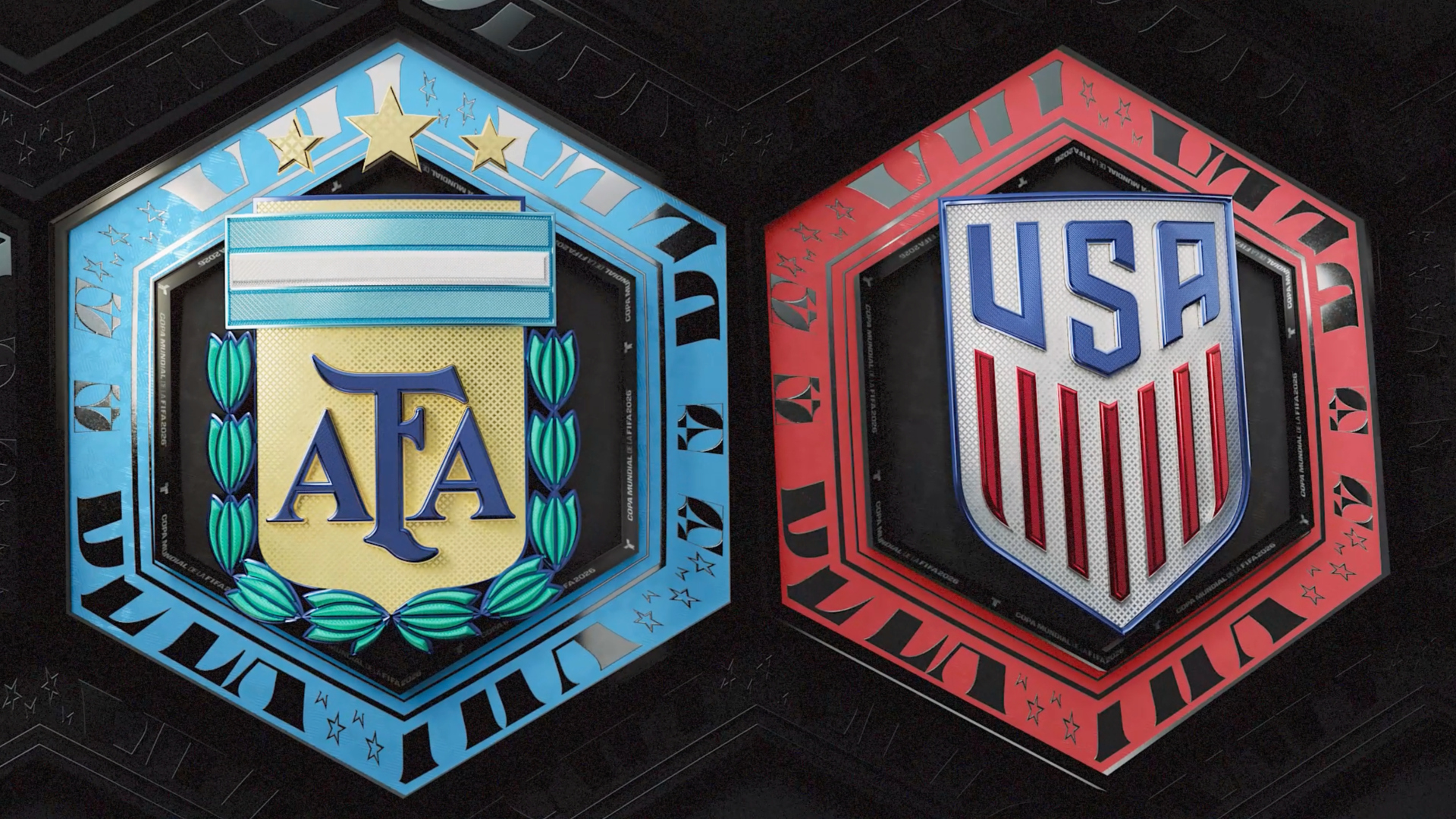
Those pillars included cinematic 3D elements for opens and transitions, an insert system focused on information delivery, and marketing and sponsorship executions that needed their own visual behavior while remaining connected to the larger identity.
Owning the World Cup on Telemundo
Telemundo’s approach started with a specific brand question: How should the World Cup look when it is being presented to a Spanish-language audience in the United States?
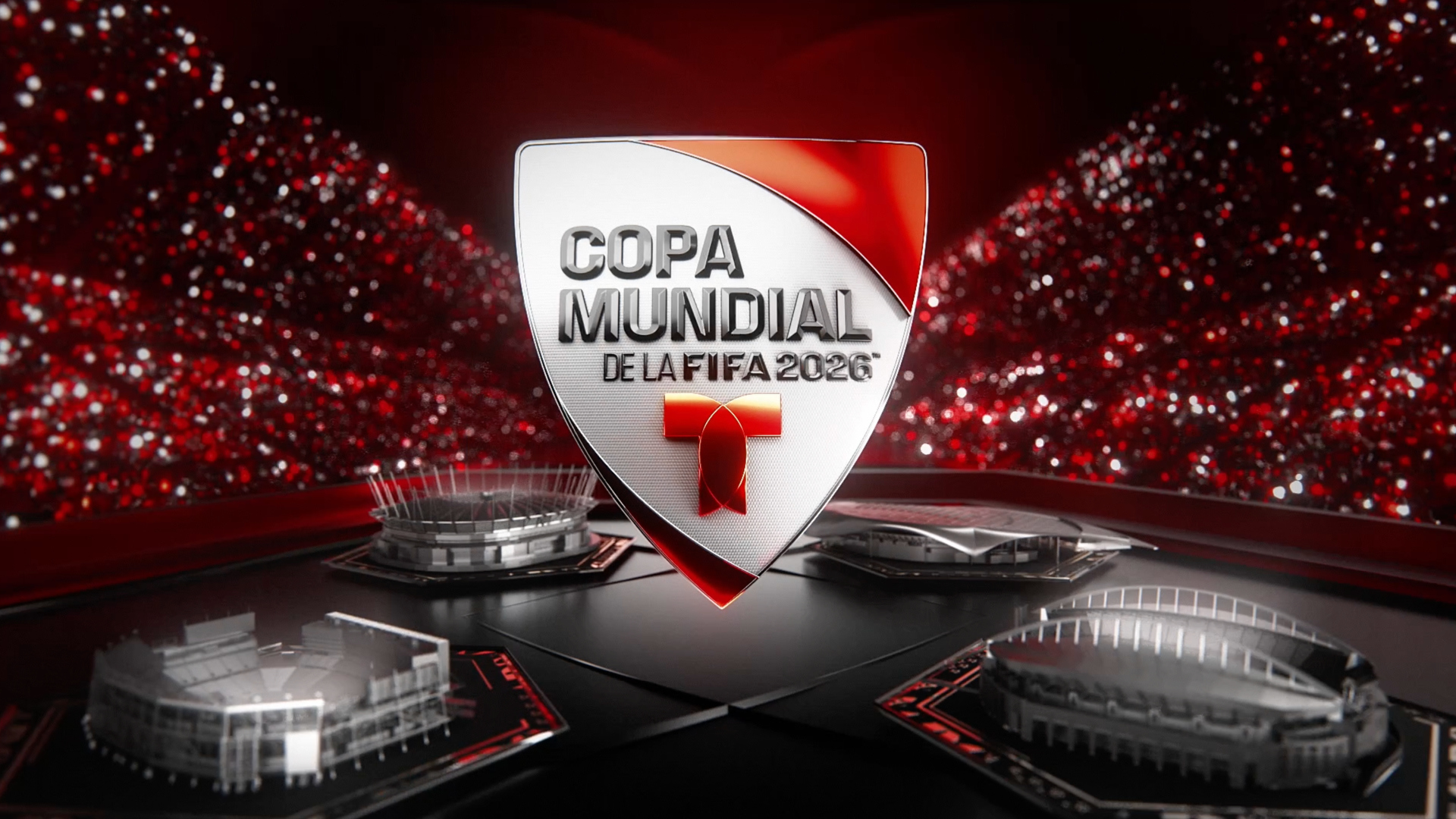
FIFA provided the tournament’s global identity, but Telemundo wanted viewers to immediately understand they were watching the World Cup through its broadcast and editorial lens. That led the network to develop its own Spanish-language branding and logo treatment around the event.
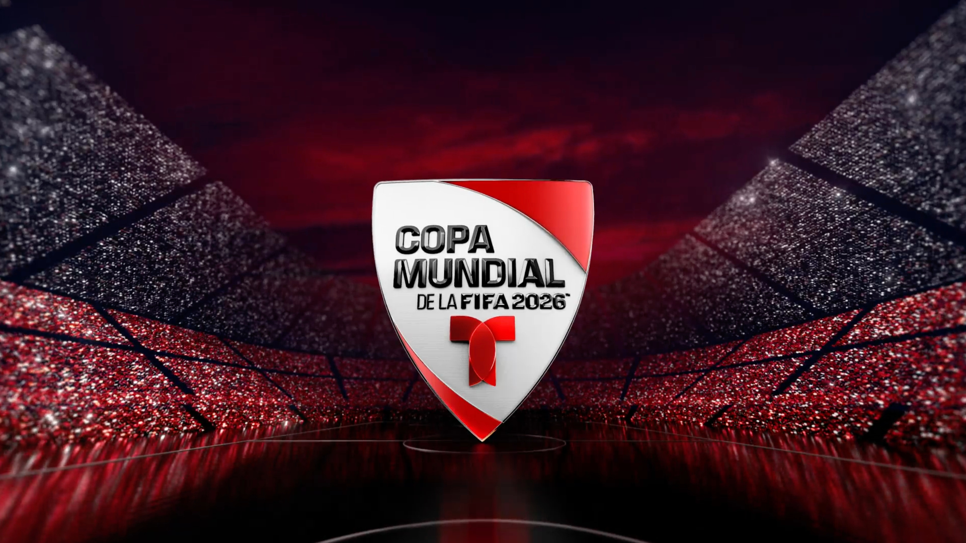
“I believe FIFA provides a fantastic tournament identity,” said Peñalosa. “But I think one of the things that we have in the U.S. that doesn’t happen in other countries is that you have two different broadcasters that have the World Cup.”
That made differentiation central to the creative brief.
The network built its identity around Telemundo’s own World Cup badge, Spanish-language naming, country colors, national team marks, host-city references and stadium imagery. The intent was not to separate from FIFA’s tournament identity entirely, but to create a Telemundo layer around it.
Gameday Creative viewed that as an ownership issue as much as a design issue.
“They very much wanted this to be the World Cup on Telemundo,” Say said.
A cinematic package built around multitudes
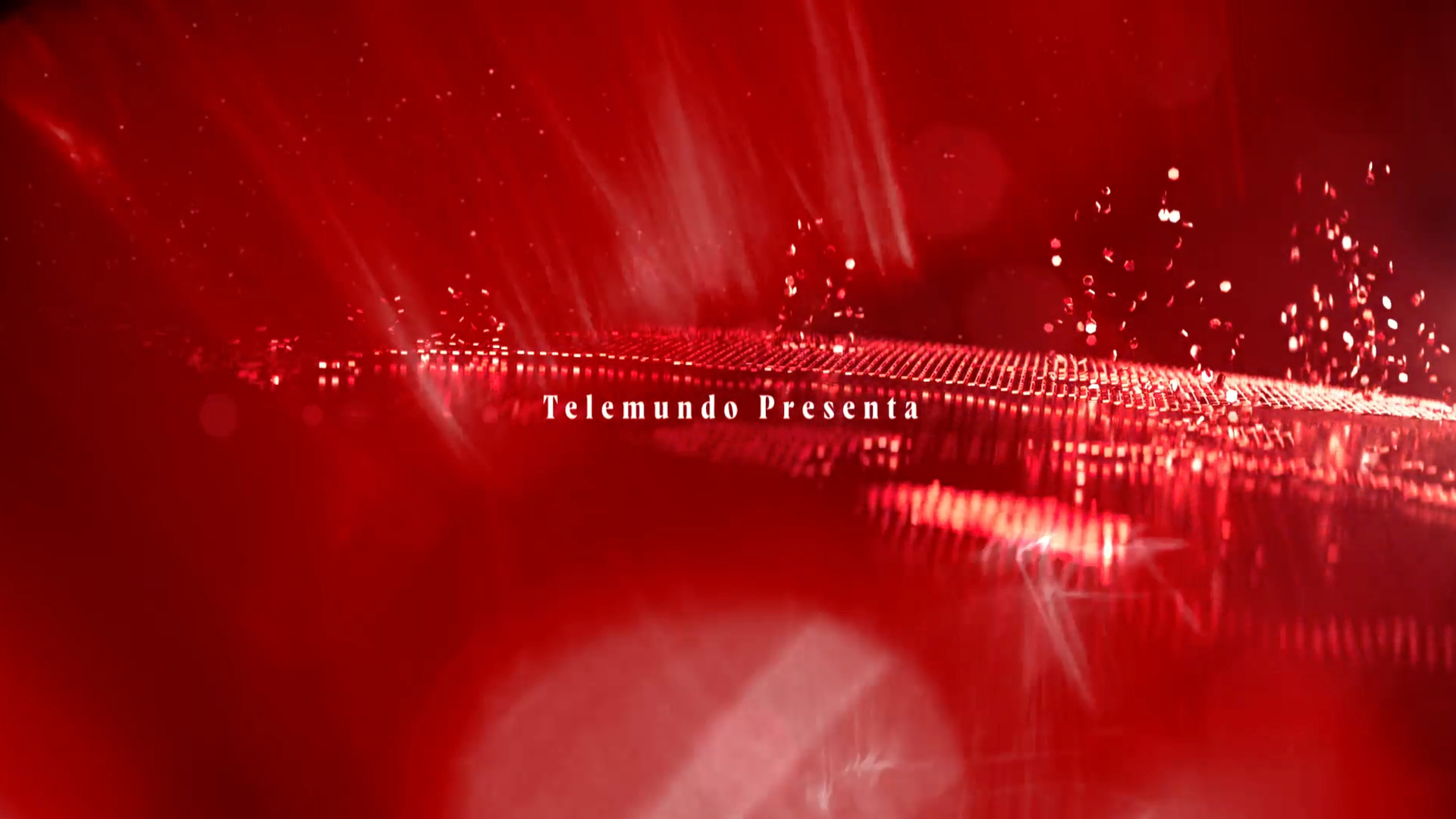
Gameday Creative began work roughly 10 months to a year before the tournament, with one of the early objectives centered on making the package more cinematic than previous broadcast looks.
The main open became the clearest expression of that direction. Rather than relying primarily on fan reactions or generic tournament energy, the sequence used host countries, stadiums and a larger sense of global gathering as its foundation.
“We wanted to capture the elevation and prestige of the World Cup,” Say said. “We wanted that to come through in the graphics.”
Internally, the concept was called “multitudes.”
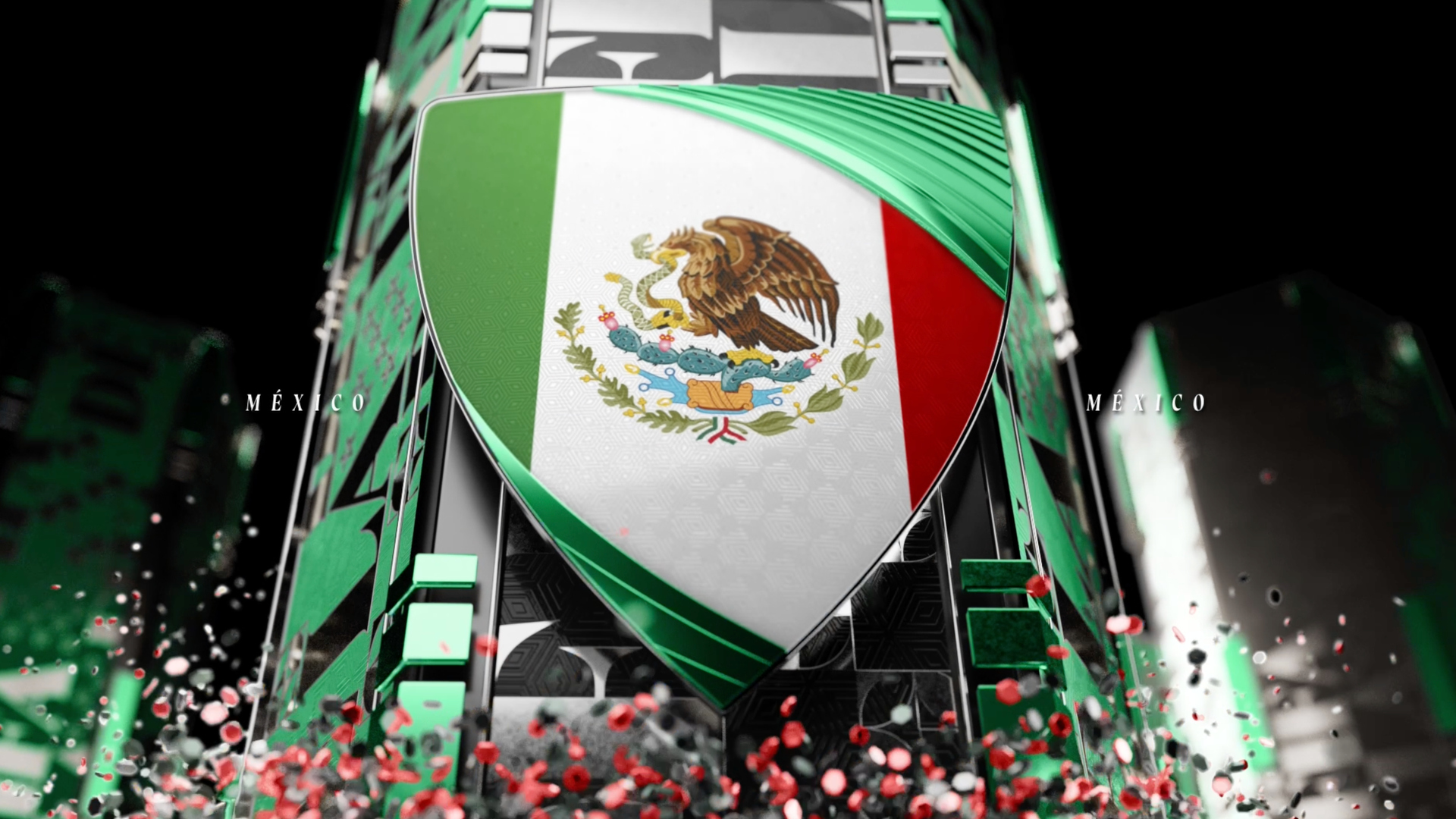
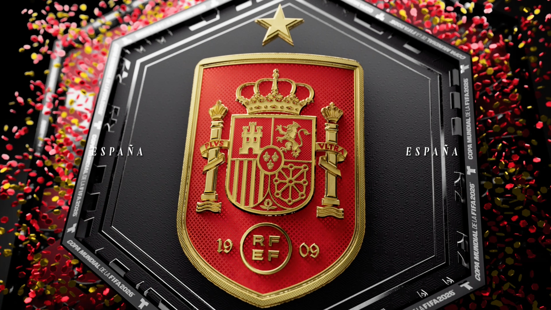
The idea was to visualize the scale of the tournament through repeated shapes, crowd-like patterns and graphic fragments that could come together into larger forms. The system drew loosely from the geometry of a soccer ball but was used more broadly as a way to express accumulation, movement and shared participation.
“We liked this idea of trying to capture the sense of scale of the World Cup and fandom through a graphical vehicle,” Say said. “The idea is, how do you visually express the idea of the world coming together to participate in this sporting event?”
That concept appeared across the package, from the open to transitional elements and the broader motion system. It gave the design team a flexible device that could support both the cinematic and information-driven parts of the package.
Peñalosa described the desired tone as cinematic, darker and more dramatic than a standard sports package, with lighting and 3D treatments used to give the event a larger sense of importance.
“We wanted to do something that is cinematic, that really caught your eye,” Peñalosa said. “It’s not just a normal graphics package for any other event.”
Designing for host cities and sponsor moments
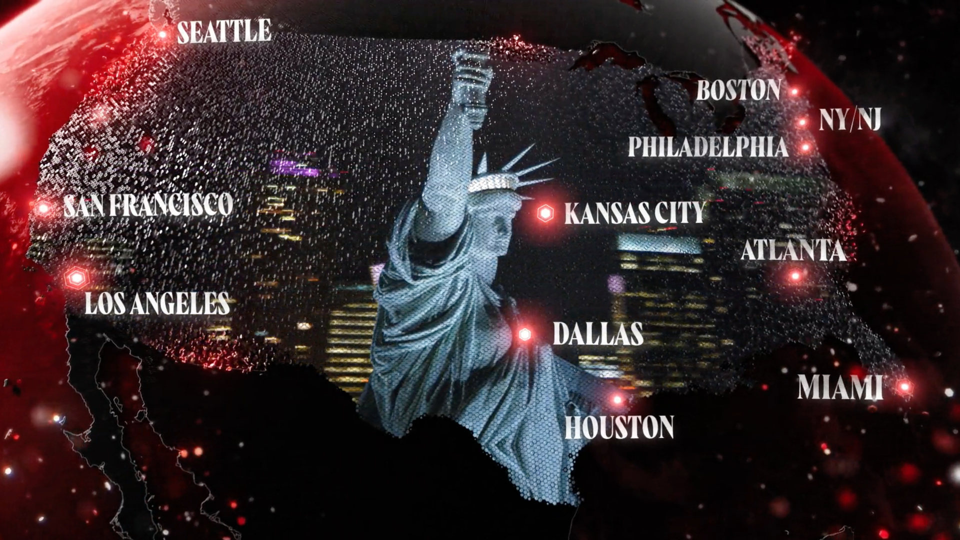
The 2026 World Cup added another creative challenge: three host countries, 16 host cities and a greatly expanded tournament structure. Telemundo and Gameday used stadiums and city references as recurring anchors throughout the design system.
For Telemundo, location was part of the editorial function of the graphics. The network wanted viewers to understand where each match was taking place and to feel the geographic scale of the tournament.
“We rely a lot on the stadiums and city skylines because we wanted to make it feel like, OK, we’re in the U.S., we’re in Mexico, we’re in Canada,” Peñalosa said.
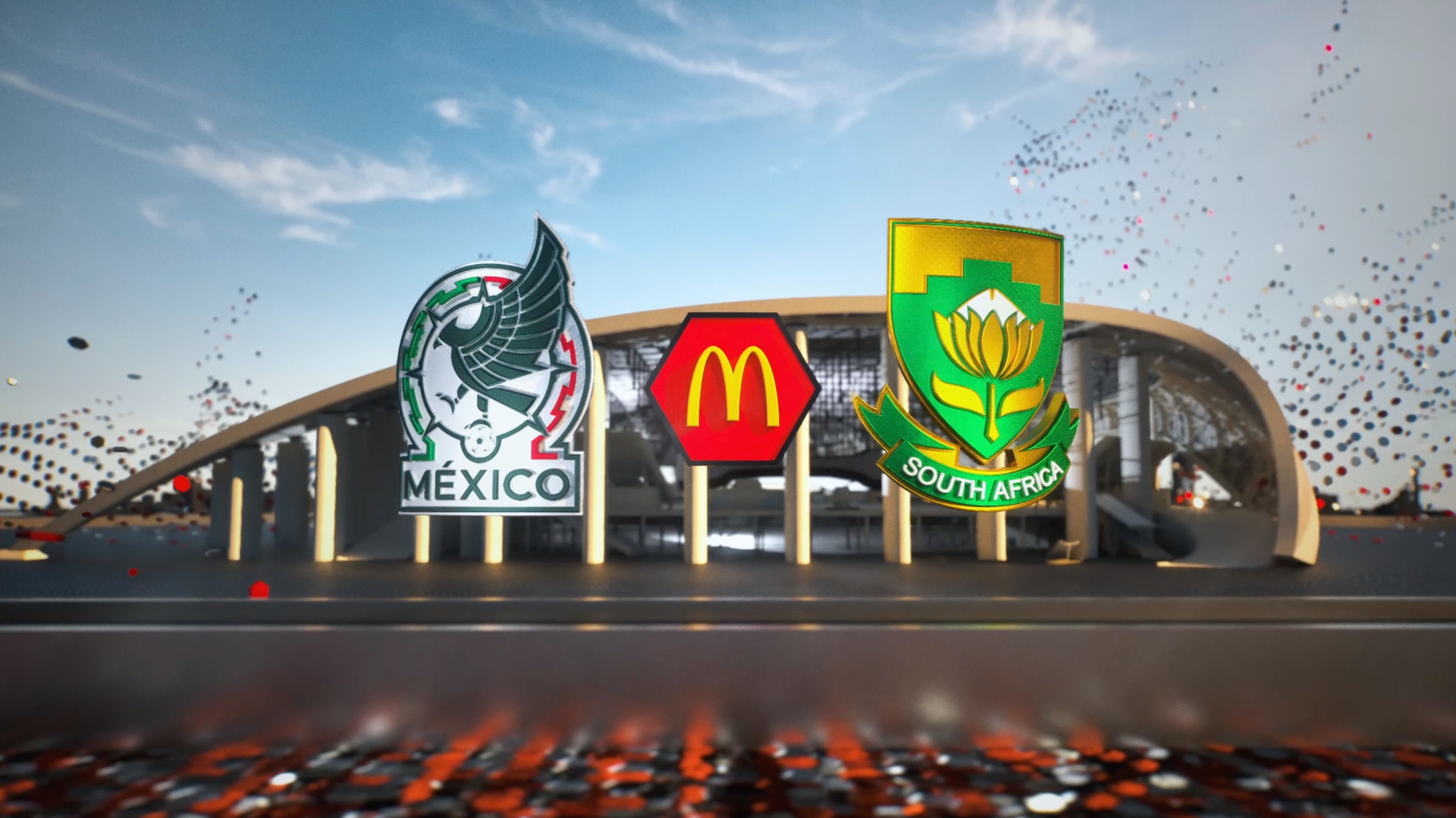
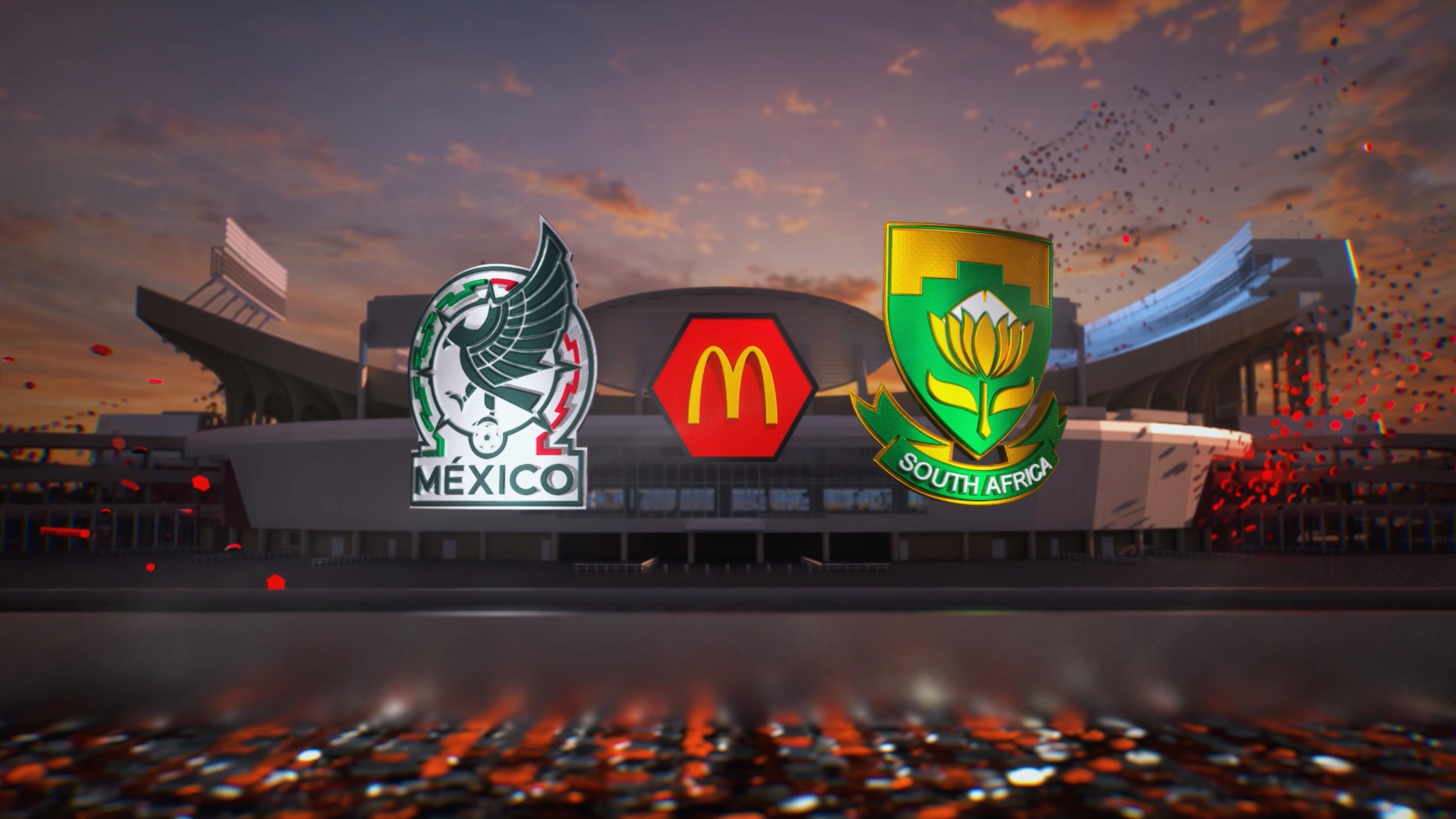
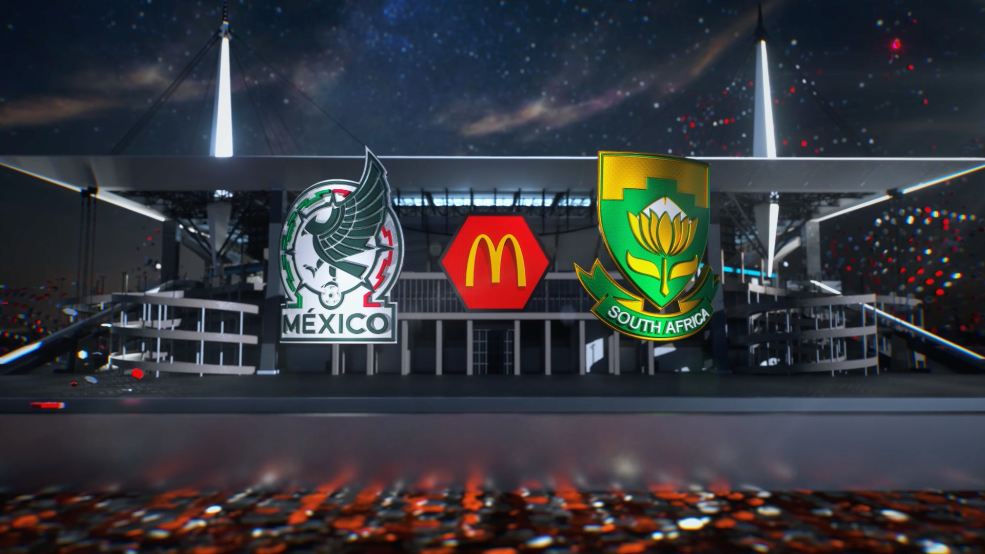
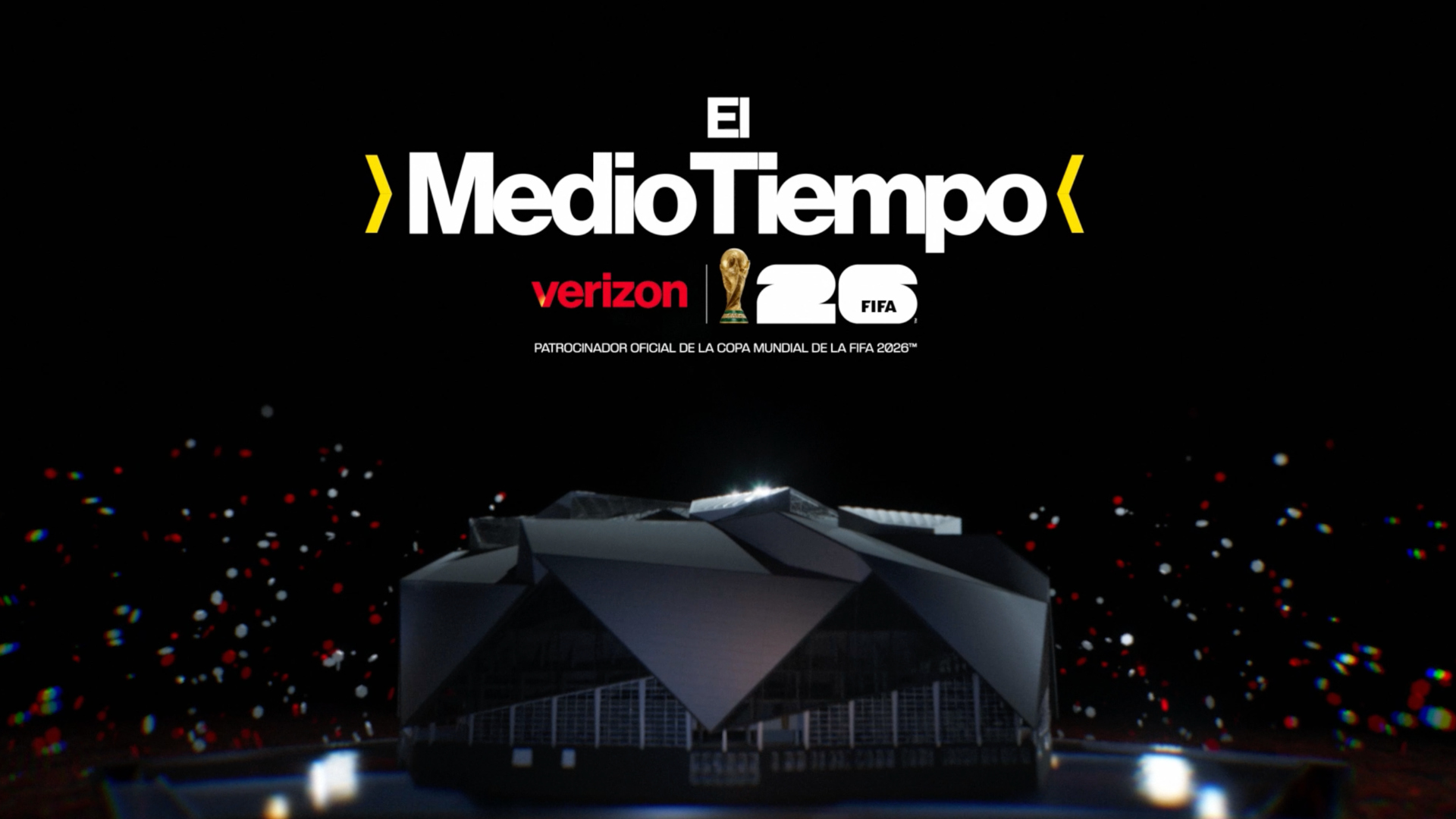
That thinking carried into sponsorship executions, including halftime and daily show elements. Peñalosa pointed to the Verizon halftime open and “Hoy en la Copa,” presented by Coca-Cola, as two of the package’s strongest uses of stadium-based graphics.
For the halftime elements, Telemundo created 16 versions tied to the host stadiums, allowing the show to move into a specific venue visually while also integrating a sponsor.
“I think it’s important to our audience: This game is happening in Mexico City, this game is happening in Toronto,” Peñalosa said.
Gameday also built stadium environments that could be used more flexibly through Unreal Engine. Those assets allowed the team to generate topical graphics based on matchup, region and time of day.
“If there’s an afternoon game between two countries, we can change the stadium, change the time of day and generate a graphic for that,” Say said.
The real-time and pre-rendered approaches often overlapped. Some elements were built in a real-time engine to allow flexibility, then rendered out for other uses. Say said the project showed that real-time tools are valuable, but traditional design control still matters when a package needs a specific look.
In stadium builds, Gameday found that realistic lighting was not always the best visual answer. Instead, the team curated time-of-day lighting rigs so the images matched what viewers expected to see, even if the result was more stylized than physically exact.
“Sure, is it less realistic? Absolutely. Does it look better? Yes,” Say said. “At the end of the day, the look better is the barometer for success.”
Sponsor integration becomes part of the design brief
As with other major sports events, sponsor integration represented a significant portion of the workload. The design teams were not simply placing logos into an existing package. They were creating branded moments that needed to feel connected to Telemundo’s coverage and useful to advertisers.
Peñalosa said virtual placements and branded design moments helped the network connect sponsorship to editorial segments more naturally.
“Looking at sponsorship in a different way with all the virtual placements helps us also tell the story editorially a lot better,” Peñalosa said.
For Gameday, that shift reflects how sports design has expanded into marketing strategy.
“There was a world back in the day where you could put a logo on a billboard and that did it,” Say said. “That’s not where the bar is at. That’s not the expectation anymore.”

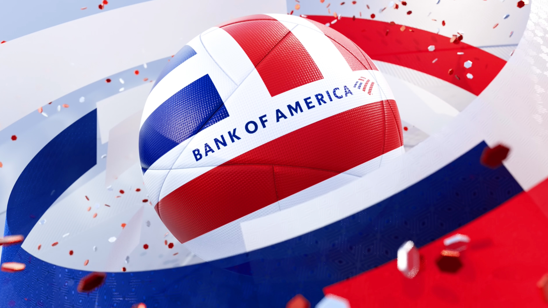
Kulani Jenkins, lead producer at Gameday Creative, said sponsor elements can become some of the most visible parts of a World Cup package because FIFA’s match feed controls much of the in-game presentation.
“The times your graphics shine are before, halftime and after these games, and a lot of that is sponsor work,” Jenkins said.
That visibility increased the importance of cohesion. Sponsored graphics needed to stand apart enough to serve the advertiser, but not so much that they felt disconnected from the broader tournament identity.
Inserts, social and the need for flexibility
Beyond opens and sponsor elements, Gameday placed particular emphasis on the insert system. Say described it as one of his favorite parts of the package because it moved away from some expected sports graphics conventions while maintaining clarity.
“For me personally, I think the insert system is my favorite part of this package,” Say said. “It has a really strong editorial style, but more than anything, I feel like it moved the bar a little.”
The insert package also needed to coexist with FIFA’s own match graphics. During game action, Telemundo relied on FIFA’s required or provided elements in many areas. Around the match, however, the network had more room to develop its own visual identity.
Peñalosa said FIFA’s 2026 graphics were more colorful and energetic than some past international event packages, but still reflected a different design philosophy than U.S. sports television.
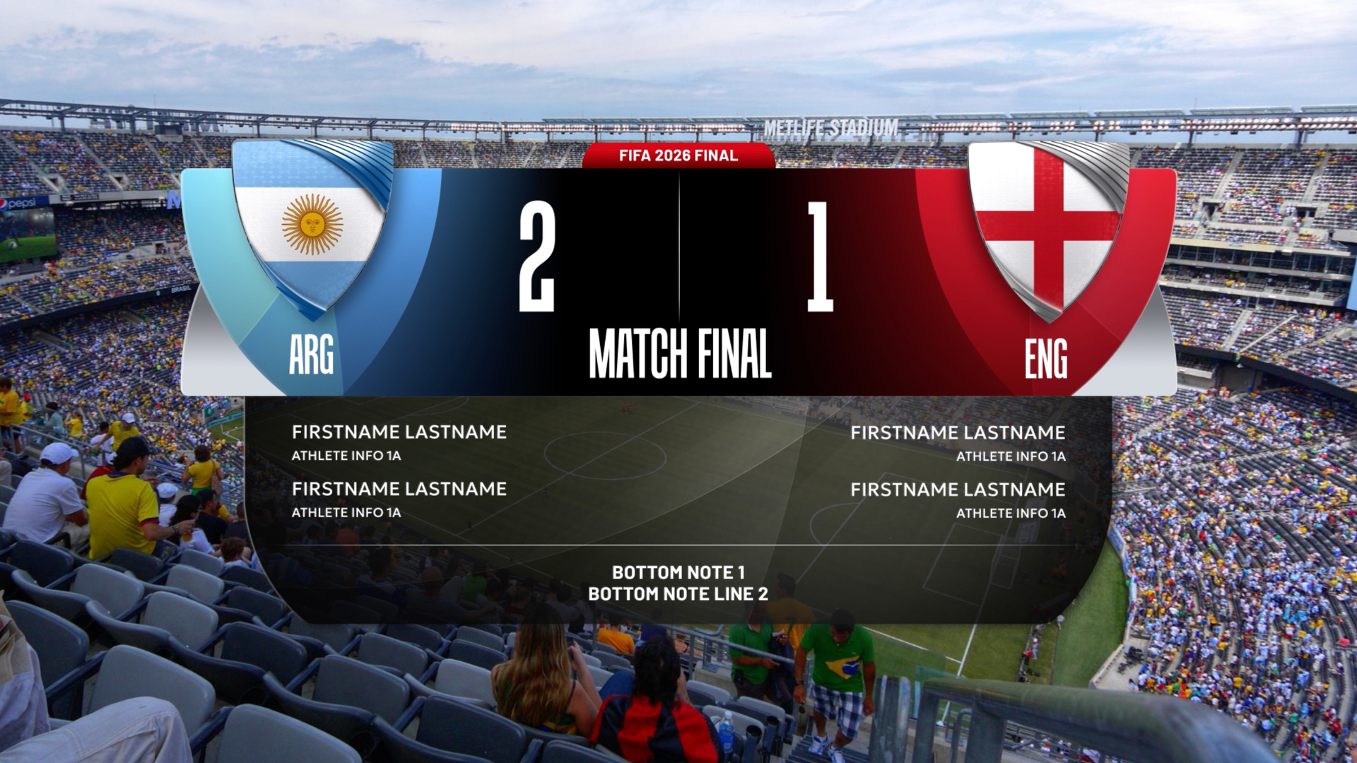
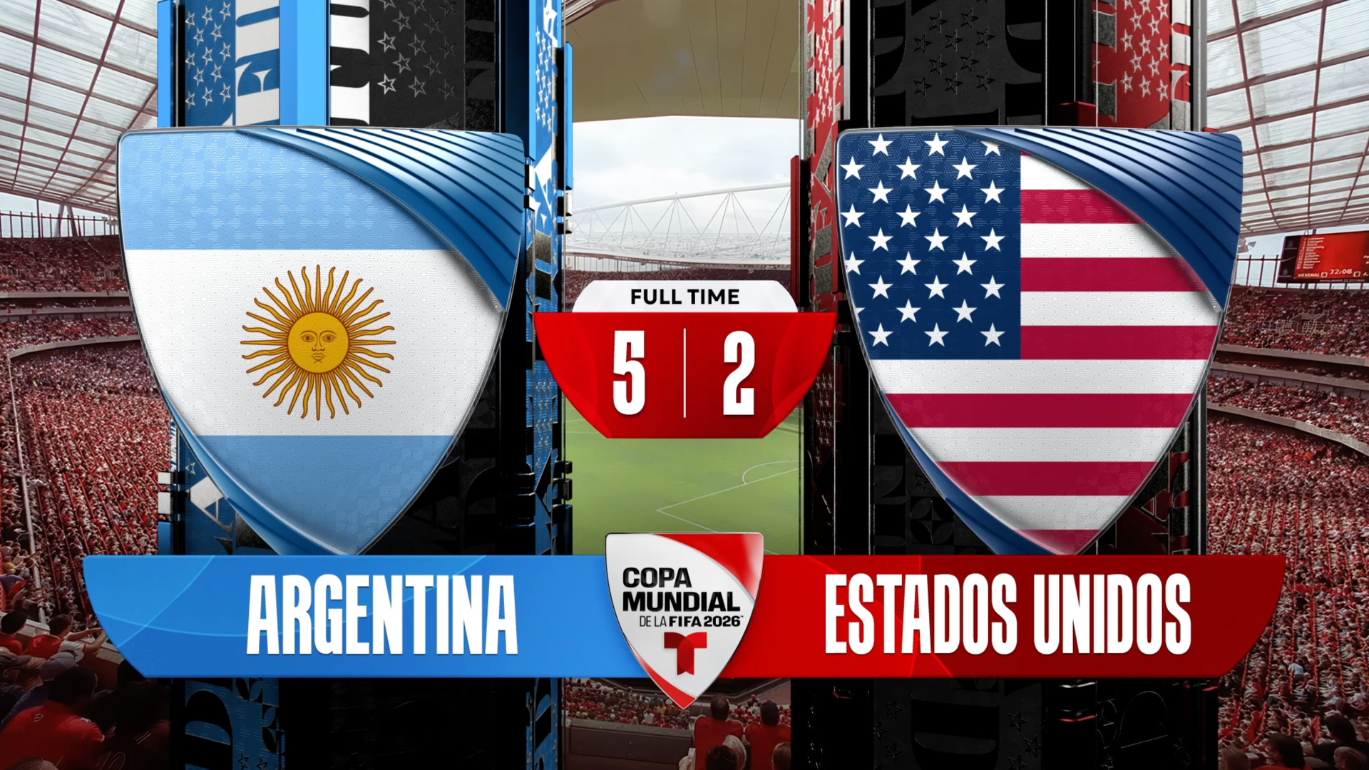
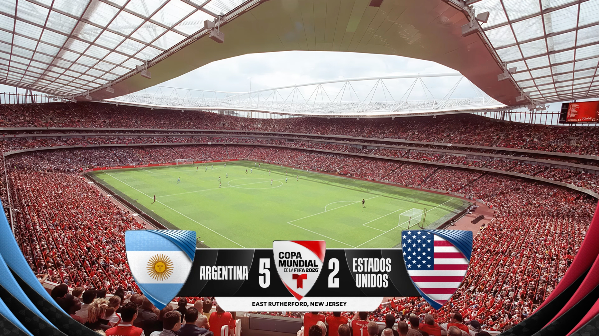
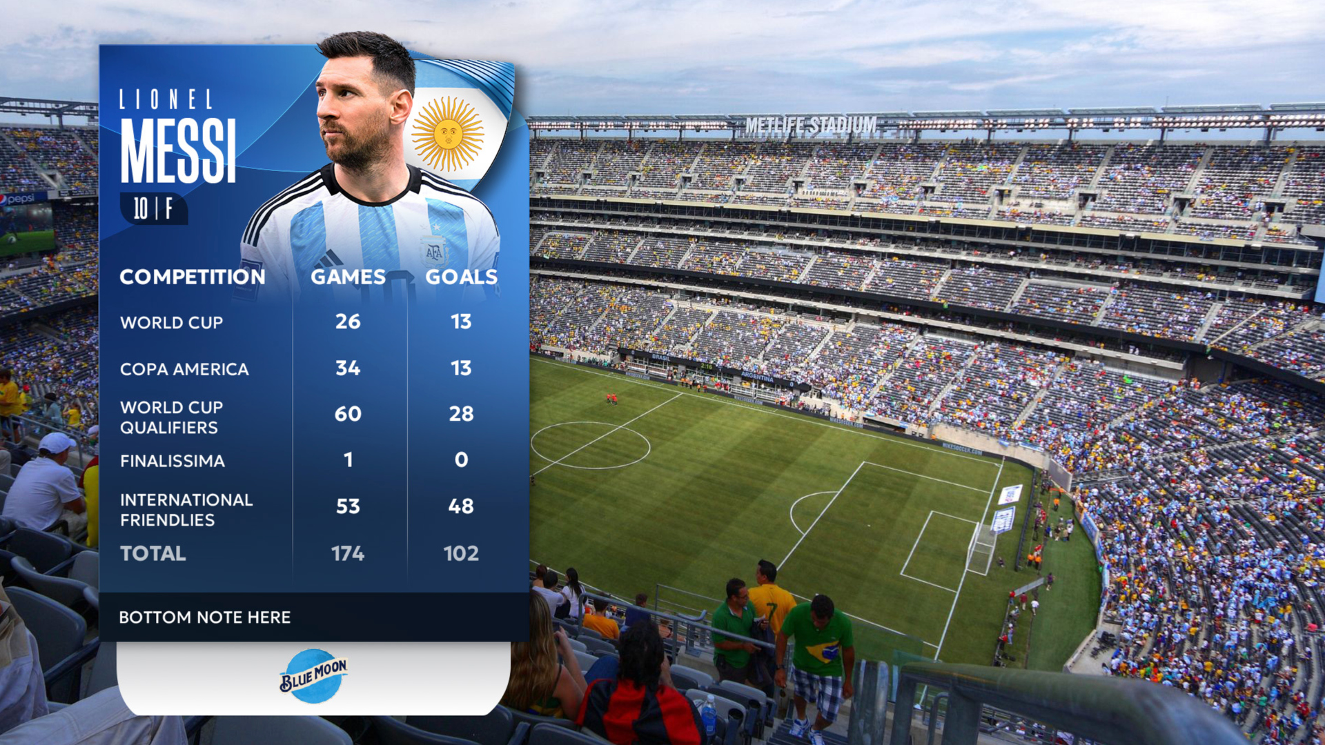
“European graphics and American graphics are very different in concept,” Peñalosa said. “In the U.S., we rely a lot more on graphics than in Europe.”
Telemundo’s own package was built to support more entertainment, culture and personality around the games, especially during pregame, halftime and postgame coverage. Country colors, player imagery and larger visual treatments helped carry the production through long windows between matches.
The system also had to work outside the 16:9 television frame. From the beginning, Telemundo considered vertical video, 4:3 formats, YouTube thumbnails and social distribution. Peñalosa said that planning has become a standard part of modern broadcast design.
“When you’re building a new graphics package, you’re already thinking on social, you’re already thinking on digital,” Peñalosa said. “You’re thinking about all these formats, how can that be modified?”
That meant graphics needed to retain identity when scaled down to a phone screen or rebuilt as a thumbnail. Some elements that worked in linear television had to be rethought for platforms where larger typography and more direct composition are necessary.
Holding the concept through production
For Gameday, one of the largest production challenges was maintaining the original concept through months of versioning, technical adaptation and file handoffs.
“I think one of the hardest things on a project this scale is holding onto our original concept frames,” Jenkins said. “How do you not water down your graphics? How do you hang on to that original idea and keep it alive from beginning to end over 10 months?”
Say said the project benefited from Telemundo’s internal graphics and production teams, which were able to take Gameday’s design assets and extend them across a large event without requiring every small adjustment to return to the original design team.
“They know how to speak graphics,” Say said. “They take the stuff we give them, they breathe life into it. They make a million iterations of it.”
Peñalosa described his role as setting the creative vision, then working with internal teams, technical directors, directors and Fabian Albarracin’s real-time graphics group to ensure the design was executed properly across systems and shows.
For Telemundo, the package ultimately functioned as both a brand statement and a production tool. It helped the network distinguish its World Cup coverage, support a Spanish-language audience, integrate sponsors and adapt to a tournament spread across countries, cities, platforms and formats.
The result was a motion design system built less around a single signature graphic and more around a connected language that could move across the full World Cup operation.

tags
2026 FIFA World Cup, Eric Say, Gameday Creative, Jaime Peñalosa, Kulani Jenkins, telemundo, Telemundo Deportes
categories
Broadcast Design, Graphics, Heroes, Sports Broadcasting & Production