‘World News’ debuts blocky new look
Weekly insights on the technology, production and business decisions shaping media and broadcast. Free to access. Independent coverage. Unsubscribe anytime.

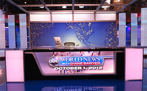
“ABC World News with Diane Sawyer” debuted a new look Monday evening, including a new theme song, new graphics and modified set.
The new graphics use a 3D block motif in red, white and blue.
The broadcast’s new open uses the 3D cubes heavily, along with highly stylized, floating 3D lettering. The open’s teases are framed with additional 3D cubes and matching transitions. The set, meanwhile, has been modified to eliminate much of the wood tones, especially on the anchors desk, where the corners are not backlit panels. The new theme was composed by Hans Zimmer.
Here at NewscastStudio, we have a bit of a disagreement about the overall. Michael, our founder and publisher, really hates the new look, while Dak Dillon, our editor, has a different take. Check out each of our opinions below.
Michael’s take

The new look’s use of blocks and blue and red gives the broadcast a childish, dated look that looks like bathroom tiles — and gives the show an almost retro or disco look (and not in a good way).
While the cubes design is a solid design foundation, this package takes the look a bit too far. The new graphics package also provides too much visual clutter, with the sharp edges of the cubes competing with the other design elements. A bit of depth of field or softening technique would have helped significantly.

The new backlit panels on either side of the set’s rear projection screen continue the dated look, making the set feel like a cheap corporate set at a convention in the 1980s.
The show’s new logo treatment is also poorly designed, framing the show’s title in a shape that looks like a frying pan from the side that crowds the typography. Then, the placement of Diane Sawyer’s name in the a red box, while certainly emphasizing it visually, adds to the clutter.
Dak’s Take

I will agree with Michael, that the tease during the open is a bit over-the-top… but overall, the graphics are a much needed improvement for a stale brand.
Now that “The Newsroom” has borrowed from the previous “World News” graphics, a change was in order.
The new open is polished, flashy and different. It feels like something you’d see on Sky News. It stands out from the competition in the U.S. The 3D work is excellent and it pops.
The set changes are a bit eh, but many have been in place. The new tall panels have existed for a while, just recolored. The wood is gone… that’s not a big deal, just wish a better job was done to replace it.

The world map with cubes is also different, and works well when used behind Diane.
We’ll see how long the overly patriotic colors last. Through the election? Or are they here to stay?


tags
ABC, ABC News, ABC World News, diane sawyer, world news
categories
Branding, Elections, Graphics, Networks, Set Design, Theme Music