ABC-Univision’s ‘Fusion’ unveils twisted logo

Subscribe to NCS for the latest news, project case studies and product announcements in broadcast technology, creative design and engineering delivered to your inbox.
Fusion, the news and lifestyle channel that’s a joint venture of ABC and Univision, has a logo.
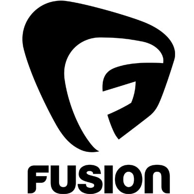
The logo features a the word “Fusion” in stylized type below what appears to have been the letter “F” inside a rectangle with rounded corners that’s been twisted and morphed into a irregular shape.
The type beneath the icon is clean and has a flowing feel to it, thanks to the elegantly rounded corners of the letter.
The “F” icon above, quite frankly, looks like someone had a little too much fun with the morph tool.
While the idea of creating an off axis, morphed look likely started with good intentions, it almost feels like the designers went a bit too far.
Because of how the shape was morphed and twisted, there are some awkward sharp points that don’t mesh well with the free flowing look of the logotype. The large black area in the upper left awkwardly dominates the logo and makes it appear top heavy, while the lower right hand corner’s angle doesn’t quite change directions obviously enough and creates a strange, staggered sense of movement.
The logo was developed by LA-based design firm Buster in collaboration with Lubin Lawrence and the team at Fusion.
“The logo is a powerful representation of Fusion’s identity. Our brand will reflect the attitude of millennials – shaped by a sense of unity with a voice that’s fun, fresh and even irreverent,” said Beau Ferrari, interim president for Fusion and executive vice president of operations for Univision Networks.
Subscribe to NCS for the latest news, project case studies and product announcements in broadcast technology, creative design and engineering delivered to your inbox.


tags
ABC, ABC News, fusion, logo, Univision
categories
Branding, Cable News, Featured