
State of the Union graphics combine old, new
Weekly insights on the technology, production and business decisions shaping media and broadcast. Free to access. Independent coverage. Unsubscribe anytime.
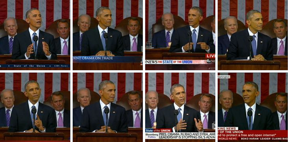
Tuesday’s State of the Union address coverage saw a mix of repeat and new looks for the major broadcast and cable networks.
For comparison purposes, be sure to check out our 2014 coverage of the State of the Union.

NBC News used a new graphics package that includes a circular logo tinted with blue and red bursts of color and elegant, clean lower thirds that used elements from the presidential seal as embellishment. The typeface Trajan was used throughout.

CNN‘s look used much of the graphics from last year, including the rather garish seal-shaped emblem. The network did, however, also incorporated its new, flat-style graphics into the coverage as well, which looks a bit odd against the overly stylized look of the metallic 3D logo.
CNN also made use of its virtual studio technology for data analysis.


ABC News also held over the same look — a rather cluttered and overly colorful look that also included a sidebar that included a rundown of topics.

CBS‘s look was the same as last year.

MSNBC‘s look remained the same, though with the addition of a “Bing Pulse” realtime viewer feedback bar appearing on screen. Similar technology was used last year by Fox News, but this year MSNBC was the sole broadcaster using a realtime polling system.

Fox News kept its 3D rendering of the presidential seal in the lower right corner of the screen, but altered it to be a bit less shiny and also added vignetted American flag graphic to anchor the seal a bit better.

PBS kept things super simple, with just the “PBS News Hour” logo in the lower right.

Bloomberg aired its coverage under its “Bloomberg Politics” branding and used a rectangle-heavy graphics package in various shades of red, white and blue. Its lower thirds included tightly spaced text that included excerpts from the speech.

British import BBC used its blocky China red “Breaking News” graphics and also included quotes and its normal ticker, creating a bit of a cluttered look. The bright, solid expanse of red detracted from the image of Obama, making it almost seem to fade into the background.

tags
ABC, ABC News, BBC, Bloomberg, Bloomberg Politics, CBS, CBS News, CNN, Fox News Channel, MSNBC, NBC, NBC News, PBS, PBS News Hour, State of the Union
categories
Branding, Cable News, Featured, Networks, TV News Graphics Design, TV News Motion Graphics Design