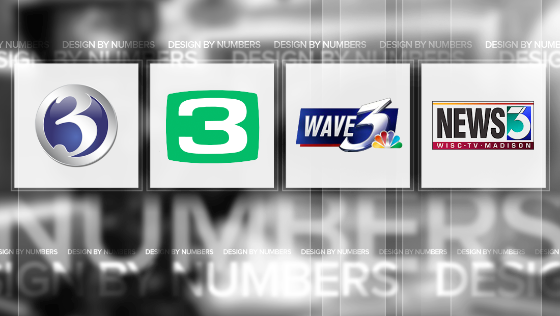
Notable Channel 3 TV station logo designs

Weekly insights on the technology, production and business decisions shaping media and broadcast. Free to access. Independent coverage. Unsubscribe anytime.
They say three’s a crowd. Well, in the TV news business, it’s also the source of some pretty cool logos. Here are our favorites:
WKYC-TV

WKYC-TV, the NBC affiliate in Cleveland, Ohio, has one of the more distinctive “3” logos in the business — and it’s a great example of clean, simple design that still manages to be unique.
The station’s logo starts with a carefully crafted and angled “3” numeral with the far right side “cut off” by a vertical line that’s somewhat reminiscent of a cursor.
Situated directly below the line is the NBC peacock — note how the bird is centered exactly under the line. Also worth noting is how the lower part of the “3” gently dips down slightly below the baseline of the NBC logo — a layout that not only emphasizes mimics the rounded edges of the feathers, but also adds to the general active look and feel of the logo.
The station also uses all lowercase letters for its call signs beneath the number, though this does create a bit of an awkward trapped white space. The addition of “-hd” on the end of the logo also could have been a bit more refined by nudging the vertical stroke of the “h” over just a bit so it lines up perfectly under the center of the peacock and vertical line above.
WFSB-TV

WFSB-TV, the CBS affiliate in Hartford, Conn., uses a variation of the ubiquitous “circle 7” logo.
The logo is somewhat unique, especially among “circle (any number)” logos in that the numeral is in a serif typeface with very pronounced round ends.
The varied stroke thicknesses in the number also help offset the fact that the number appears to be slightly offset to the right.
KCRA-TV

Hearst’s KCRA-TV in Sacramento, Calif., has perhaps one of the more unique renditions of a “3” logo in both form and color.
The station’s “3” is contained in a “bulging” box that creates the look of an old-fashioned tube television monitor. The Kelly Green, meanwhile, is a rarity among TV station logos but manages to create a unique look for the station.
The numeral itself is a slightly retro figured with curves a shape that match the form factor of its box.
The continued use of the “3” logo, at least according to legend, is outlined in the agreement that gave Hearst ownership of the station guaranteeing the logo is used, well, forever. The Kelly green color is also said to be a nod to one of the original owners, the Kelly family, and its Irish heritage.
WAVE-TV

WAVE-TV, the NBC affiliate in Louisville, Ken., has a distinctive and extreme variation of the number “3.” Not only does the numeral jut out at extreme angle, but it boasts sharp edges that give it an even more eye-catching look.
It’s worth noting, however, that the sharpness is missing from the upper right side of the number, where the point appears to have been “chopped off.”
The station also lets its logo extend outside the blue polygon that also houses the call signs in a condensed, angled typeface.
WBTV-TV

Perhaps the most eye-catching feature of Charlotte’s WBTV-TV’s logo is the softer, almost pastel color scheme of bright blue and violet-blue.
The left side of the logo is the number three, blown up and cropped tightly so that, at times, it almost looks like an “8.” The number is typically rendered in a silvery gray. Behind this is approximately half of the CBS eye logo.
The station typically runs its call signs to the right of the logo, opting for a condensed typeface. With the addition of its “On Your Side” branding, the station added that tagline to its logo, though the use of a sharper and wider typeface is a bit odd.
WISC-TV

WISC-TV in Madison, Wisc., uses a geometric inspired logo that also makes use of a unique color scheme of teal and darker blue.
The number, meanwhile, features a bit of an odd composition that almost looks like a mix between a “5” and “7” (or some other number?). There’s also a thin, roughly diagonal line in the upper part of the number that adds a bit of visual interest.
This post is part of a semi-regular series on NewscastStudio that takes a look at TV station and network logos that include the numbers 1 and up. These posts aren’t meant to be a comprehensive list of all logos featuring the number in question, but rather a look at notable logos with creative, historic or an otherwise significant impact on branding design. If you have other logos with the number featured in this post, feel free to share it in the comments and stay tuned for a “reader’s favorites” version of this post coming soon.


tags
Charlotte, Circle 7, cleveland, design by numbers, hartford, KCRA, logos, Louisville, madison, sacramento, wave, wbtv, wfsb, wisc, wkyc
categories
Branding, Design By Numbers, Heroes