
Orlando station goes flat with new graphics package
Weekly insights on the technology, production and business decisions shaping media and broadcast. Free to access. Independent coverage. Unsubscribe anytime.
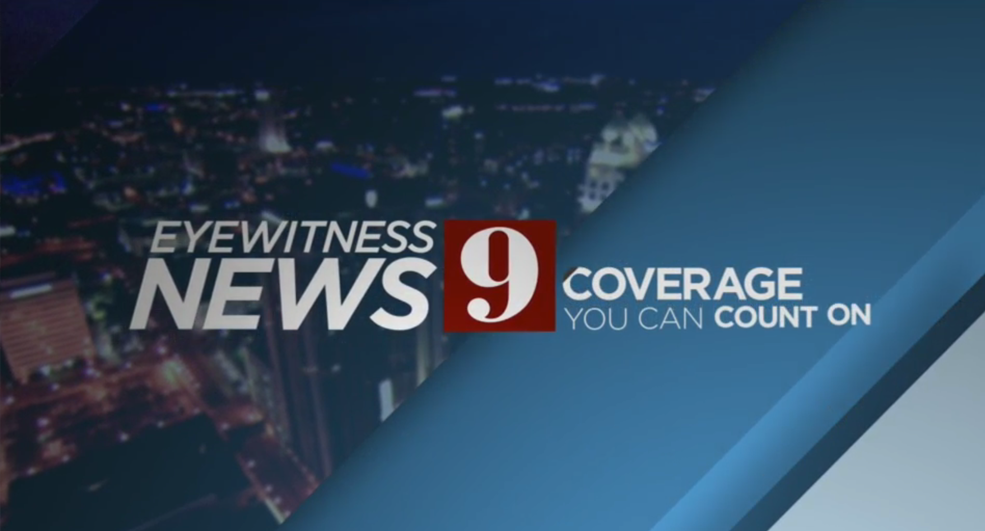
Orlando’s WFTV-TV has unveiled a new flat-style graphics package and new music.
The station, which received a set overhaul in August, debuted the changes this week.
The new graphics, designed by Hothaus Creative, are dominated by a muted shade of blue and grays and a mix of boxes and angled lines.
WFTV-TV has also tweaked its newscast logo — the “Eyewitness News” name still appears in italics, but in the cleaner Gotham typeface instead of the previous Bankers Gothic-style font. The station’s number “9,” however, remains in the same typeface.
The new graphics are primarily based on a series of rectangles ands squares, including the side-by-side boxes found in the station’s bug.

Subtle animation is found throughout the package and includes slowly moving diagonal lines as well as typography-based effects that have text “shrink” to accommodate additional tiers of copy — similar to CNN’s graphics.
The station also now places its red breaking news flag under the lower thirds as part of a semi-transparent gray bar.


The new package sheds the more traditional glassy, 3D look found in many news graphics packages, including WFTV-TV’s previous one, in favor of the flatter style look that’s becoming more popular in broadcast TV news.

Another notable aspect of the new graphics package is that it makes full use of the 16:9 space rather than leaving “safe area” for 4:3 viewers. The OTS graphics also have become wider to fit this aspect ratio.

The station’s weather graphics have also been updated to make use of the simpler look — including the use of the angled shapes to divide the days’ high and low temperatures, with the red finding its way in behind the weekend labels. Simpler, flat style icons are also now in use for the weather graphics as well.

The angled motif is particularly evident in the station’s full screen graphics. Here you can see the gray and blue color scheme along with a visual “slash” running from top right to lower left. The angled theme is also found in the arrow-like dark blue corner in the gray box that houses the text.

Interestingly, there were a few spots where the station’s previous graphic package snuck in on Tuesday’s 11 p.m. broadcast, including these two stingers:


The contrast between the old and new look is perhaps more evident here, with the metallic extruded and distorted “9” and rings serving as the main design theme.
Overall the new WFTV-TV graphics are a clean look that gives the station a more unique look in the market — competitor WESH-TV uses the standard Hearst “triangle” graphics package that’s, while flatter than previous packages used at the station, still stocked with 3D and metallic effects, while the market’s CBS affiliate, WKMG-TV, uses a white, yellow, red and blue color scheme in its rather dated graphics and the Fox station uses the standard Fox O&O look.
That said, the color scheme WFTV-TV opted for is a bit murky and also appears to compete a bit with the brighter tones used on the set.
In addition to the new graphics, the station is also using the new Stephen Arnold Music package “Guardian,” which was the subject of a naming contest last year.

tags
orlando, Stephen Arnold Music, wftv
categories
Broadcast Design, Graphics, Local News, MoGraph, TV News Graphics Design, TV News Graphics Package, TV News Motion Graphics Design, TV News Music, TV News Music Package, TV News Weather Graphics