Readers pick for notable Channel 6 logo designs

Weekly insights on the technology, production and business decisions shaping media and broadcast. Free to access. Independent coverage. Unsubscribe anytime.
Last week we took a look at some of our picks for notable Channel 6 logos — and now it’s your turn.
Here are some of the Channel 6 logos our readers mentioned via social media, email and comments on last week’s post.
WDSU-TV

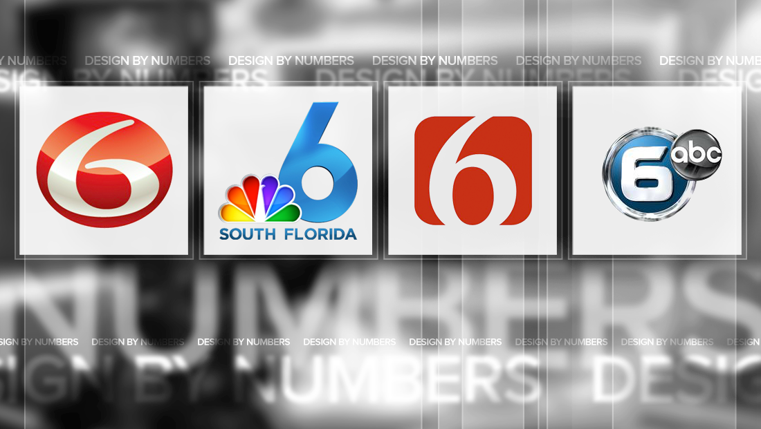
Hearst’s WDSU-TV in New Orleans has used its iconic “6” logo, a various forms, for years. The station places its number inside an oval that’s slightly wider than it is high with a large “6” inside that also appears to be stretched slightly.
The figure starts with a blunt slightly rounded tip before widening in the lower left, then narrowing as it goes to the right before thickening again on its way back up, giving the logo a nice sense of movement.
The “hook” on the number doesn’t meet the left hand stroke.
In its latest lockups, the station has begun using a rather tightly spaced version of its call signs in Bankers Gothic, a longtime Hearst standby with a large, wide “News” in a bold italic font.
WTVJ-TV

Miami’s NBC O&O, WTVJ-TV, which brands on air as “NBC South Florida,” has a sleek and clean “6” that appears in a fresh blue shade.
The top stroke of the figure doesn’t cross from left to right, but rather ends abruptly, giving the numeral a simplified look. Meanwhile, the lower portion of the logo is almost a perfect circle, an element that again lends itself to a clean look.

The station previously used a boxy logo that contained a rather generic “6” in yellow inside of a red box. The NBC peacock is perched to the left atop a yellow bar with “NBC” in it and the station’s website below — both of which are rendered in Copperplate Gothic, a font that several other NBC O&Os used for a while.
KOIN-TV

Media General’s KOIN-TV in Portland, Oregon, uses an edgy typeface and unique shape to create a more modern look for its logo.
The “6” the station chose is wider with more extreme curves, as well as featuring a top “hook” that stops just short of the full width of the widest part of the numeral.
It’s placed inside a blue box that has a rounded upper left corner and diagonal notch in the lower right. It’s worth noting that the angle found here mirrors the one used in the “hook” of the “6,” while the rounded corner mimics the upper left part of the “K” in the station’s call sign.
WATE-TV

WATE-TV in Tennessee uses a similar “6” as KOIN-TV, but instead encloses it in a circle.
The station also renders the logo with a look that’s a bit more metallic and shiny.
KHQ-TV

KHQ-TV in Spokane, Wash., which brands on air as “Q6” uses a angled logo that has, as you might expect, a distinctive “Q.” The letter takes on the form of an “O” or zero, with a unique “tail” in the lower right with a very short “hook.” In addition, the character is rendered in a way that makes the lower bar and “tail” look like it’s slightly in front of the rest of the letter.
The curves of the “Q” is mimicked in the “6,” meanwhile, both in its rounded rectangle motif and subtle “tail.”
KOTV-TV

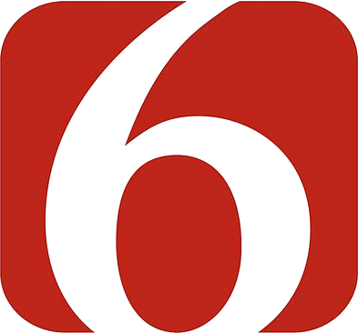
Tulsa, Okla., CBS affiliate KOTV-TV, owned by Griffin Communications, uses a simple logo that uses negative space to create its number.
A red rounded rectangle serves as the base of the logo, with the number “6” “punched out directly down the middle, with the upper hook and base part of the number disappearing outside where the red box’s boundaries.
The station’s logo is, interestingly, basically a flipped version of sister station KWTV-TV in Oklahoma City, which uses a number “9” in its logo.
It’s worth noting that the base of the base inside of the “6” sits on the same baseline of the box. The curves of the box also do a nice job of alluding to the same curves found in the number.
While certainly simple and clear, KOTV-TV’s logo also lacks much character — and is a good example of how simply typing out a number in a cool font and making a few minor tweaks doesn’t always cut it for TV station logos.
The strongest numbers in TV station logos out there are typically hand crafted to be more dramatic and sometimes are completely hand drawn to liven up what could otherwise be a boring number.
When your business’ primary mark is only one or two characters, it’s important that those characters count — and remain memorable.
This post is part of a semi-regular series on NewscastStudio that takes a look at TV station and network logos that include the numbers 1 and up. These posts aren’t meant to be a comprehensive list of all logos featuring the number in question, but rather a look at notable logos with creative, historic or an otherwise significant impact on branding design. If you have other logos with the number featured in this post, feel free to share it in the comments.


tags
6, Channel 6, design by numbers, Griffin Communications, hearst television, khq, koin, KWTV, logo design, logos, media general, miami, new orleans, oklahoma city, portland, spokane, WATE, wdsu, wtvj
categories
Branding, Broadcast Design, Design By Numbers, Heroes