
CBSNews.com redesign emphasizes live, on demand video while adding elegance
Weekly insights on the technology, production and business decisions shaping media and broadcast. Free to access. Independent coverage. Unsubscribe anytime.
CBS News has redesigned its website with an updated elegant look that places heavier emphasis on both on-demand and live video.
The new design appears to have started rolling out publicly Dec. 13.
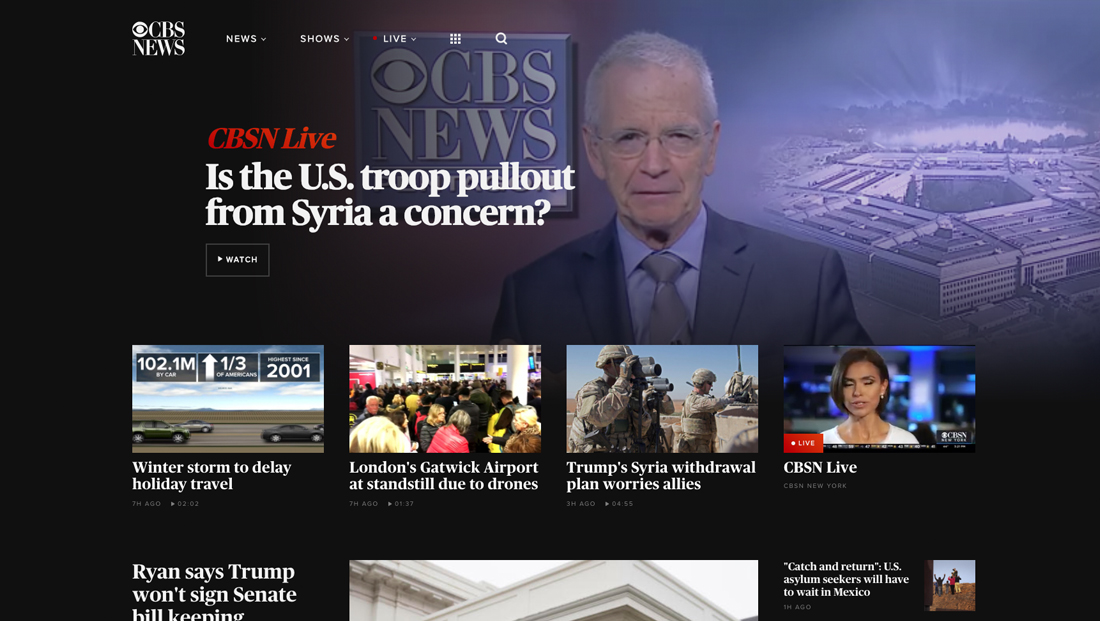
The new homepage, for example, shows a live stream of CBSN gently faded into the black background along with a headline, which changes dynamically as the streaming service changes topics, overlaid on top.
The entire section is clickable to bring up a more immersive view of CBSN with audio.
CBS then offers a row of four additional thumbnails — which can lead to traditional story page, video or, as available, additional CBSN streams, including the newly launched CBSN New York.

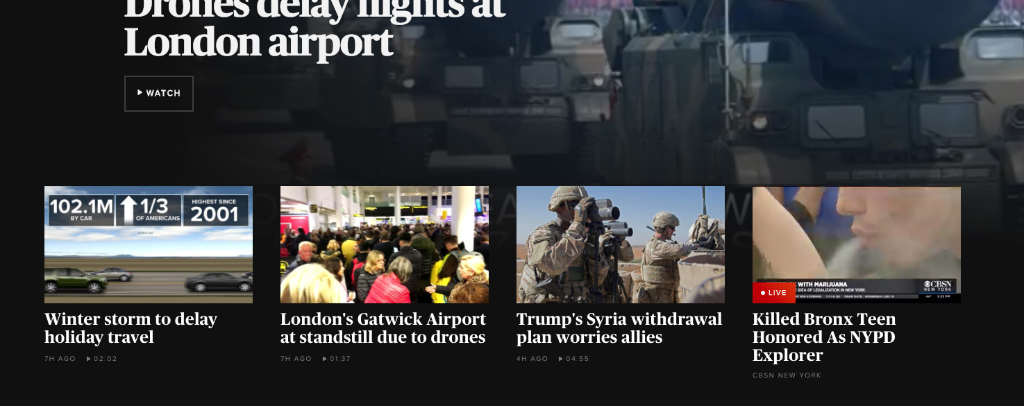
CBSNews.com uses this boxy layout just below the main element and four horizontal boxes — giving it space for one major story, two with less emphasis and then a stack of other stories on the right.
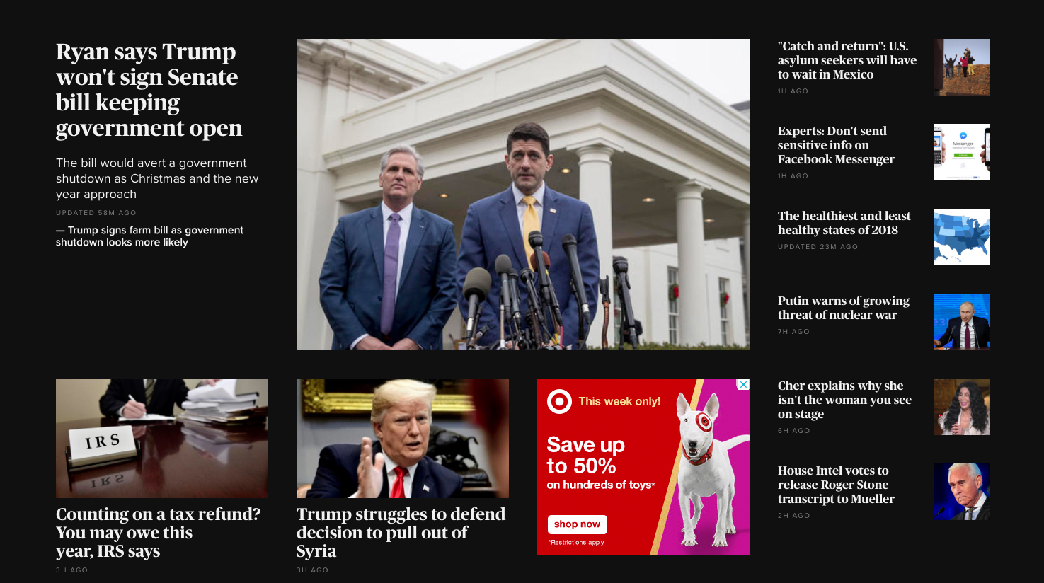
Below this the page switched to a white background with an additional grid layout showcasing even more content in an almost identical layout to the section above it.
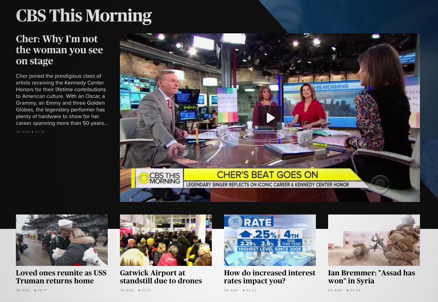
The rest of the page has what appear to modular blocks that allow the network to showcase specific shows, topics and other content. For example, this “CBS This Morning” section spotlights a lead video clip from the show along with four additional stories below.
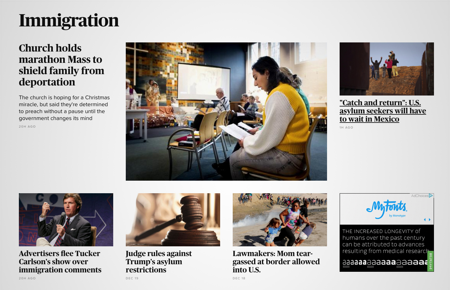
Sections can then use another grid layout to showcase content on specific topics, in this example — immigration.
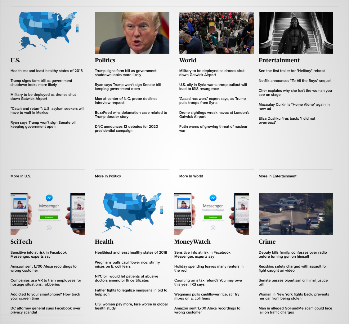
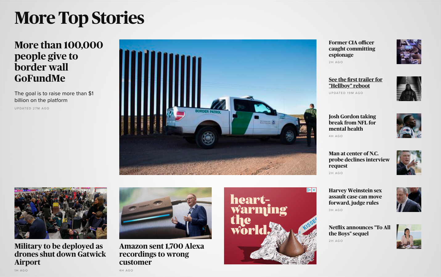
Finally, after a series of additional horizontal sections that take on largely the same layout as the ones already showcased, the very bottom of the page features a four column, two row lineup of headline scrapes from stories throughout the site on key topics.
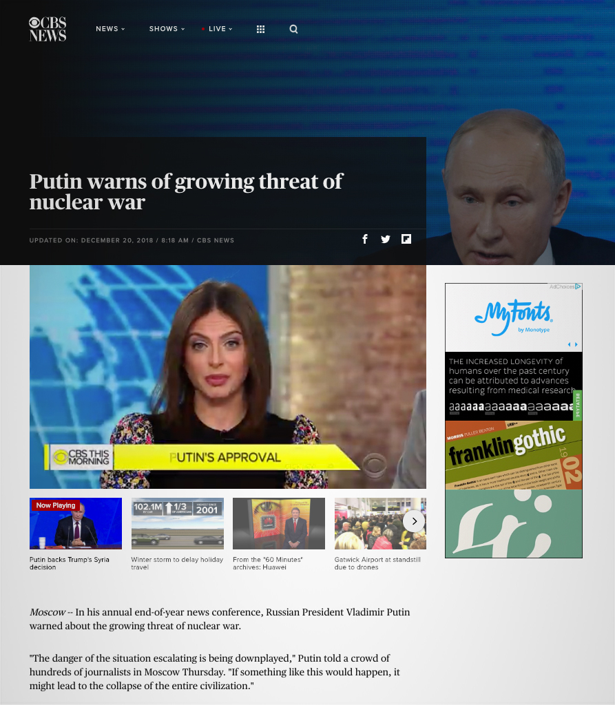
Story pages have a variety of layout options — with many emphasizing video at the top, including related video using four thumbnails below the main video pane. Other layouts allow for photo-less stories and, for major news topics, the network can put a topical background image into background between the navigation and headline. For other stories, this space is reduced and remains a solid black.
The bottom of most story pages then offers another grid layout with links to related content — with paid content mixed in. For stories with video, a smaller, floating version of the clip hovers on the right side of the browser as you scroll down.
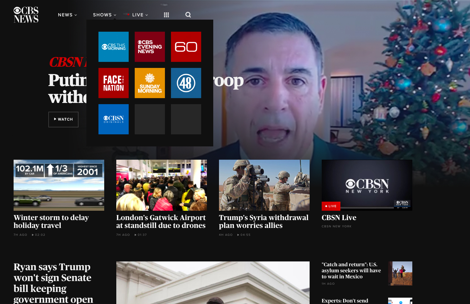
Besides inverting colors from a white background with black logo and text, the header of the site remains relatively the same as it did before — with a simplified number of options. Shows and live streams get square icons under the “Shows” and “Live” menus, while the “News” link provide quick access to category pages (which have not been redesigned as of this writing) as well as additional menu options and a search bar.
The new design keeps the highly boxy and grid-shaped look of the old site, but also gives elements more room to “breathe” by increasing spacing, goes a bit wider and eliminates much of the heavy lines used in the old, clunkier look.
For headlines and article body text, the site uses the heavy sans serif Publico, while subheadlines and meta data is in Proxima.
In addition to category pages, select other pages have not been moved over to the new design as of Thursday, Dec. 20, 2018.
Much of the previous design was first introduced in 2012, with the network updating the navigation header in 2017 and tweaking it again throughout the rest of the year and into 2018.


tags
CBS, CBS News, CBSNews.com, web design
categories
Branding, Broadcast Industry News, Featured, Networks, Online and Digital Production