
Blue is truly a ‘classic’ color for broadcast design

Weekly insights on the technology, production and business decisions shaping media and broadcast. Free to access. Independent coverage. Unsubscribe anytime.
After Pantone picked “classic blue” for its 2020 color of the year you could almost hear the collective shrug of broadcast designers — who have been using variations of the shade in TV motion graphics and sets for years.
Pantone sticks with a ‘classic’ for 2020’s color of the year https://t.co/6FltmZQ4Qp #Fonts #Typography
— TypographicMix (@TypographicMix) December 5, 2019
Blue is a natural choice for broadcast design — it’s calming and neutral enough to not overpower other imagery being shown on screen but still brings some visual interest to the screen.
It’s also complementary to human skin tones, making it an ideal background color.
Back when graphics systems were less sophisticated, a bright shade of blue was often used on the walls behind anchors so that the station could use chroma key technology to insert graphics behind talent — though the backdrop, without any graphics keyed in, would still appear on camera.
Blue continued to be a classic choice for backgrounds behind anchors as computer graphics improved — ranging from painted or laminated walls to the high tech video walls so popular in TV studios today.

For what it’s worth, blue has started to become replaced (or at least accented by) various shades of red.
In today’s landscape, more and more broadcasters are placing an emphasis on “breaking news” (including news that isn’t quite so breaking) and red is often used on conjunction with that coverage.
Going back to blue, however, below is a quick look at the various blues used on some of the most popular TV news programs and networks.
Note that, in some cases, these are approximations of the actual shades used and, due to monitors and ambient lighting, the shades may appear slightly different. In some cases, blues are used in gradient form, so the most prominent shade of blue is shown here.
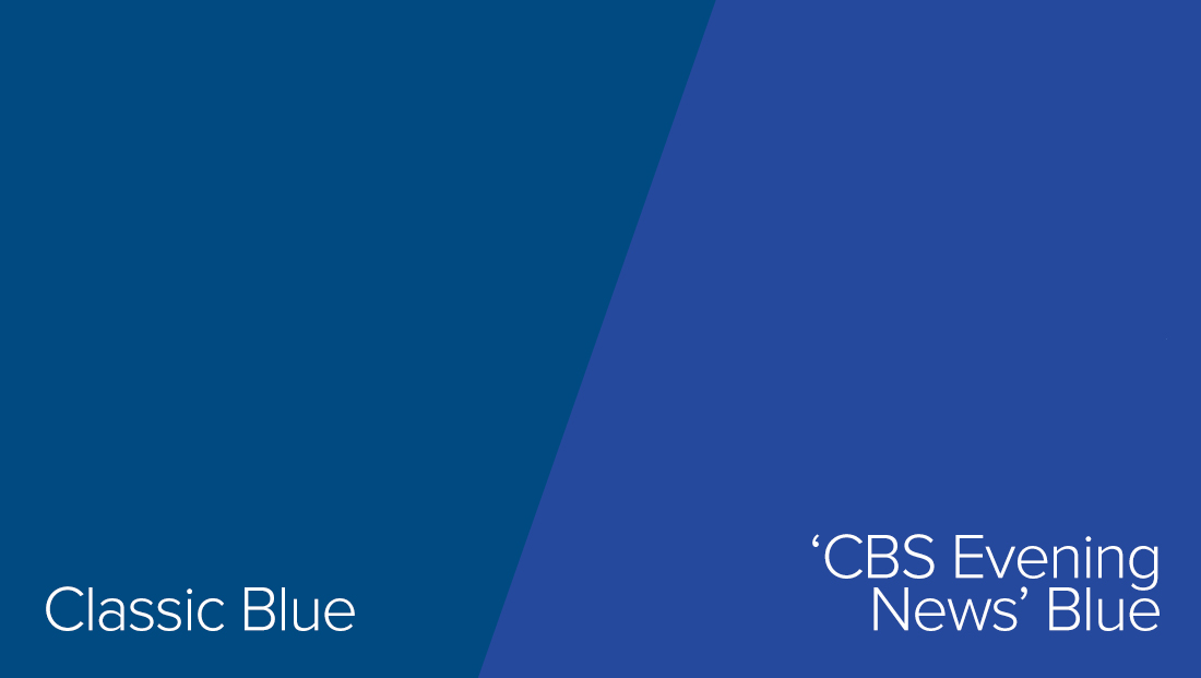
“CBS Evening News” switched to its current blue color palette July 15, 2019 when Norah O’Donnell took over. The show retained the blue look, with red mixed in, when it moved to Washington, D.C.
The blue used in the show’s logotype is slightly brighter than classic blue, but various shades of blue are used in the show graphics, including ones closer to the classic Pantone shade.
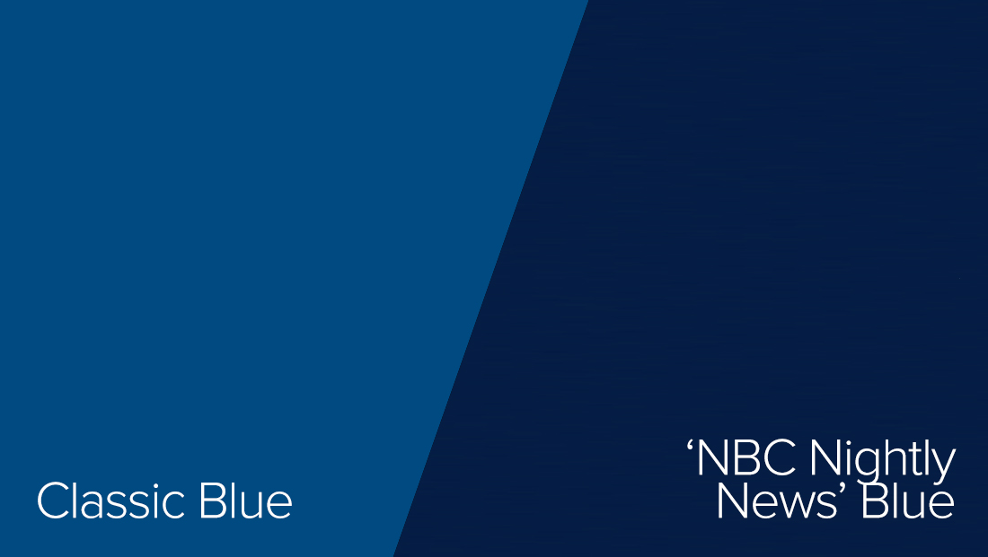
“NBC Nightly News” often uses a darker version of blue as a background color behind its logo. This shade is similar to the shades found in the show’s lower thirds, though at times the shades skew a bit more toward violet.
Previously, “Nightly” used shades of color more toward the violet end of the spectrum.
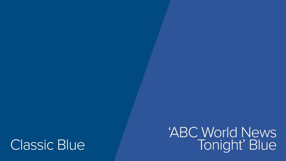
“ABC World News Tonight” also uses a variety of blues, though the one used in its logo is also slightly lighter than classic blue. However, the broadcast’s on-set video wall graphics and lower thirds also include a myriad of blue shades.

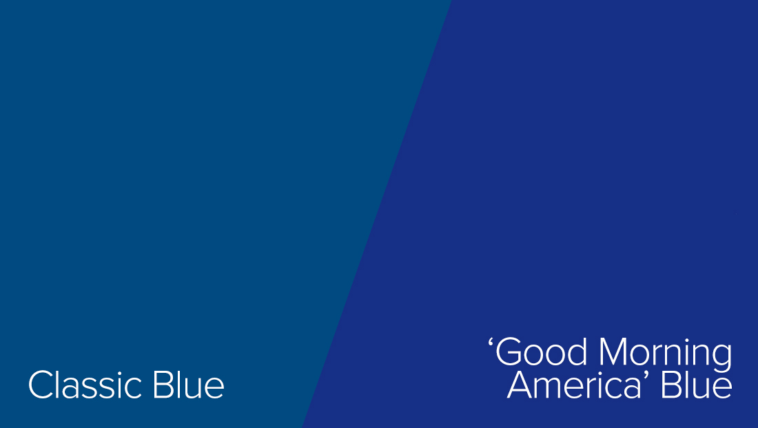
“Good Morning America” on ABC also uses blue in its standard lower thirds and many on set video wall graphics, which are also accented with bright yellow shades.
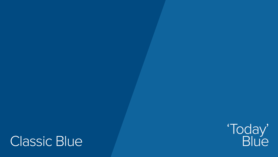
Despite “Today” opens and other graphics being orange, the show also uses blue in a variety of places, including as the base color of its lower thirds.
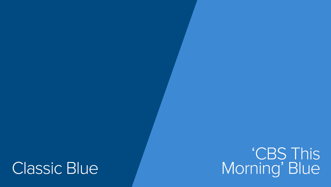
Over on “CBS This Morning,” a bright shade of blue is used behind tease headlines and also finds its way into the lower thirds in the form of a light shade and colored logotype. A bright shade of yellow, leftover from a previous look, is also used in the show’s graphics.
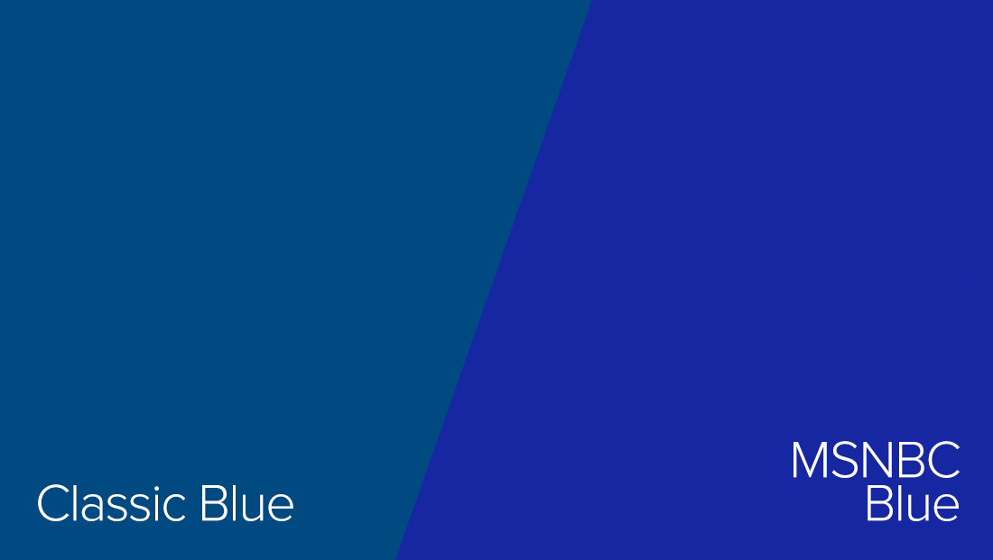
MSNBC uses a more saturateed shade of blue in its non breaking news lower thirds and ring like designs.
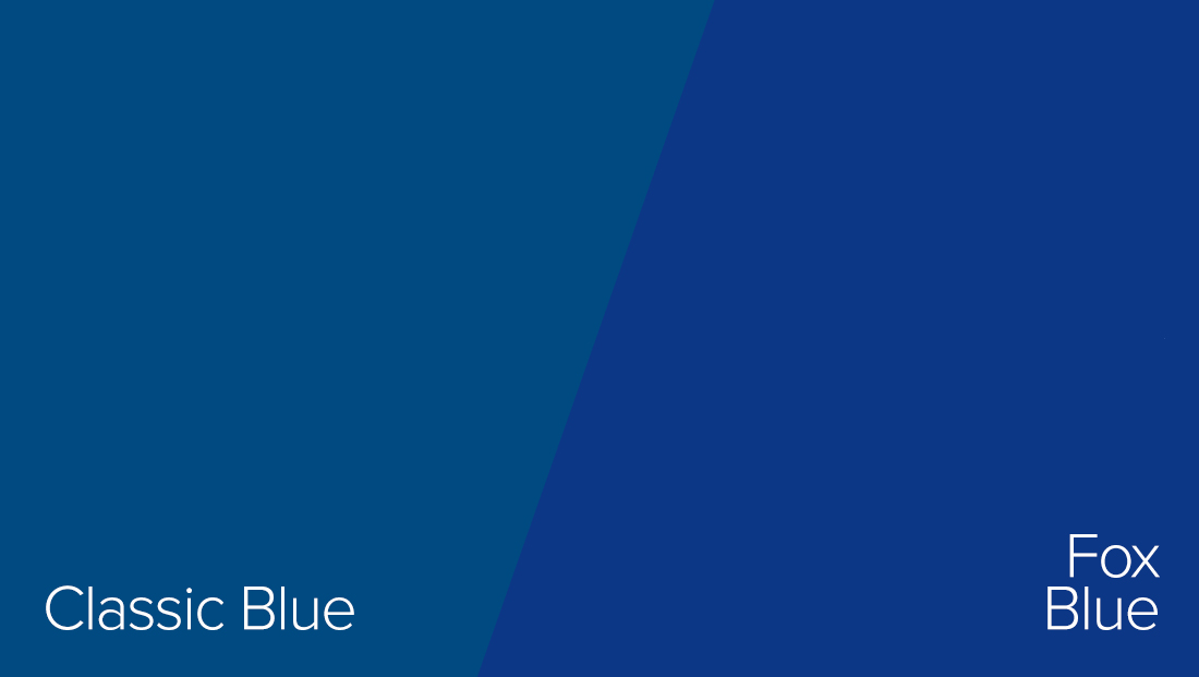
Fox’s cable channel also uses blue in both its logo and as a primary accent color in its lower thirds, though each show has its own color palette.
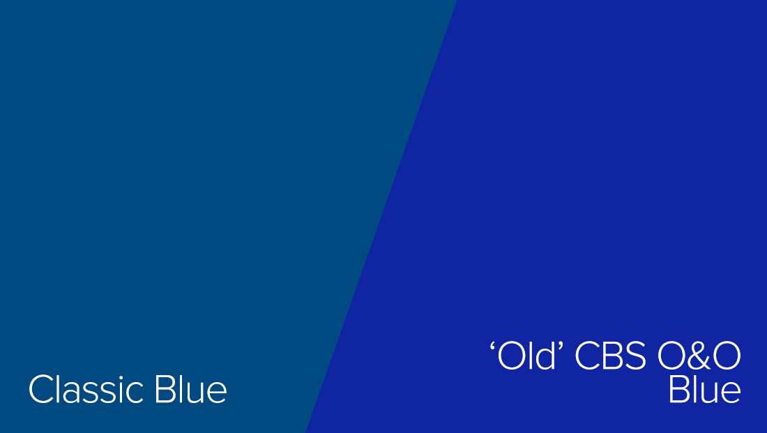
CBS owned stations in major markets current use lower thirds with a saturated shade — and additional shades are also used in the gold and blue ring motif.
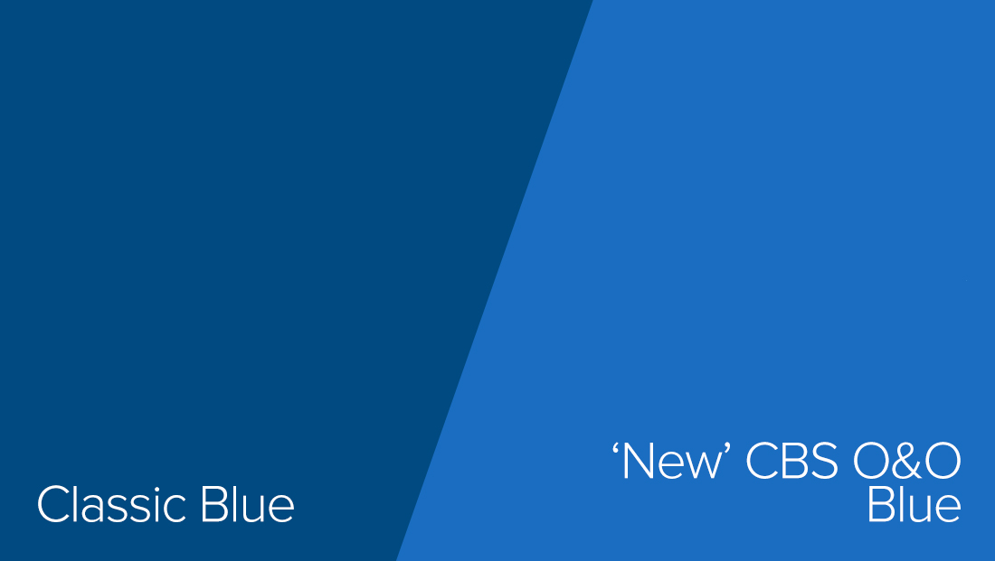
However, CBS O&Os are in the process of switching over to new graphics, which uses a different take on the shade of blue. A similar shade is already used on the network’s nationwide and regional CBSN streaming networks.
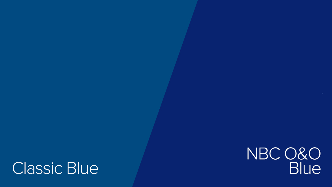
NBC O&Os also used blue lower thirds in major markets, often with a gradient or glassy overlay.

tags
ABC, ABC News, ABC World News Tonight, CBS, CBS Evening News, CBS News, CBS This Morning, GMA, Good Morning America, NBC, NBC News, NBC Nightly News, Today, Today Show
categories
Broadcast Design, Featured, Graphics