
‘Symone’ blends elegant logotype with bold, brutalist graphics
Weekly insights on the technology, production and business decisions shaping media and broadcast. No paywall. Independent coverage. Unsubscribe anytime.
“Symone,” MSNBC’s newest weekend offering, made a bold debut Saturday, May 7, 2022, from NBC’s Washington, D.C. headquarters with a look that combines eye-catching colors, imagery, typography and animations to channel a sense of energy thanks elements of the “in” style of the moment, brutalism.
Hosted by Symone Sanders, who served as press secretary for Sen. Bernie Sanders’ presidential campaign in 2016, the show originates from the multipurpose Studio N5 in NBC News’ Washington, D.C. bureau. The two are not related.
While lower third banners remain the standard MSNBC look, they are tinted green, which is a bit of a unique look for the network — and a color that appears elsewhere in the graphics package alongside a myriad of other splashy shades.
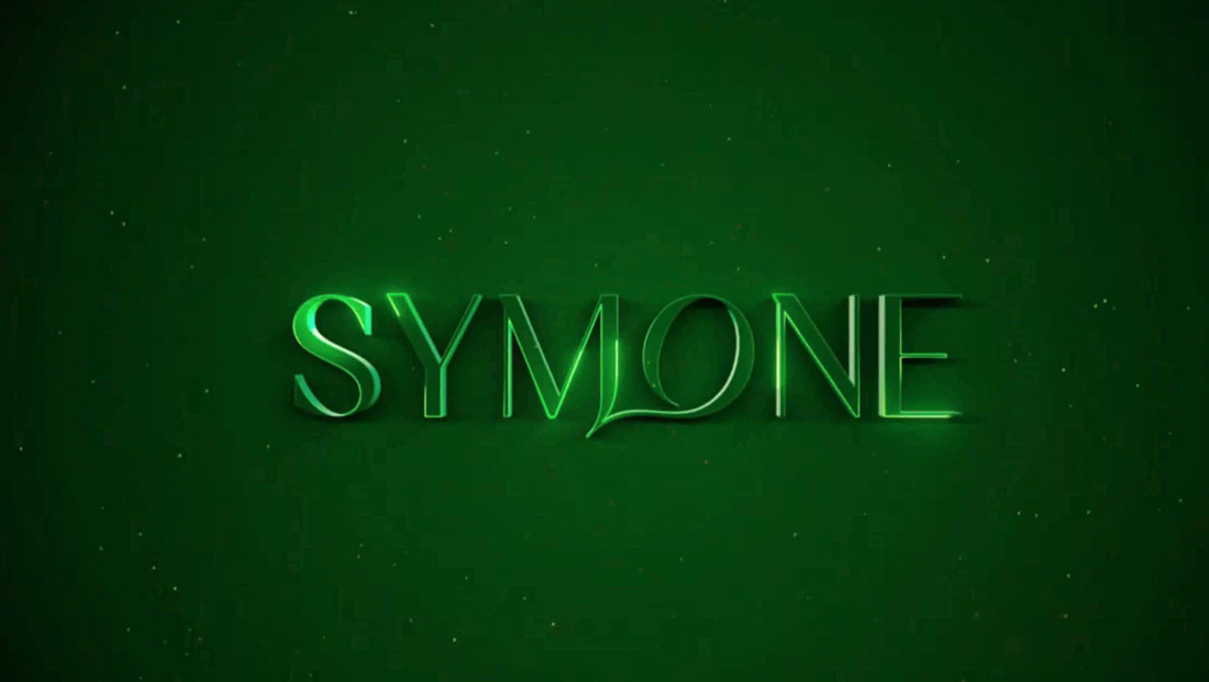
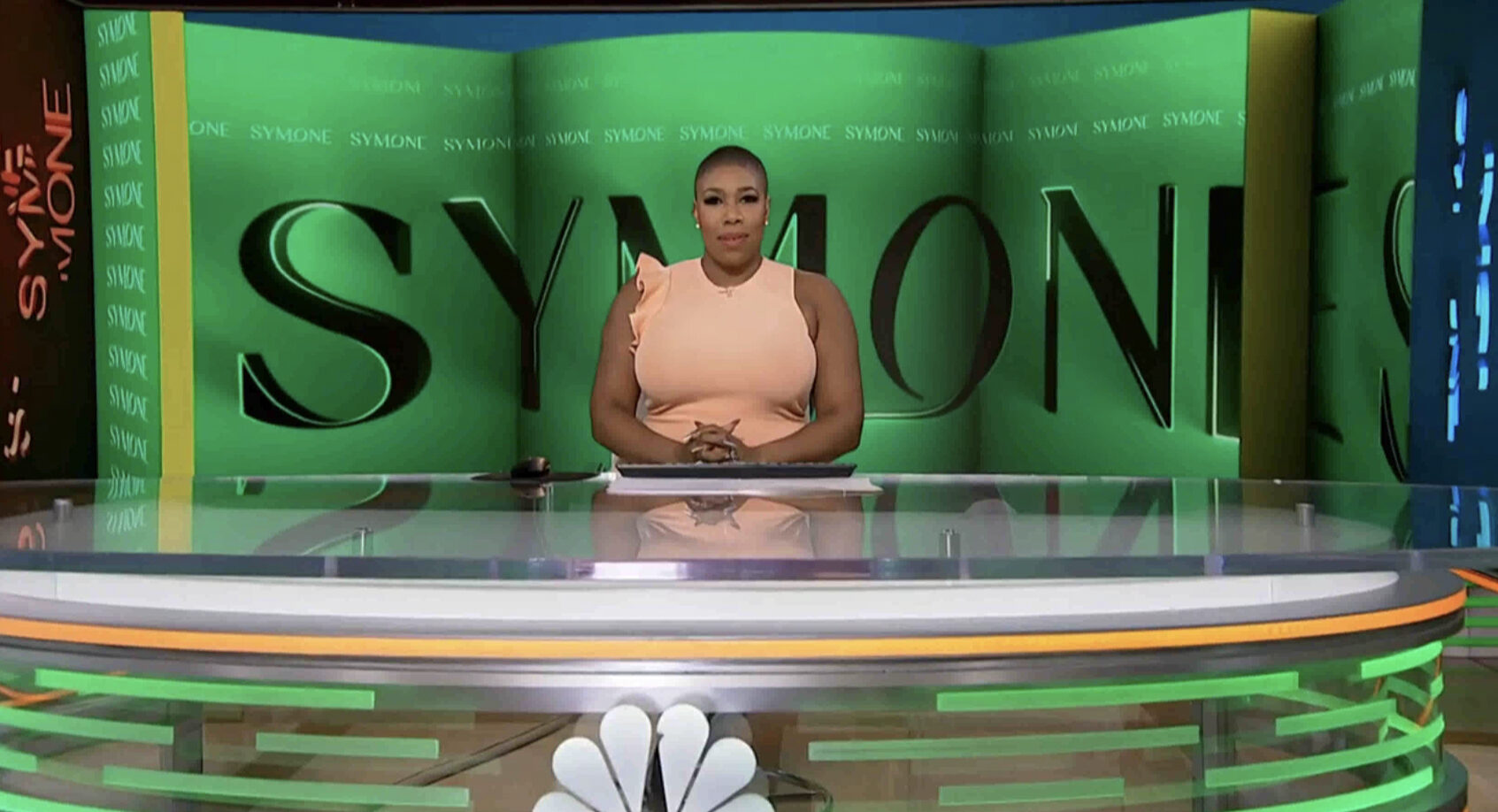
As already previewed, the show uses an elegant but friendly typeface for its logotype that’s somewhat evocative of a beauty brand along with a custom “M” and “O” that, when combined form the suggestion of a speech bubble, heart of even, perhaps, a peacock feather.
The show’s open features an upbeat but unidentified musical bed along with imagery of Sanders that’s been heavily stylized — the opening scene uses a multiple exposure-style look to capture her as she moved across the screen before eventually standing in the middle.
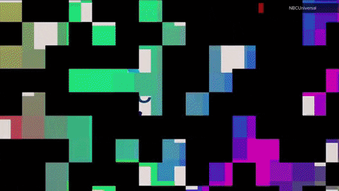
There’s then a black and green screen of the show’s distinctive logotype with angled elements that feature distorted renditions of the same logo before showing the show, previously released in the show’s key art, of Sanders, dressed in a green suit jacket and a bright green lighting effect that appears to make her left side glow.
In the open, viewers get an extended look at this effect, which includes a trail of light paths and flowing particles before a series of morphed text matrices — not set in the logotype font — appear in black and green along with a separate shot of Sanders in a blue and red outfit with a faint trail or those colors extended away from her.
Next is a tiled view of Sanders back in the green outfit but in a different post and with a blue lighting effect applied before the view animates into three repeating segments, two of which briefly switch to two additional poses of Sanders, these with stronger blue light.
The open then finally switches to a dark green screen with the show’s logo in the middle with a 3D effect and animated laser line edges.
For pre-show teases, Sanders stands to one side of the oval anchor desk in N5 with a black and white step-and-repeat style background on the video wall array behind her and a large rectangular opening left for topical imagery. A green box with white accent box and bold, extended typography is used for a headline below, though the box is briefly yellow when it animates in.
Thanks to the color-changing technology built into the set, the knee walls and desk are both accented in orange and green.
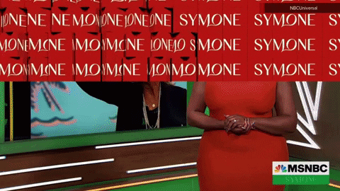
May 7’s show started with Sanders standing next to one of the integrated video panels framed by a backlit lightbox, tinted green, near the oversized NBC peacock logo wall accents. Bold, green, yellow black and white elements framed out the topical imagery on the screen and also created a container for headline text in the upper left corner of the graphic.
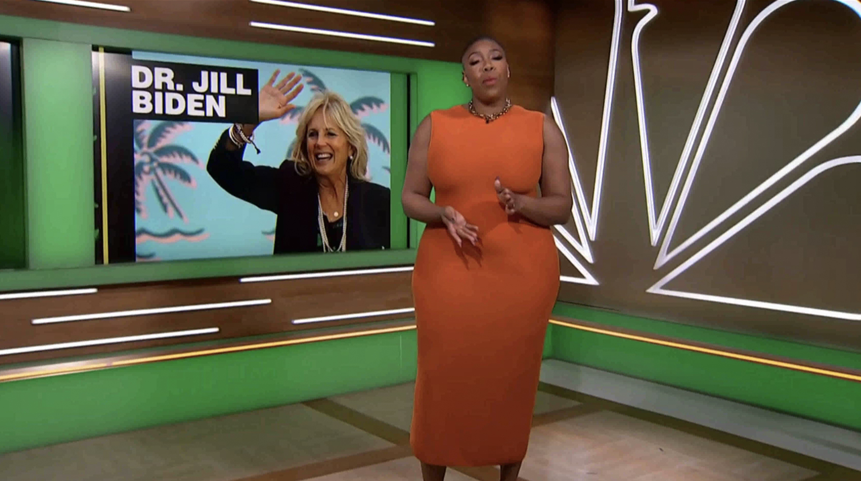
This edition included a pre-taped interview with First Lady Jill Biden that was shot in Studio N1, the home of “Meet the Press,” “Hallie Jackson Now” and other programming.
The space’s blue, traditional federal-style walls were a bit of a contrast between the show’s overall look and the show wisely went with darker blue graphics on the video wall segments visible through the archways behind Sanders and Biden.
The far left one featured a repeating show logo that most appeared behind Sanders’ one shot, while the one next to this used the simplified version of the show name and showed up mostly in two shots.
Biden, meanwhile, was framed against a third LED segment that was being fed a video loop of the nearby newsroom.
On the second show, Sanders switched to opening the show at the oval anchor desk in N5.
Behind her was a rather elaborate video wall graphics that appeared to spread a black version of the logo logo across multiple segments, some flat and the middle one curved outward.

The left side features a vertical yellow line and a narrow green segment using perspective to create what is presumably meant to be a small wall segment adorned with stacked logo.
To the far left, meanwhile, is orange-tinted versions of the show’s non-logotype rendition purposeful broken into segments or shards — a blue tinted version of this is camera right and the video wall graphic also features a wider yellow setback before a final green panel, also with forced perspective, continues the logo.
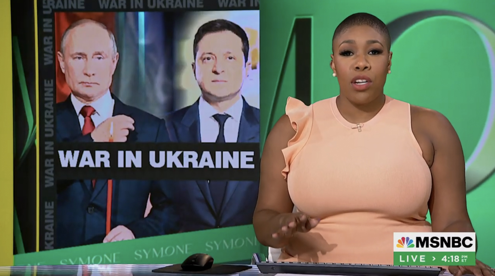
The video wall was also used to display OTS-style graphics behind Sanders that use a similar black, yellow and green framing as on the smaller panel across the space, with the added element of the headline text repeating up the left side.
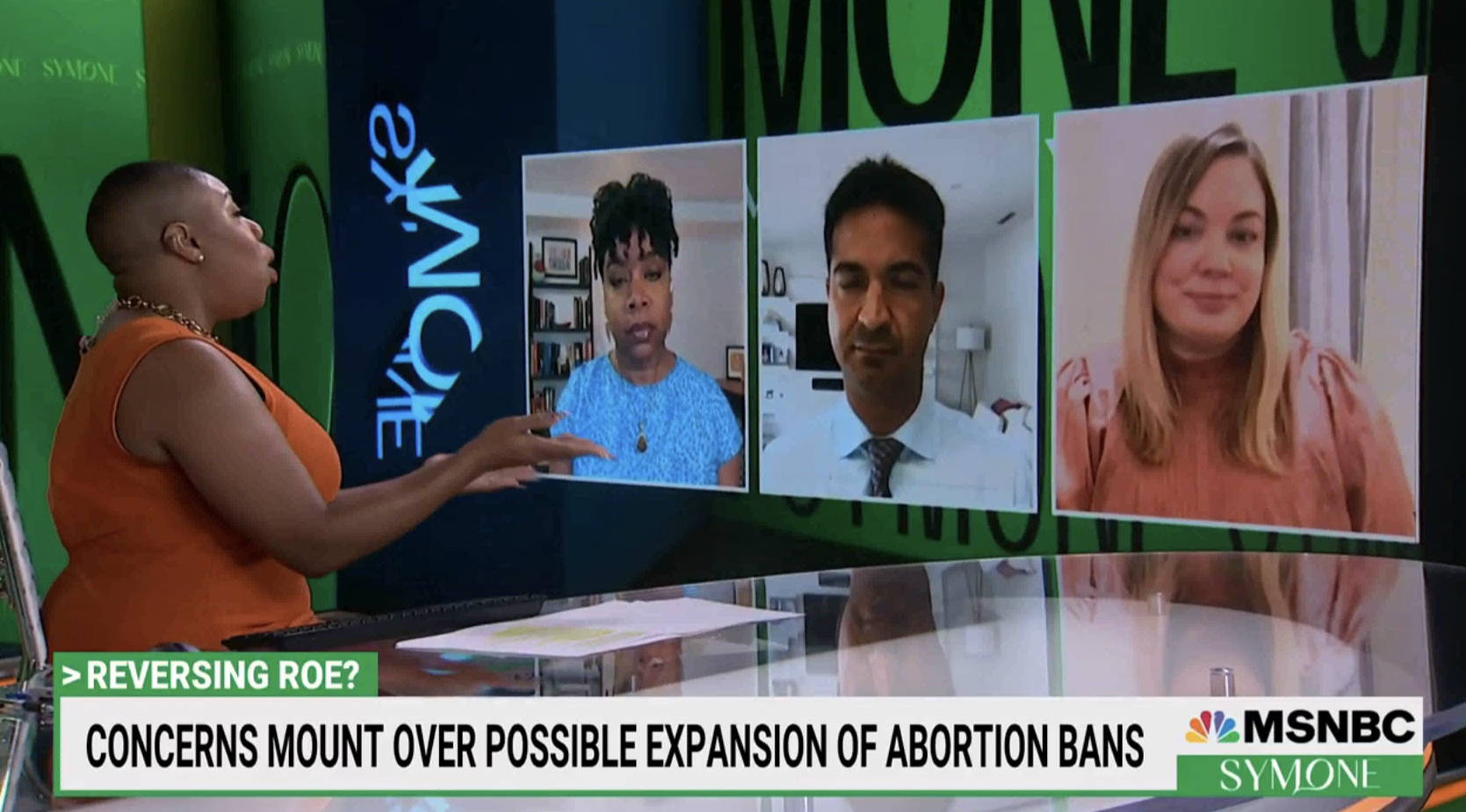
The right side of the U-shaped video wall installation in N5 could also be used to display remote interviewees’ images.
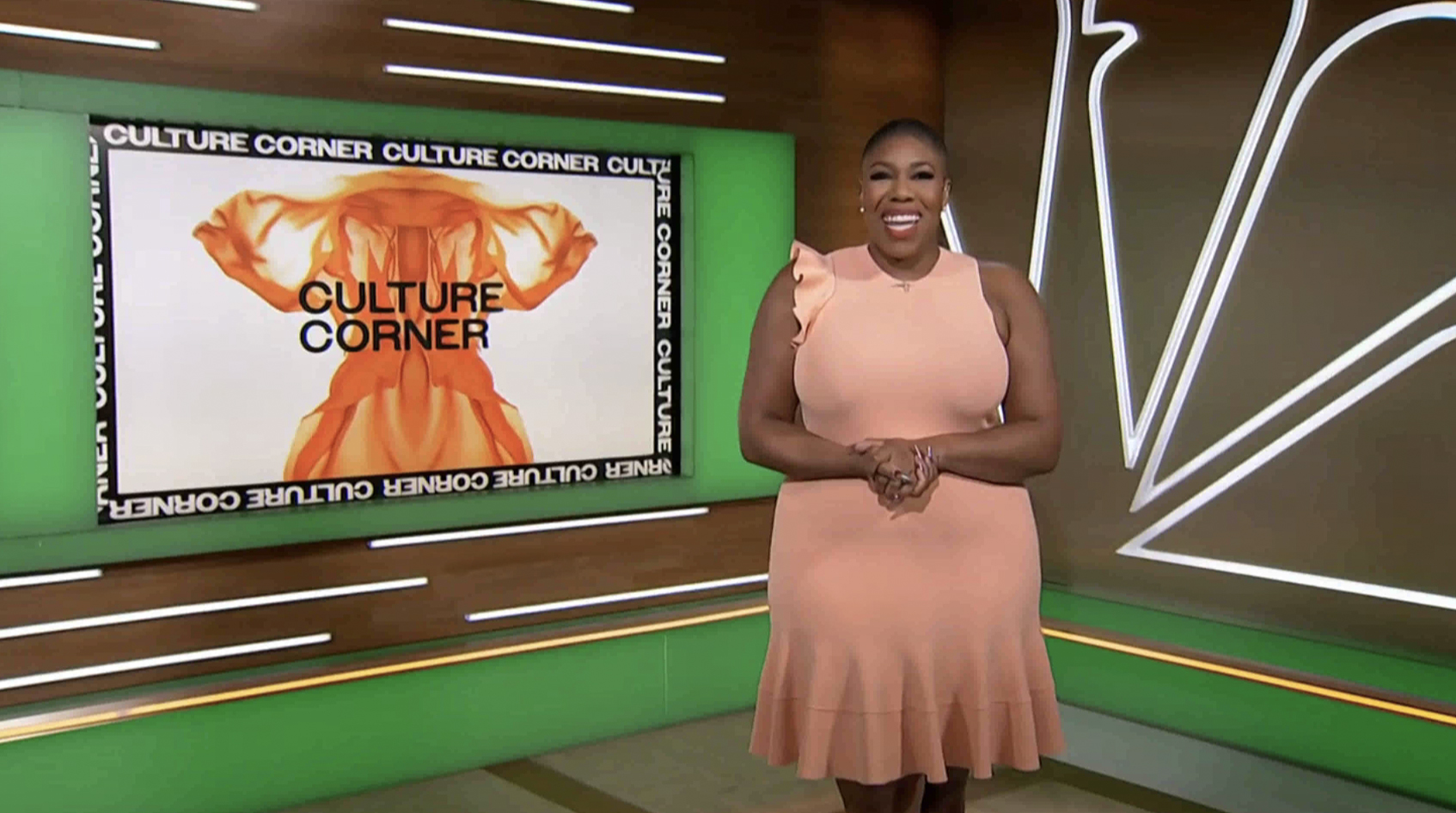
The standup corner area was also leveraged, quite appropriately for the “Culture Corner” segment, which features its own distinct mini-open that combines an eclectic combination of typography, geometric elements and what appears to be a collection of a collection of specialty imagery of a crystal growing, billowing smoke and an unfolding, fabric-like material that ends up looking — likely not by chance — a whole lot like portions of the female anatomy (come, we all see it).
The segment also uses a rainbow square patterned animation effect, something that’s also used, in a slightly different format, for wipes in other parts of the show, including a black and white version at the top of the show.
There is also an orange one that can be used between segments.

In many ways, the motion graphics and video wall graphics for “Symone” appear to attempt to blend both the elegant, softer feel found with the logo with a more trendy brutalist style that’s been becoming the “it” thing right now.

tags
MSNBC, Studio N5, Symone
categories
Branding, Broadcast Design, Broadcast Industry News, Cable News, Graphics, Heroes