ESPN on ABC debuting new look, sound hallmarks during Little League World Series

Subscribe to NCS for the latest news, project case studies and product announcements in broadcast technology, creative design and engineering delivered to your inbox.
Disney will debut a rebranding of its ESPN on ABC programming blocks Sunday, Aug. 28, 2022, during its coverage of the Little League World Series.
The new look includes a new approach to animation that focuses on the ESPN “speed line,” a piece of the network’s logo that created an opportunity for the design team to more closely unify the ESPN and ABC brands through the dark-to-light reveal of the logos, according to ESPN.
ABC and ESPN worked with Trollbäck+Company, a longtime design partner, on the new hallmarks.
“It is elegant, epic and timeless. The sound design amplifies the energy created in the animation,” the network wrote in a blog post announcing the rebranding that was attributed to Seth Ader, vice president of brand marketing, alluding to the update to the sonic branding from Yessian that will debut.
“(Our goal was) to connect our fans to the highest profile events through not just the creative design, but also the sound that would accompany the hallmark,”
Pam Neff, senior director of creative operations, ESPN Creative Studio, was quoted as saying in the post.
The look appears to also be moving toward the more simplified approach that ABC began rolling out with its “Aperture” branding strategy in 2018. This included a redesign of the ABC globe logo with slightly refined typography, which has been incorporated into the new look.
The look appears to continue the trend of using red as a key color component, while the “speed line” element is suggestive of the fast-paced, active nature of sports.

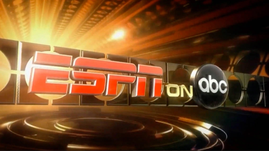
2006 hallmark still.
The ESPN on ABC name was first used back in 2006 as a way to unify the two Disney-owned properties and, like any network, has gone through numerous looks over the years.
In the past, red and gold have been dominate elements, with red being used as a primary color by both ABC and ESPN during much of the time.

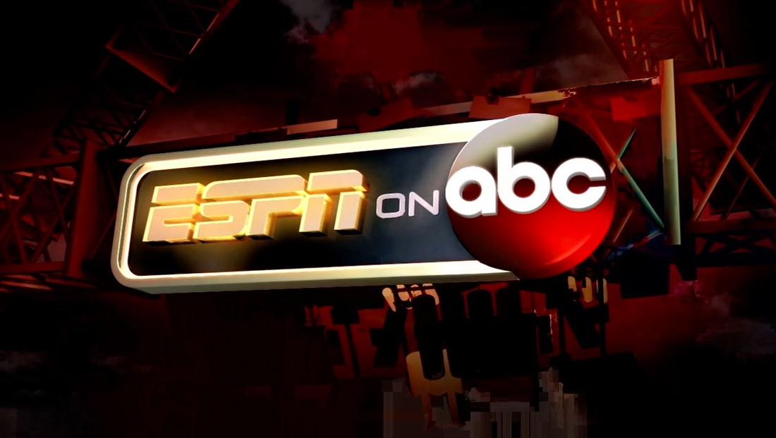
2012 hallmark still.
Past looks also relied heavily on 3D animation with glassy elements, a common trend in TV news and sports graphics at the time.
However, the industry is making a shift, like many others, toward flatter looks that often emphasize typography, logos and geometric shapes. 3D elements have not been eliminated entirely in most cases, but are often more subtle and refined or used for key parts of the look.
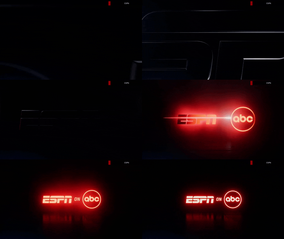
Key art of the new hallmark released Aug. 26, 2022, for example, shows a single color for the entire co-branded logo lockup with a glowing red effect added and a subtle reflection on an imaginary black surface below.
The word “on” is now set in more condensed typeface with letterforms and an angle that appears to tie into the ESPN logo.
“ABC has become a centerpiece for some of the biggest and most important events each year. With the strategy of consistent distribution of sports on ABC, we felt it was time to design the hallmark such that the two brands were more seamlessly integrated,” said Ader.

The new hallmark debuted as scheduled Aug. 28 and reveals the sleek rendering of the ESPN logo after zooming out from between the “P” and “N.” The speed line is rendered as a bold red laser-like line that brings color to the animation while also visually leading to the ABC globe icon on the far right.
Subscribe to NCS for the latest news, project case studies and product announcements in broadcast technology, creative design and engineering delivered to your inbox.


tags
ABC, ESPN, espn on abc, Trollbäck+Company, yessian
categories
Branding, Broadcast Design, Heroes, Sports Broadcasting & Production, TV Sports Theme Music