Weekly insights on the technology, production and business decisions shaping media and broadcast. No paywall. Independent coverage. Unsubscribe anytime.
After nearly 17 years, TNT debuted a new set for its fan-favorite late-night “Inside the NBA” broadcast — a space that now blends a deconstructed stadium motif with the show’s signature elements.
“The set is the fifth character no one talks about but is an integral part of the show,” said Andre Durette, executive design director of the Jack Morton Worldwide broadcast team. “It’s understated but delivers on function. It’s a subtle nod to the other personalities that are bold and engaging, so it needs to linger in the background. It should not be the center of attention yet be striking enough to captivate the viewer.”
Jack Morton also designed the previous set.
Home base for talent is set up in front of the “Big Board” LED video wall framed with edge-lit vertical elements and backlit printed graphics of the interior of an imaginary warehouse for “Inside” broadcasts with an alternate look available for Tuesday-evening “NBA on TNT” broadcasts set to start again in January 2023.
These graphics rely on the old-fashioned duratrans technique, but can also be integrated with augmented reality and virtual set extensions that make the space look even larger than is suggested by the printed backgrounds alone.
When redesigning the space, the network worked closely with Jack Morton to ensure it kept familiar elements of “Inside,” including Kenny Smith’s steps in front of the Big Board and booth for Underdog, the show’s nickname for senior researcher Joe Underhill, noted TNT director Steve Fiorello.
The Underdog booth is now open, facilitating easier banter between Underhill and the rest of the show’s hosts, while doing double duty as a workstation for the show’s in-studio lighting team.
The booth is fronted with a frosted glass panel with a white “NBA on TNT” logo. The spiral staircase has been replaced with a straight flight of practical steps with landings added to allow it to be used for guest entrances or other segments.
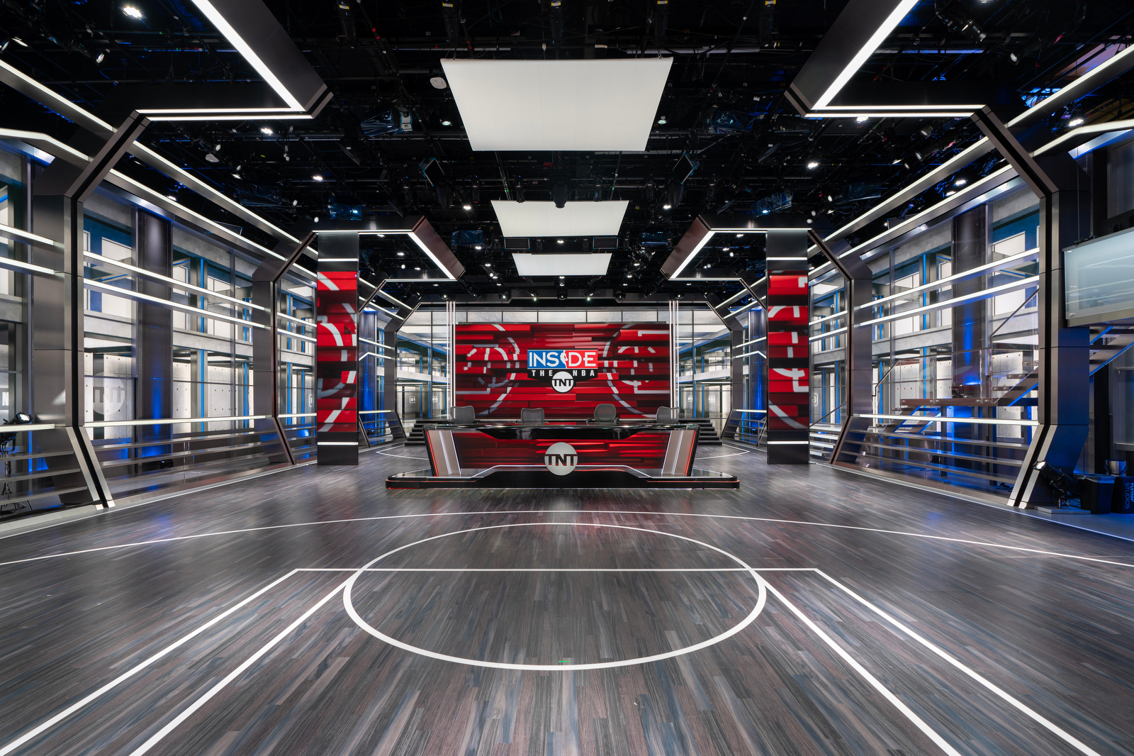
Studio J, home of “Inside the NBA” on TNT along with TNT’s NBA wraparound programming.
Structurally, the new set carries through some of the old space’s horizontal design elements, including both edge-lit and internally lit bars, but sheds the prominent, sweeping shell and arches that were a highly visible part of the show’s previous look.
The set does maintain some of the wraparound feel that element gave the space, but with a more abstract notion created using vertical columns accented with diagonal segments inspired by stadium support structures.
This arch motif is created using a solid metallic finish that transitions to internally-lit segments mounted horizontally to the floor and grid. Instead of spanning the entire beam of the studio, however, the suggestion of an enclosed, arch-like feel is completed with backlit squares installed near the grid down the center of the set.
For a show with a die-hard fan base, the new interpretation of the arches was a risk from a creative standpoint. Ultimately, however, eliminating the arches ends up creating a more open feel. Impressive as the archways were, especially when viewed straight-on, they also, by definition, created a more enclosed space.
Meanwhile, the rest of the space has been updated with more on-trend design elements. Instead of a traditionally-toned wood floor, Durette’s team opted for a gray-hued finish, which creates a more contemporary look.
There are also basketball court markings on both sides of the studio, done in a bold off-white for eye-catching contrast.
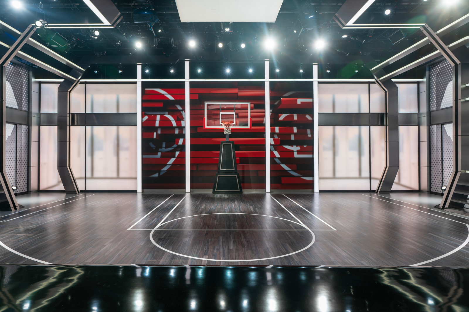
Opposite home base is the new demo area that features an updated movable hoop flanked by backlit wall graphics suggesting a distant team locker room (with the option to swap out that look) and perforated metallic panels. Behind the hoop is a three-segment video wall that spans 26 by 17 feet, with each segment defined by internally lit columns.
Wrapping around most of the studio is an arrangement of metallic bars topped off with an internally lit segment. This appears to be a nod to both the railings found throughout stadiums as well as the typically solid half-walls that ring most pro basketball courts.
These are tilted outward to follow the diagonal elements of the vertical column structures, a design choice that reinforces the suggestion of an archway while also serving as a strong foundation for the rest of the scenery. They also provide a way to neatly tuck the staircase in along one side of the space, allowing it to blend into the background when it’s not being used while still allowing the last run of steps, which are internally lit, to flow over the railing for direct access to the studio floor.
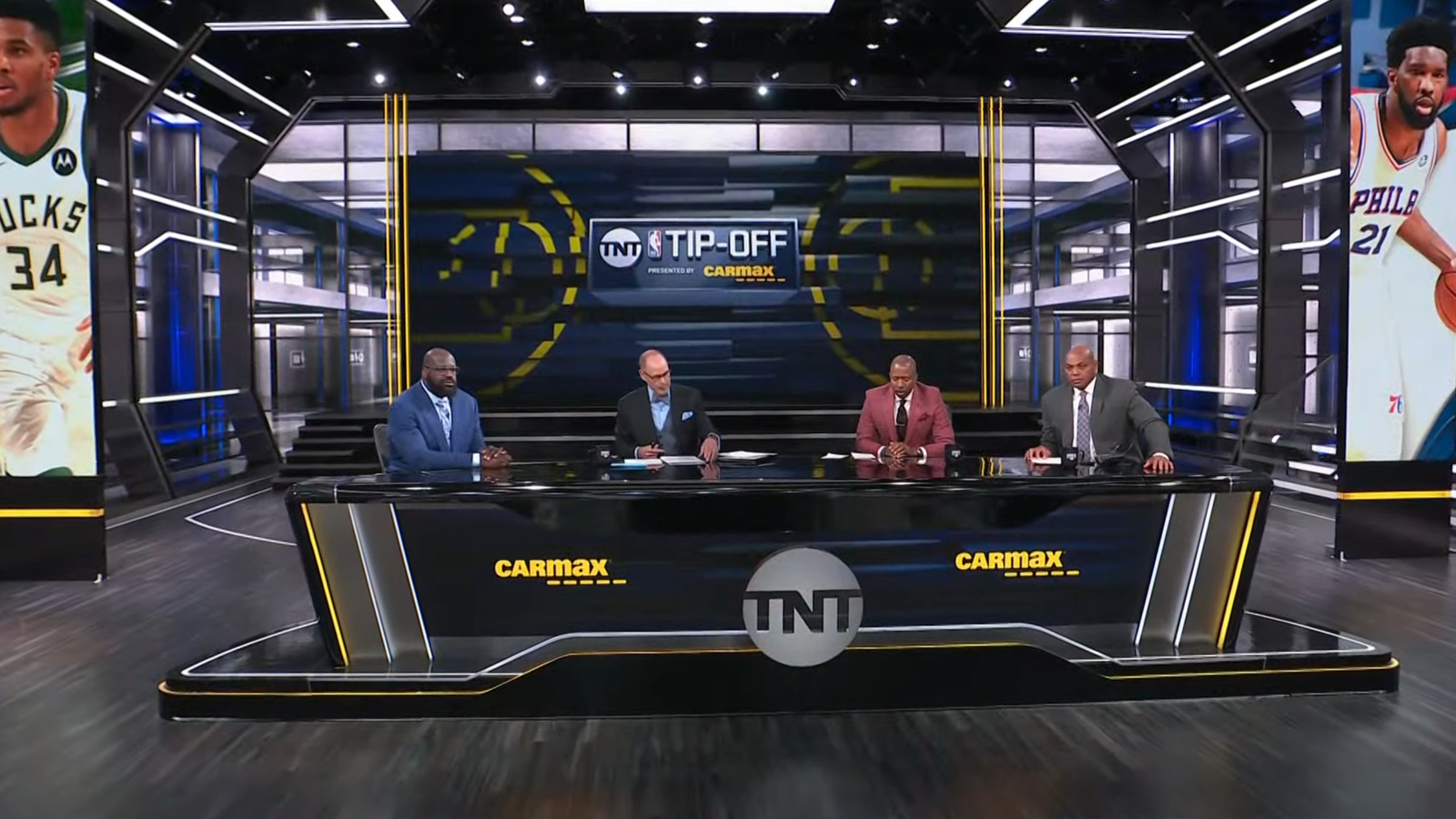
Flanking the space are six tracking LED columns replicating some of the strong vertical elements on the old set while visually emphasizing the vertical axis of the set. These elements can slide behind the scenic vertical columns, allowing flexibility to create unique looks.
The desk itself is a departure from the wavy look of the old one, with two diagonal fin elements on either end, tilted inward and outfitted with integrated lighting that draws the eye cleanly downward, much like a basketball swishing through the hoop. The riser continues the lighted linear look on its sides.
On the front of the desk, a black portion of the riser flows diagonally upward briefly before flattening out, creating a look that recalls the negative space created with the vertical column elements elsewhere on the set.
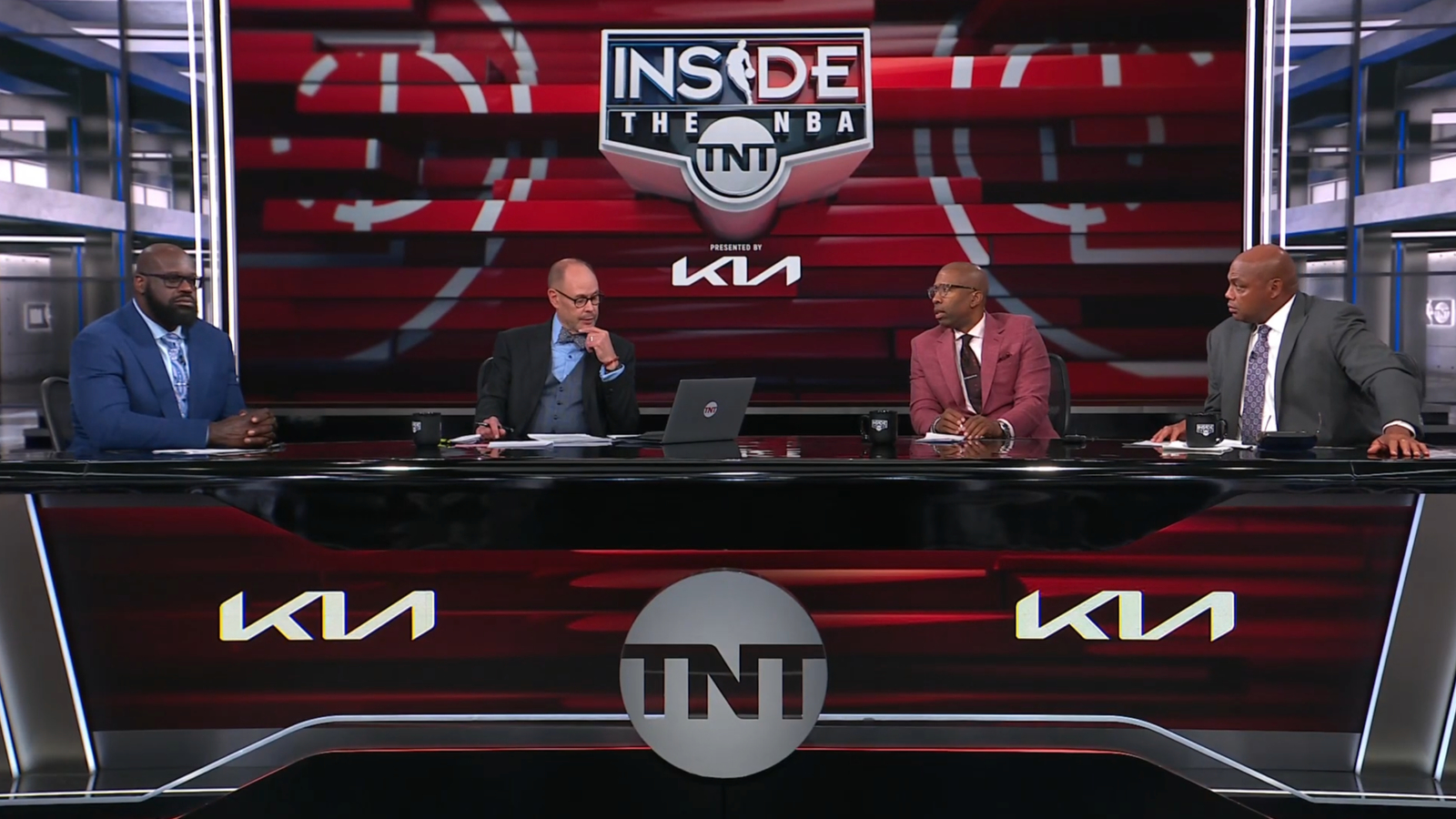
This allows a dimensional, knocked out TNT logo to sit proudly in the middle of the front of the desk, which is finished out with seamless 1.5 mm LED panels.
With an eye toward flexibility, the desk and riser are movable and feature the ability to be quickly disconnected from the wiring necessary to provide power and broadcast hookups that ultimately loop back to one of the studio’s walls.
In keeping with the set’s bolder, more metallic and gray elements, the default configuration relies on the video walls to add color to the space, with bold red graphics carrying on the old set’s red floor markings, anchor desk riser and horizontal bars.
The red, white and blue color scheme, which matches both the NBA and traditional American flag palette, is carried through from the old set, though with some changes to how colors are used and how much space they occupy visually.
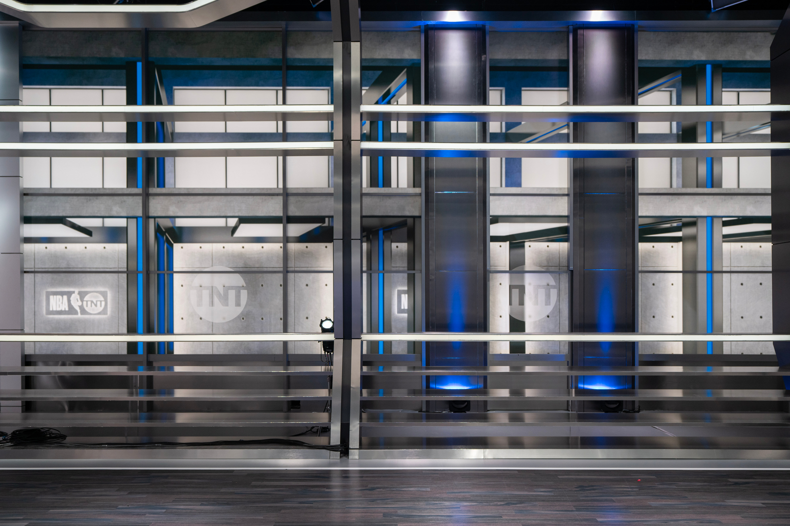
Blue is added to the set through the printed warehouse backgrounds as well as physical accent lighting, while white appears mainly in internally lit elements, as well as being hinted at in the lighter parts of the printed wall graphics. Red is largely brought into the space with video wall graphics, though some of the studio’s backlit elements are color-changing and can be shifted red if needed.
By changing how color is used, the design has transformed the set from a blue-tinted cityscape to a bolder, high-contrast look.
Photos courtesy of Raeford Dwyer / Jack Morton.
Project Credits
Warner Bros. Discovery Sports
Craig Barry – EVP/Chief Content Officer
Steve Fiorello – VP, Coordinating Director
Joanie Barry – Production Manager, Studio
Quentin Johnson – Senior Technical Manager, Live Events
Kelsie Hawkins – Technical Manager
Scenic Design – Jack Morton Worldwide
Andre Durette – Production Designer/Executive Design Director
Alison Zullo – Production Designer/Art Director
Matt Jackson – Project Manager
Nick Nocera – Drafting
Chris Maroney – Senior Illustration
Raeford Dwyer – Senior Graphic Design Art Director
Fabrication – blackwalnut
Fabrication – Warner Media Studios Scenic
Lighting Design – The Lighting Design Group
AV Integration – GrantAV and PRG


