After CW moves to different station, WCIU reverts back to its roots

Weekly insights on the technology, production and business decisions shaping media and broadcast. Free to access. Independent coverage. Unsubscribe anytime.
Back in September 2024, Chicago’s WCIU dropped its CW affiliation and returned to its longtime “The U” branding as an indy.
WCIU was a CW affiliate from 2019 to Aug. 30, 2024. Nexstar Media Group, which owns the CW network, announced plans earlier in the year to make WGN, its owned-station in the market, the home of the network for the second time in its history.
WCIU, which is owned by Weigel Broadcasting, then became an independent station again and returned to its recognizable “The U” branding.

During the time WCIU was known as “CW 26,” Weigel moved “The U” branding to WMEU, another station it owns in the market. That station had been known as “The U Too” until the 2019 change and has since reverted back to that branding.
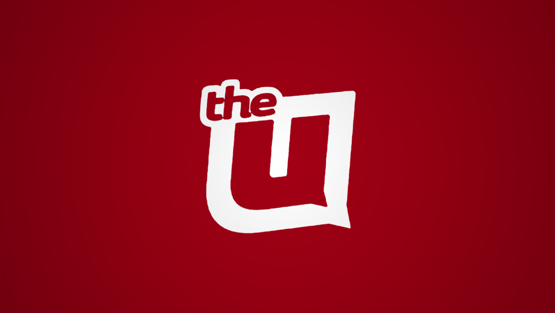
As part of all this shuffling, WCIU also rolled out an updated version of “The U” and “The U Too” logos that streamline the old look a bit and introduce a circular motif that makes its way into other on-air graphics, including IDs and promos.
2017 logo for WCIU when it was known as ‘The U.’
Back in 2017, the station opted to update the “U” glyph, which had been used as part of the station logo going back to late 1994, as a clean sans serif with a slight “tail” in the lower right.
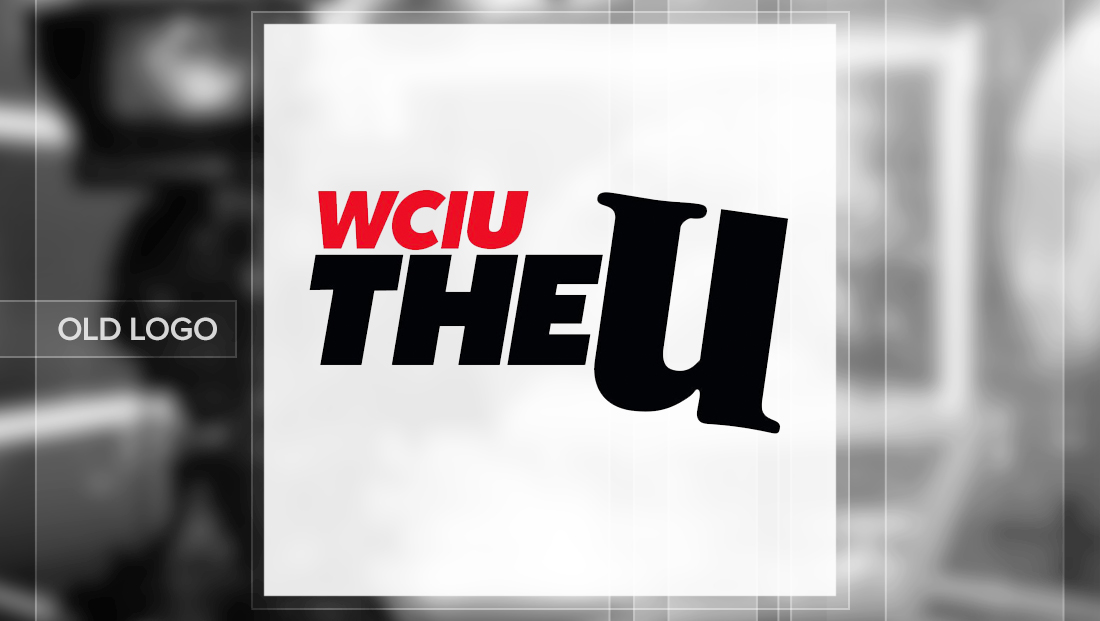
Logo from 2008 to 2017.
The overall effect was that of a speech bubble of sorts. In the original version to use the new “U,” the word “The” and “Too,” in the case of WMEU, was overlapped into the thick border around the “U” icon, with its own, narrower border.
For the 2024 redesign, however, the “U” figure has been redrawn slightly to have slightly less space between the two vertical strokes of the letter. The “The” and “Too” have been moved to a circular frame placed on the left or right side of the main logo element, respectively.

Notably, WMEU’s logo does not contain the article “The,” however.
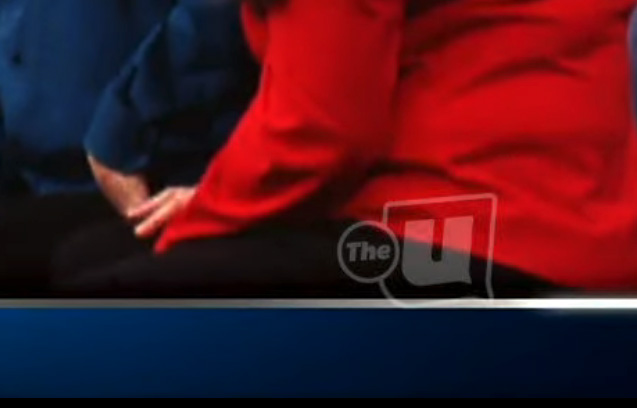
In addition to these updates, select applications of both logos now have a second border around both the “U” and the circle, a change that is carried through to the updated bug that includes semi-transparent borders, the “U” and the word “The” or “Too” with the remainder of the design completely clear.
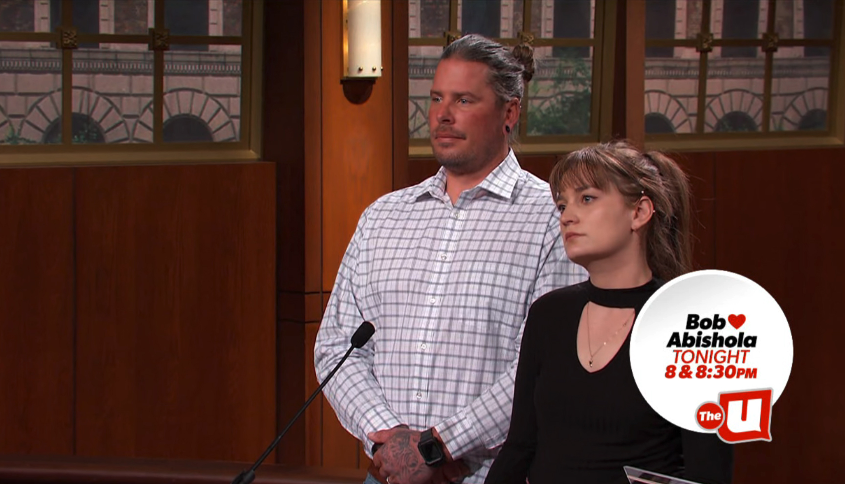

The bug’s position allows it to become part of circular, bubble-like snipes that appear during programming teasing upcoming shows.
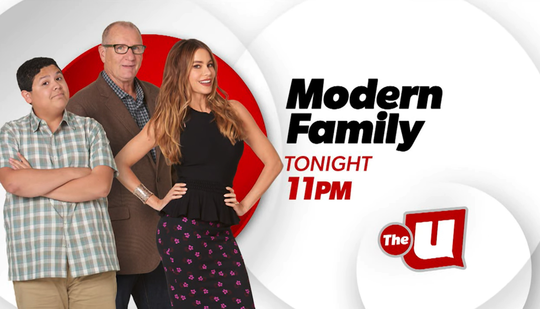
The circular motif, meanwhile, appears more prominently in many of the updated fullscreens, including as overlapping quasi-monochromatic elements in promos. For the most part, the white circles used roughly provide a placeholder location for the show title and time as well as the station logo.
A red circle, meanwhile, is typically displayed behind the promotional photography used to illustrate each show.
Typography has mostly been switched over to a bold sans serif with some fun flairs.
In addition to the updated logo, the station also promoted its return to “The U” by repurposing (and slightly modifying) its old “The U’z Got It,” tagline as “The U’z Still Got It.” There are also promos running under the banner “The U Rules” for its court-themed programming and “The U’z Got Comedies.”
The CW has a winding history in the windy city.
Originally WGN had the affiliation from 2006 to 2016, after being a WB affiliate for about a decade prior to that.
It then jumped to WPWR, the Fox-owned sister station its WFLD station in the market that now brands as Fox Chicago+. While it was a CW affiliate, the station used “CW 50” branding.
It then went to WCIU starting in 2019, where it was known as “The CW 26.”
Since taking back the CW affiliation earlier in 2023, WGN continues to focus its branding on its well-known call signs and “9” logo along with its “Chicago’s Very Own” tagline, though there are versions of the logo that combine the station logo with the “hot sauce” “CW” icon and the station also uses the branding “Chicago’s CW,” which somewhat mirrors the structure of the “very own” slogan.




tags
Chicago, The CW, wciu, weigel broadcasting, WMEU, WPWR
categories
Branding, Broadcast Business News, Broadcast Design, Broadcast Industry News, Heroes