Des Moines station marks 70th with anniversary logo

Weekly insights on the technology, production and business decisions shaping media and broadcast. Free to access. Independent coverage. Unsubscribe anytime.
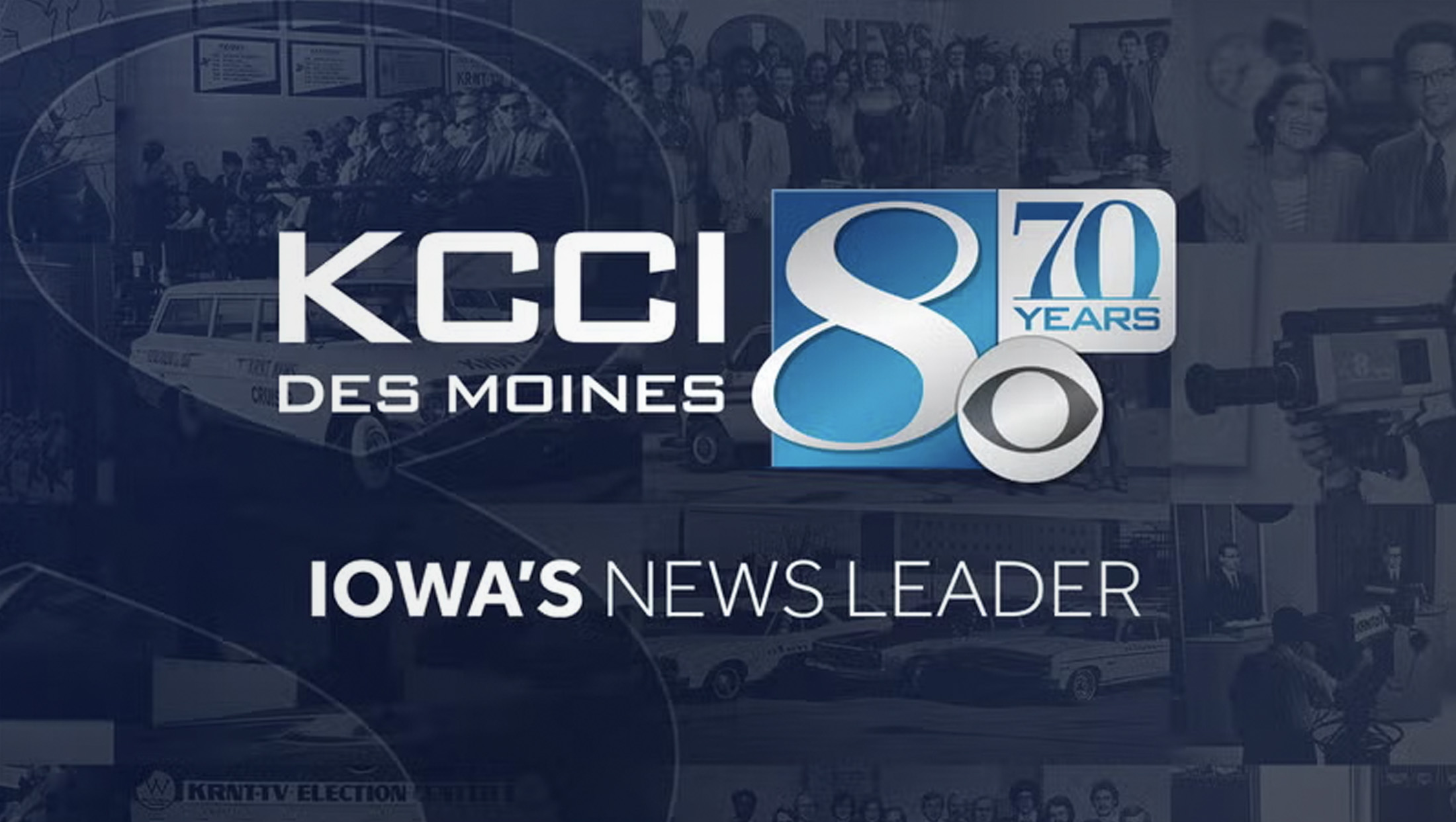
KCCI, the Hearst-owned CBS affiliate in Des Moines, Iowa, will turn 70 years old at the end of July 2025 — and the station has already been marking the occasion with a special logo and a variety of promotional activities.
The station, which was then known as KRNT, signed on July 31, 1955.
For the big 7-0, the station added an additional box to its logo, located to the right of its boxed “8” mark and just above the CBS eye.
Inside are the words “70 years” with the number set in an elegant serif sitting atop a horizontal rule that cuts off the lower portion of the numerals. The word “Years” is set in Bank Gothic, a distinctive san serif that was used heavily across the Hearst Television station group going back to its days as Hearst-Argyle (at one time, even lower third graphics appeared in the typeface).
The typeface is no longer used as extensively within the group, though it still remains in use at some stations, mainly as part of their logos.
The group’s shared graphics look has since transitioned to using Effra as a primary font, and it has also begun finding its way into logo designs. KCCI uses this font as well, including in its “Iowa’s news leader” tagline.
KCCI has used its current “8” logo since 1995, though some versions have cut off the curved of the number in the lower left that, in today’s iteration, pokes out from the blue box behind it.
This “8,” which features a broad upper-left to lower-right stroke complemented by a much thinner one used to complete the circular character, has a flowing, forward feeling to it.
The “70,” meanwhile, is shown in a much more solid, stoic font that appears to be similar to classic typefaces such as Bodoni and Didot (the latter of which had been used by CBS News for years until switching to the sans serif TT Norms) and its use of both thick and thin strokes make it a good complement to the “8.”
It also has the advantage of being distinct enough to reduce the chances of someone reading the entire series of numbers as “870.”
Meanwhile, the station has been busy with a variety of efforts to promote its birthday, including a social media campaign with the hashtag #KCCI70. Viewers are also encouraged to take selfies and share them online using that tag.


tags
Bank Gothic, Bodoni, Didot, Effra, kcci
categories
Branding, Featured, Local News