
MS NOW channels its fluttering flag icon in new motion graphics package

Weekly insights on the technology, production and business decisions shaping media and broadcast. Free to access. Independent coverage. Unsubscribe anytime.
MSNBC officially rebranded as “MS NOW” Saturday, Nov. 15, 2025, with a new graphics package that integrates with both its rolling news coverage blocks and individually-branded shows.
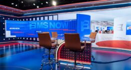
The network also relocated from NBC’s studios at 30 Rockefeller Plaza in New York City to a temporary space on West 43rd Street, which is the new HQ of Versant.

The new motion design ties into the key art graphics that NCS reported began rolling out at the beginning of November.
The new look’s animated elements draw heavily on the network’s fluttering flag-like icon, revealed Oct. 27, 2025 and designed by Loyalkaspar, including borrowing its overall shape and the two stripe segments with distinct rounded and notched corner elements.

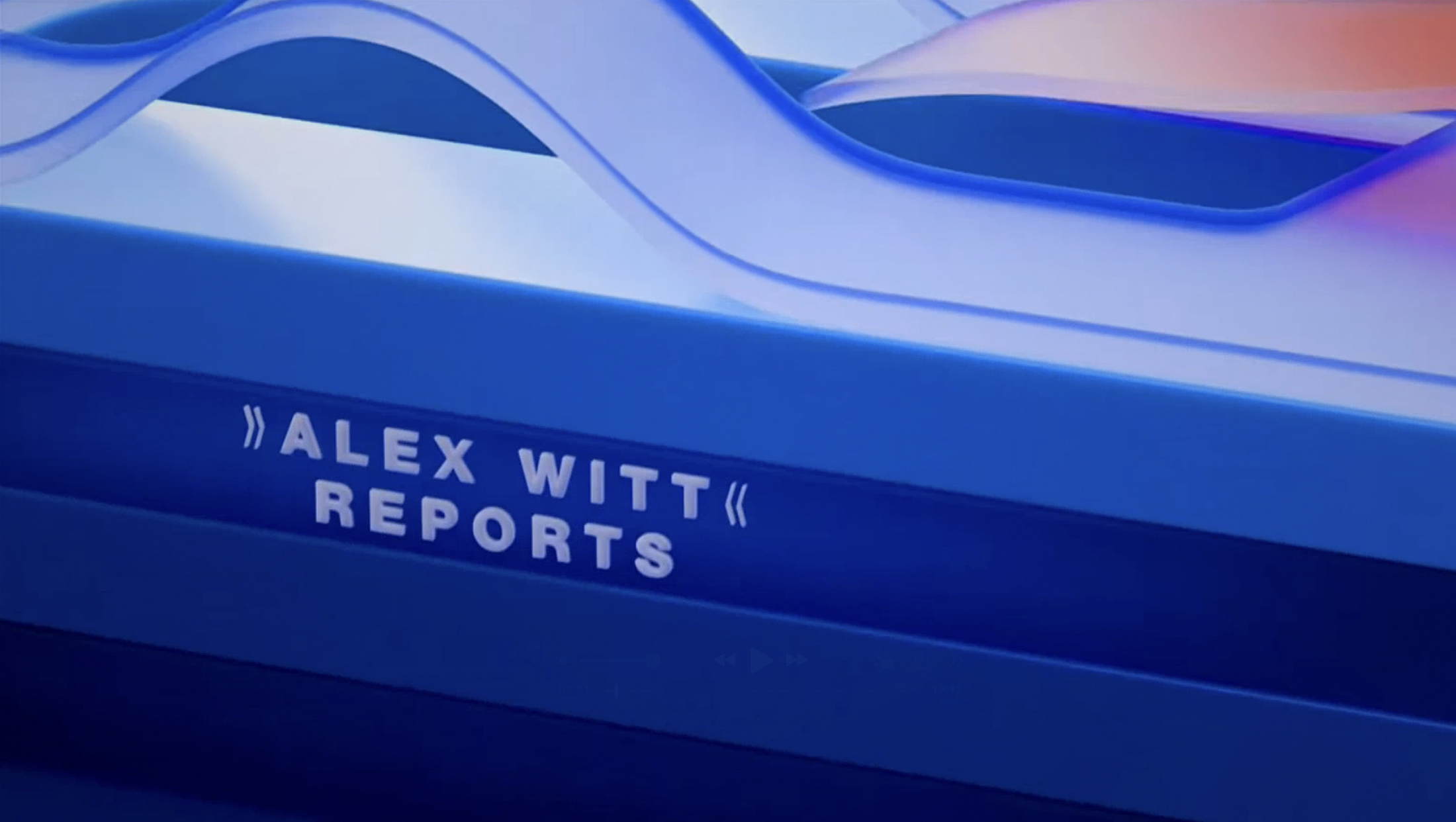
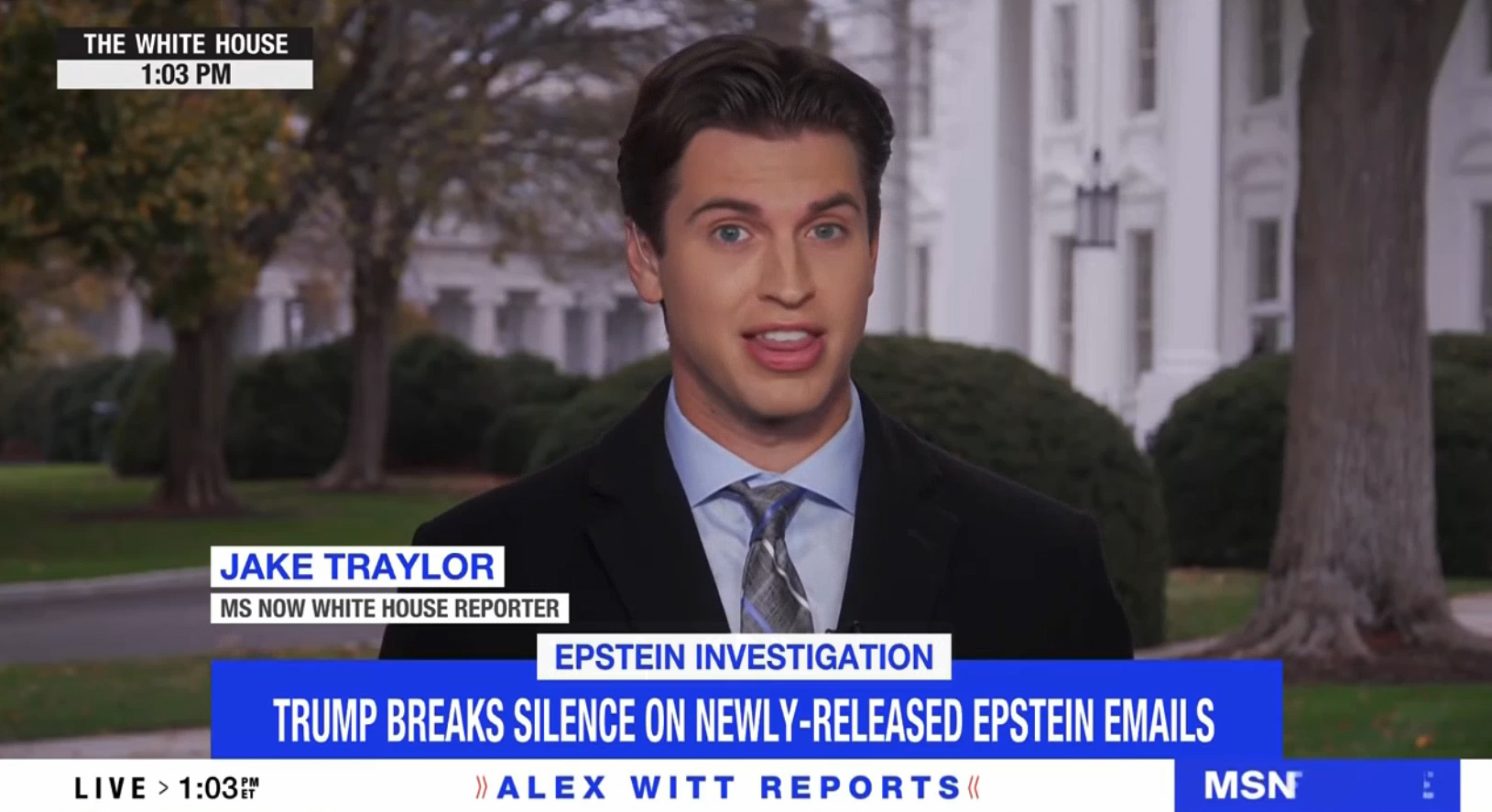
Like when the network was still known as MSNBC, much of the dayside schedule continues to be occupied by blocks of rolling news coverage that are collectively branded as “MS NOW Reports” (previously “MSNBC Reports“), with each hour taking on the format “(Anchor Name) Reports.”
These blocks use the new graphics package in its entirety, much like on MSNBC, with morning, primetime and other programming with specific titles only using select parts of the look, including the footer, bug and banner graphics.
“MS NOW Reports” opens retain the same music from the MSNBC days, but drop the blocky, isometric look in favor of a more organic, flowing feel.
These opens start with a soft 3D interpretation of the logo icon sitting in a field of blue. As a ripple runs through the muted glassy surface of the icon’s outline, the two red stripes flutter out of the viewport.

They then appear as part of a dual-layer wave-like array of stripe shapes flowing by in red and blue. Select stripes take on a sharper, glassier, clear look that can be filled with talent photos, with one of them also being used to showcase a short list of headlines.
Talent photos include a blend of on-set imagery and headshots, with the final one just before the last scene, showcasing a closer view of the anchor’s face.
These stripes exit the screen, revealing an off-axis view of the original scene, with the viewport focused on the bottom edge of the icon’s container, which is shown as a three-layer arrangement.
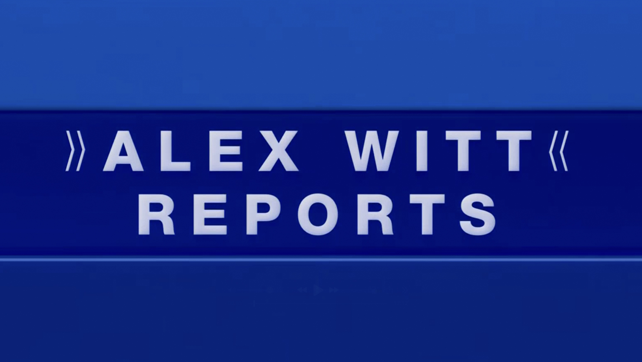
Sandwiched in the middle is the anchor’s name and “Reports” spread over two lines, with the name featuring inward-pointing double chevron accents.

This view zooms in a bit, creating a bold, simple view that remains on-screen briefly before the layers slide to the left of the screen, creating a sort of stair-style arrangement before exiting and revealing a camera feed.
Lower bar and bugs
During the majority of the broadcast day, MS NOW uses a horizontal bar running near the bottom of the screen, which is dedicated to showcasing branding and two bugs.
One, on the left, combines the “Live” indicator, when appropriate, with the current time that flips through the various U.S. time zones.
In the lower right, meanwhile, is a looping animation of the MS NOW logo designed to showcase the “My Source (for) News, Opinion (and the) World” backronym that “MS NOW” is meant to stand for.
This is accomplished by first showing the full MS NOW logo with icon, which then slides over to reveal “My Source.”
The “S” in “Source” slides left to join the “M” in “My” before pausing on “MS.” The words “News,” “Opinion,” and “World” then appear in that order next to the “MS.”

Finally, the “MS” moves over again, revealing the icon at the same time, to become “MS NOW” again.
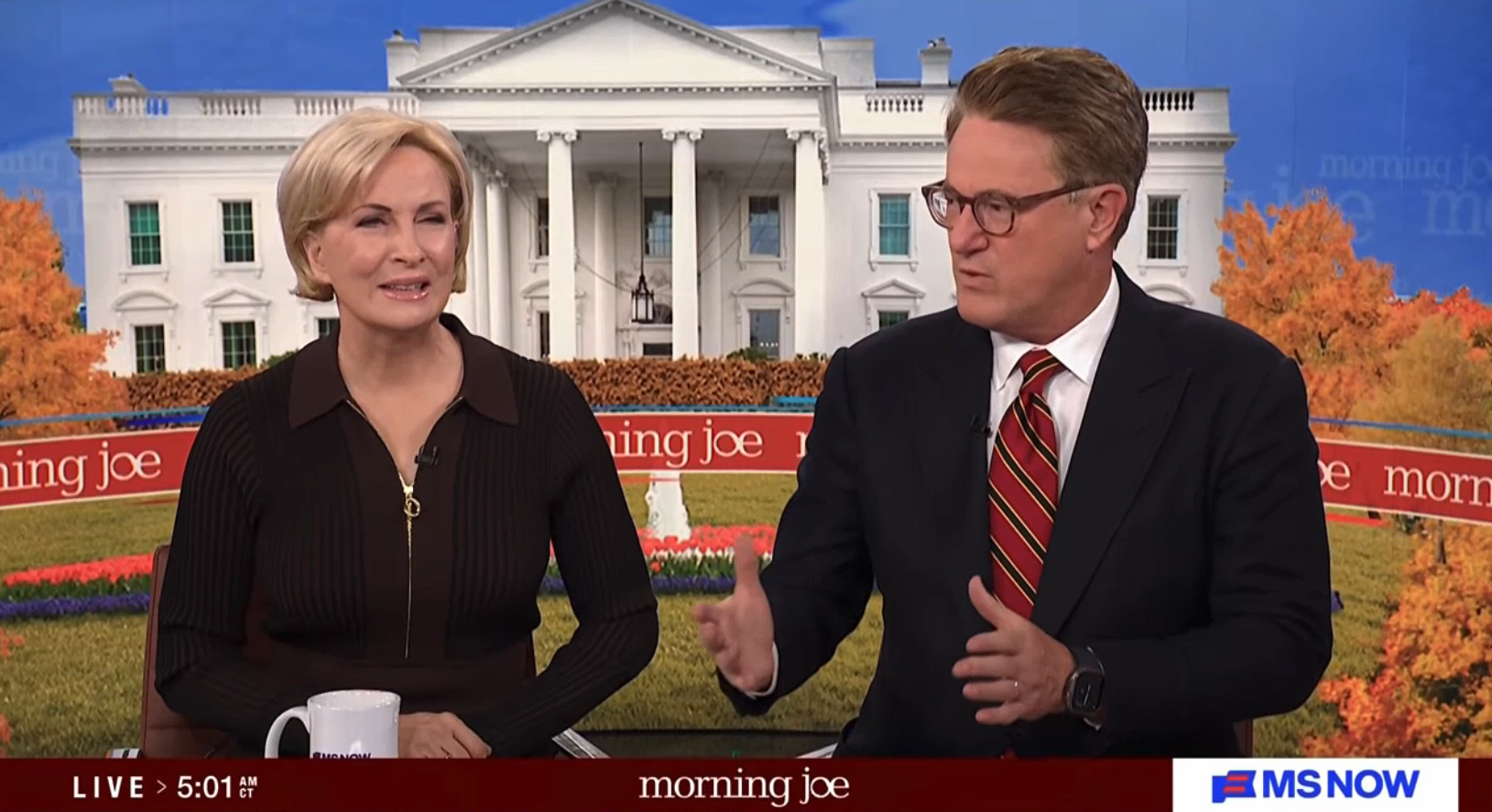
General “MS NOW Reports” hours use a white background with blue letters and red chevron accents to showcase the anchor name version of the block, while the bar can change color for other programming with standalone looks, such as “Morning Joe.”
Insert graphics
Banner graphics have been updated to, by default, occupy roughly the width of a 4:3 safe area.
Inside the main banner, which is a simple blue box, there is room for a headline, with a smaller white box with blue type centered above it that can be used for a text label or topical graphic banner.
Identifiers for both talent and VSOTs float above the main banner in a two-tier format.
Placing identifiers in a separate area has the advantage of allowing headlines, which have become a staple of cable news, to be on-screen at full size more.
Previously, MSNBC would remove the headline text when an on-screen ID L3 was needed.
There is also the option for the entire main banner to slide left to allow a promo box to the right.
It’s also easy to imagine a similar layout being used for countdowns, countups, radar loops, stock market information and other information that the network wishes to keep on-screen.
Combined, this layout occupies almost the entire 16:9 safe area. In this layout, the label or graphic banner slides to the left side of the box, creating a look that’s more in line with the old MSNBC look.
In these cases, identifiers also move farther to the left of the screen.
When headed into breaks, the network can transition to an alternate banner that focuses on a catchy headline while an oversized “MS NOW” logo appears behind it with four red line accents added in.

When returning from breaks or at the top of shows, there is also a 3D flipper-style animation available that showcases both the network and show name before revealing the headline.
Overall, the updated lower-third area continues the clean, straightforward approach that MSNBC introduced in 2021.
While certainly legible, it’s a bit interesting that the network didn’t incorporate any rounded or notched corners into its wraparound look to reinforce that shape as a symbolic element of the brand, though squared-off corners do give the package a cleaner look.
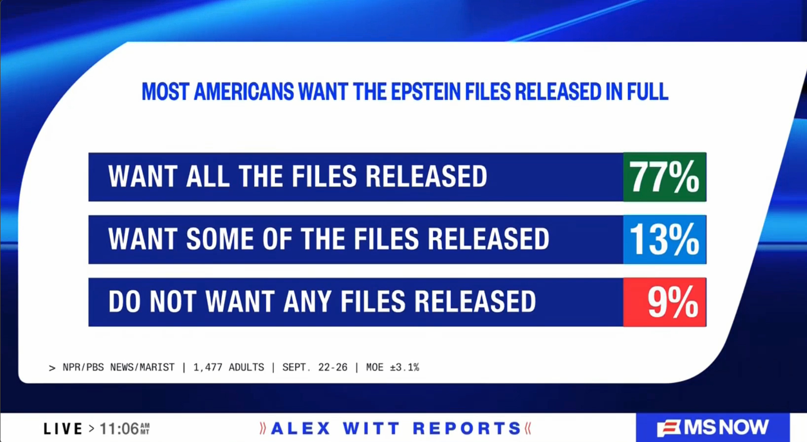

Those shapes do, however, make appearances in many of the new fullscreen layouts, including when the network needs to showcase a quote, poll results or mugs of key figures.
Many of these graphics also use a looping background showcasing the stripe motif, which also appears behind most boxed layouts.
Wipes
The updated look also includes a collection of animated wipes and transitional elements.


Designs include looks that use an array of the distinct flag stripe shape, a larger take on the shape with full logo and a horizontal bar with show branding.
Breaking news
Not surprisingly, the graphics can turn red for breaking news.
MS NOW also has a new breaking news stinger that starts with an eye-catching white and red look featuring shapes inspired by the logo before transitioning to a darker scene where the words “Breaking News” appear sandwiched between layers of 3D renditions of the network logo that collapse on each other like a deck of cards.

The stinger received an updated snippet of music, likely because the old, MSNBC version had a hint of the NBC chimes signature in it. There is still a deeper three-note sequence near the end that is less likely to be mistaken for an NBC audio element.
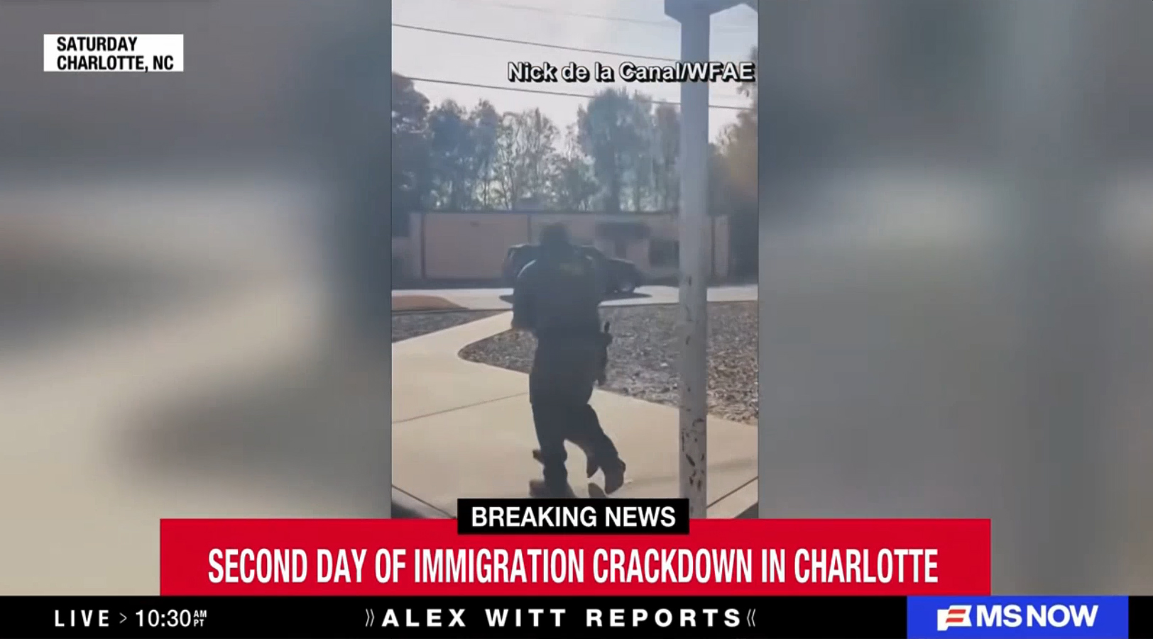
Instead of MSNBC’s breaking news palette that focused more on red and white, MS NOW’s look for these occasions opts to incorporate more black with the red. This includes changing the bar along the bottom of the screen black — though the logo bug remains on a blue background.
Identifiers also switch to a black background, with the first tier using red text and the second white.

tags
Loyalkaspar, MS NOW, MS NOW Reports, MSNBC, MSNBC Reports, Versant
categories
Broadcast Design, Cable News, Graphics, Heroes, TV News Graphics Design, TV News Graphics Package, TV News Motion Graphics Design