WBD partners with DixonBaxi, MotionBox for flexible Olympics look
Weekly insights on the technology, production and business decisions shaping media and broadcast. Free to access. Independent coverage. Unsubscribe anytime.
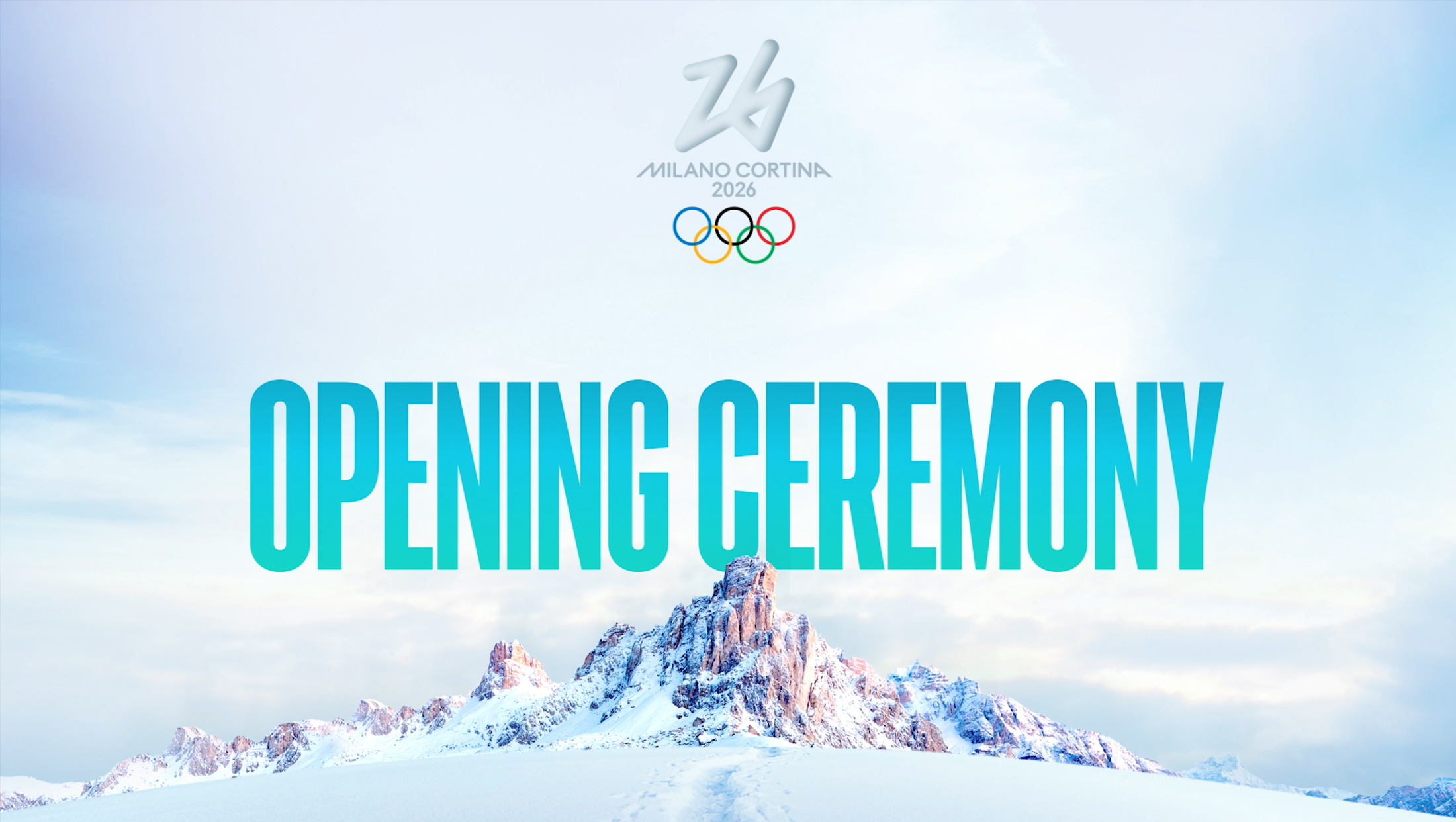
To create a visual identity for Warner Bros. Discovery Sports’ global coverage of the Olympics, the company’s creative partners drew inspiration from right out from under the athlete’s feet — literally.
The look, which is set to appear on Eurosport, TNT Sports Europe, HBO Max and Discovery+ in various markets outside the U.S. where WBD holds broadcast rights to the Olympics, finds its foundation on the three-tiered medal podium that the gold, silver and bronze finishers are honored atop after achieving Olympic glory.
Created in partnership with the WBD Sports and creative teams in Paris and London, the project included a collaboration with DixonBaxi and MotionBox Studio.

DixonBaxi described the podium as “an iconic symbol of achievement, hierarchy and human aspiration” and said it used the concept of three boxes — each at a different level — as a device to animate, navigate, reveal and highlight information in a seamless fashion.

The look is intended to be used through 2032 when the Olympics are held in Brisbane, Australia, so it needed to be flexible enough to work across both summer and winter sports. It also needed to be usable in multiple markets.
Overall, the system appears to rely mostly on the color palette and imagery to connect with each Olympics.
This could include adding in geographic, architectural and cultural imagery from certain parts of the world alongside sports-specific selections. Meanwhile, typography, including oversized applications, is also used as a key visual.
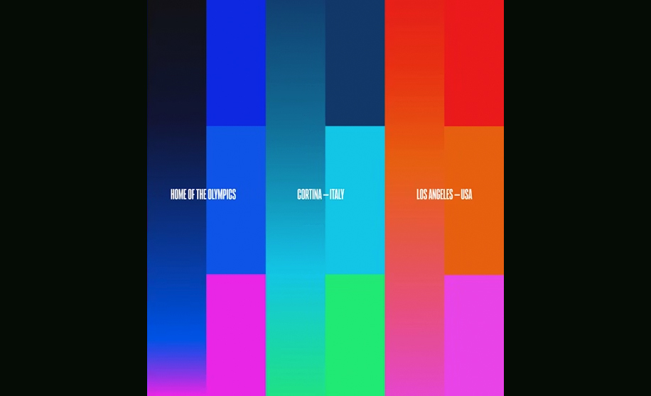

Based on initial imagery released by DixonBaxi, shades in the deep blue to magenta range serve as a sort of connecting palette for the “Home of the Olympics,” the overarching brand used across the WBD properties around the world. Blues and greens have been designated for use during the 2026 Winter Olympics, while reds, oranges and magenta are tied to the upcoming 2028 Summer Olympics.
It’s not clear if WBD will develop unique color palettes for each year or alternate between the two families, which are largely sorted into “cool” colors for winter and “warm” shades for summer.

The design draws on the ultra-clean look that European broadcasting is known for, including using a condensed sans-serif font to maximize on-screen real estate, making it easy to see how it might be used on-air.

Throughout the system, the three tiers of the medal podiums are shown in a variety of formats, including the front-on view that emphasizes the three heights. However, the boxes representing the podium are used extended and used in a ribbon-like fashion to form a variety of takes on the concept of an animated ring (perhaps a nod to the Olympic movement’s iconic logo).

Ring elements can wrap around topical or regional imagery, appear in concentric arrangements from a variety of angles or, when the entire perspective is shifted to a side view, appear on the broad surfaces of the wide elements. Often accompanied with a flip-like animation, the motion, which feels a bit like a roll of paper unraveled from the bottom of the viewport, is used to reveal and showcase a variety of information, ranging from event pictograms to on-screen stats.
Final deliverables included a suite of logos, a flexible color palette, customizable arcs, typography, a rule of three, flexible texture and imagery treatment, a motion system and a collection of custom-drawn animated pictograms.

tags
2026 Winter Olympics, 2028 Summer Olympics, Discovery Plus, DixonBaxi, eurosport, HBO Max, MotionBox Studio, TNT Sports Europe, WBD Sports
categories
Branding, Graphics, Heroes, Olympics