

X Games builds broadcast design on regional culture, unique influences
Weekly insights on the technology, production and business decisions shaping media and broadcast. Free to access. Independent coverage. Unsubscribe anytime.
A New York skatepark segment on X Games broadcasts now opens with the same visual language as a 1990s hip-hop record cover. A Los Angeles segment leans on liquid ink and tattoo art. Neither looks anything like a standard sports bug or lower third, and that was the point.
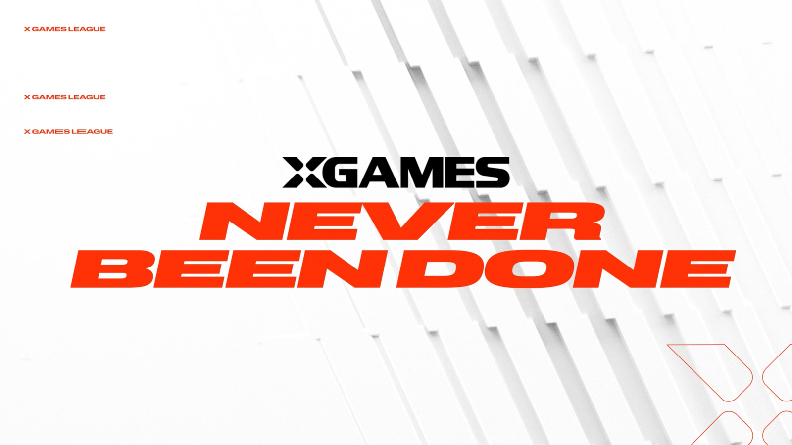
X Games has spent three decades building its identity around standalone, single-athlete events. This year, that changed. X Games League launched in summer 2026 as the organization’s first year-round, team-based competition format, with four location-based clubs drafting athletes to compete across summer and winter seasons. X Games remains distributed on ESPN but is no longer owned by the network and now produces its own broadcasts.
Rebuilding the on-air look to match fell to Gameday Creative, who has worked on design for previous X Games events.
Eric Say, the studio’s owner and creative director, and Scott Flato, its executive vice president and partner, walked through how the new package came together, and why they built it to look nothing like a typical sports broadcast.
A league replaces one-off events
The X Games League adds club structure, a draft and season-long competition to a brand that had previously been built around tentpole events tied to individual athletes.
“They’re trying to lean into the culture around X Games and the globalization, so these clubs are in different parts of the world, but they want to develop fandom behind it, and they want people to be more attached to the athletes and to these clubs,” Say said.
X Games still runs some standalone events outside the league structure, according to Say, but the league is intended to become the core of the brand going forward.

Say compared the shift to how team branding reshaped the way fans relate to individual stars in traditional sports.
“It’s a little trickier now, but Michael Jordan, you associate with the Bulls,” Say said. “People are fans of the Bulls and of Michael Jordan because he’s a standout athlete, but there’s franchise thinking behind him, too.”
Say and Flato both pointed to skateboarding’s crossover moment in the late 1990s and early 2000s, when games like Tony Hawk’s Pro Skater and a wave of skate-influenced fashion pushed the sport into the mainstream, as a touchstone for what X Games is trying to rebuild.
“I think there was this sort of heyday,” Say said. “Everyone was wearing the skate clothes.”
Gameday Creative avoided the visual conventions of sports motion graphics on purpose, pulling references instead from fashion, architecture, music and regional culture.
“One of the really cool things about this broadcast package, and something we really wanted to pull into it, was to get visual references that are not from the vernacular of sports broadcast,” Say said. “That’s fashion, that’s architecture, that’s music, that’s urban culture and regional culture.”
Four clubs, four distinct looks
X Games League built four clubs around specific cities rather than sports or divisions, and more than 150 athletes declared for the league’s inaugural summer draft. Gameday Creative gave each club a visual identity pulled from that city’s culture instead of a conventional sports logo.
“They don’t look like sports team logos,” Say said. “They don’t follow that same formula of kind of the vector art eagle or whatever.”
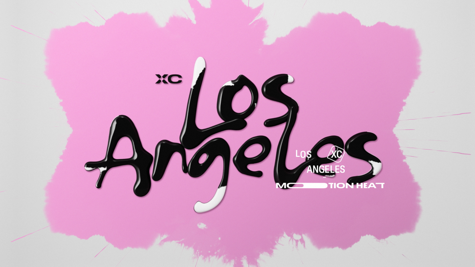
The New York club’s identity draws on 1990s hip-hop culture. The Los Angeles club’s draws on tattoo art and streetwear. The league’s other two summer clubs, São Paulo and Tokyo, follow the same approach, with graphics rooted in each city’s own visual culture rather than a shared template.
Say said the goal was for each club’s graphics to feel unmistakably tied to its city the moment they appear on screen.
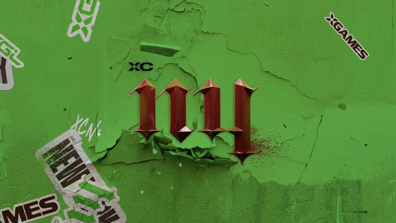
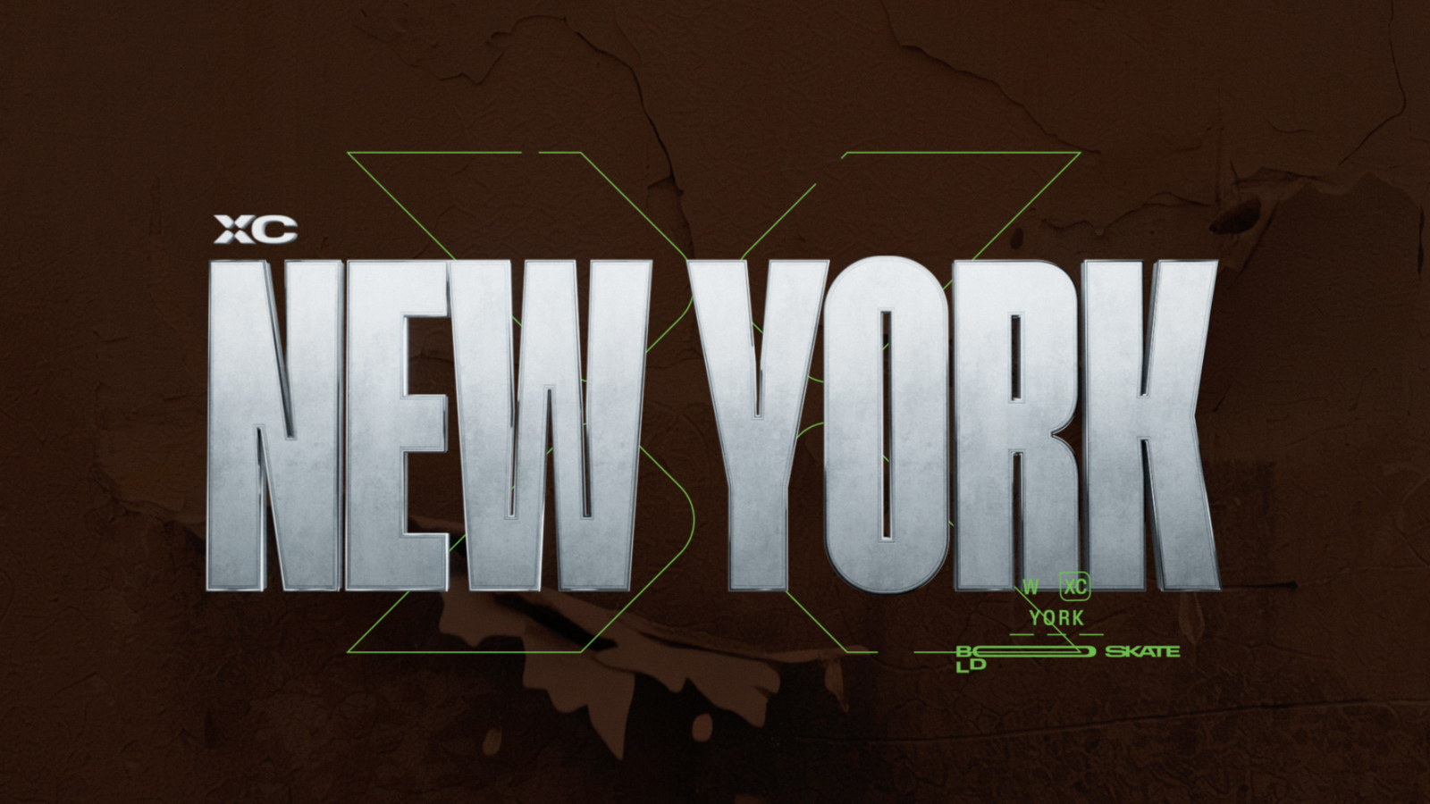
“When a New York interstitial fires, it is unapologetically the New York one,” Say said. “It’s their colors, it’s their tone and it’s their attitude.”
The agency Weekend Hours built the brand decks for each club and event, which Gameday Creative then translated into broadcast graphics. To keep four distinct identities from feeling like four unrelated packages, Gameday Creative built what Say called a unified motion logic: the visuals change from club to club, but the way elements move on screen stays consistent throughout the package.
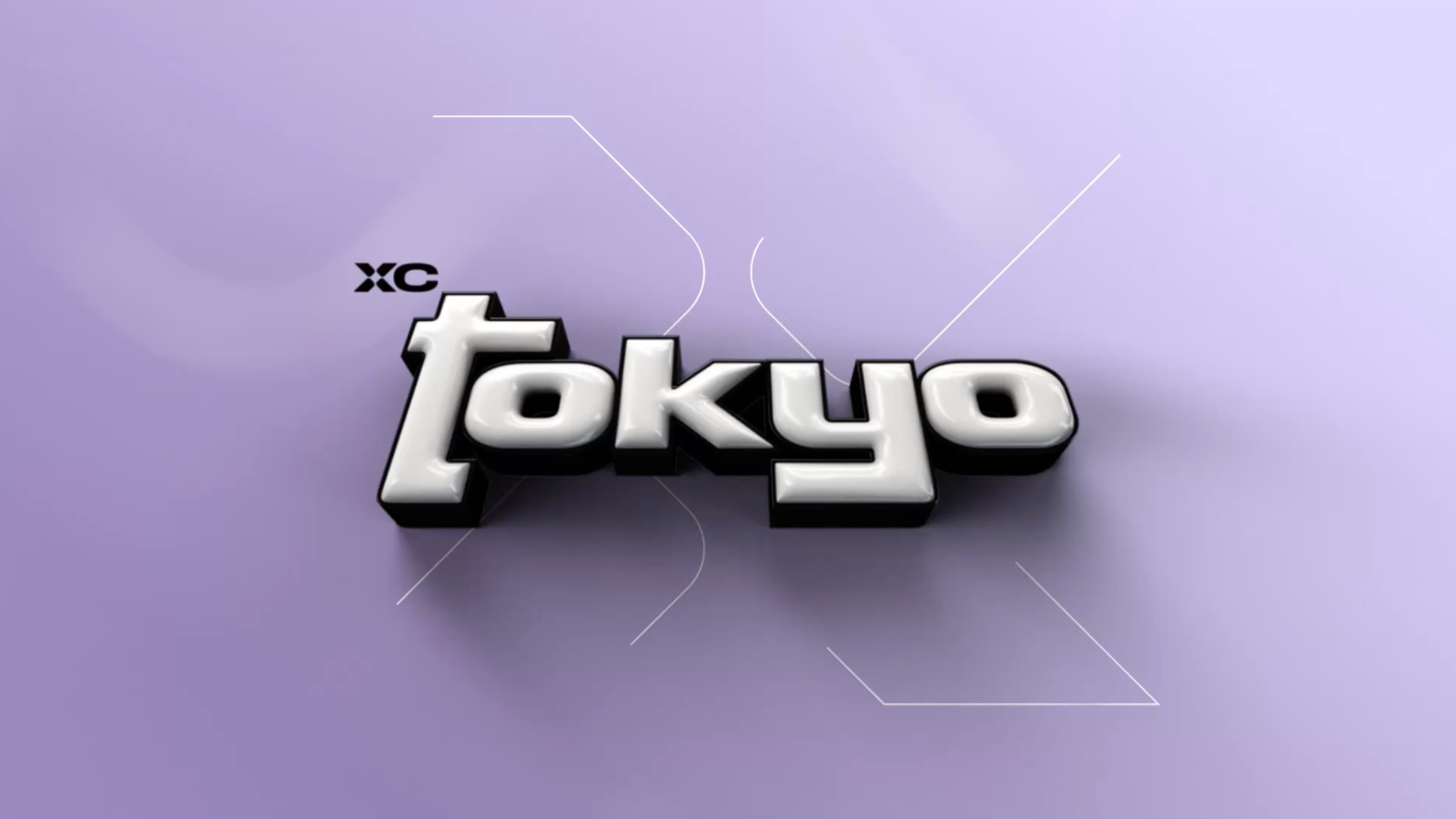

Sport added another layer on top of club identity.
Say pointed to motocross, paired with the Los Angeles club’s ink-inspired look, as an example of how a club’s visual identity and a sport’s own texture combine on screen.
“Motocross and a dirt bike just is inherently different than a skateboard,” Say said. “It has a little more aggressive personality and a little more texture.”

Creating the intersection
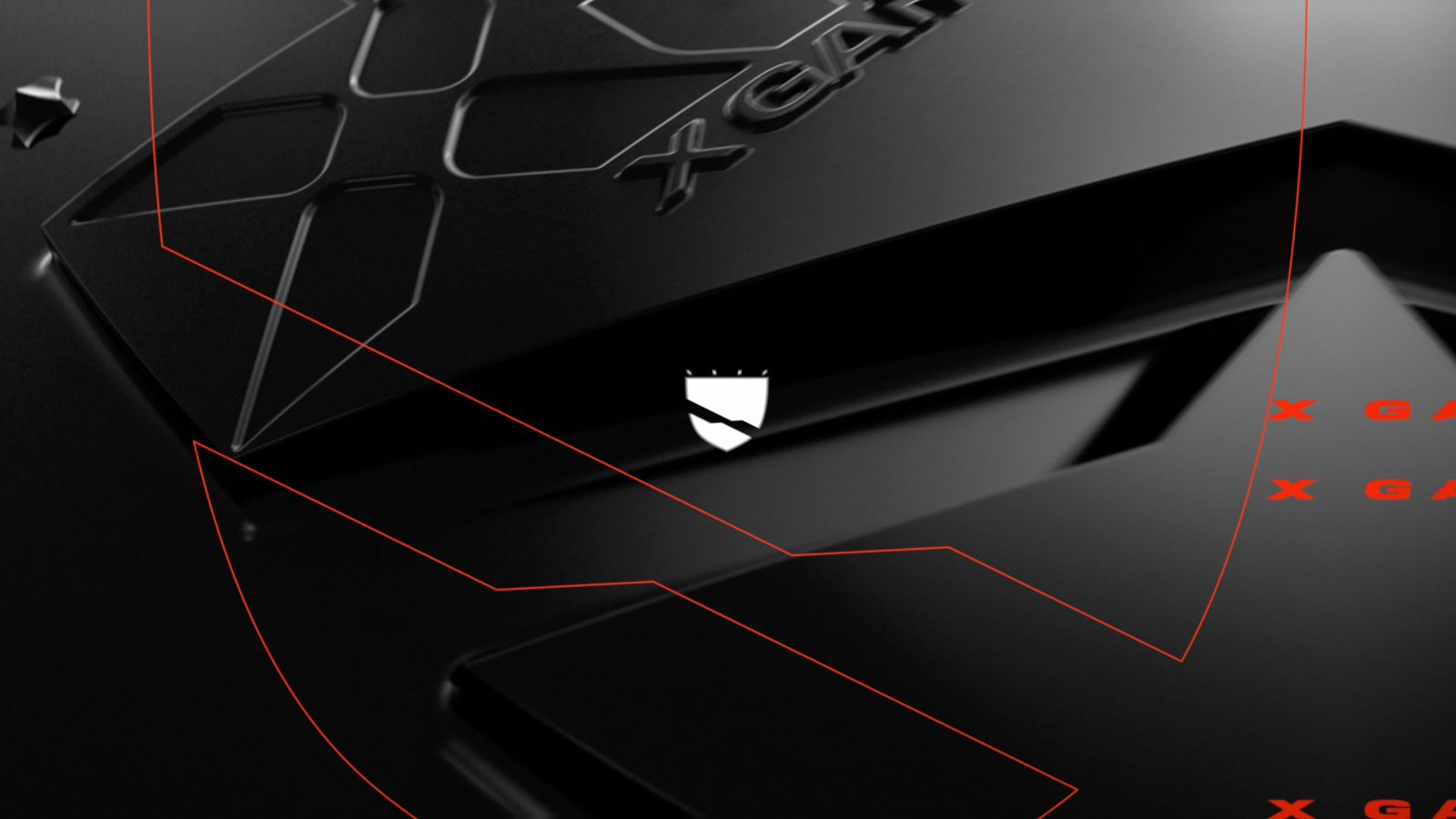
Every graphic in the package hides a second layer. Trigger it, and the frame cuts away into an X-ray view of the club or region behind it. Gameday Creative calls the package Intersection, and that cutaway moment is its signature move.
“The core of what we call this graphics package is Intersection, where there are these moments, or these vehicles, inside the graphic that is essentially like an X-ray lens or a cut-through lens,” Say said. “It shows you what’s behind that, whether it’s the team’s personality or the region’s textures and images.”
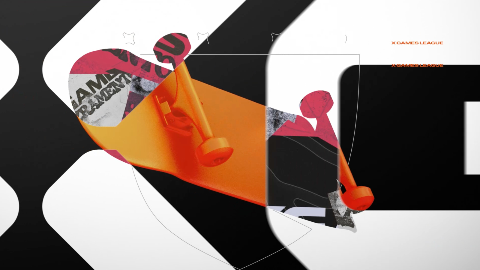
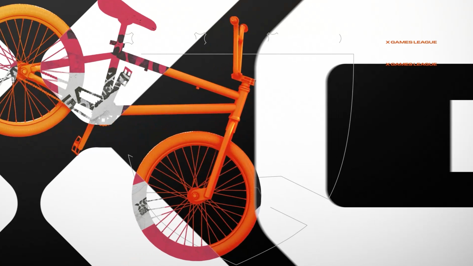
The same concept extends to individual sports within the league. Say said the studio also built intersections between a club’s identity and a given sport, citing the combination of Los Angeles’ tattoo-inspired look with motocross as an example.
“What is the intersection between LA and motocross?” Say said. “Those create these graphic personalities when they intersect.”
According to Say, those intersection elements are built in advance and can be swapped out as new events or club personalities are introduced.
The package uses color to distinguish between clubs, individual events and the league as a whole. Club colors are fixed, while each event carries its own palette and the league itself uses a neutral palette with an orange accent.
“Club colors are locked, but the formula stays the same,” Say said. “Each event has its own color palette, and the league has a neutral color palette as well.”
Flato said the intent is for color to function as a visual cue for viewers switching between events.
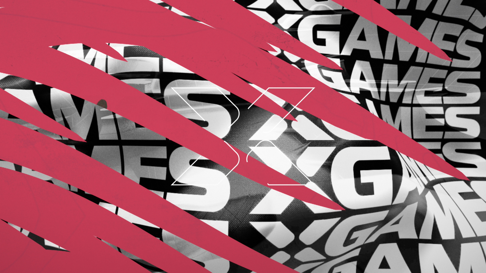
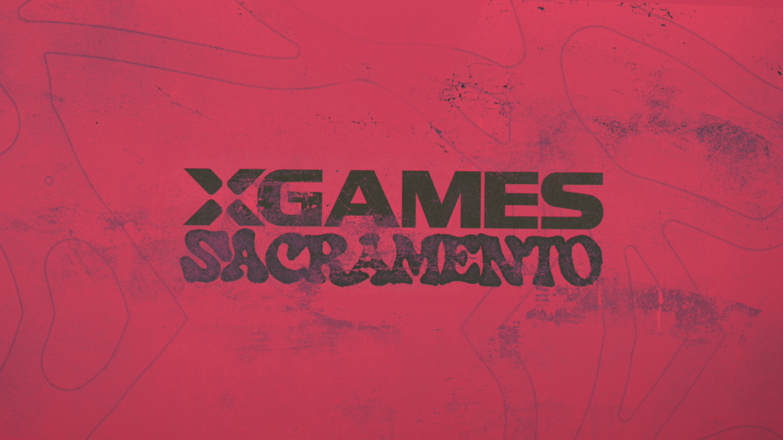
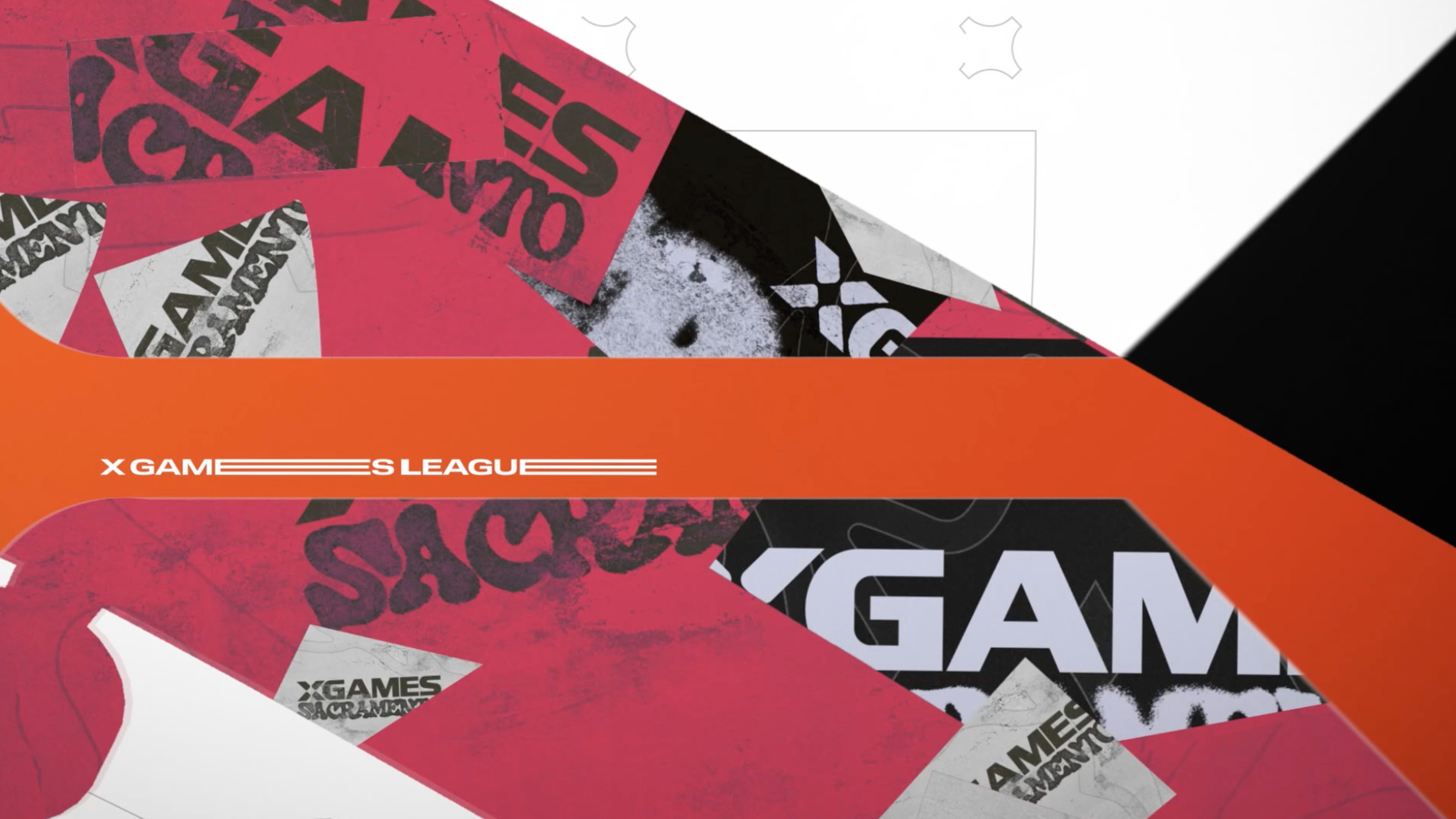
“As viewers turn on the summer event, it’s going to have the red summer palette,” Flato said. “When they turn on the winter event, it’s going to have the blue winter palette.”
Because each club and event pulls from a different visual reference, Gameday Creative used different production techniques for different segments rather than a single workflow across the package.
“Some of these lend themselves to high-end 3D production or fluid simulation,” Say said, citing the ink-inspired look built for the Los Angeles club as an example that required liquid simulation work. Other segments, he said, used a flat illustrator style modeled on stickers rather than 3D rendering.
“If we’d used the same production technique for all styles, we wouldn’t have gotten the variety that we wanted,” Say said.
Say said the graphics package is intended to evolve over time rather than remain fixed, with new art styles or cultural references potentially added as the league expands.
“This is not the final look, and not the final state of the graphics for X Games,” Say said. “I think it would be cool to have them grow as the league grows.”

tags
Eric Say, Gameday Creative, Scott Flato, X Games
categories
Broadcast Design, Graphics, Heroes, Sports Broadcasting & Production