

ABC News switches to simpler approach to election branding, sets and graphics
Weekly insights on the technology, production and business decisions shaping media and broadcast. Free to access. Independent coverage. Unsubscribe anytime.
For the 2026 election, ABC News took a cleaner approach to its on-screen presentation that included limited use of AR, a less cluttered screen and video wall graphics that felt sleek and elegant.
In the past, the network’s approach to special events — including elections — has been much more dramatic, sometimes even to the point of being over-the-top thanks to dramatic cold opens and sprawling, elaborate studio spaces.
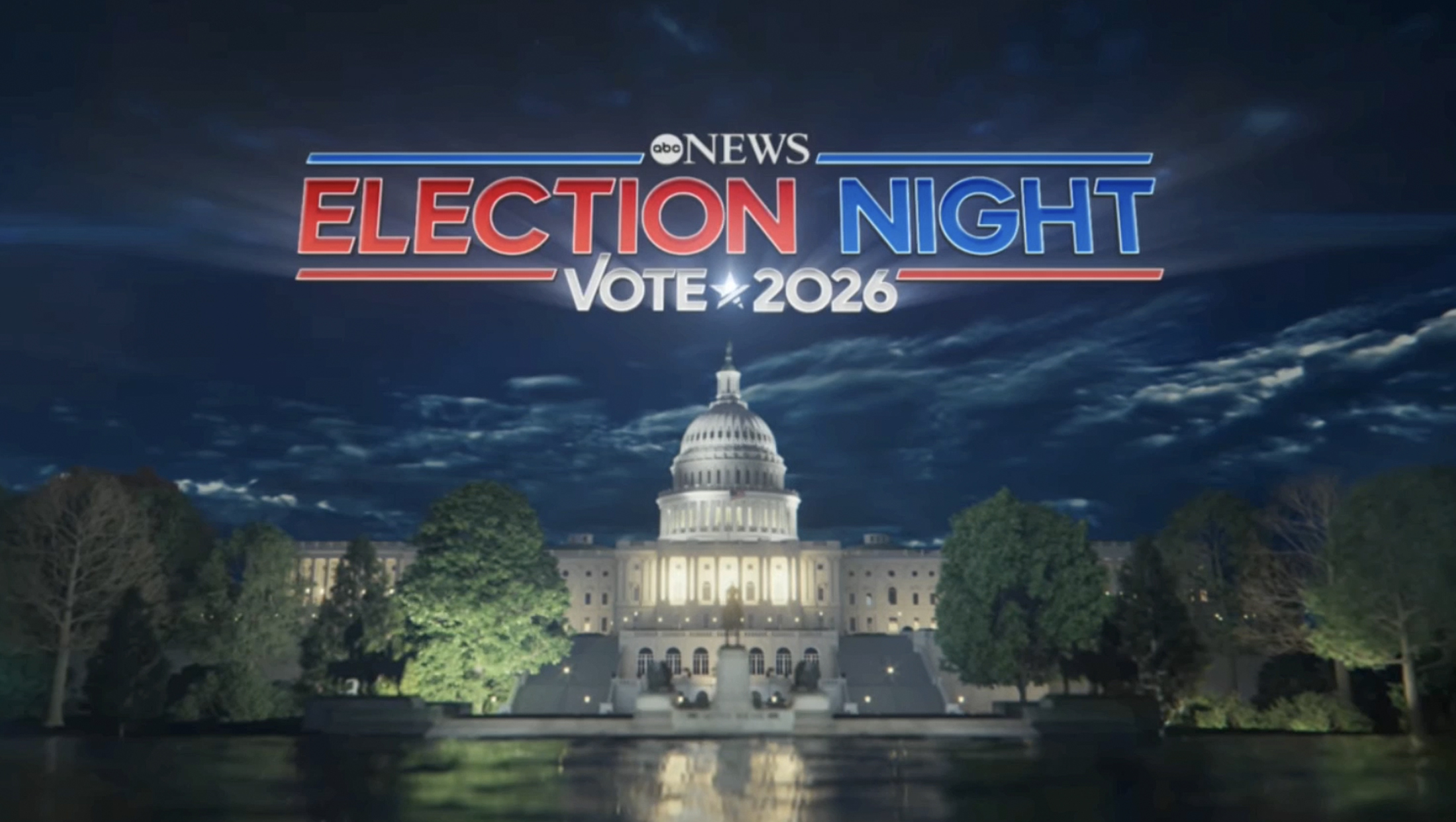
The midterms marked a significant departure from this approach, something that started with the network largely dropping the wordy “Your Voice. Your Vote.” branding it had favored (wordy titles had also become commonplace at the network), which NCS was first to report.

ABC also didn’t run a ticker during the earlier hours of its coverage. One did appear later in the evening as more results began funneling in, but it still felt more restrained in both layout and the amount of information it attempted to convey.
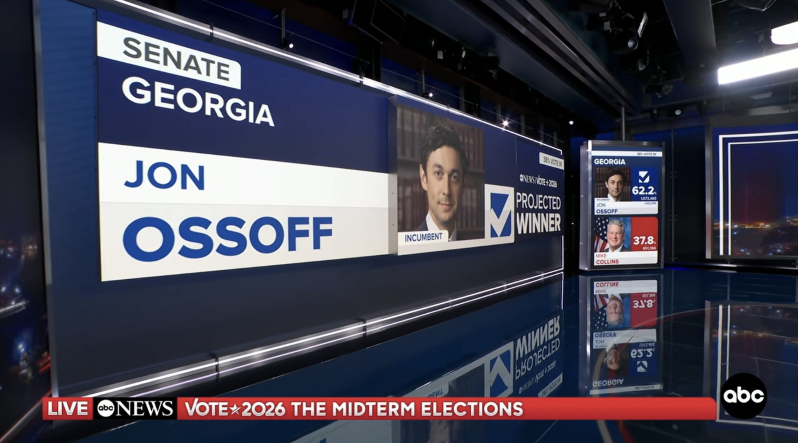
A projection shown on a flat video wall and one of the studio’s nearby vertical tracking panels.
The network also held back on using dramatic alert or projection stingers like many of its counterparts.
Rather than rely heavily on AR or fully virtual environments to showcase results, the network would either showcase the graphics fullscreen or throw them up on a video wall and use the floating camera look to capture the video on video.
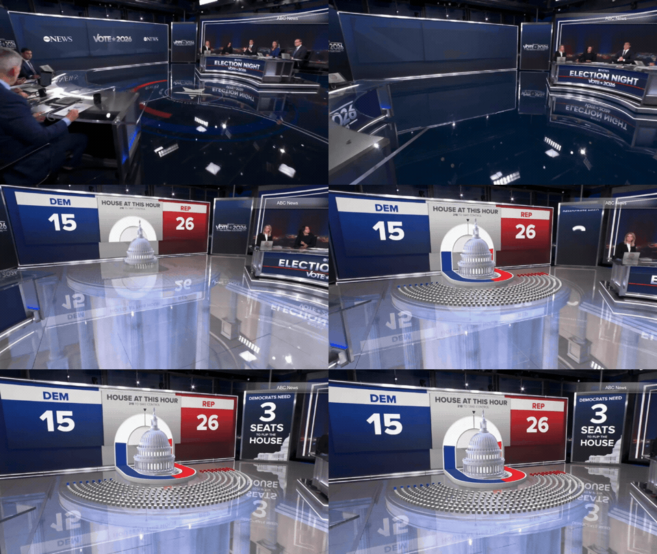
The graphics used in both of these instances benefited from a clean, flat-style design that meant key information could be displayed in larger, bold glyphs.
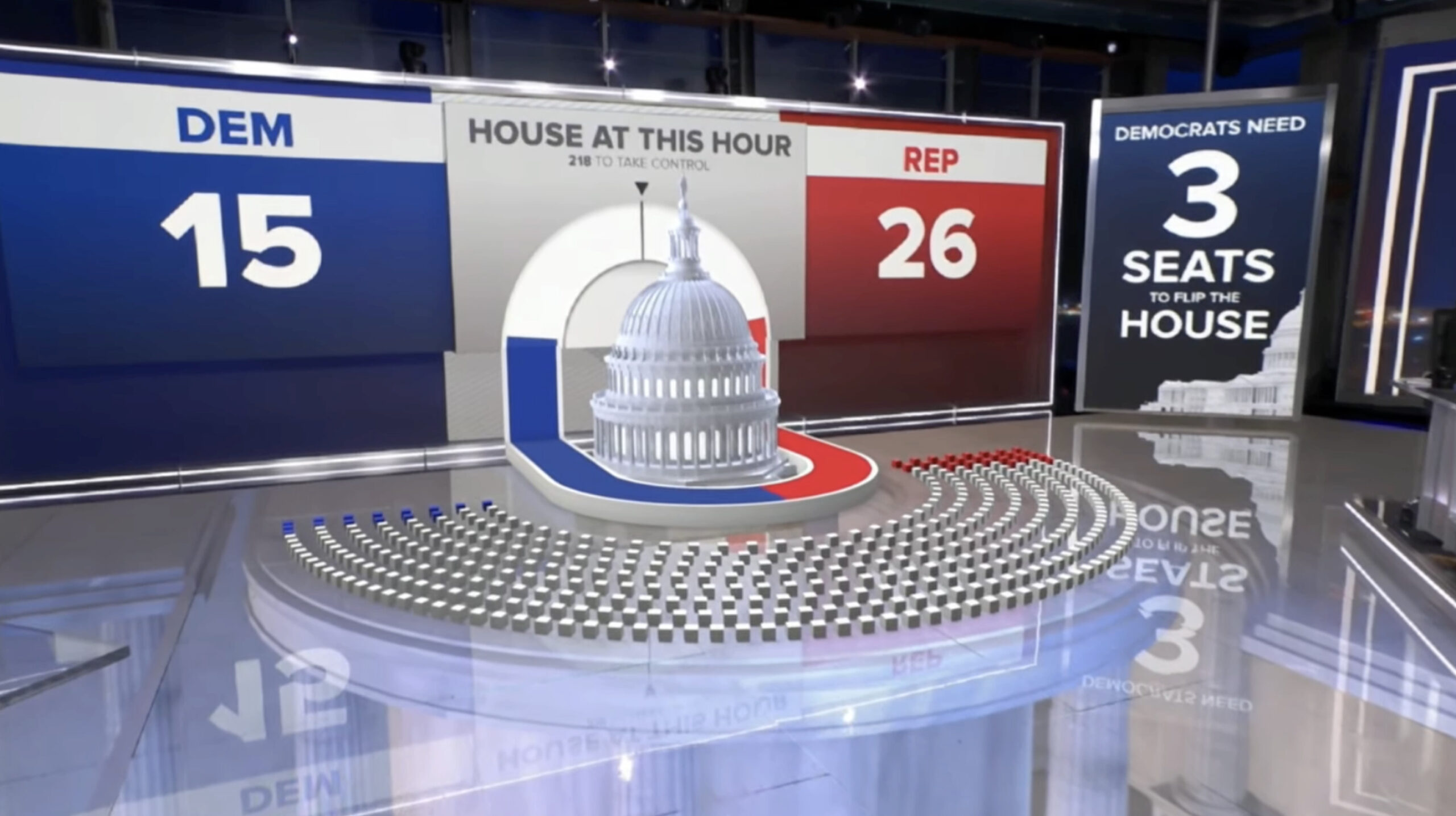
When ABC did use AR, it was decidedly less restrained that previous years — including when compared to the 2022 midterms. The network did have the option to insert a 3D model of the Capitol with a seat map below that appeared to be sitting atop the studio floor, but the approach was significantly less elaborate than in the past.
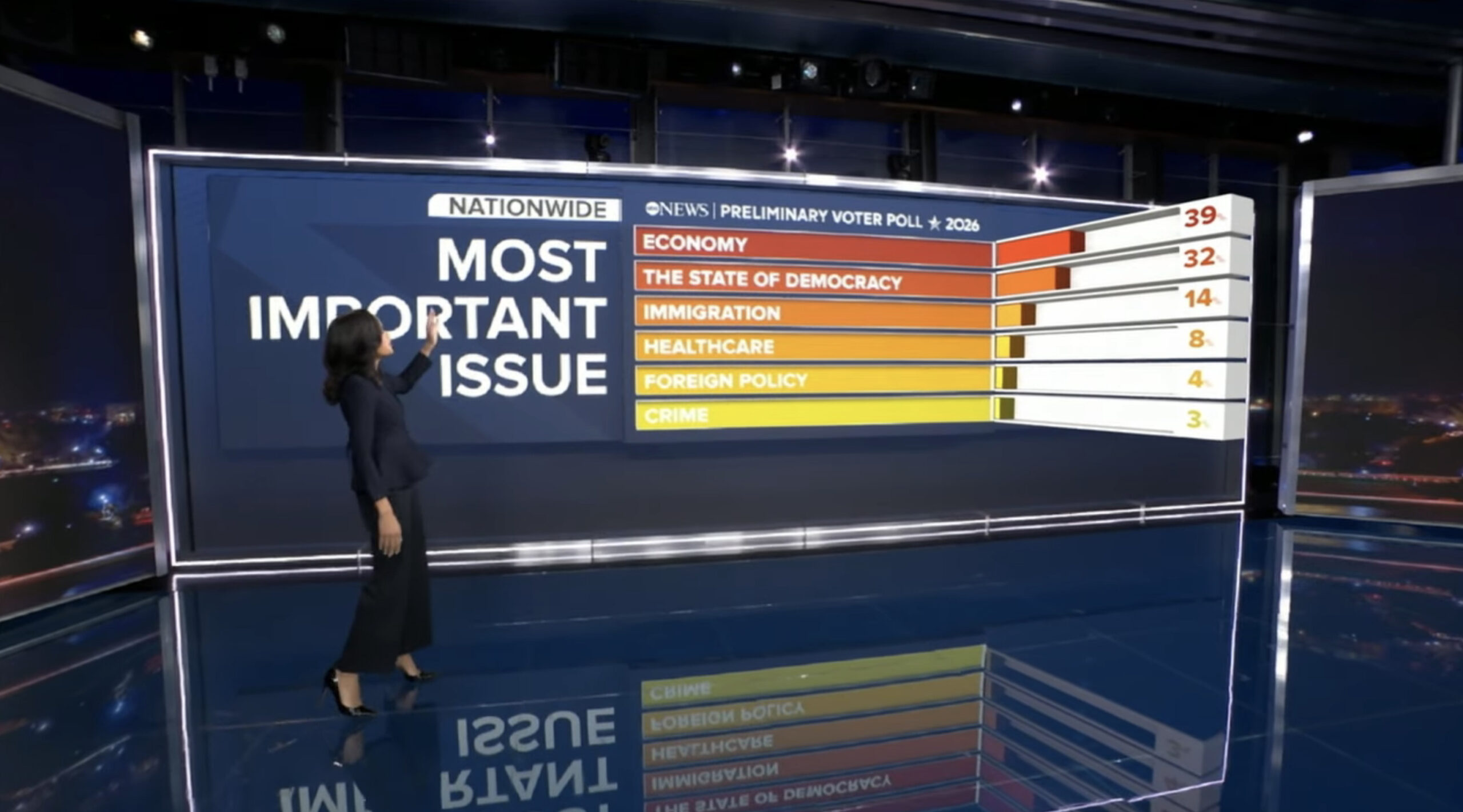
Likewise, polling data could be shown to viewers with a 3D bar chart that jutted into the studio perpendicular to the video wall surface.
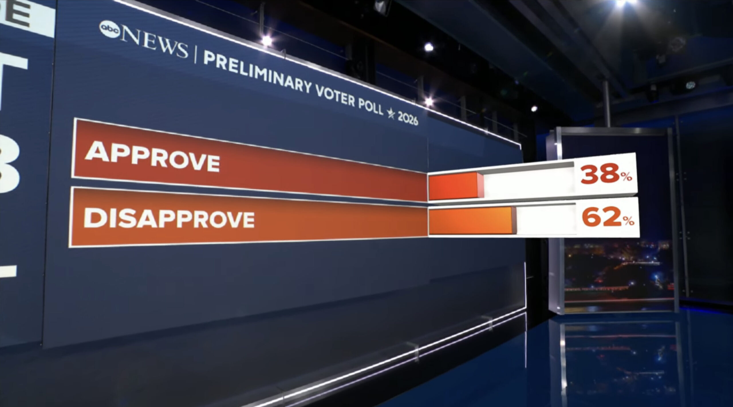
The effect was both eye-catching and subtly understated.
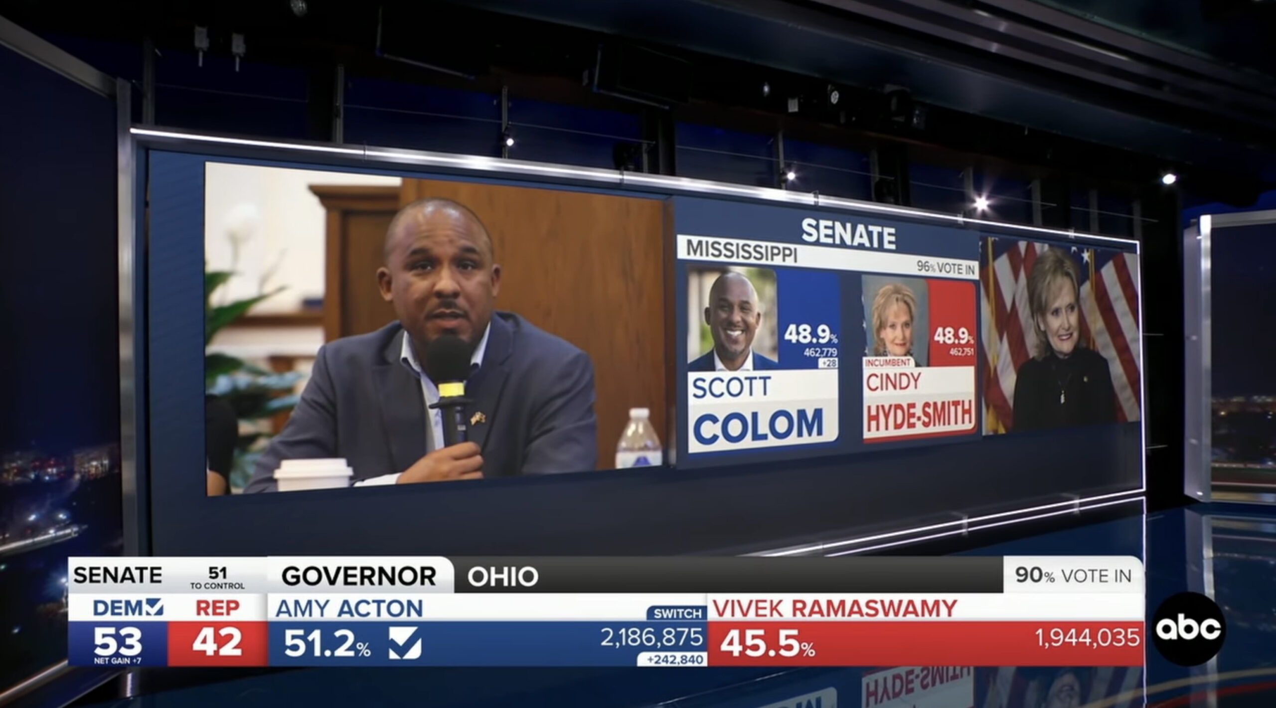
Both candidate matchups and poll data were typically shown on one of Studio 4E’s video walls with three distinct zones of LED panels physically pushed forward at varying amounts, which were used to create three clear zones of information or imagery.
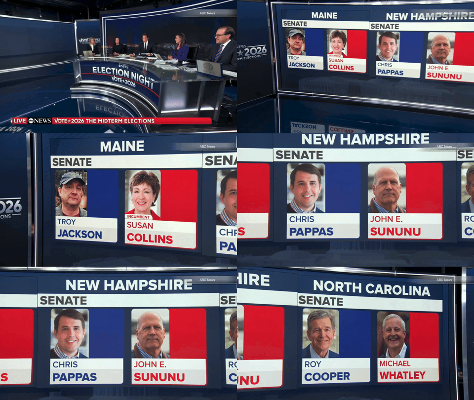
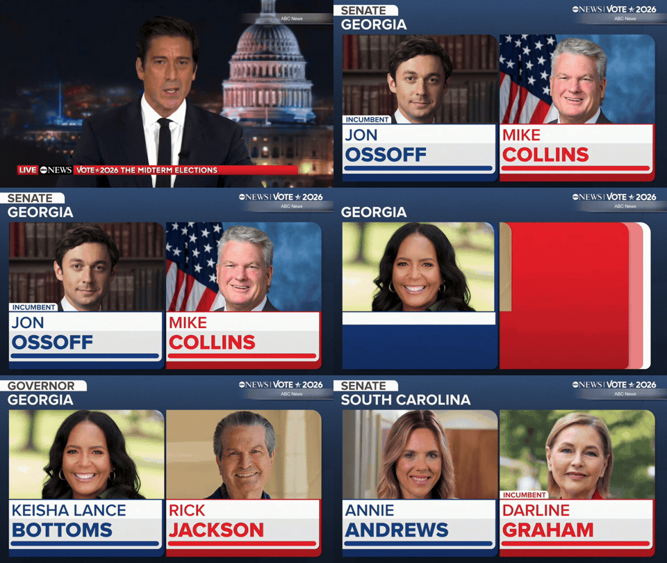
Both video walls and fullscreen sequences were also used to show graphics similar to those used on the video walls.
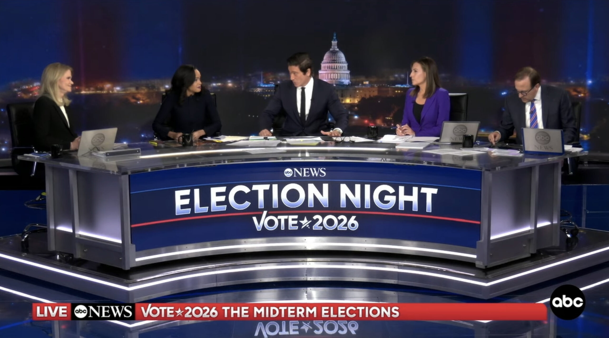
A larger, curved desk was brought in and set up with one of the space’s video walls behind anchor David Muir and his in-studio panel of journalists.
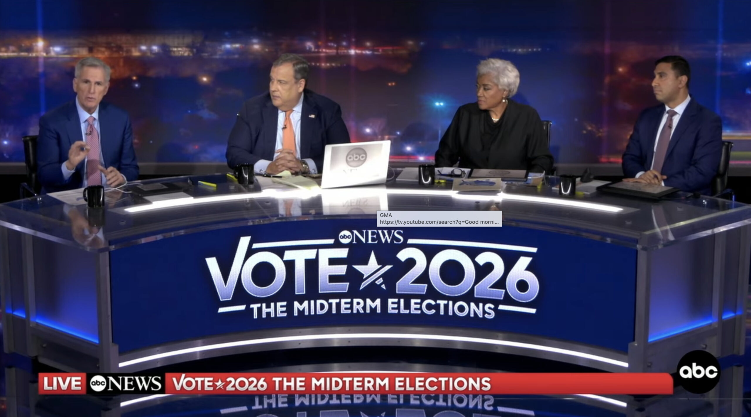
A smaller curved desk with in-studio analysts and contributors was set up opposite that.
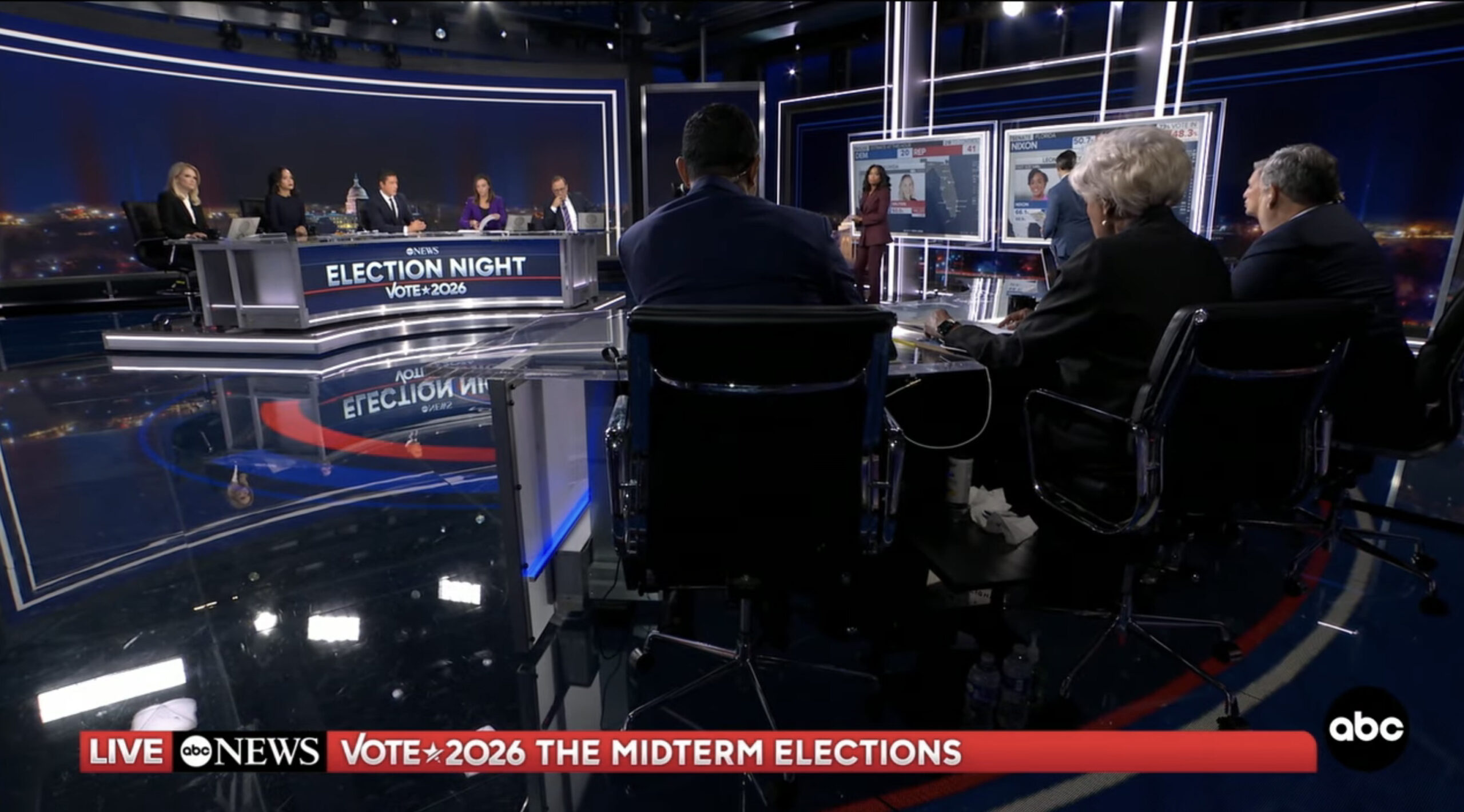
The two desks could be captured with a reverse shot for those on either side to interact. Many of these shots also showed the two touchscreen positions with talent busy analyzing data or waiting for their cue.
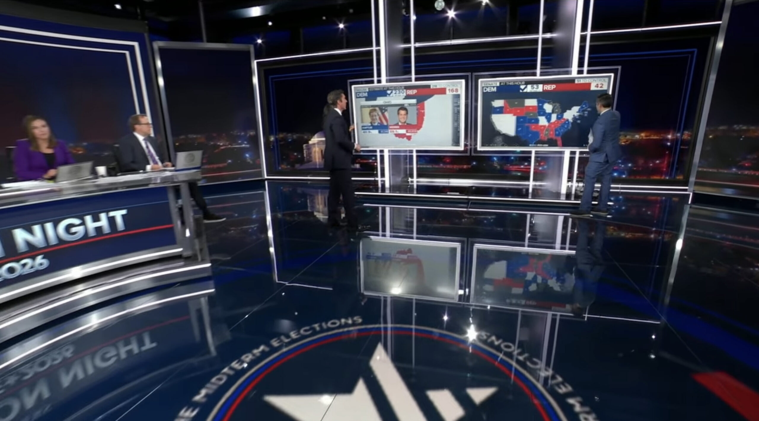
ABC did offer two side-by-side touchscreen setups for analyzing voting trends, results and other data.
With the four distinct venues around the space, ABC would also have journalists at the main desk get up out of their chairs and walk to either the AR video wall or touchscreen area to deliver updates or discuss key points with other staffers.
Overall, ABC’s look felt more somber than in the past. It was notably one of the only major networks to use a darker color palette for its results graphics.
Behind Muir and his studio guests, the network showed a stylized Washington, D.C. skylines. While there were some subtle motion effects on the backdrop, it felt decidedly lower-key — to the point of being more minimalist and elegant — than some of the other looks used during the night.

tags
2026 Election, 2026 Election Coverage Roundup, ABC, ABC News, ABC Studio 4E, david muir, November 2026 Midterm Elections, Video Walls
categories
Augmented Reality, Virtual Production and Virtual Sets, Broadcast Industry News, Elections, Heroes, Networks