

NBC News Now special showcases broader look at ‘Decision 2026’ graphics package
Weekly insights on the technology, production and business decisions shaping media and broadcast. Free to access. Independent coverage. Unsubscribe anytime.
An NBC News Now special on control of Congress offered a closer look at the network’s updated Decision 2026 branding and graphics.
Earlier this month, NCS was first to report that NBC News was preparing its first significant update to its election graphics in about a decade. A source inside the network confirmed that a new logo appearing in promotional materials on NBCNews.com was part of the updated visual identity.
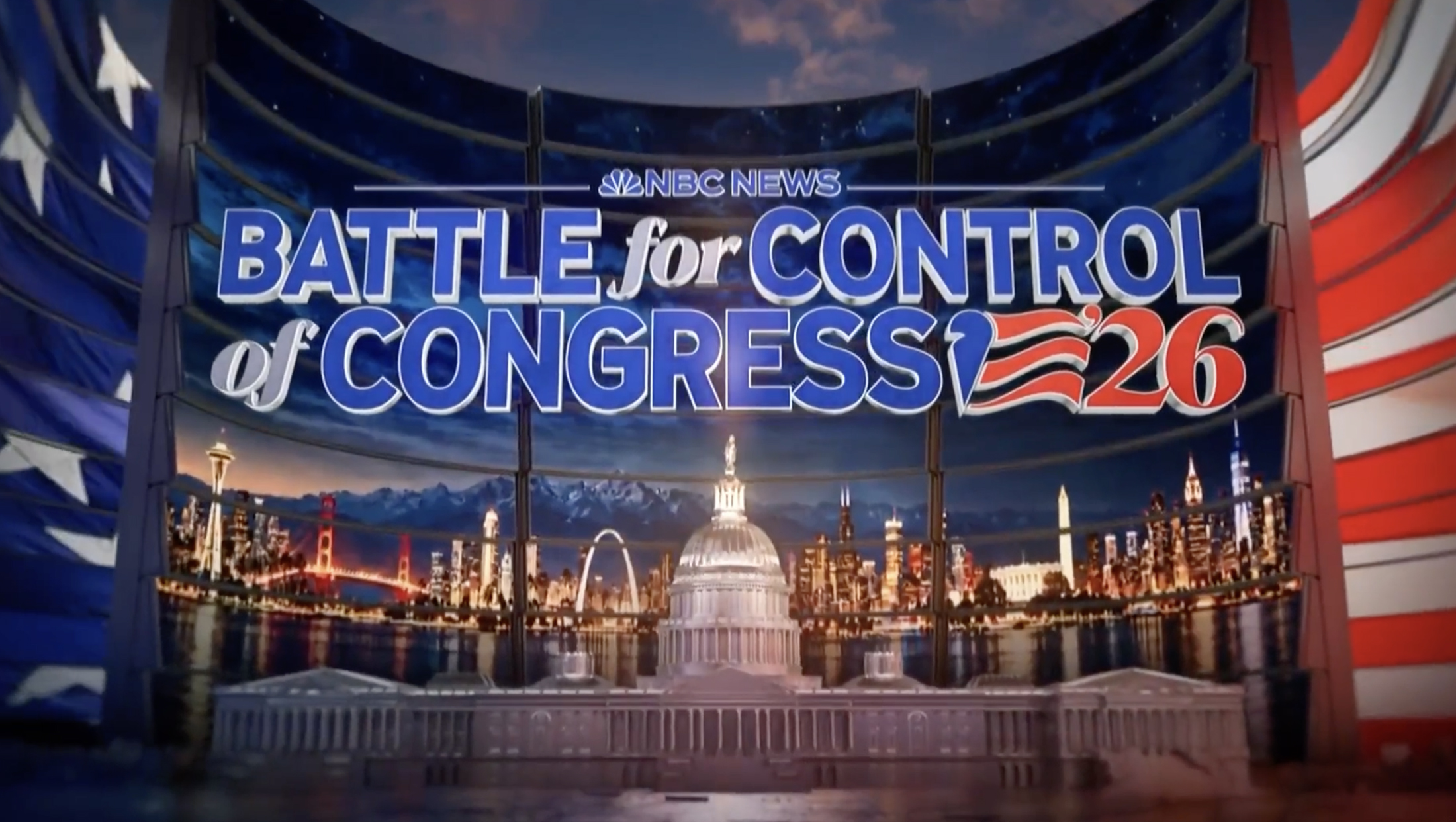
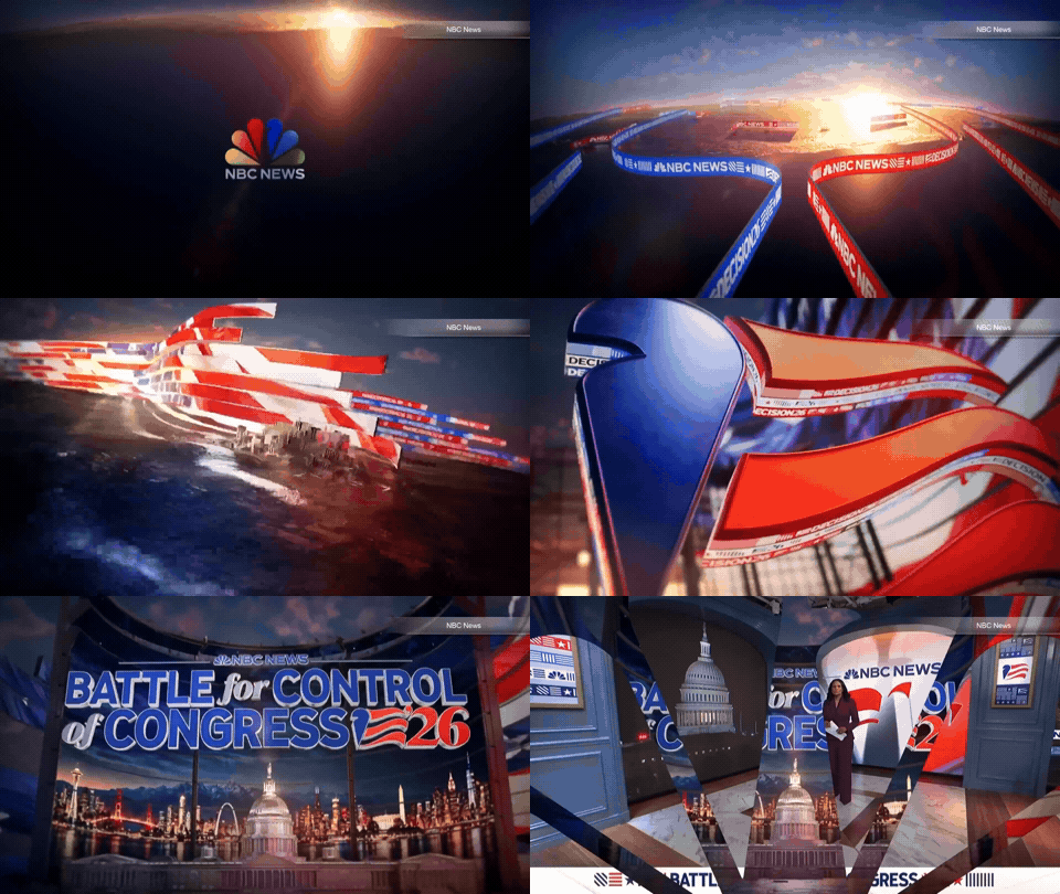
The special, officially titled “Decision 2026: Battle for Control of Congress,” featured a wide variety of graphics ranging from a full cold open and animated opening sequence, fullscreen and touchscreen graphics as well as supporting designs for insert graphics and wipes.
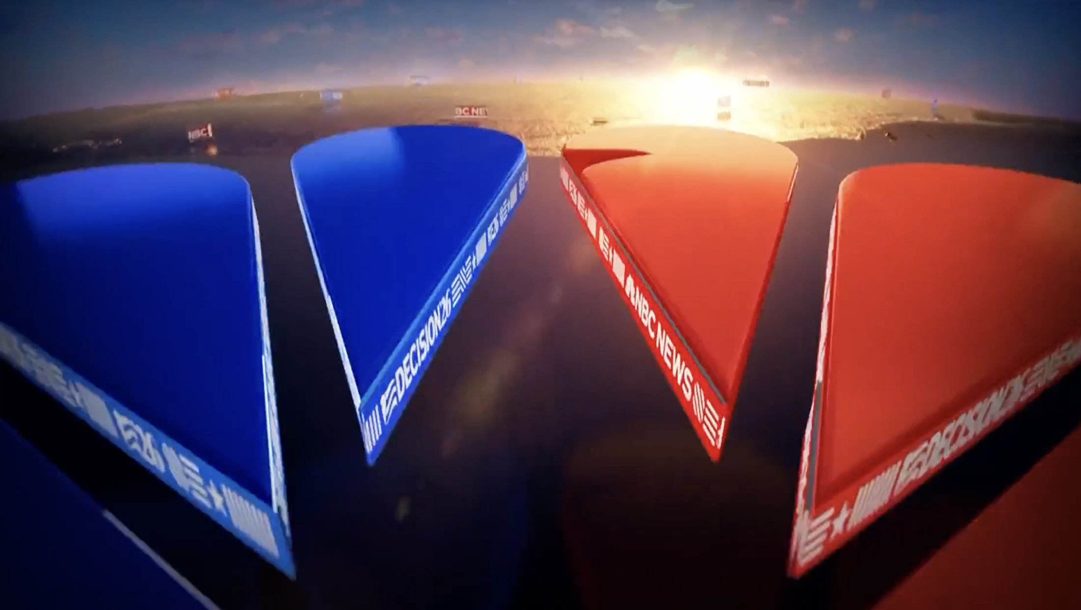
The animated open started with the NBC logo set in front of a portion of the globe still cloaked in darkness as the sunrise emerges on the horizon, as the view zooms in on 3D blue and red peacock feathers with “Decision ’26” and “NBC News” logos running along the sides of the shapes.
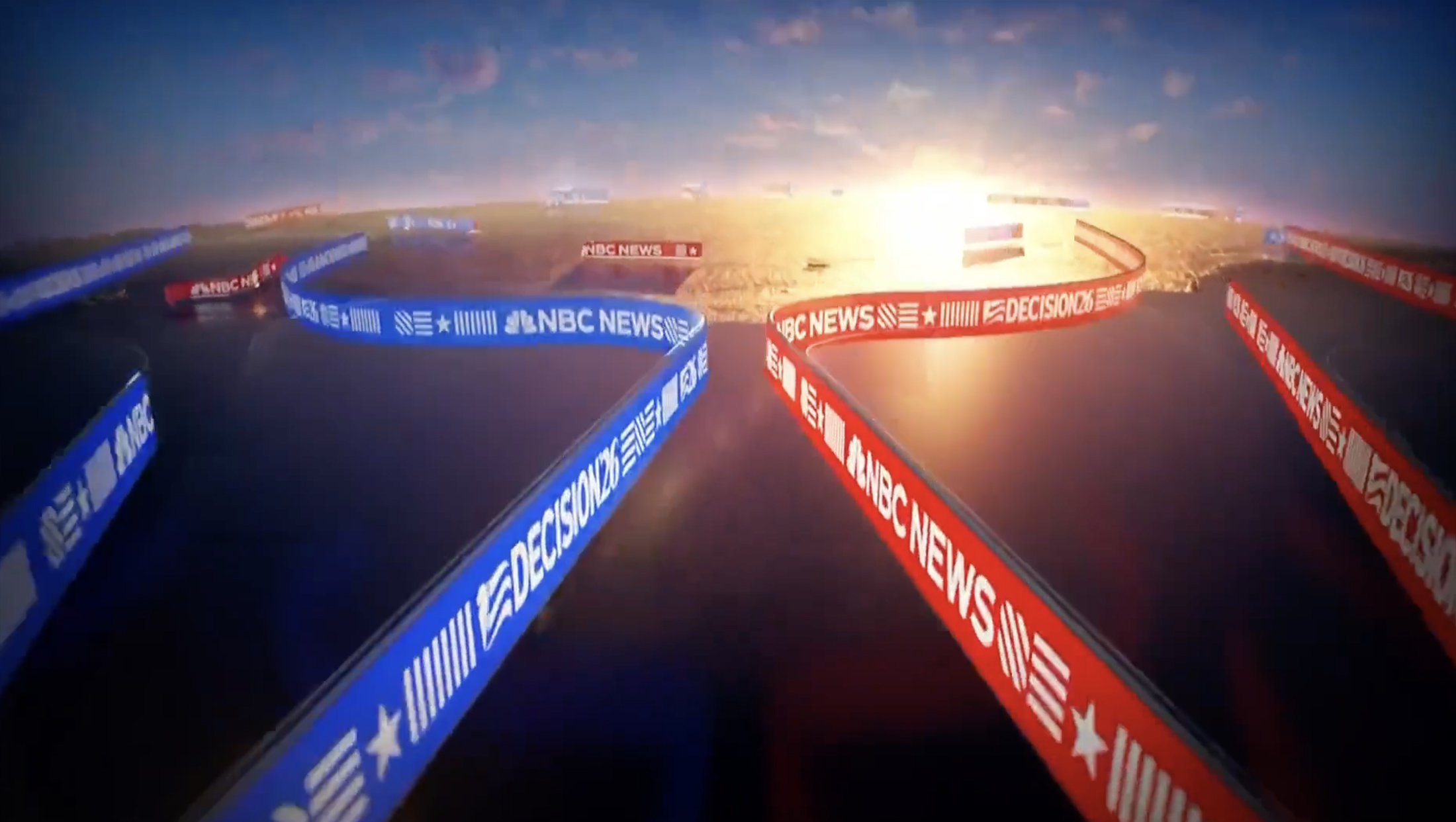
The ribbons also introduce an element that hasn’t been seen yet — a series of symbols formed by horizontal, vertical and diagonal lines — likely meant to be reminiscent of the stripe motif and inspired by elements of the U.S. flag. They also include a star and a solid rectangle and are frequently used as both textural and background elements in the package.
The solid parts of the feathers then fade away, leaving the ribbon elements to snake across the globe beneath.
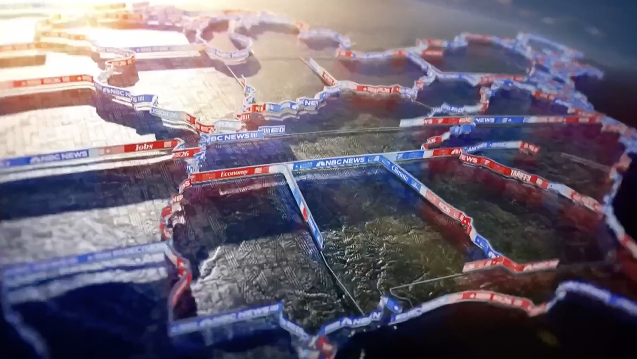
Next, the viewport shifts to show the ribbons forming the outlines of U.S. states, with both NBC News and Decision 2026 branding mixed with additional text representing key issues voters are likely to consider at the polls.
The surfaces of the states’ shapes have a sort of organic texture that, at first glance, feels like the patchwork nature of a satellite image but, upon closer inspection, is revealed to be a pattern of those shape elements that also read as a nod to topography.
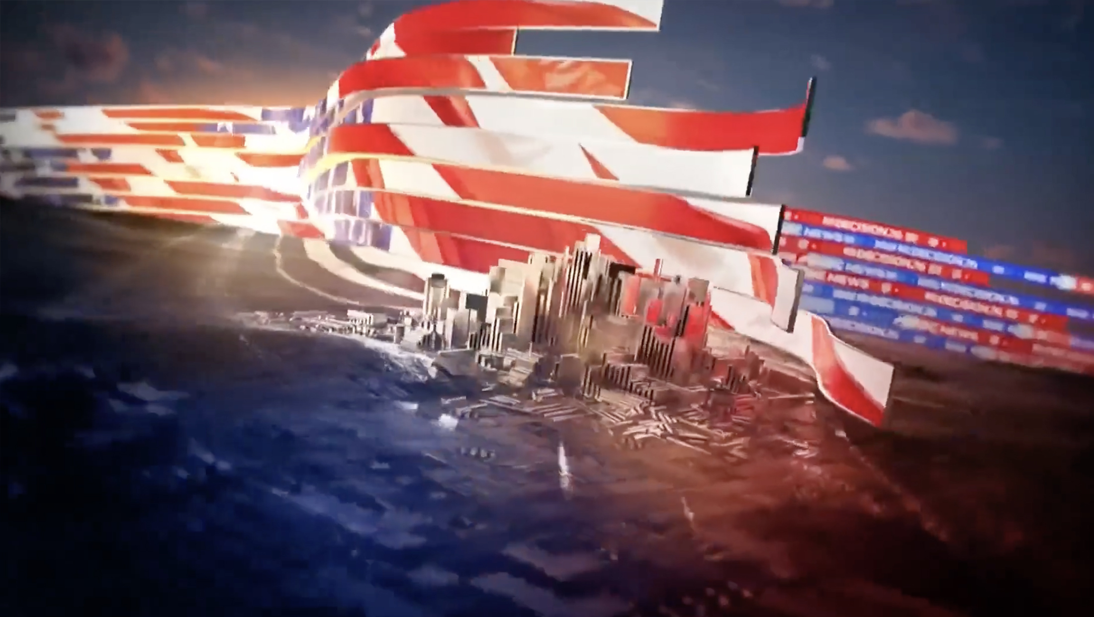
The ribbons continue to gather together and eventually form a wall-like structure that seemingly floats above the earth while also snaking around stylized views of cities — built from block and linear shapes inspired by the collection of symbols.
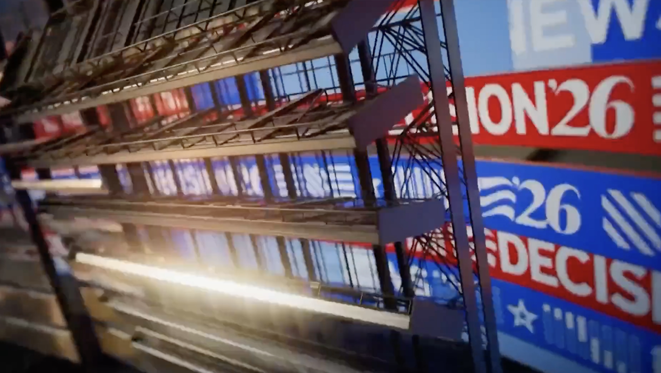
The view then showcases a tall billboard-like structure with panels that appear to be able to fold up and down.
This industrial trusswork-heavy look creates a nice nod to NBC News’ previous election graphics. Those graphics included large billboard elements too — shown either inside a dark, warehouse-like space or within exterior views. The flipping panels also have some similarities to how tall, vertical segments of the billboard would often flip into place in the previous design.
The final scene in the open, which appears to be suggestive of something that is likely to serve in a similar way in other opens and title cards, shows the show title floating in front of a tall curved structure that appears to be built from horizontal LED panels, complete with a sort of louvered effect that ties into the stripe and banner elements.
For this particular open, these imaginary panels showcase a hybrid cityscape with structures borrowed from major cities across the country.
This virtual structure is, in turn, wrapped with a larger structure showcasing a fluttering American flag and encloses a 3D model of the U.S. Capitol (though it’s easy to see how the building could be swapped out for the White House or other objects needed to symbolize various election themes).
The special also previewed what the network’s fullscreen election graphics will look like.

These graphics often appear on on-set video panels or touchscreens and can be heavily data-driven, with the network liking having an arsenal of hundreds of layouts to showcase everything from simple data points to detailed county-by-county results breakdowns.
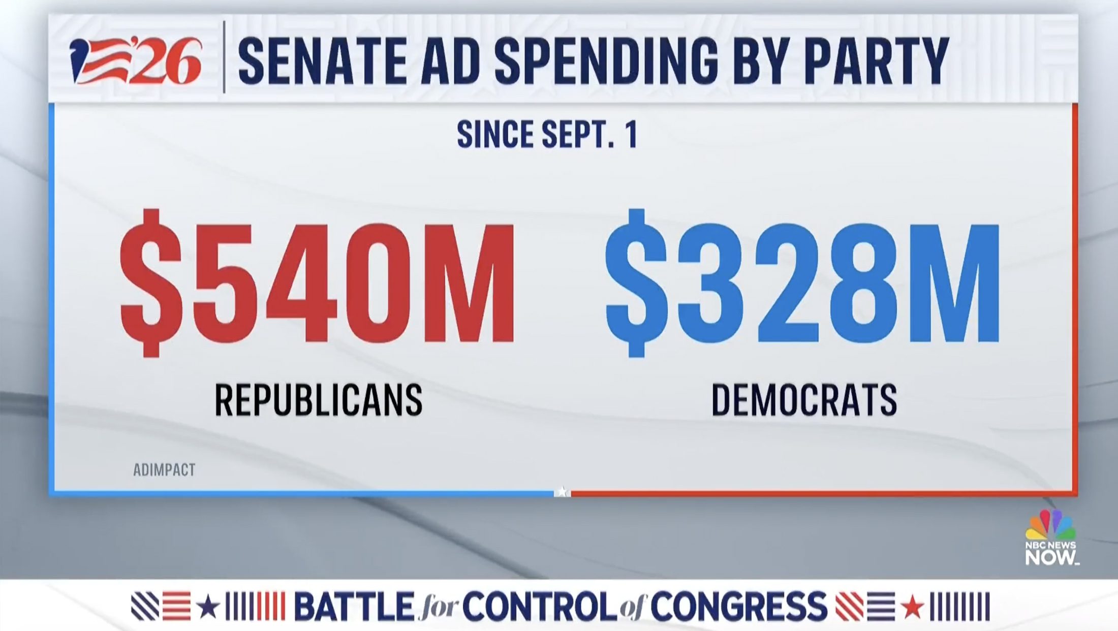
These graphics retain the light and airy look that NBC has used for the past several election cycles thanks to backgrounds of white, gray, and a hint of blue.
In the background, subtle 3D waves inspired by the stripes in the logo and ribbons found provide a solid foundation for data, while a translucent white box with a blue border on the left and red on the right serves as the primary place for text and visuals.
Most of the layouts also feature an off-white header with a pattern borrowed from the geometric symbols. When shown in white, the shapes could also read as a way to incorporate the solid, linear lines found in the architecture of many federal buildings, which also often happen to be built from white stone.
The far left of this bar typically houses a version of the logo that features the feather and stripe elements along with just “’26.”
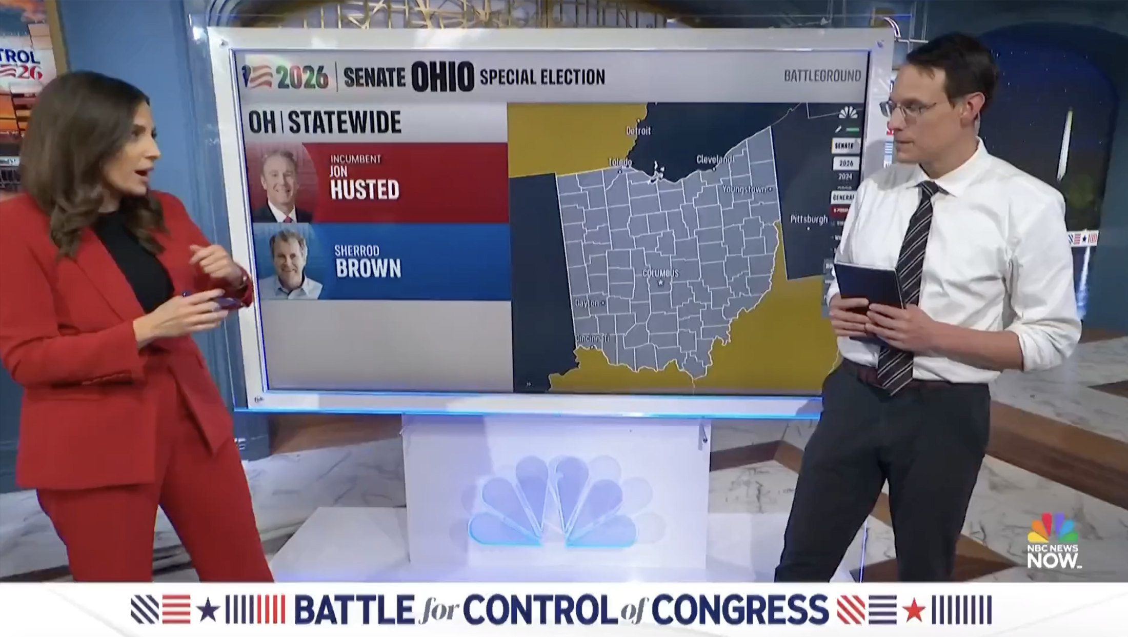
There are also additional layouts that appear to be largely designed for use with touchscreen technology. These have much less texture and non-essential graphic elements, instead largely being built from colored boxes with no spacing between. These screens largely feel like designs used on touchscreens in past years, though the typography and colors have been swapped out.
It is worth noting that NBC appears to have introduced some of the symbol motif into these screens but, as shown in the example above, only as a background texture behind candidate headshots.
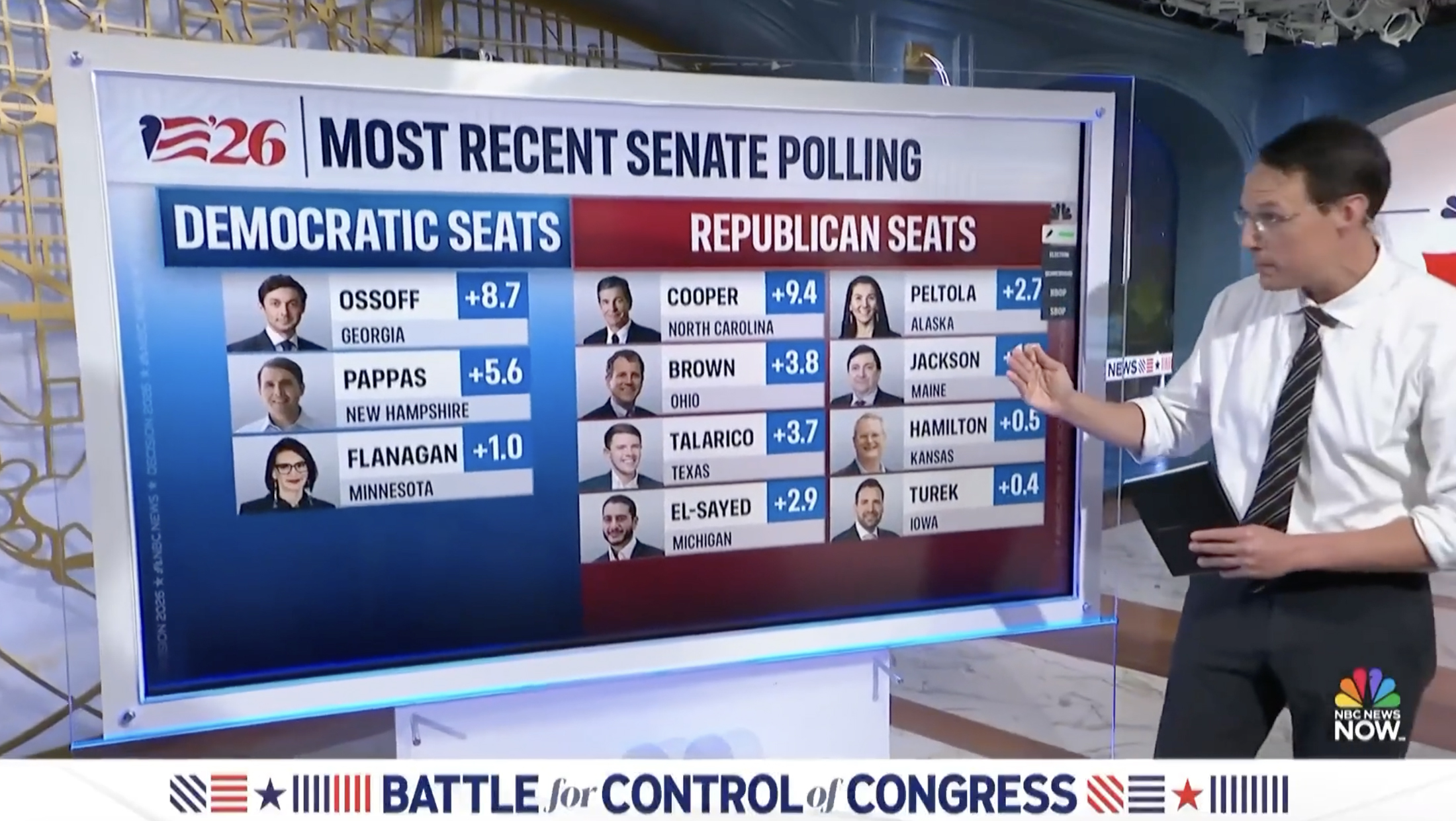
Meanwhile, some graphics also take on a hybrid look between the two, largely centered on tighter spacing combined with some of the stronger 3D feel found in the open. It’s not entirely clear which layouts will serve which purposes through election day.
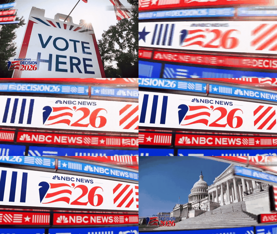
The special also contained other elements, including some animated wipes and bumps.
One look uses the red, white and blue ribbon with repeating text and symbols to transition between content.
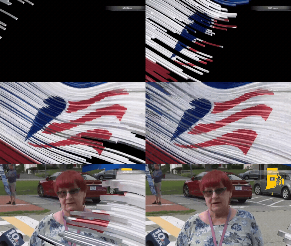
There is also one without a different take on the ribbons — reducing them to a much smaller scale to the point where they feel more like strings or pasta and then flowing across the screen to reveal the feather and stripe icon.
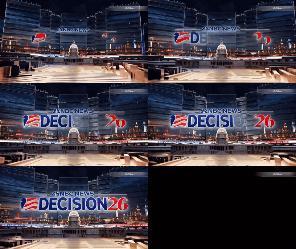
Another quick animation offers a different take on the scenes used in the special’s title card — but drops the American flag wraparound element in favor of a wide cityscape.
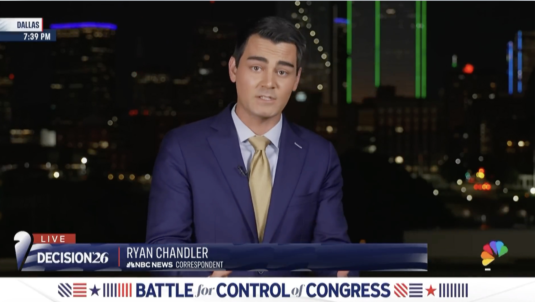
The network also designed a deep-blue lower-third banner that includes the feather on the far left, a repeating stripe background and space for both Decision 2026 branding and on-screen identifiers.
The special made use of the full-width banner running along the bottom of the screen, a longtime NBC News practice. The design focused on centered typography, with the symbols flanking it and a take on the subtle wave background behind.
Both the special’s cold open and animated open used the network’s famous election theme music.

tags
2026 Election, NBC News, NBC News Now
categories
Broadcast Design, Broadcast Industry News, Elections, Graphics, Heroes