

’60 Minutes’ gets updated take on stopwatch, story intro looks
Weekly insights on the technology, production and business decisions shaping media and broadcast. Free to access. Independent coverage. Unsubscribe anytime.
The season premiere of CBS News‘ “60 Minutes” included some key updates to the newsmagazine’s graphics and virtual environments used to intro stories.
“60 Minutes” debuted the new look on the Sept. 13, 2026, edition of the broadcast and the changes centered around the show’s open, bumps and the virtual backgrounds behind correspondents.
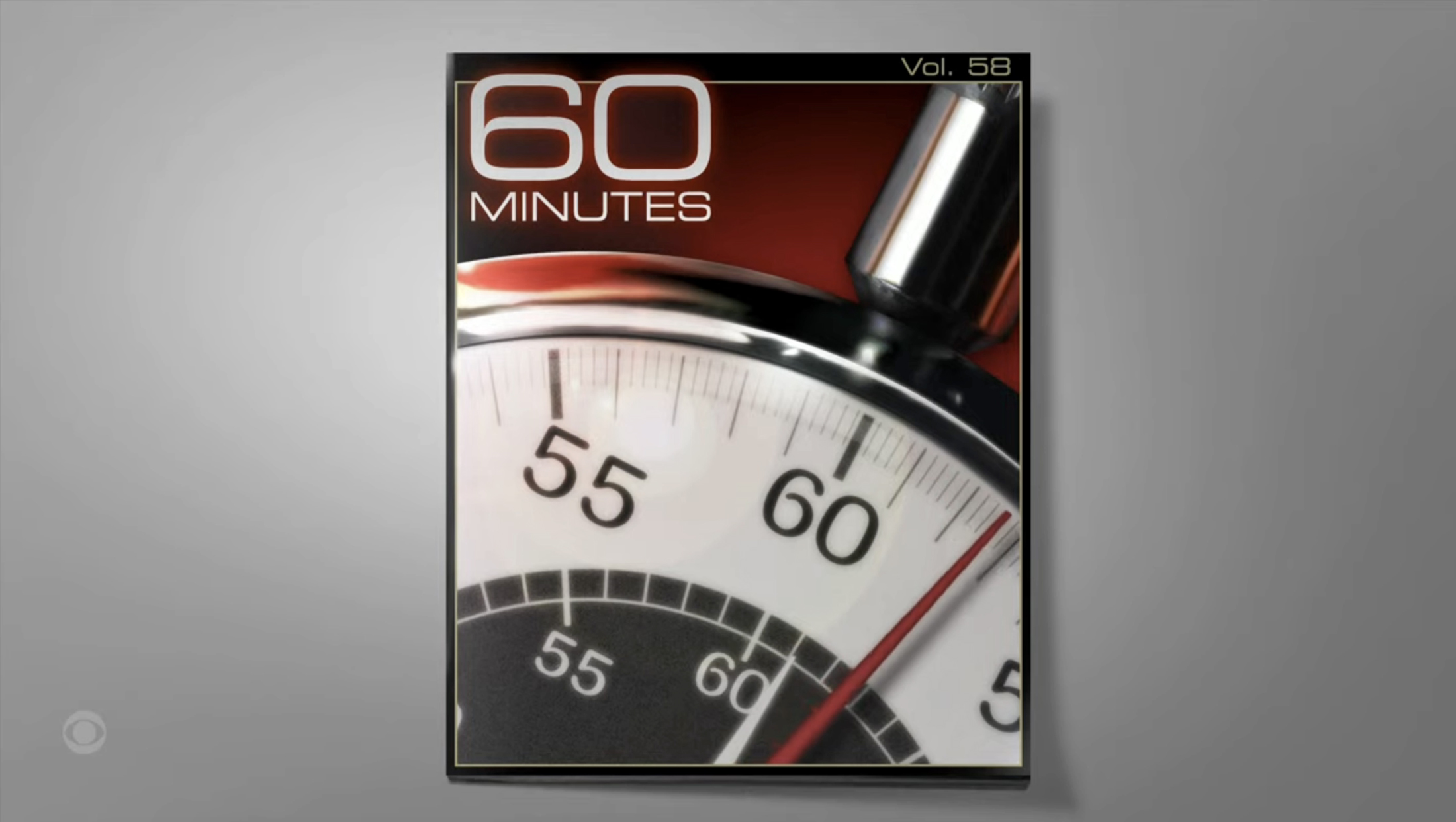
The Season 58 show look.
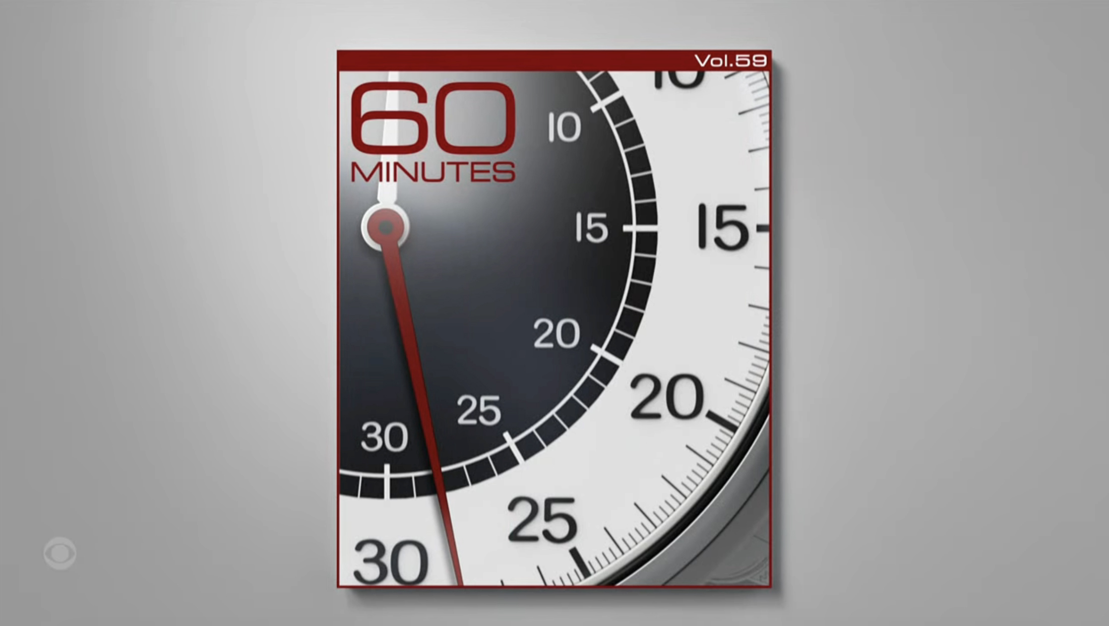
For the show’s framed stopwatch imagery, the Season 59 look has removed the dark red background, along with the heavy metallic effects and lens flare.
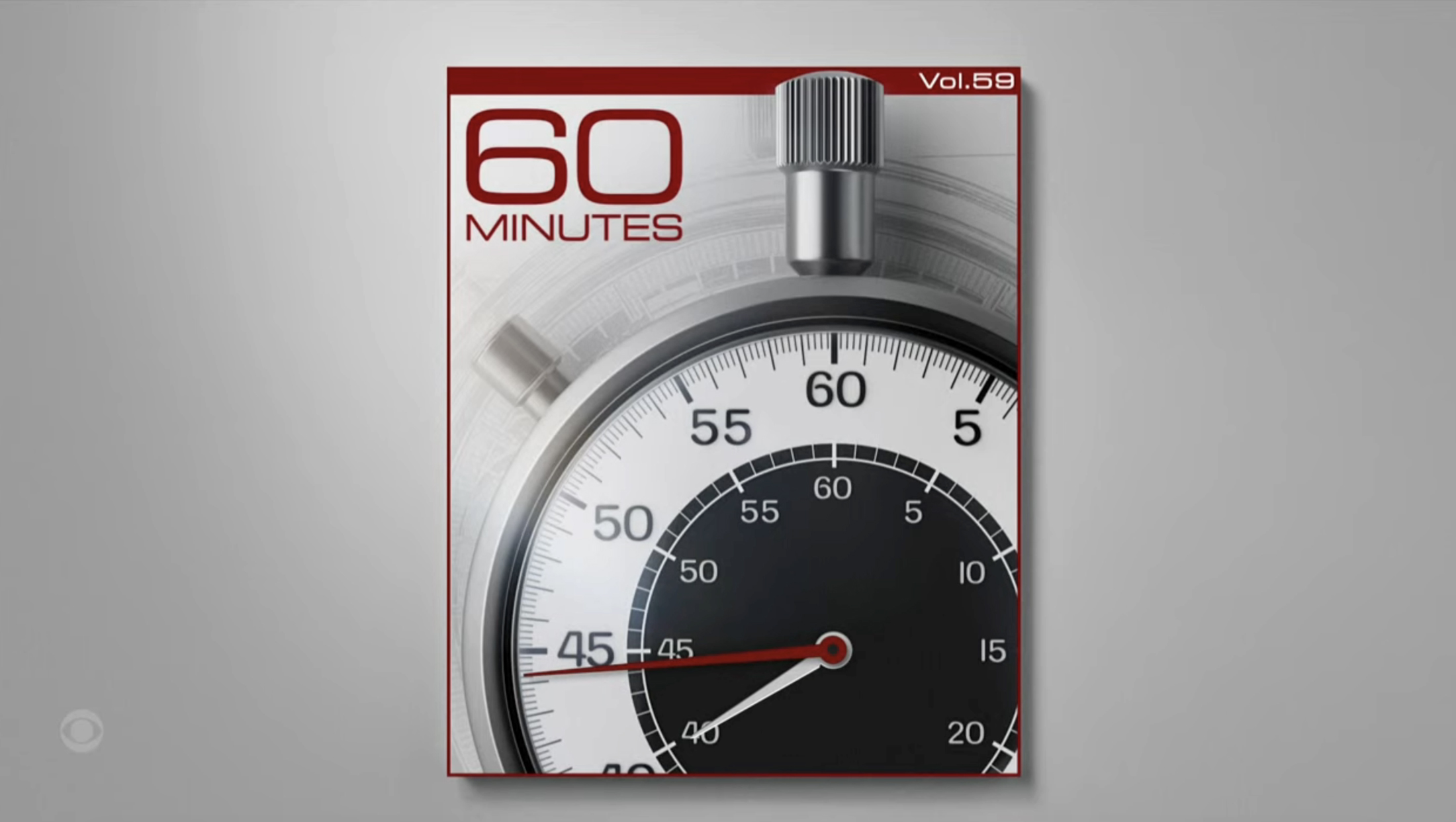
One of the different views of the stopwatch used in Season 59.
At the top of the show, the stopwatch’s face and metallic rim are stylized with a flatter and cleaner look. Depending on what part of the show, the image is cropped at various levels. For wider crops, a slightly larger version of the watch image, shown in a textured, faded look, is shown behind the foreground iteration.
In these wider views, there is also a subtle lighting effect, but it’s a far cry from what the show has used in the past.
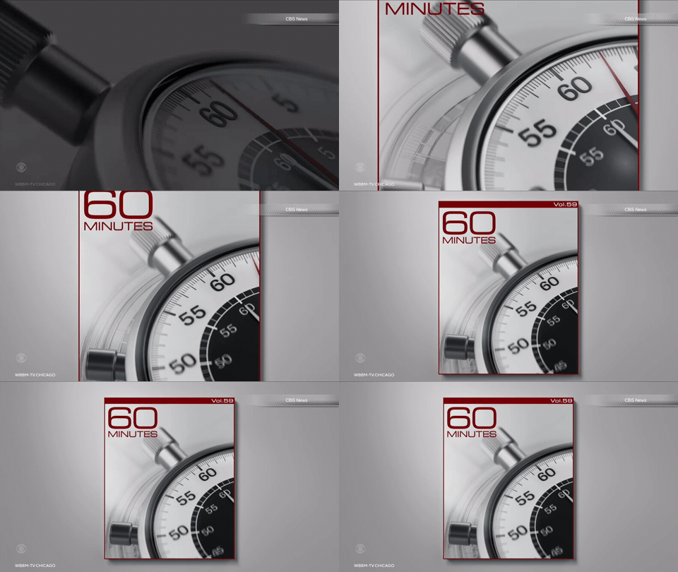
For the most part, the updates align with the overall shift in design at CBS and CBS News as a whole toward flatter elements that rely on more subtle gradients and effects to add texture when needed.
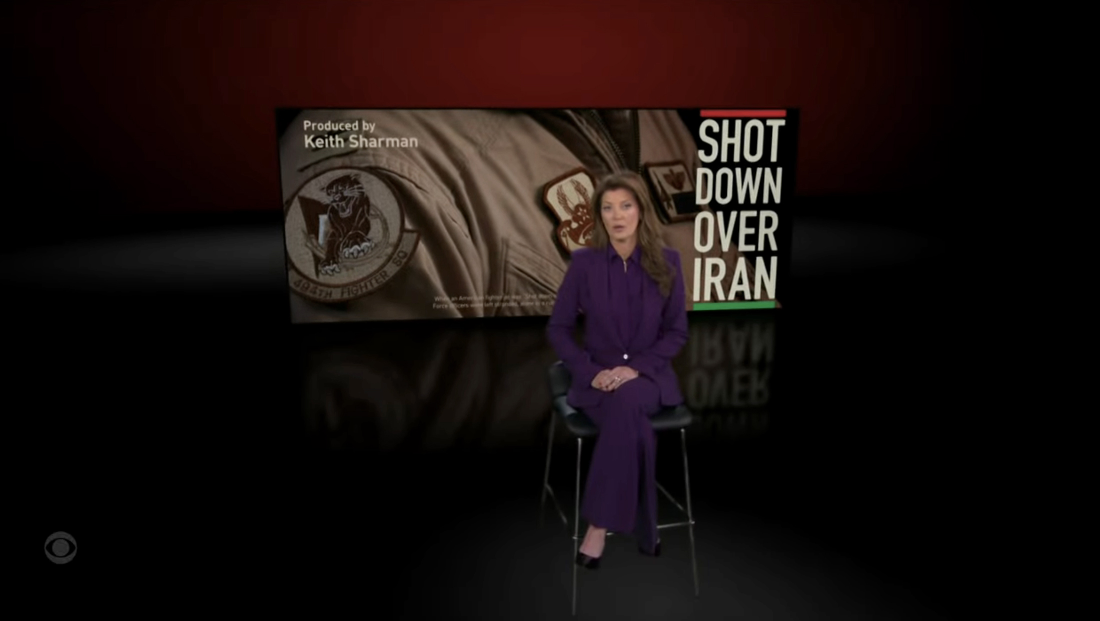
The show also updated the virtual backgrounds it uses for when correspondents introduce stories.
Perhaps the most significant change is that the large topical graphic behind the talent is no longer styled to look like a literal (albeit oversized) open magazine or book. Instead, the image appears as more of a freestanding, floating panel that is also wider than previous looks.
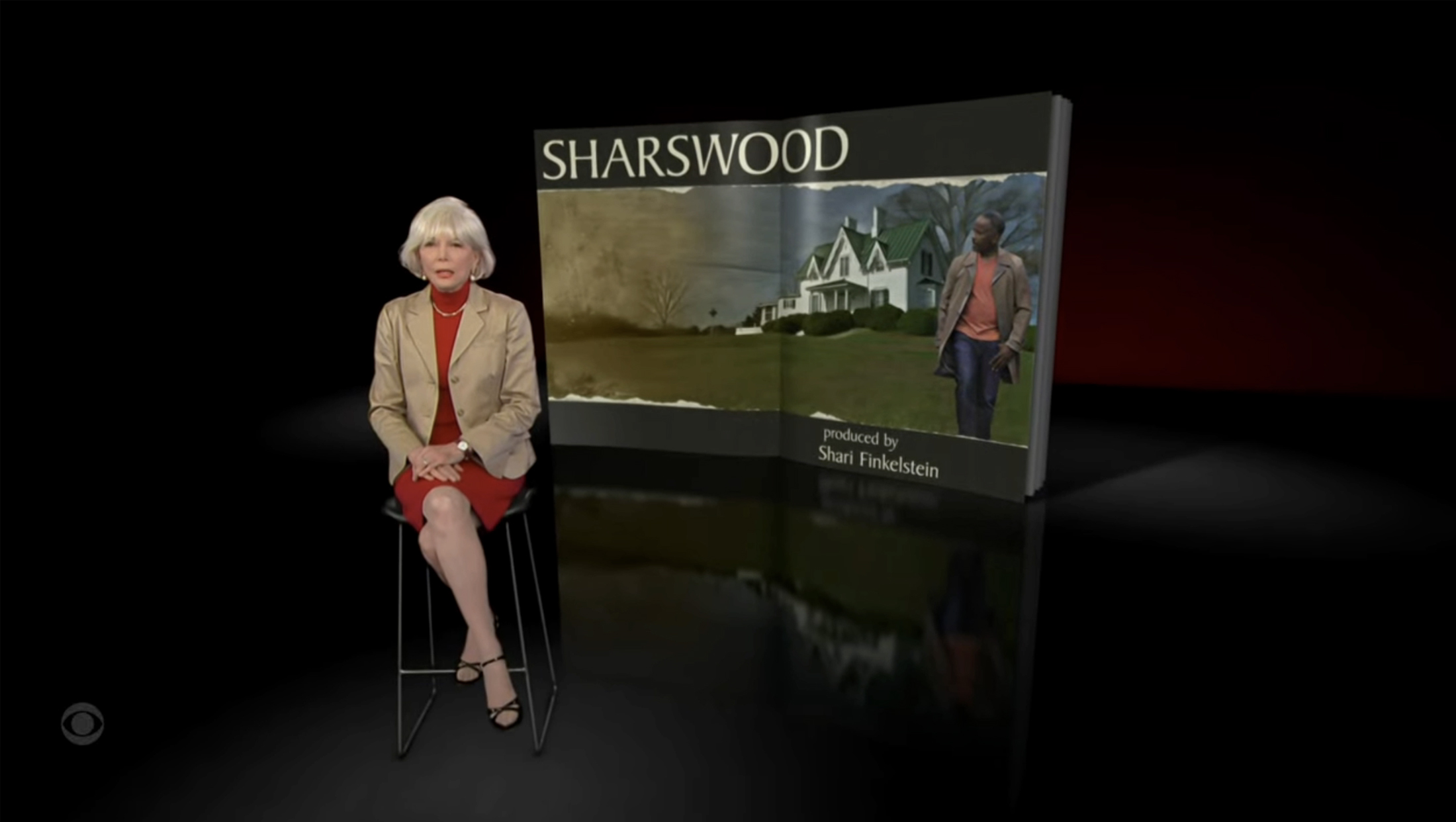
How the correspondent intros look for Season 58.
This change is a nod to the overall shift away from print formats. Of course, “60 Minutes” was always channeling the look and feel of a different medium when it used the open book look.
It’s likely, however, that many people’s image of what a magazine is has shifted to how it appears in a digital format.
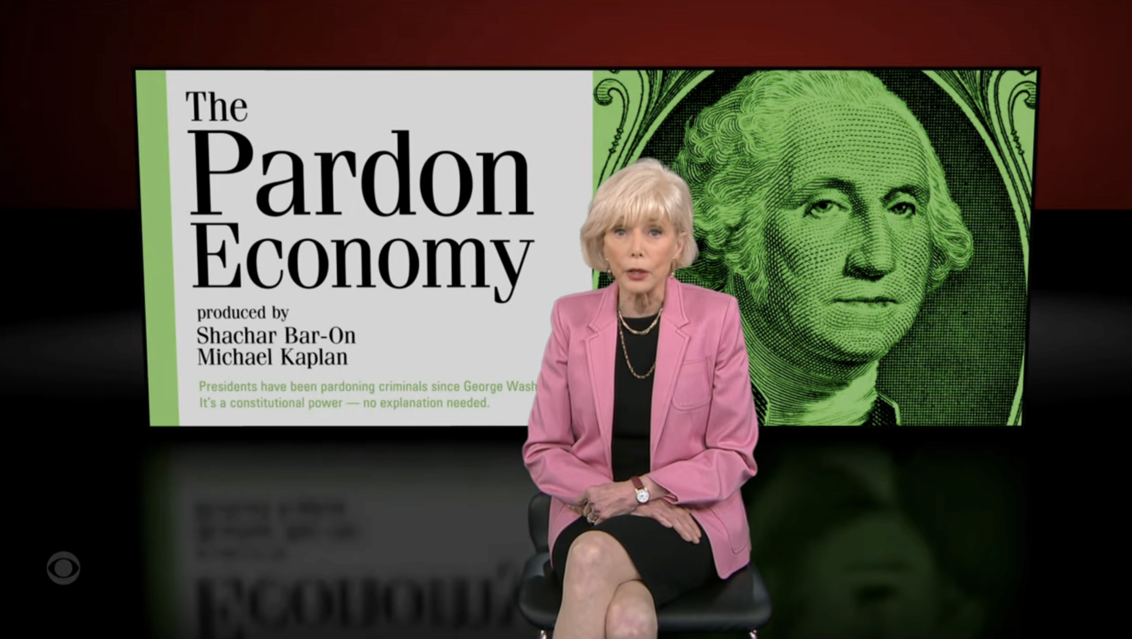
While some magazines still attempt to replicate their print looks when offered in digital format, many publishers are taking advantage of screen real estate to offer digital versions that are less twins than their print counterparts and more like cousins, including the use of large visuals mixed in with on-screen text.
For those keeping track, however, “60 Minutes” still displays the names of the producer or producers who developed each report in a prominent location on the graphic.
In an interesting nod to the print medium, “60 Minutes” has added one feature to its topical graphics — a few lines of text that often feels more like microtext accents but is actually, upon closer inspection, the first lines the correspondent is reading on camera.
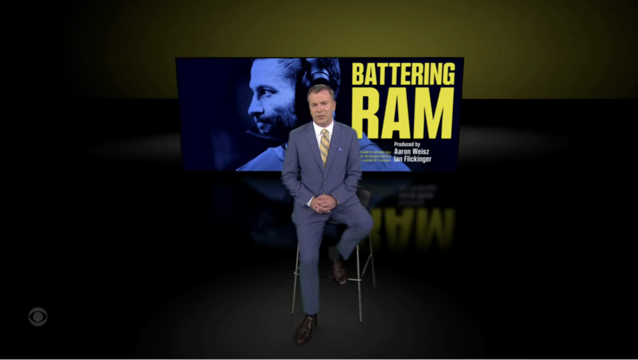
“60 Minutes” has long relied on red as its primary accent color, and the far background — which feels a bit like a lighted cyc behind the floating graphic — can still be red. This season, the brightness has been bumped up a bit, however, and there is also the option to change to a coordinating shade such as the yellow shown in the “Battering Ram” segment intro above.
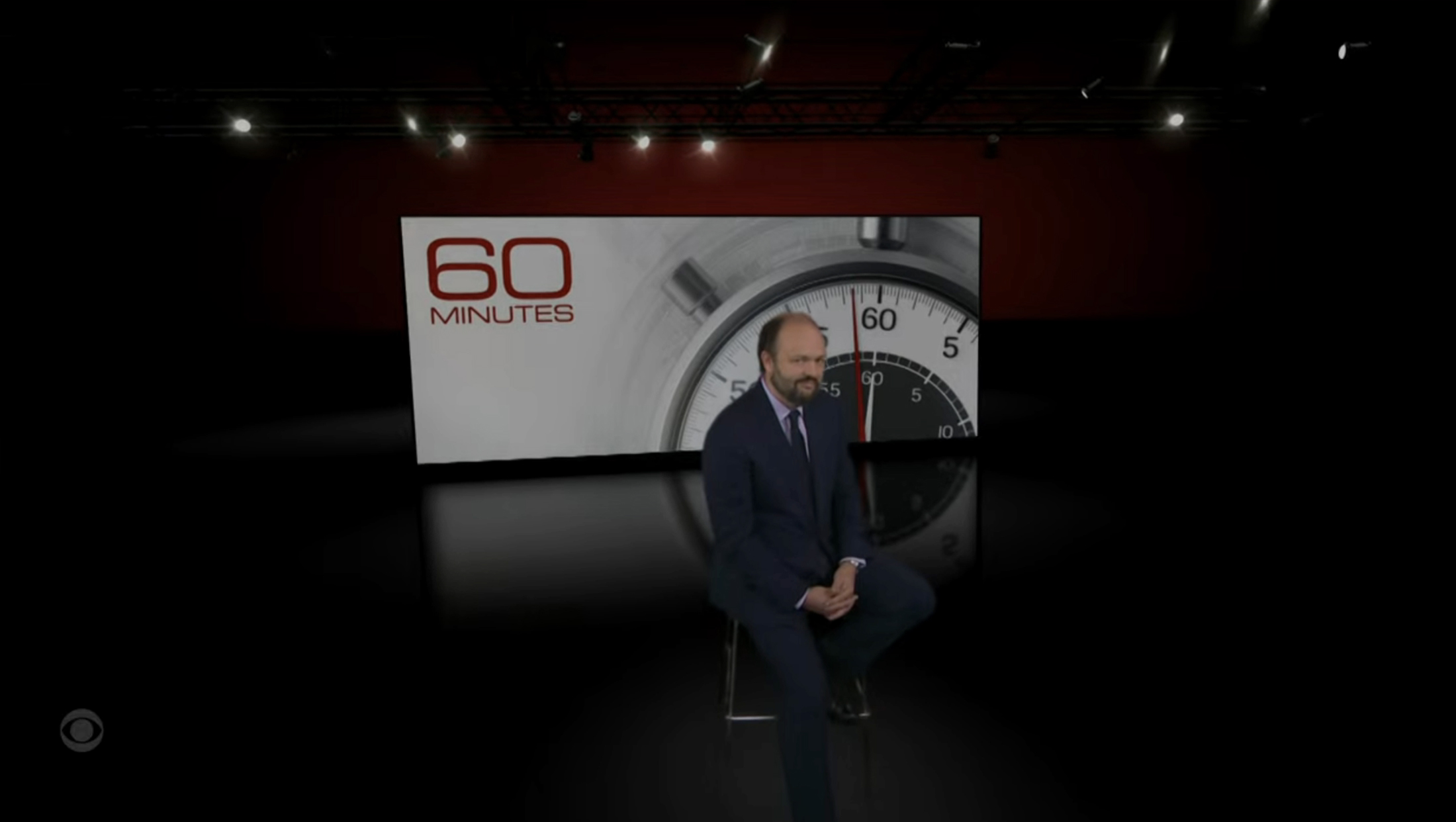
For the show’s kicker segment, known as “The Late Minute,” the virtual environment becomes even more obvious, with bursts of light from digital renderings of lighting instruments visible above the correspondent.

tags
60 Minutes, CBS, CBS News, virtual set design, Virtual Sets
categories
Branding, Broadcast Design, Broadcast Industry News, Graphics, Heroes, Network Newsmagazines, Networks, Virtual Sets