
Review: New NBCNews.com design confusing, inconsistent

Weekly insights on the technology, production and business decisions shaping media and broadcast. Free to access. Independent coverage. Unsubscribe anytime.
Please note: While we welcome your comments on the new NBCNews.com website on the form below, please note this commenting system is NOT an official way to reach NBC News. If you wish to let NBC News know your feelings about the redesign, please use its official contact page. Also please note that comments that are simply attempts to communicate with NBC News are not approved — only comments about the NBCNews.com website will be approved.
Despite NBC News’ efforts to drive home the idea that the new NBCNews.com is more about storytelling and less about the design of the site, it’s inevitable that people will be drawn first to the look and feel of the site — especially when it gets in the way of accessing all that great storytelling.
Overall, the new NBCNews.com design ends up being both disappointing and overwhelming.
The grid-style layout on the homepage and section fronts is cluttered and offers few visual cues as to what is most important.
That said, many news sites are experimenting with veering away from trying to prioritize content in favor of creating sites that are easier for users to “scan” and glean a large amount of information in a short amount of time. However, the NBCNews.com grid is rather difficult to scan since the headline text styling doesn’t carry enough weight against the large blocks of images.

A page from the 2013 design that appeared on some sections of the site.
In many ways, it’s disappointing that NBC didn’t use more of the elements from the 2013 page design NewscastStudio spotted — besides the continuous storytelling feature that was being tested in these new designs.
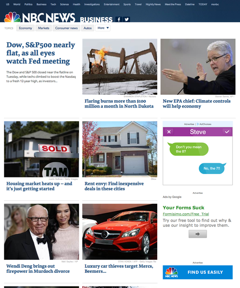
The grid layout from NBC’s experimental section fronts.
This design was clean, gave a prominent yet elegant treatment to the NBC News logo and offered a much more approachable grid design and sidebar of additional content on story pages.
The new site’s simplified navigation, meanwhile, is clean but the NBC News logo gets a bit lost.
Another confusing point — why does the site features a more generous amount of white space between rows but not in the vertical space between blocks, especially when white space is so widely used on story pages? From a design standpoint, it almost seems to imply the stories on each row are somehow related.
In fact, during Tuesday’s press event, NBC News execs specifically called out the white space on the story pages, but it’s a bit mysterious as to why that approach wasn’t used consistently throughout the site.

Where did the site go?!
There are also some reports of a bug in the site that, after accessing the search box, users get “stuck” on nothing but a white screen. NewscastStudio was able to replicate this issue and found the only solution was to clear the browser’s cookies.
Another issue being reported, which was also replicated by NewscastStudio, is slow loading of new content and “choppy” scrolling issues.
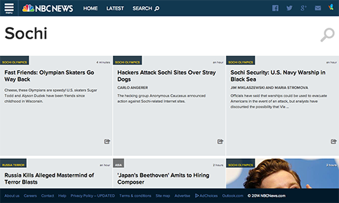
The new site’s search results page.
Speaking of that search box — if NBC can fix that search box issue, it’s worth noting the search functionality of the new site is one of its strengths. Although it’s a bit confusing to be presented with what looks like the world’s largest search box after clicking the search link in the header, once a search term is entered and results displayed, it’s refreshing to see that the results aren’t, like many other news sites, just a half hearted rebranded version of a third party search tool.
Somehow the grid layout works better here — likely because stories end up being displayed with a mix of photos and light gray, text based boxes.
During a press event Tuesday, NBC News indicated the site was designed, like many sites today, with a “mobile first” strategy. Of course, this was a smart move, but the in many ways it appears the design actually works better on smaller screens — mainly because the content neatly stacks on top of itself and the visual clutter is, by definition, reduced.
Another interesting point is that many users, including those who have posted criticism of the new site on Facebook, are drawing connections to the website’s new look and what’s referred to as the “Metro” design language in the Web design community.
Although Metro has spread to numerous Web and interactive design applications, it was originally developed by Microsoft — and users are complaining the new NBCNews.com looks too much like Windows or Windows Mobile. It’s not always clear if these users are confused over the network’s former partnership with Microsoft or mistakenly believe that, as Windows users, this somehow dictates how websites are displayed.
Going forward, it will be interesting to see how NBC News addresses the criticism of the new design.
Please note: While we welcome your comments on the new NBCNews.com website on the form below, please note this commenting system is NOT an official way to reach NBC News. If you wish to let NBC News know your feelings about the redesign, please use its official contact page. Also please note that comments that are simply attempts to communicate with NBC News are not approved — only comments about the NBCNews.com website will be approved.


tags
NBC, NBC News, nbcnews.com
categories
Featured, Networks, Online and Digital Production