
Oklahoma City station unveils new building, on air overhaul
Weekly insights on the technology, production and business decisions shaping media and broadcast. Free to access. Independent coverage. Unsubscribe anytime.
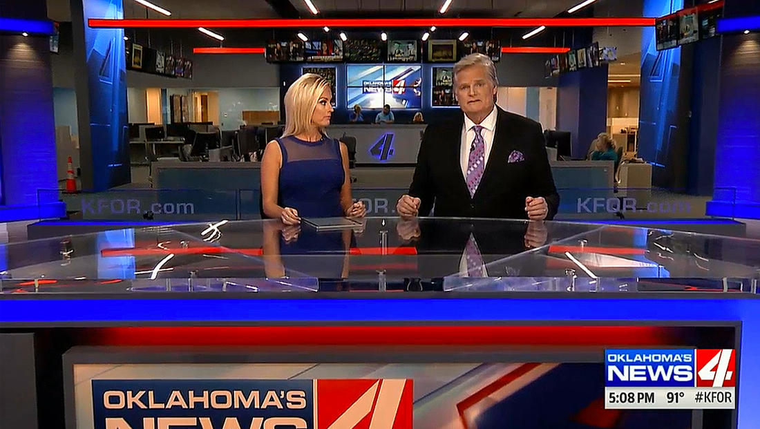
Branding
KFOR has also switched from its “NewsChannel 4” branding to “Oklahoma’s News 4.”
The station also updated its logo, changing its distinctive “4” from blue to red. The design has also switched to have the image “reversed” out of a red box.
The “4” icon has become completely flat, shedding its longtime gradient blue fill and beveled edges.
The box layout, meanwhile, also features a blue space for the words “Oklahoma’s” and “News.”
Graphics

KFOR’s new look also includes a new graphics package, which is based on Tribune’s Fox affiliate angled look, a design that ties into the strong lines found in the station’s distinctive “4” logo.
The station continues to make heavy use of the “for” (borrowed from its call sign and pronounced “four”), with the tagline “Looking out 4 you” and, the hashtag #Moving4Ward being used on social media to promote the new building.
The station’s new logo is featured prominently throughout newscasts, serving as a rather large bug.

Music
In addition to the visual changes, KFOR also dropped its longtime news music, which it had used for some 20 years in favor of Stephen Arnold’s “The Rock,” which features a prominently NBC chimes signature.
[field name=iframe]

tags
Broadcast Design International, Broadcast Facility, Broadcast Facility Upgrade, kfor, oklahoma city, panasonic, Stephen Arnold Music, the rock, tribune, tribune broadcasting, tribune creative group, tribune media
categories
Broadcast Design, Broadcast Engineering, Broadcast Facility, Broadcast Facility Technology, Broadcast Industry News, Graphics, Heroes, Local News, News Set Design, Set Design, Theme Music, TV News Music, TV News Music Package, TV News Set Design