
5 News enters the glass-and-light era with dynamic redesign
Weekly insights on the technology, production and business decisions shaping media and broadcast. Free to access. Independent coverage. Unsubscribe anytime.
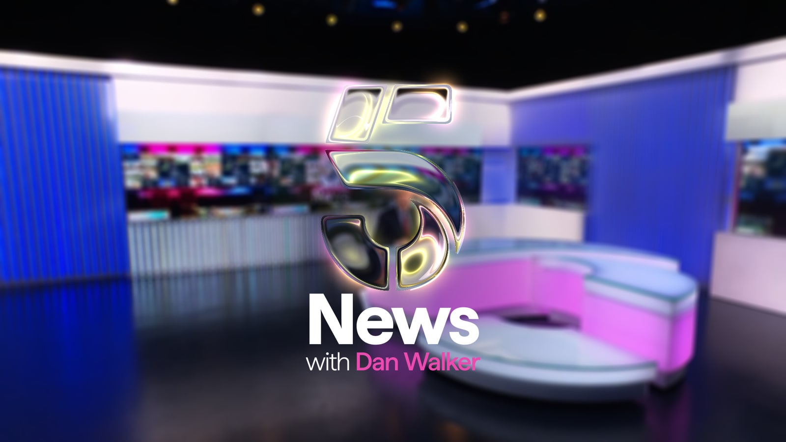
5 News, the early evening news bulletin on channel 5, has rolled out a new on-air identity built around layers of glass and light.
The redesign touches nearly every visible part of the program: its opening titles, lower-third graphics, studio set and theme music.
The channel, known as Channel 5 for most of its history, is owned by Paramount Skydance’s UK division and was renamed 5 in March 2025 as part of a wider push to unify its broadcast and streaming operations. 5 News itself is produced by ITN and presented by Dan Walker on weeknights.
The redesign arrived shortly after 5 News posted its highest annual audience share since 2018, according to figures the program released in early 2026. Debbie Ramsay, editor of 5 News, attributed the growth to an editorial approach built around everyday stories rather than Westminster politics.
“We are intentional about doing things differently for them, championing the personal stories that matter, covering the everyday issues shaping communities across the UK,” Ramsay said in a statement.
The visual overhaul aims to capture that essence, with design led by James Mobbs, a freelance creative director who previously worked as a senior designer at the BBC. Mobbs noted the brief for 5 News centered on a single idea: that the program’s journalism reflects the UK back to its audience.
A logo turned to glass
The identity’s central device is the 5 logo rendered as a three-dimensional glass object rather than a flat mark.
“Turning the logo into glass was such a clear concept to communicate that 5 News reflects the UK and the world around it,” Mobbs said. “It has different perspectives and angles within that, different sides of the shape.”
Despite the glass concept, Mobbs said the graphics avoid a heavily dimensional look. He described the approach as closer to the flat, translucent interfaces found on smartphones than to the layered 3D graphics common in television news.
“News graphics in the UK have stayed the same for quite a long time, and we need to be smarter and classier with new approaches and new technology,” Mobbs said.
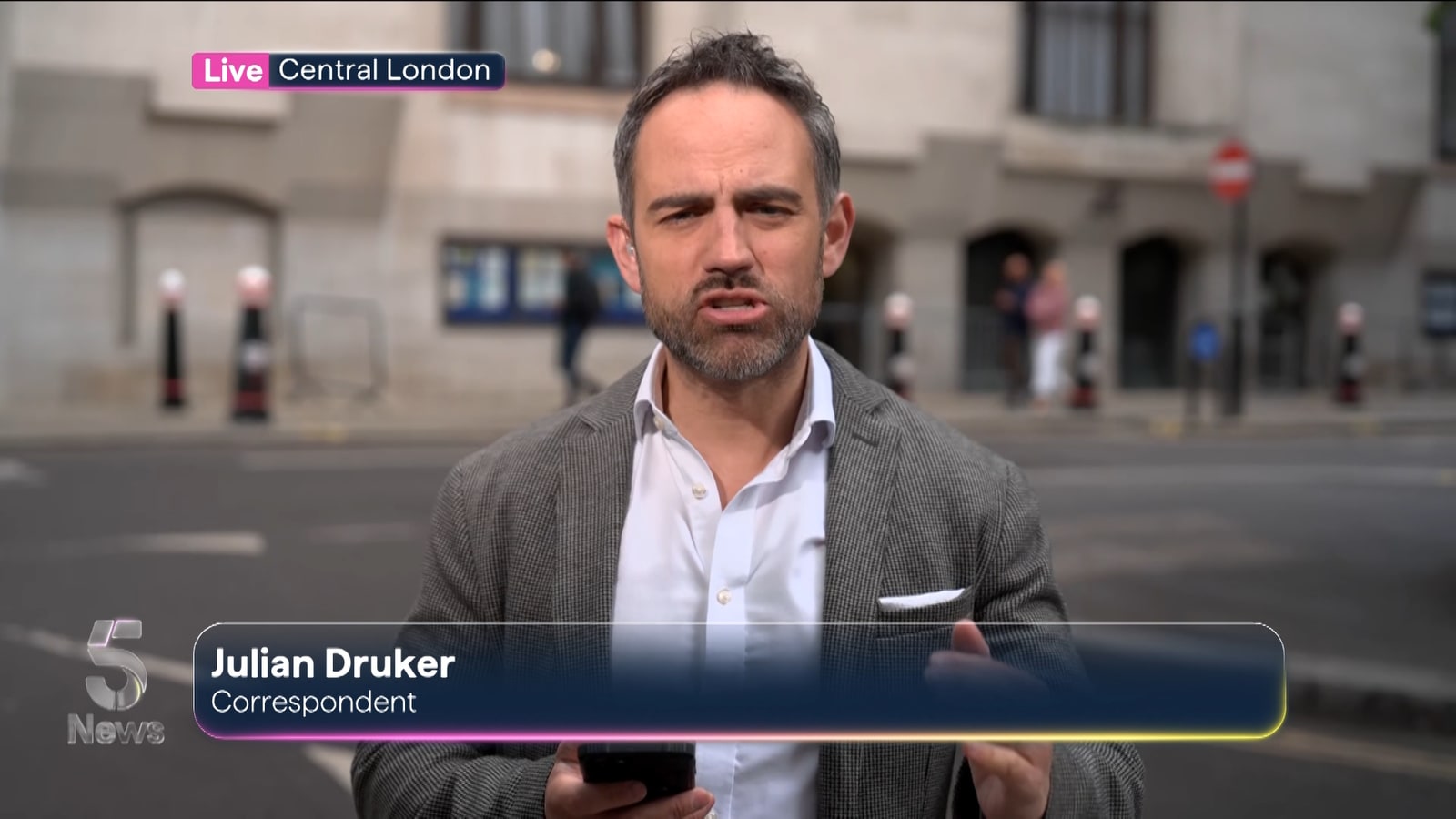
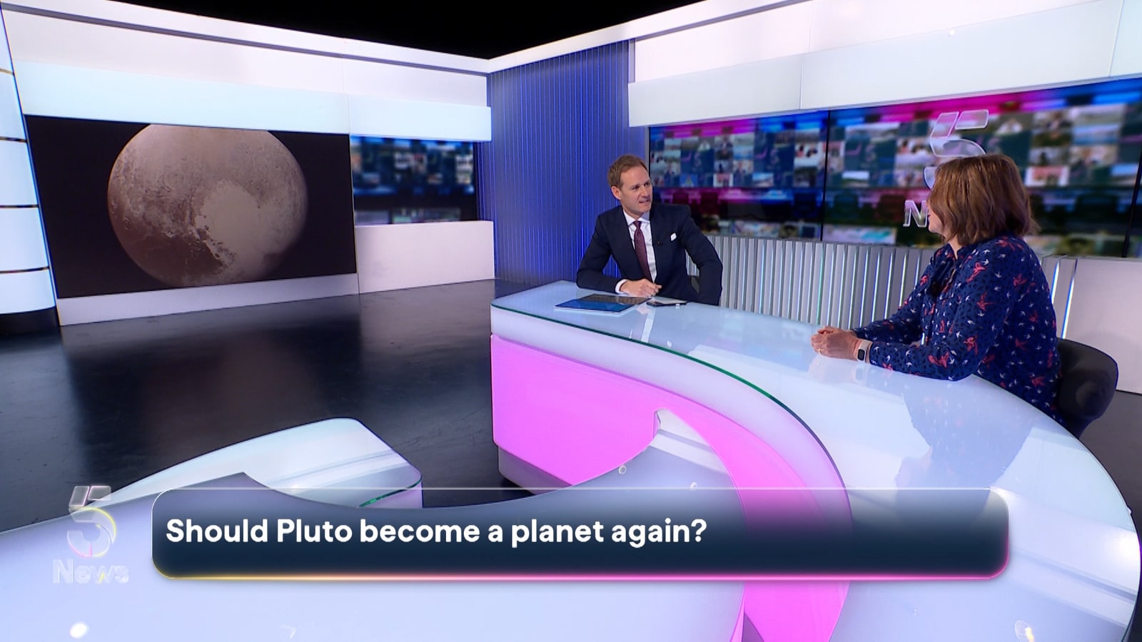
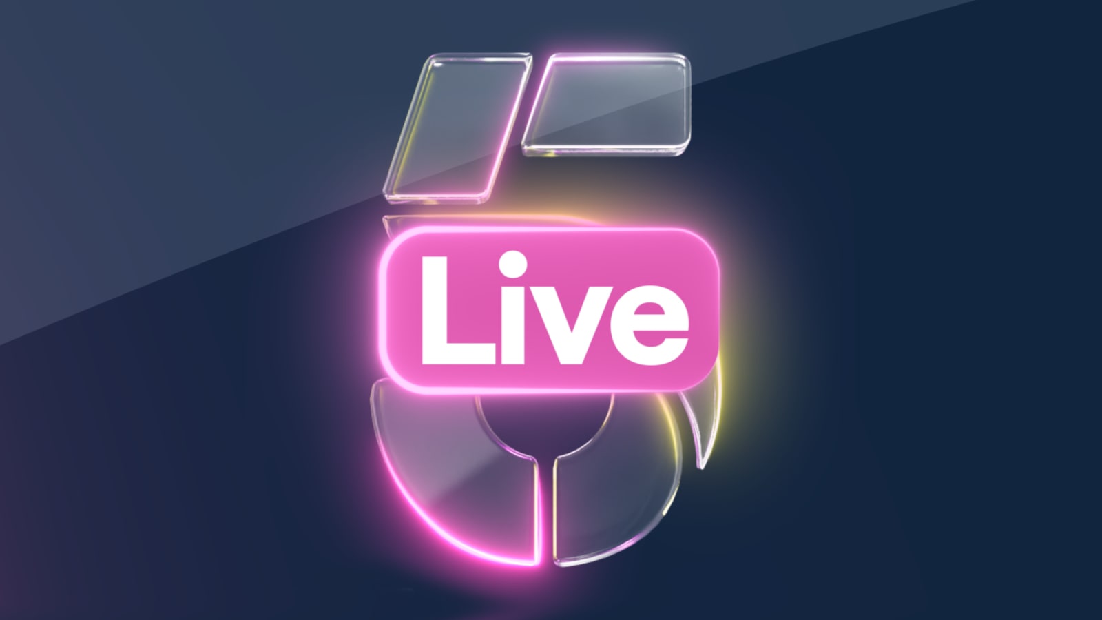
“It strikes a balance of being clean, minimal, modern and contemporary, while also allowing the screen to breathe,” added Mobbs.
That last point shaped how insert graphics like lower thirds were built. Mobbs said earlier L3s on the program covered more of the frame, and the new system was designed to let footage show through the graphic rather than sit behind a solid bar.
The lower thirds also carry a gradient effect that shifts gradually between two brand colors, described internally as lemon and rose.
“We took that key line and turned it into a constantly living thing,” Mobbs said. “It adds a bit more of a human touch to the graphics, rather than it being overly clinical.”
Graphics were also organized into a stricter hierarchy. Breaking news is flagged in yellow, “coming up” straps are smaller and sit beside a glass version of the 5 mark, and name straps carry a level of transparency so footage remains visible behind them.
Although the graphics appear dynamic on air, Mobbs said the glass elements are not generated in real time. Title sequences were composited in Adobe After Effects, while the lower-third graphics and studio screen elements were modeled in Cinema 4D and rendered using Redshift before being imported into the newsroom’s Vizrt graphics system as finished assets.
“A lot of time was spent getting the glint as glassy as possible without it being distracting,” said Mobbs.
The graphics package was also consolidated to a single typeface and a four-color palette of white, navy, rose and lemon, which Mobbs said was intended to keep the system usable for producers working on daily deadlines.
“We consolidated the graphics language,” Mobbs said. “It’s about keeping that language simple enough that in the rush of on-the-day news, you can create graphics that are effective but not overly complex to construct and get on air.”
A studio reworked, not rebuilt
The redesign extended to the 5 News studio, which Mobbs said was largely retained from its previous build rather than replaced. Physical lightbox panels in the set were replaced with video monitors, which now display a looping background sequence intended to place the studio within a working newsroom.
“The previous studio remains fairly unchanged since it was first installed,” Mobbs said. “Where there were lightbox prints previously, they’ve been replaced by monitors, and we developed a seamless background loop that places the studio in the heart of the newsroom.”
The program’s anchor desk, designed to mirror the distinctive 5 logo, was also retained but rebuilt to be fully lit.
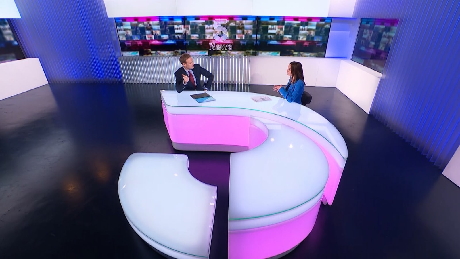
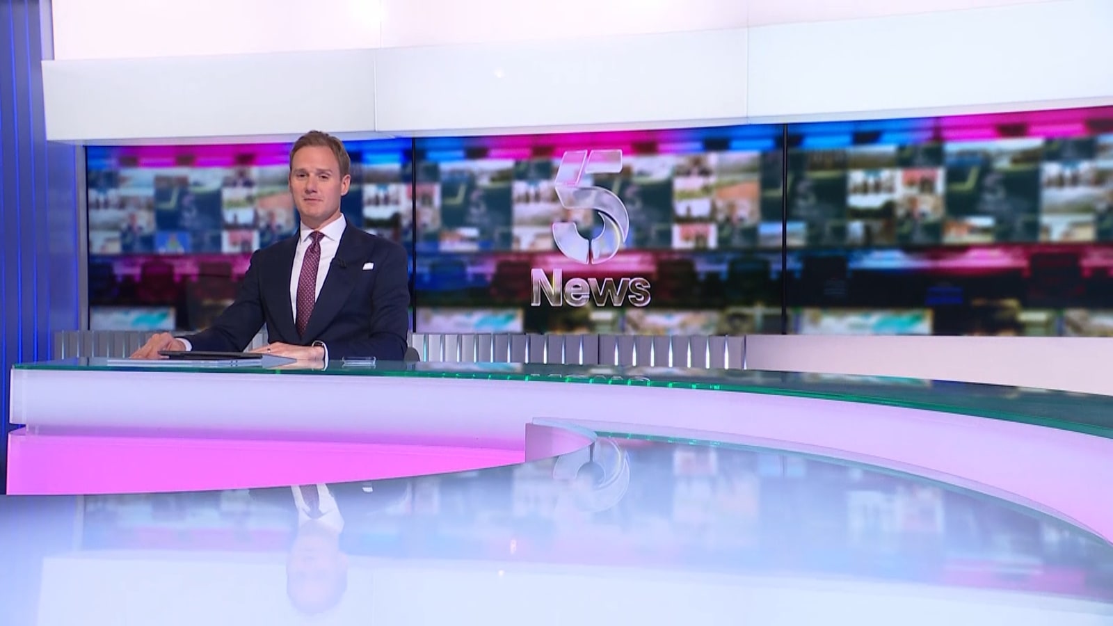
“The 5 mark is such a distinctive logo, we really wanted to keep it as part of the studio design,” Mobbs said. “The update there was to light it up, add glass to that desk and make it feel part of the same visual language as the titles.” The full set was also relit to match the new on-screen graphics.
Titles that open on the newsroom
One structural change involved the sequencing of the opening titles. Where the program previously opened directly on the presenter, the new titles now run first, ahead of any studio shot.
“Previously we’d always open on the presenter,” Mobbs said. “We put titles first so we can tell that story of a day in the life of 5 News: presenter walks in, there’s journalists on the phone, there’s people working hard, camera crews getting ready and setting up for the program.”
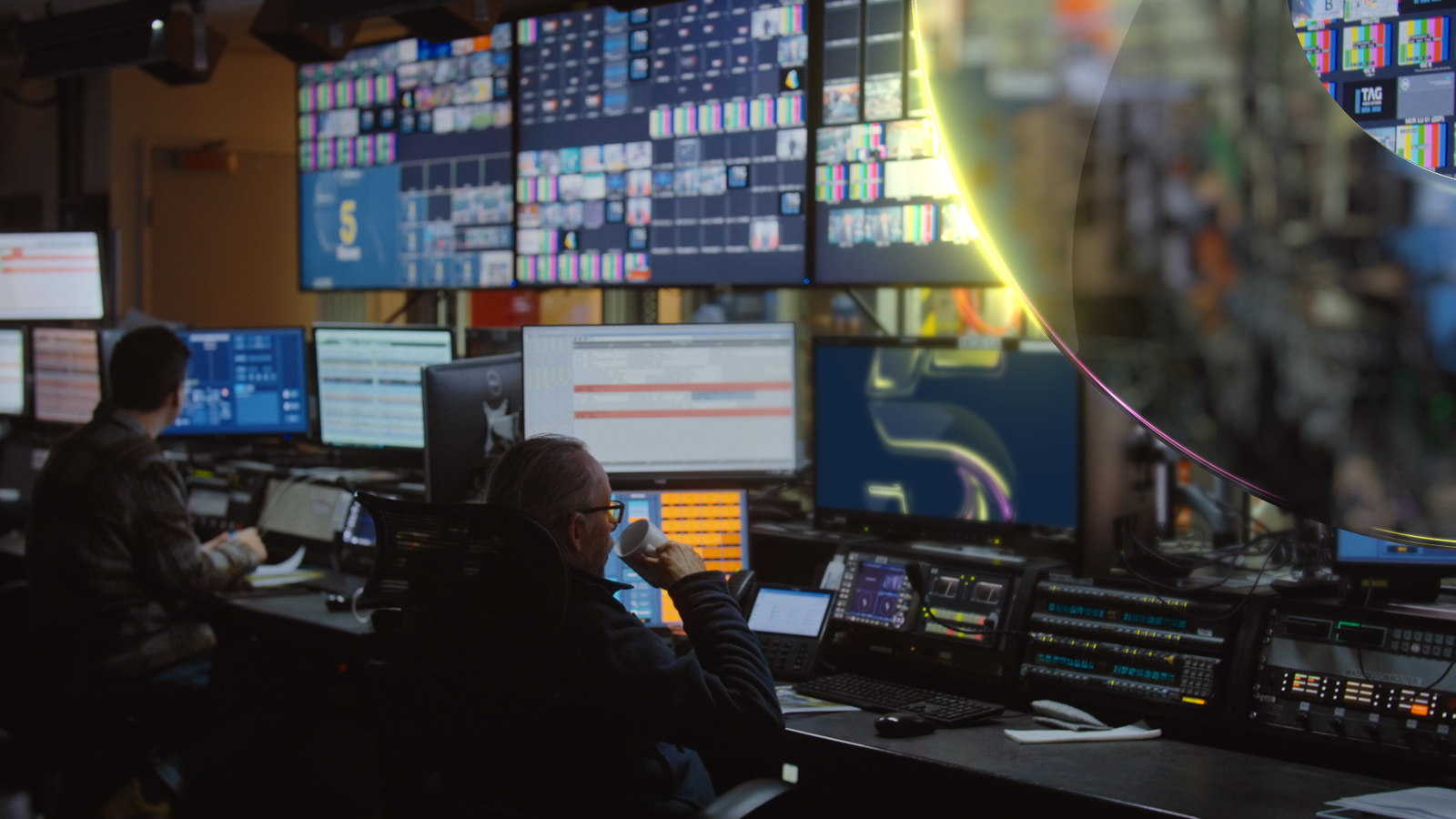
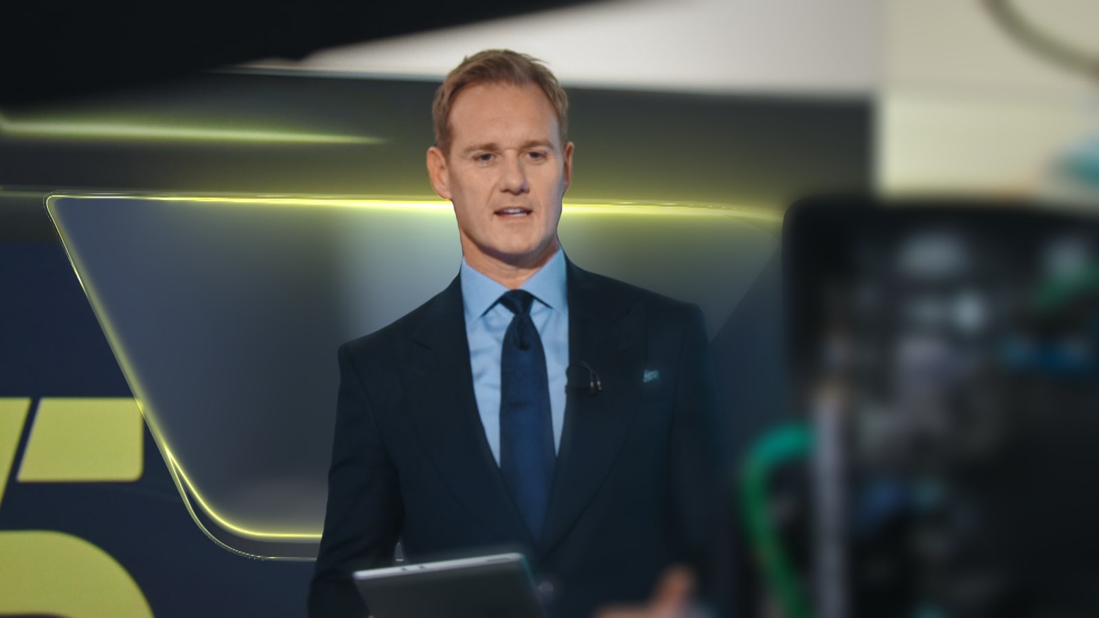
The titles are also built to be adjusted around major news events. Mobbs pointed to coverage of a change in prime minister, when Walker presented from Westminster and Downing Street.
“The titles are flexible to reflect major news events,” said Mobbs.
Transitions between segments were also redesigned around the glass motif, using the 5 mark as a visual device to move between shots.
A matching sonic identity
The visual redesign was paired with a new score developed with the audio studio Molecular Sound, which Mobbs has worked with previously.
“Five News needed a really strong sonic logo that we could then run throughout the whole program, not just in the titles but in the break stings, the music beds and the closing,” Mobbs said.
The resulting theme draws on strings, brass and percussion associated with traditional news scoring, combined with what Mobbs described as a more modern arrangement – culminating in a five-note sonic logo.
“It was all kind of based around dramatic strings and brass and percussion of traditional news, but with a modern edge and arrangement, with subtle glass textures within it,” Mobbs said.
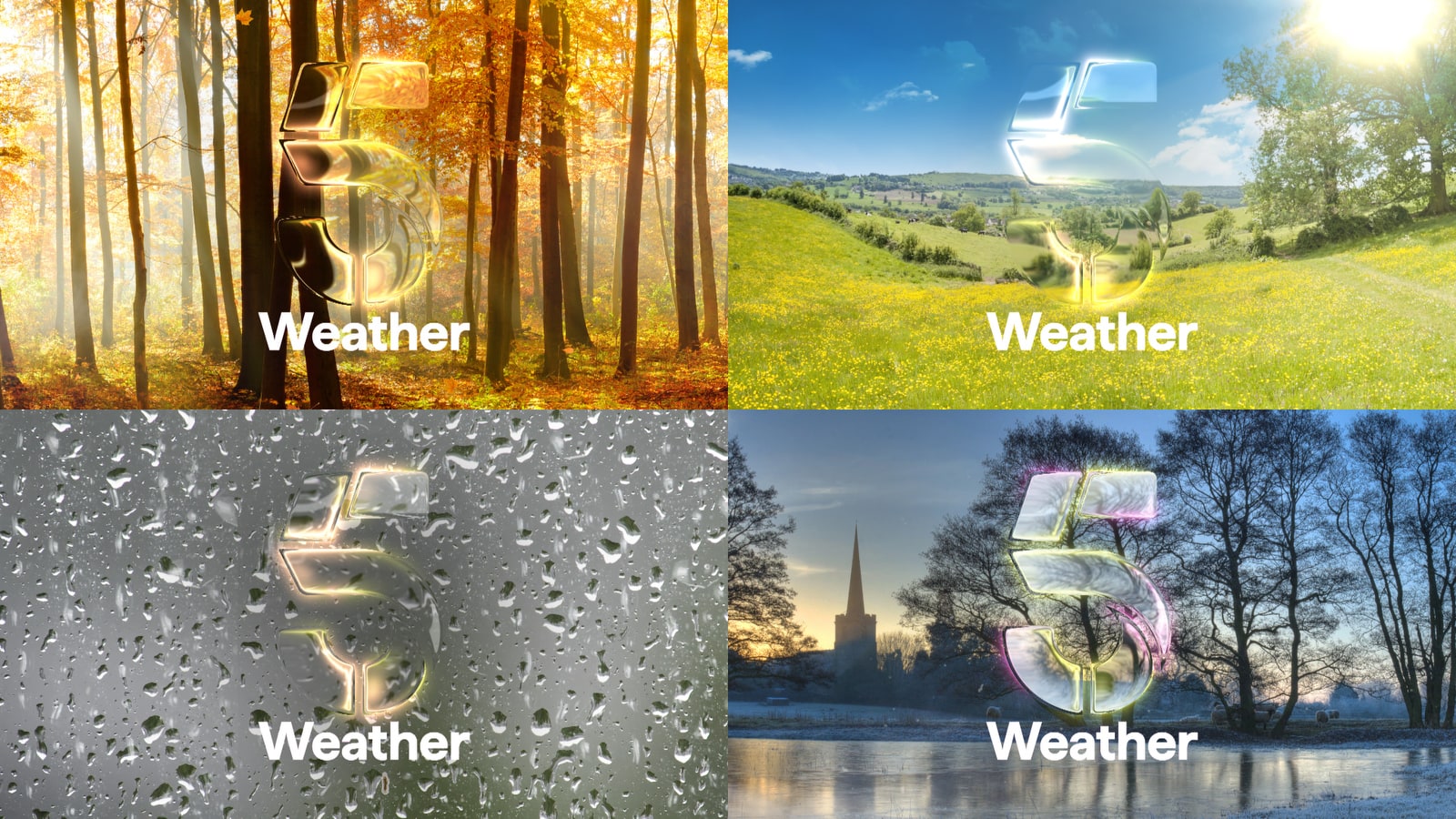
The score includes variants for different segments of the program. A separate bed was built for the “Around the World in Three Stories” segment, and another for weather bumpers, which Mobbs said was designed to shift tonally with the seasons.
“We took the 5 glass, but instead of placing it in newsy environments, we place it in the seasons of the UK: spring, summer, autumn or winter,” Mobbs said. “There’s also some conditions-based ones, like rain, so they’ve got a choice of weather bumpers they can decide upon each day, depending on the conditions outside.”
The titles, lower thirds, studio and score all launched together as a single system, tied back to the glass concept Mobbs said anchored the brief from the start. He said the identity was also built to change alongside the program’s coverage rather than stay fixed.
“It’s hopefully a quite versatile brand for them to evolve,” Mobbs said.

tags
5 News, Channel 5, james mobbs, Molecular, United Kingdom, Vizrt
categories
Branding, Broadcast Design, Graphics, Heroes