New Orleans’ WWL-TV debuts shiny new graphics
Subscribe to NCS for the latest news, project case studies and product announcements in broadcast technology, creative design and engineering delivered to your inbox.
WWL-TV, the CBS affiliate serving New Orleans, has unveiled its new graphics package.
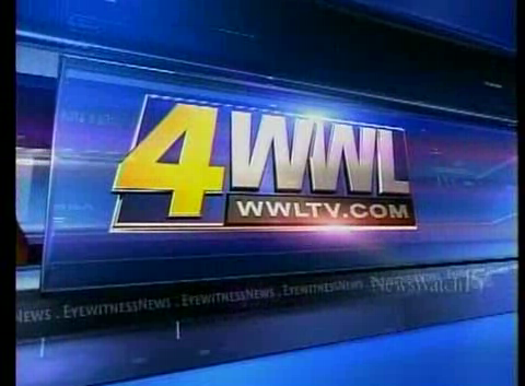
The new look uses bold shades of blue combined with sharp, glass-like geometric surfaces to create a sleek, modern set of graphics.
The station has moved away from using its lavender tone in its logo, opting for blues instead, though some of the purple tones are still evident in subtly blended accents throughout the package.
It would have been interesting, however, if WWL-TV had stuck with the purple, perhaps shifting to a slightly richer hue. This would have created a stand-out graphics package that would be easily distinguishable from the sea of blue graphics packages out there (for example, Hearst’s NBC affiliate in New Orleans, WDSU-TV, uses blue as well).
The station’s logo has been rendered in sharp 3D, complete with shiny edges and surfaces that reflect light glows for added effect.


Some other parts of the graphics package due, however, shift to a lighter, fresher shade of blue that’s almost teal, which is a unique twist on the blue tone. This is particularly prevalent in the open, which uses a glassy-3D clock outline showing the newscast’s time as a focal point. Behind this layers of text and local imagery round out the look.
The clock’s 3D “ice” looks is also carried out in the open, as a opposed to the more solid version used in the pre-show tease, a particularly effective method for creating visual variety. This clear effect also gives the package an awesome sense of depth and makes the viewer feel as though there’s a potentially unlimited number of layers to explore.
A particular strong point of this package is its transitions. The design takes advantage of the open space in the “4” and zooms through this hole to video clips. Elsewhere, bursts of light and moving rectangles work together to transition from the several “scenes” in this news open. Another effective animation is when the logo’s letters individually “burst” out toward the screen.

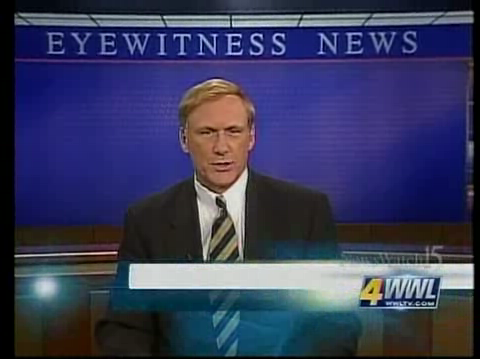
A final high point of the WWL-TV graphics package is its lower thirds. Here again, the package shows its strength in transitions with each tier making a slick entrance.
The lower thirds also boast subtle animation, including a looping background and bursts of light that zoom along the edge. A gold-toned block of color caps off the lower thirds to the left, separating the text area from the clock animation carried over from the open.
Finally, it’s worth noting that WWL-TV has elected to use a unique font for its lower thirds. So many times we see stations with great graphics packages who then chose to uses Helvetica or other similar font … boring! Fonts add character to type on paper and it’s no different on-screen. WWL-TV’s selection, for example, has a the clean, modern look of a sans serif face but still has some rounded corners and subtle flourishes that convey a friendly feel.
Subscribe to NCS for the latest news, project case studies and product announcements in broadcast technology, creative design and engineering delivered to your inbox.


tags
Belo, new orleans, wwl
categories
Graphics, Local News