Collection of CNN graphics screen grabs now online; plus vote
Subscribe to NCS for the latest news, project case studies and product announcements in broadcast technology, creative design and engineering delivered to your inbox.

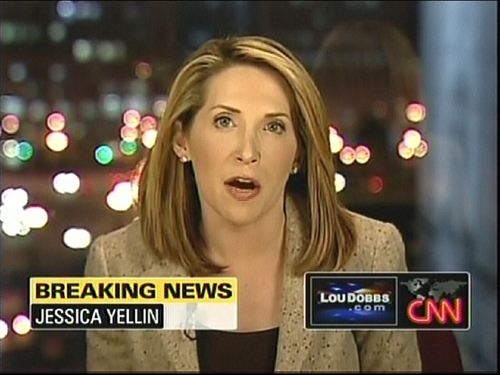
We’ve added a collection of images from the new CNN graphics package and have some additional thoughts on the package. Plus, share your opinion in our poll.
The new graphics do have a clean look and we still like the idea of placing the show logo to the left of the bug, but it’s still too large. That said, this arrangement does a good job of not having to modify lower thirds to match each show and gives a more cohesive look all around.
We’re a litte bothered by the empty white space that shows up, like in the image shown above, when one of the lines isn’t as long as the other. The animation used to switch between graphics is very eye-catching, but might be too much of a good thing; sometimes it’s hard to focus on a specific area of the screen with things morphing and and zipping around.
That said, we love the new “Flipper” that replaced the ticker. It’s a much better way to present headlines, though one could argue it does add to the on-screen movement clutter. However, it’s a welcome change from the normal scrolling (I’m still waiting for a network to drop their ticker altogether for not other reason than to stand out).
Subscribe to NCS for the latest news, project case studies and product announcements in broadcast technology, creative design and engineering delivered to your inbox.


tags
CNN
categories
Cable News, Graphics