‘Situation Room’ updates logo, motion graphics
Weekly insights on the technology, production and business decisions shaping media and broadcast. Free to access. Independent coverage. Unsubscribe anytime.
Approaching its 10-year anniversary in August, CNN’s “The Situation Room” rolled out a new look Wednesday complete with a revamped logo design. The design was completed by CNN’s internal CNN Design unit.
The design sheds the over-the-top 3D animation and greenish blue color, opting for a cerulean tone that’s friendly and approachable… and a little less “there’s breaking news right now.”
Logo Design
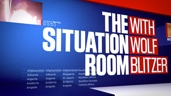
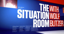
 The shows new logo design uses a grotesque sans-serif typeface and drops the former circular stars and glossy effect.
Using a center line, the shows name is right aligned while Wolf Blitzer’s name is left aligned. While off balance a bit, the logo is a welcome update for the program, as the old had grown a bit old from its 2012 debut.
Motion Graphics
The package uses many flat elements, with extruding bars weaving through a world of maps, charts and “live feeds.” The bars join at the end, creating the three rows of the logo.


In program, the show uses the standard CNN insert package with new blue backgrounds with subtle world maps and lines. For remote interviews, “The Situation Room” is using a logo wall similar to Sunday talkers like “Face the Nation.”

Both “State of the Union” and “The Situation Room” share some graphic similarities with CNN’s previous election look, so it will be interesting to see if that remains true as the election cycle continues.
Overall the new look is a welcome change for the program, as it doesn’t look like a 1990’s movie version of “crisis” and “war room.” The look is very patriotic, but not in a Fox News way. We’ll see what CNN show is next for an update.

tags
CNN, motion design, motion graphics, news graphics, situation room, the situation room, tv graphics, tv motion graphics, wolf blitzer
categories
Graphics, MoGraph, TV News Graphics Design, TV News Graphics Package, TV News Motion Graphics Design