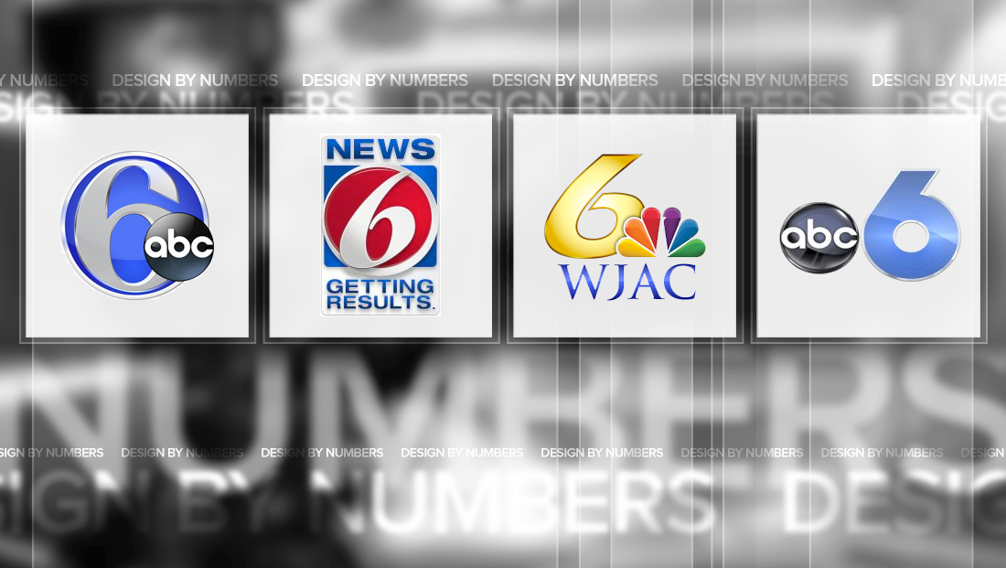
Notable Channel 6 TV station logo designs

Weekly insights on the technology, production and business decisions shaping media and broadcast. Free to access. Independent coverage. Unsubscribe anytime.
Whether it’s just plain old six or half a dozen, the number six offers some interesting possibilities for the design of TV station logos.
WPVI-TV

Philadelphia’s ABC O&O WPVI-TV has a look that draws some inspiration from the network’s iconic “Circle 7” logo used in markets such as New York, Los Angeles and Chicago, starting with the blue circle that serves as the base of the mark.
However, since this station uses “6” instead of “7,” the look is obviously somewhat different — and not a true “circle 6” design.
The station has used the same basic “6” character, with only minor variations, since 1967. The character is a bit wider than many “6s” and also adds heavier vertical strokes with narrower strokes near the top and bottom. The “hook” of the “6,” meanwhile, is cut off at a straight angle that perhaps could have been better crafted to match the curve below it.
WKMG-TV

Graham Media Group’s WKMG-TV, the CBS affiliate in Orlando, Fla. uses a dynamic “6” that conveys action and movement. Not only does the character appear slanted, the quick downward stroke that hooks back around to form the “6” almost comes to life on screen.
In the design, the number “6” is encased in a red circle with silver edging and slightly overhangs into the border area. The same “6” figure was used in a previously version of the logo, along with the red background, though that logo used a square box instead.
WJAC-TV

Sinclair’s WJAC-TV in Johnstown, Pa. uses an active, flowing “6” as well.
The character has been in use for years, dating back to when the station was owned by Cox and, therefore, was considered the “little sister” to WPXI-TV in Pittsburgh, some 65 miles away.
The “6” used by WJAC-TV includes sharp corners and is notable for not having its return right-to-left stroke meet up with the downward stroke on the far left.
The station previously boxed in its logo in a lockup that mirrored that of WPXI-TV, with the NBC peacock placed underneath the call letters, the center two of which were made smaller to form a sort of “arch” over the icon.

The station, meanwhile, continues to use the Trajan typeface for its call signs, another tie to its former sister station.
WSYX-TV

The logo at WSYX-TV, the ABC affiliate in Columbus, Ohio, uses an interesting version of the character “6.”
The roundedness of the logo is exaggerated, creating a character that’s more circular in its lower half than oval like many other fonts. The upward “tail,” meanwhile, is significantly shorter than most other “6s,” as well — to the point where it almost looks more like a zero with an errant “tail.”
This post is part of a semi-regular series on NewscastStudio that takes a look at TV station and network logos that include the numbers 1 and up. These posts aren’t meant to be a comprehensive list of all logos featuring the number in question, but rather a look at notable logos with creative, historic or an otherwise significant impact on branding design. If you have other logos with the number featured in this post, feel free to share it in the comments and stay tuned for a “reader’s favorites” version of this post coming soon.


tags
columbus, design by numbers, johnstown, orlando, philadelphia, wjac, wkmg, wpvi, wpxi, wsyx
categories
Branding, Design By Numbers, Heroes, Local News