
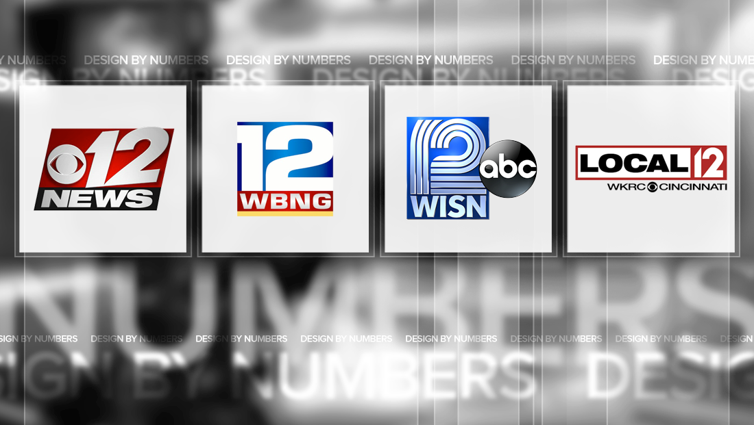
Notable Channel 12 TV station logo designs
Weekly insights on the technology, production and business decisions shaping media and broadcast. Free to access. Independent coverage. Unsubscribe anytime.
Here are our picks for notable Channel 12 TV station logo designs.
WISN-TV
![]()
Hearst’s WISN-TV in Milwaukee, Wisconsin, logo uses three rather thick lines that form the strokes of the numbers “1” and “2.”
The shapes of the numbers themselves are a bit unusual, too, with the top of the “1′ being curved slightly to the right to match the curve of the “2” and the “2” itself appearing as two distinct segments, both of which result in a stacked, horizontal set of six lines near the middle of the logo.
While the three-line design results in a bit of a dated look that’s a bit reminiscent of neon tubes or a science fiction-style logo, the look has the advantage of being recognizable and unique.
WBNG-TV
![]()
Update: Since this post was published, WBNG debuted a new logo.
Quincy Media’s CBS affiliate in Binghamton, New York, WBNG-TV uses a wide and bold rendering of the number “12” as the base of its logo.

The numbers include thick white strokes with exaggerated widths, with is most prominent in the “2.”
It’s important to note that the design appears to use characters that have either been custom drawn or heavily customized to work in the wider scale, rather than taking a font and “stretching” it out, which often results in inconsistent strokes and thicknesses.
In the typically lockup, the “12” stretches edge to edge of the blue box, with the far left and far right of the numbers going off-canvas, so the number is actually rendered in negative space.
Under the number, the station’s call signs appear in a font that’s a close but not perfect match to the numerals, with that slight inconsistency especially apparently between to the “G” and “2,” which could have shared closer “hooks” on the upper right and upper left, respectively.
WXII-TV
![]()
WXII-TV in Winston-Salem, North Carolina, another Hearst station, uses a unique arrangement of “1” and “2” in its logo design.
The station’s channel number appears in an italicized serif font that have been arranged in a “stepped” format inside of a red box.
The arrangement of the two numbers is such that the lower serif of the “1” is meant to visually connect to the lower “base” of the “2.”
In some ways, the uneven arrangement results in a bit of optical trick to the eye — and can, at first glance, make the reader wonder if the second character is some kind of odd “7” before realizing the horizontal stroke that forms the base of the “2.”
The design also allows the lower left serif and pointed top of the “1” as well as the far right curve of the “2” to peek out from the red box.
The call letters, meanwhile, are rendered in a simple serif typeface with a baseline that favors that of the “1” — but doesn’t match the slight angle found in the angle, which creates both a strong contrast and slight inconsistency.
It’s also worth noting that the station’s call signs are meant to match the Roman numerals for “12.”
WKRC-TV
![]()
Sinclair’s WKRC-TV in Cincinnati, Ohio, uses a pointed and well crafted “12.”
The logo uses a geometric, sans serif font as a base with a steeply angle on the “1” that draws the eye in.
Although the angle might seem a bit extreme, once the eye goes to the “2,” the source of that angle becomes apparently — it’s meant to match the downloard angle of that character, which results in a consistent look and feel.
The logo lockup with the station’s “Local 12” branding typically includes that number rendered in the negative space of a red square, which in turn is conntected to a thick red border that houses the word “Local.” The typeface here, however, doesn’t have quite the sharp and pointed look that logo does, instead favoring gentler curves.
While the typeface is certainly bold and easy to read, it would have been interesting to see a typeface with a bit of a closer visual connection with the numerals itself.
WPEC-TV
![]()
Sinclair’s CBS affiliate, WPEC-TV, in West Palm Beach, Florida, has had two notable Channel 12 logo designs.
The station’s current logo is a bit more of generic that its old look, but still does pack some attitude.
Previously, the station uses this logo, which made use of a slab-style rendering of the numbers, including the unique, two-piece “2” split by a strong diagonal line.
![]()
At the time, the station’s branded as “News 12” and used a red, blue and yellow color scheme.
That look was changed out, however, in 2008, at the same the station began including its network affiliation in its on air news branding. At the same time, the order of “News” and “12” was flipped and the station became known as “CBS 12 News.”
The new branding necessitated a new logo, as well, which includes a strong angular look contained in a tilted polygon box i red, blue and silvery-gray.
The station’s channel number is rendered in a carefully drawn number that includes strong points on both the “1” and “2” and a strong, bold rendering of the word “News.”
The one oddity of the logo is that the “12” is rotated slightly counterclockwise, which means its baseline is just slightly off that of the bottom of the red polygon it sits within. This doesn’t allow the curve of the “2” to peak out of from the top of the shape, but the rotation hovers between “too little” and “just right” so that it could be, especially at a quick glance, viewed as a mistake rather than a purposeful design decision.
In some ways, perhaps just a few more degrees of tilt would have made all the difference.
The mixed angles also has a slight effect on the “forward tilt” and motion of the logo, but care was taken, at least, to ensure the bottom right side of the “2” was shaved off to match the angle of the red container it sits in.
This post is part of a semi-regular series on NewscastStudio that takes a look at TV station and network logos that include the numbers 1 and up. These posts aren’t meant to be a comprehensive list of all logos featuring the number in question, but rather a look at notable logos with creative, historic or an otherwise significant impact on branding design. If you have other logos with the number featured in this post, feel free to share it in the comments and stay tuned for a “reader’s favorites” version of this post coming soon.

tags
binghamton, Cincinnati, design by numbers, logo design, milwaukee, TV station logo design, WBNG, west palm beach, winston salem, wisn, WKRC, wpec, WXII
categories
Branding, Design By Numbers, Local News