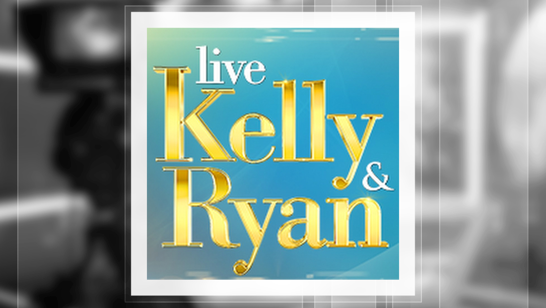
‘Live with Kelly & Ryan’ logo an odd mix of spacing, trapped white space

Weekly insights on the technology, production and business decisions shaping media and broadcast. Free to access. Independent coverage. Unsubscribe anytime.
With Ryan Seacrest joining “Live,” the syndicated talk show naturally got a new logo to incorporate his name next to existing co-host Kelly Ripa — but the result is a bit of an awkward arrangement similar to what the show has used in the past.
The show has retained its shiny gold serif lettering along with the teal backgrounds, but now Seacrest’s first name appears just below Kelly Ripa’s.
The logotype, which is based off Bodoni, retains its elegant and clean look, but brings back awkward trapped white space and alignment.
It’s first worth noting that the word “Ryan” appears with a capital “R,” breaking the logo’s traditional all lowercase look. This results in a huge empty space between the two names that designers commonly refer to as “trapped white space.”
Trapped white space is generally avoided in design as it creates awkward empty space.
In this case, the space sort of initially draws the eye in but then causes it to wander to the other text around it.
Ripa’s first name, meanwhile, now looks like it can’t quite decide whether it should be a capital “K” or not.
The word “live,” meanwhile, has moved up to “sit” on the “try” formed by the serif of the “K” (or “k” depending on its mood).
The vertical alignment of the “K” and “R,” is awkward as well. First, the two letters appears have slightly different thicknesses on the vertical far left vertical stroke. Second, the name “Ryan” is stacked just a few notches over to the right, making it difficult to determine if the stacking is on purpose or a mistake.

During the in-between times when Ripa was solo host, the show used a logo that neatly tucked in the word “live” (in lowercase letters) into the negative space left between the ascenders of the “k” and first “l.”
The result? A neat stacked and compact logo.

Back when Michael Strahan, now at “Good Morning America” after an infamous exit from “Live,” hosted with Ripa, the logo also had some odd trapped white space above the “c” in “Michael” and an odd “notch” created above the lowercase “m.”
Back then, at least, the logo maintained the capitalization consistency and still had the word “live” tucked neatly in between “Kelly.”


tags
Good Morning America, Kelly Ripa, Live, logo design, Michael Strahan, Ryan Seacrest
categories
Branding, Featured