
Q&A: Inside the redesign of Spectrum News by Loyalkaspar
Weekly insights on the technology, production and business decisions shaping media and broadcast. Free to access. Independent coverage. Unsubscribe anytime.
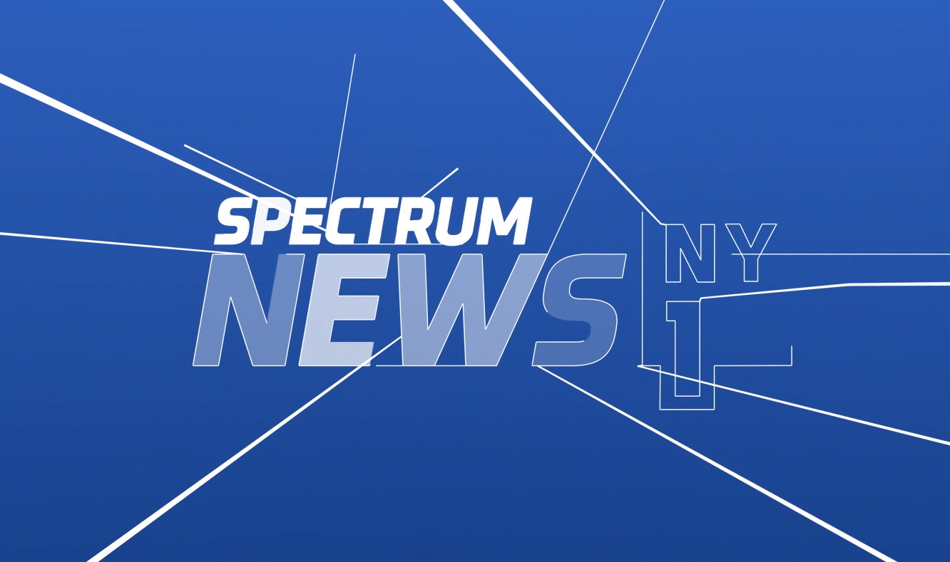
Spectrum News, the cable news channels acquired by Charter Communications in its merged with Time Warner Cable, have begun rolling new looks.
With graphics from Loyalkaspar and a new custom music package from Man Made Music, the look aims to unify the networks with a large toolkit to cover the ever-expanding news day.
We recently had a chance to speak with Loyalkaspar’s Creative Director, Anna Minkkinen, about the redesign, which has already launched on NY1 in New York, Bay News 9 and News 13 in Florida and Spectrum News NC in North Carolina.
Talk a little about the client brief and scope of the project?
We were asked to create a unified motion design system for Spectrum’s local news channels in markets across the country including North Carolina, Texas, New York City (NY1), and Florida. We were tasked with designing, animating, and delivering on-air graphics toolkits to Spectrum stations that they could customize for or all of their on-air needs. We worked with Spectrum over several months to get to the final product and while one, cohesive design direction was chosen, we did create some custom elements for certain markets.

Talk a bit about the overall style and direction?
The project included a period of intake in which we interviewed key stakeholders at Spectrum and at the various regional stations so that we could come to an understanding of their needs and interests. Out of this research, we identified goals that guided our design process.
Strategically, it was important for us to create a system that could effectively convey useful, local information clearly and efficiently. We aimed to inspire curiosity and conversations with viewers through good storytelling and graphics that could effectively punctuate these stories. Although unified in it’s overarching style, the system had to be customizable across markets. We were seeking network quality with an authentic, local sensibility.

The clean modern lines in the package underline a theme of interconnectedness. Individual lines come together to form larger patterns, as if to suggest that Spectrum both connects viewers to information and helps build understanding of their communities by providing in-depth and relevant content. The design system is very cohesive, but it offers variety and local flavor through its use of a spectrum of colors and customizable, photographic content.
What sets the design apart from others? The animation and simplicity?
There were two main components to this project that sets the design apart from others includes the news/promo packaging and the insert system- in which we developed a robust lower third system that could flexibly deliver a variety of information simultaneously. If you look at national news networks like CNN, the lower third is like a beating heart- constantly putting out information for you to engage with. We retooled the way that Spectrum conveyed information on screen previously, placing more content into this lower third system and designing it to have a color system as well as tabs and tickers that could animate-on as needed to convey more information as needed. So- ultimately, part of our process was developing this information system – and the other was creating a news package that felt unique.
Overall, we were interested in standing apart from other local news stations- which often look alike and have a somewhat flashy 3D aesthetic. Although we wanted to have rich color and bold, clear graphics, we did want to stand apart and have a modern sensibility. We wanted to have a simple system that was flexible and dynamic.
How was the color scheme chosen?
We knew that blue would be a core color, paying homage to Spectrum’s corporate palette. In collaboration with Spectrum, we explored different shades of blue that would be used on-air and ultimately developed a system where we would use lighter hues in the morning and darker shades of the blue in the evening. As for the rest of the palette, we worked with Spectrum to color code core story topics, for example, a bright purple is used for all lifestyle and entertainment news, orange for traffic, forest green for finance, gold for health, red for breaking news, etc. The idea with the color system was that when you are watching the news, we could introduce things like a weather or traffic update on the ticker with a pop of color. For regular viewers, when you see an orange ticker pop up, you know it’s conveying a traffic update and helps visually separate information.
What fonts were used?
We used various weights of Gotham and Gotham Narrow (narrow being used primarily within the insert/lower third system).

tags
Anna Minkkinen, Charter Communications, Loyalkaspar, ny1, ny1 news, Spectrum Networks, Spectrum News, Spectrum News NY1, Spectrum NY1 News
categories
Branding, Broadcast Design, Exclusives, Executive Session, Graphics, TV News Graphics Design, TV News Graphics Package, TV News Motion Graphics Design