Sky News leverages new logo for simple new promo

Subscribe to NCS for the latest news, project case studies and product announcements in broadcast technology, creative design and engineering delivered to your inbox.
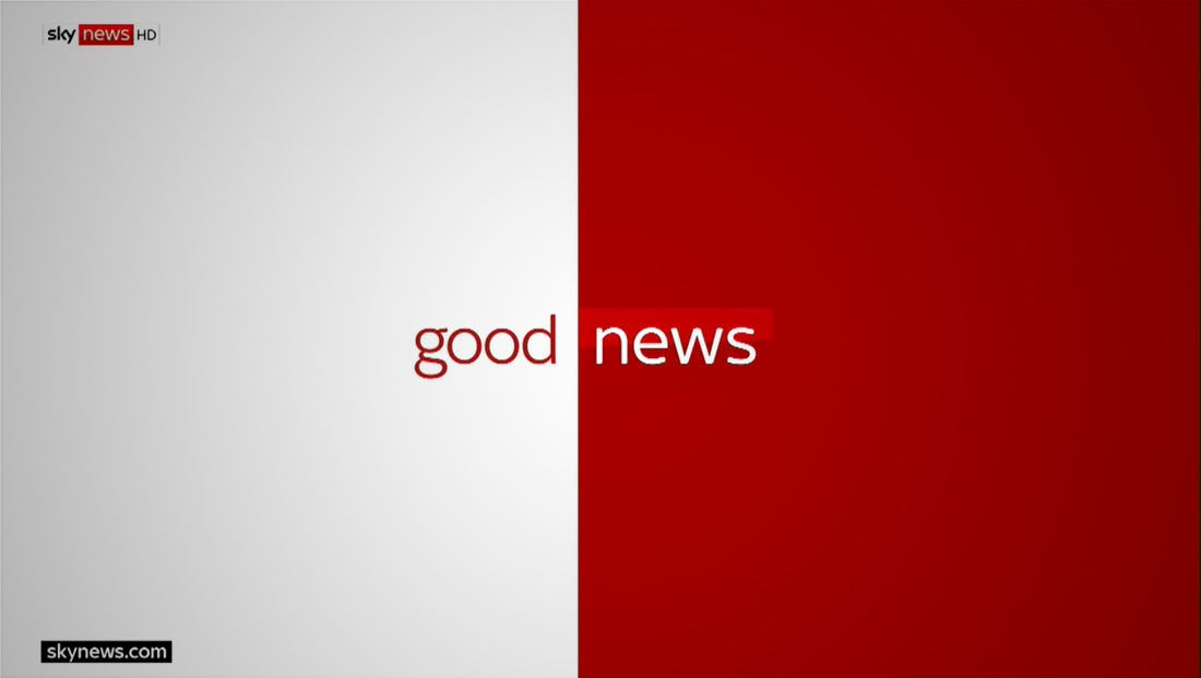
Sky News, which updated its logo design earlier this month, has found a way to use the new logo as part of a simple, typographically oriented promo.
The promo, which channels the network’s “split” logo design, features a mostly red and white background divided down the middle of the screen.
The spot includes a dramatic musical bed with beats cued to the when the word to the left of the word “news,” which is rendered in the network’s new typeface, flips through a variety of words such as “good,” “secret” and “brave.”
At certain points the beat is also linked to the colored background switching sides.


When the word “breaking” appears on screen, the color scheme switches to the yellow and black palette the network uses.
Subscribe to NCS for the latest news, project case studies and product announcements in broadcast technology, creative design and engineering delivered to your inbox.


tags
logo design, news promo, News Promos, Sky News
categories
Branding, Broadcast Design, Broadcast Industry News, News Promos and Sports Promos