
Dallas station goes bold in ‘we are’ promo

Subscribe to NCS for the latest news, project case studies and product announcements in broadcast technology, creative design and engineering delivered to your inbox.
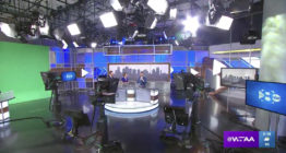
WFAA, the Tegna owned ABC affiliate in Dallas has incorporated the new arrow element in its logo into a catchy and bold new promo.
The arrow with rounded points was introduced in May as part of a set and graphics overhaul and appears prominently in the station’s logo design and as on on-set element.

The promo, meanwhile, uses a bold mix of yellow, blue and violet along with typography blended with stylized photography around the theme “We are.”

Everything from city names to “cow town” as well as inspirational words such as “proud,” “big” and, of course, “all Texans,” are used to complete the sentence “we are…”

Hothaus Creative, which created the promo for WFAA, incorporates the arrow element throughout, including as an icon, in backgrounds and transitions as well as compositing animated versions into the photographic scenes.

Meanwhile, “Something New” by Lewis Dransfield plays in the background.
Photography also shines through the boldface typography, while the bold gradient backgrounds add a bit of texture while keeping the clean look.
Houthaus’ Jeff Steed provided creative direction for the promo, with Chris Long creating the design and animation.
Subscribe to NCS for the latest news, project case studies and product announcements in broadcast technology, creative design and engineering delivered to your inbox.

tags
Chris Long, dallas, hot haus creative, Jeff Steed, News Promos, wfaa
categories
Branding, Broadcast Design, Broadcast Industry News, Featured, News Promos and Sports Promos