ESPN launching redesigned ‘BottomLine’ ticker with ‘flips’

Subscribe to NCS for the latest news, project case studies and product announcements in broadcast technology, creative design and engineering delivered to your inbox.
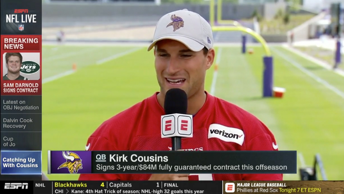
ESPN’s ticker, which it calls the “BottomLine,” will become a little less ticker-like on Monday.
The network released a preview of a redesigned BottomLine, which will occupy the same footprint as the previous iteration.
One of the key changes is the elimination of team logos and a switch from scrolling text to “flip” animations, which ESPN says will eliminate the frustration of only catching the end of story and having to wait for it to appear on screen again.
“All of its features – including type, color and motion – were purposely chosen to make the graphic as legible and effective as possible within the same footprint as the previous version,” ESPN creative services creative director Michael Ruddy said in a statement.
According to the network, ESPN drew inspiration from mobile messaging apps for the new look.
ESPN first introduced the BottomLine in 1995 and was significantly overhauled in 2014.
ESPN notes the original BottomLine was influential in driving the evolution of on-screen tickers and similar graphics that now dominate sports broadcasting and television news.
Subscribe to NCS for the latest news, project case studies and product announcements in broadcast technology, creative design and engineering delivered to your inbox.


tags
BottomLine, ESPN, Michael Ruddy, tickers
categories
Branding, Broadcast Design, Broadcast Industry News, Featured, Graphics, Sports Broadcasting & Production