
BBC Two creates a variety of two-part looks in new branding idents
Weekly insights on the technology, production and business decisions shaping media and broadcast. No paywall. Independent coverage. Unsubscribe anytime.
BBC Two’s first rebrand in two decades removes the obvious references to the number “2” but instead focuses on the curves and shapes of the numeral — and the idea of division and dichotomy.
While BBC Two has kept the same name and spelled out version of the word “two” below the iconic BBC logo, the new look centers around 16 unique “ident” spots, also known as “IDs.”
The new look also incorporates BBC Reith, the broadcaster’s bespoke font it unveiled in the summer of 2017.
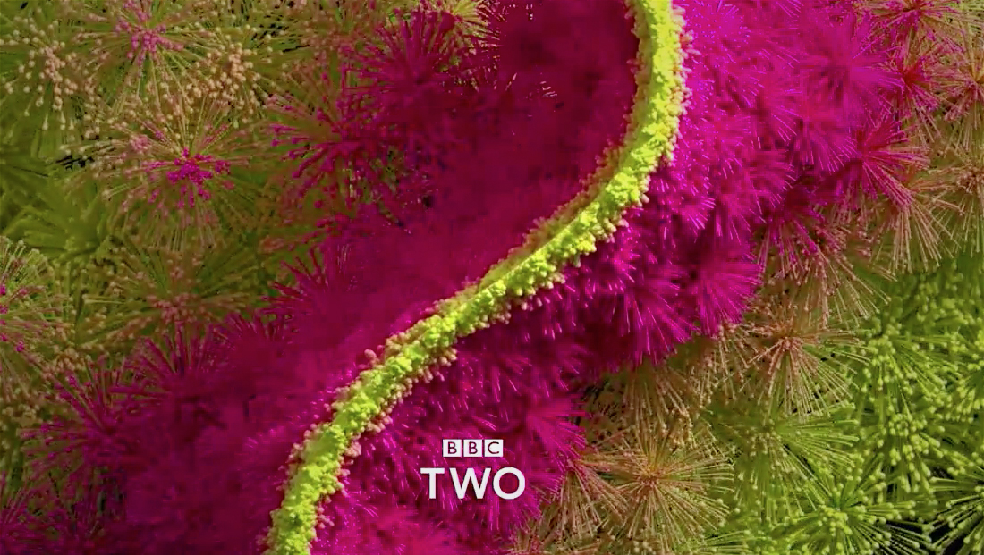
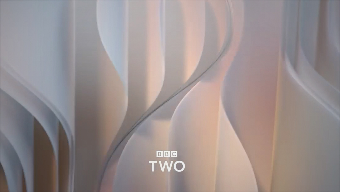
These short clips, which typically appear in between programming, continue the network’s tradition of using a variety of looks, but no longer incorporate a stylized number two into a variety of scenes. Instead, they center around an abstracted, textural curve that flows down the center of the screen and draws inspiration from the gentle descending stroke the numeral features.
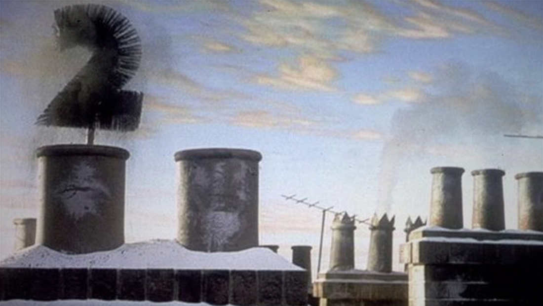
An example of an old version of the BBC Two idents.
Previously, the network was known for using “fluffy” iterations of the number two that moved around a variety of more literal scenes, such as the chimney sweep look shown above.
“The new look is intended to reinvigorate the channel, and comes amid growing pressure from on-demand services like Netflix and Amazon,” the BBC writes in its own coverage of the new look.
In addition to the initial 16 looks, which were created by animators and artists across the U.K. under the direction of BBC Creative and agency Superunion, more idents will be added in the future.

This includes an upcoming one from Aardman, the world-famous animation studio and creators of Wallace & Gromit.
Each ident has a unique look — some inspired by nature such as the curves of canyon walls, geodes and microscopic organisms — while others are more abstract and inorganic.
In many cases, the two two sides of the designs represent a study in contrast or interplay, another subtle nod to the concept of “two.”

tags
Aardman, BBC, BBC Reith, BBC Two, Idents
categories
Branding, Broadcast Design, Broadcast Industry News, Graphics, Heroes