
BBC develops its own font
Weekly insights on the technology, production and business decisions shaping media and broadcast. Free to access. Independent coverage. Unsubscribe anytime.
British broadcaster BBC has developed its own custom font in a move that is aimed to save money and increase legibility.
The font, BBC Reith, is named for Baron Reith, a broadcasting executive who played a key role in establishing the BBC as an independent public service broadcaster.
The BBC font, BBC Reith, was developed by BBC’s in house design team (BBC Creative) with noted type foundry Dalton Maag.
The new font replaces the iconic Gill Sans the network has used for decades, as well as uses of Helvetica and Arial on websites.
The new typeface has been rolled out on BBC Sport, which also redesigned its graphics package, with plans for it to debut across other the other network’s properties over the next year.

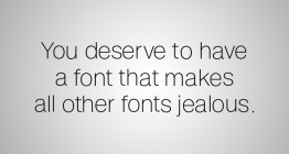
BBC Reith is designed to be more legible across screens of all sizes — whether over the air or on the network’s mobile apps and sites.
In addition, the switch is expected to save the BBC an undisclosed amount of money by not having to pay licensing fees.
Though the exact savings have not been disclosed, the cost to use Gill Sans for 25 million website page views comes to about $33,000 U.S. dollars via popular font seller MyFonts. It’s worth nothing that the use of the font in graphics could be licensed separately and the BBC may benefit from negotiated rates.

Switching to its own bespoke font is along the lines of what CNN did in 2016 with the introduction of CNN Sans.
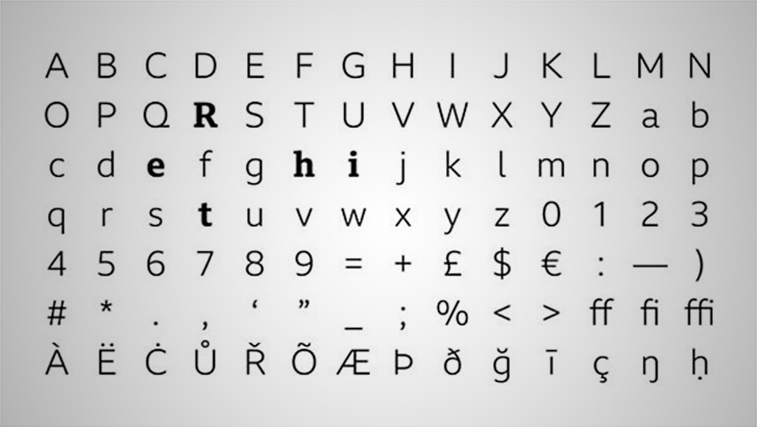
BBC Reith appears to have some visual connections to Gill Sans.
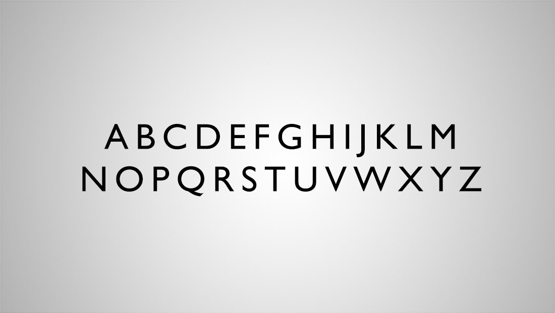
Notably, many of the letters have been narrowed slightly, perhaps most notably the “W” and “X,” a move that makes the typeface more flexible.
Another key change is the removing of the sharp “points” in favor of subtle squared-off ends.
Some of Gill Sans’ trademark looks, including the distinctive “B” and “C” used in the BBC logo, aren’t as prominent. Meanwhile, the letter “R” has lost its extended “leg,” while the descender on the “J” is no longer hanging down under other letters. The “Q” has also lost its descending “tail” in favor of one that sits on the baseline.
The font also appears to have a serif variation available.

tags
BBC, BBC Creative, BBC Reith, BBC Sport, CNN, CNN Sans, Dalton Maag, font, fonts, Gill Sans
categories
Branding, Broadcast Design, Graphics, Networks, TV News Graphics Design