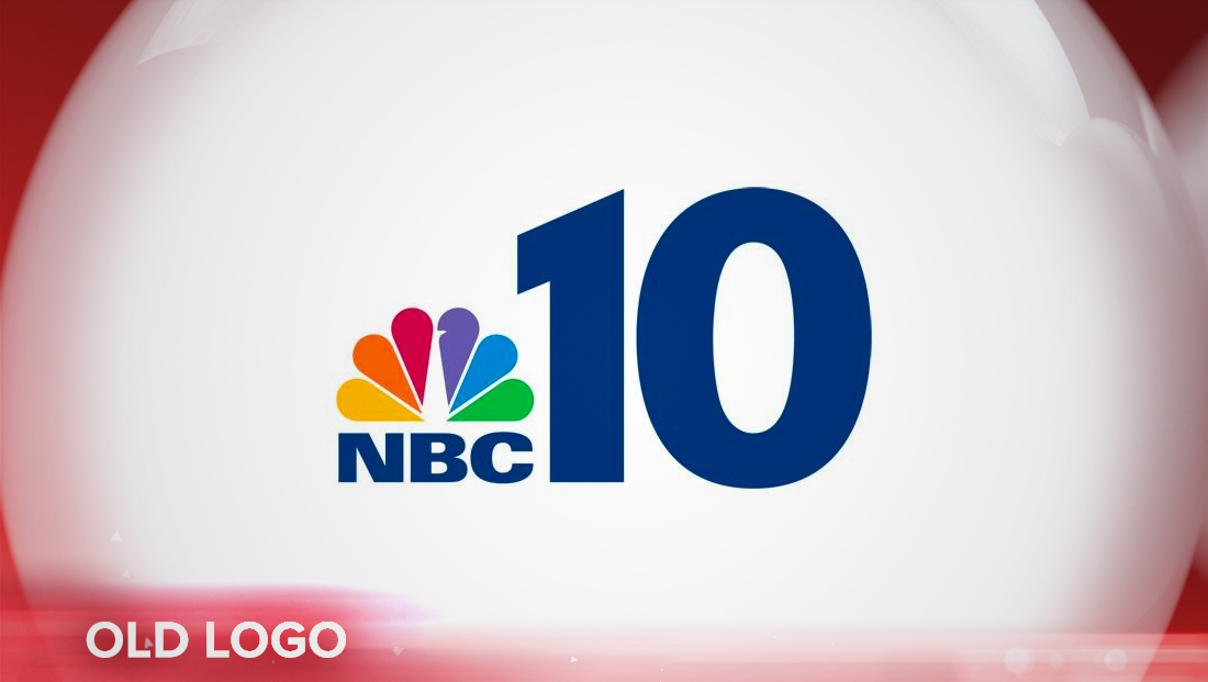
Philly’s NBC 10 tightens up logo design along with on air overhaul

Subscribe to NCS for the latest news, project case studies and product announcements in broadcast technology, creative design and engineering delivered to your inbox.
After debuting its new set in the Comcast Technology Center, Philadelphia’s WCAU has also tweaked its logo design.
The station has retained the same basic numerals for its “10” logo that it switched to in 2012, but has eliminated the thick “NBC” letters below the peacock on the left.


The peacock, meanwhile, has also been moved over and tucked about halfway over the vertical stroke of the “1.”
WCAU, which is the market’s NBC O&O, is still known on air as “NBC 10” and “NBC 10 News” — with the peacock essentially taking the place of the network’s name in the logo.
The station’s “Count on it” tagline, which used to be in a similar typeface as the letters “NBC” are now set in a cleaner, more geometric face.
In addition, the “NBC 10 News” lockup has been updated as well to incorporate the word “News” in an italicized version of FF DIN, the font used primarily throughout the so-called “Look N” graphics package that NBC O&Os use.
Graphics fed to LED video panels on the set are done in mostly bold blues — and while they do incorporate the wedge-shaped elements from Look N, the sharper, metallic elements found in the package have been reduced in these locations.
Subscribe to NCS for the latest news, project case studies and product announcements in broadcast technology, creative design and engineering delivered to your inbox.


tags
Comcast Technology Center, logo design, Look N, philadelphia, wcau
categories
Branding, Broadcast Design, Broadcast Industry News, Featured, Graphics