ABC 7 Chicago updates traffic maps, how it shows travel times
Subscribe to NCS for the latest news, project case studies and product announcements in broadcast technology, creative design and engineering delivered to your inbox.
WLS, the ABC O&O in Chicago, updated its traffic maps and graphics last week — including a notable change to how it shows travel times on key roadways.
Primarily used by traffic anchor Roz Varon, who is widely credited with “inventing” traffic reporting, the new graphics include refreshed maps and satellite imagery.
What's a 'polie'? #NBCChicago pic.twitter.com/OpQpx228Rb
— Chicago TV Critic (@ChicagoTVCritic) December 17, 2018
The familiar green, yellow and red overlays on key roads have been kept — but the city labels are now boxed in a font that doesn’t match the station’s graphics package.
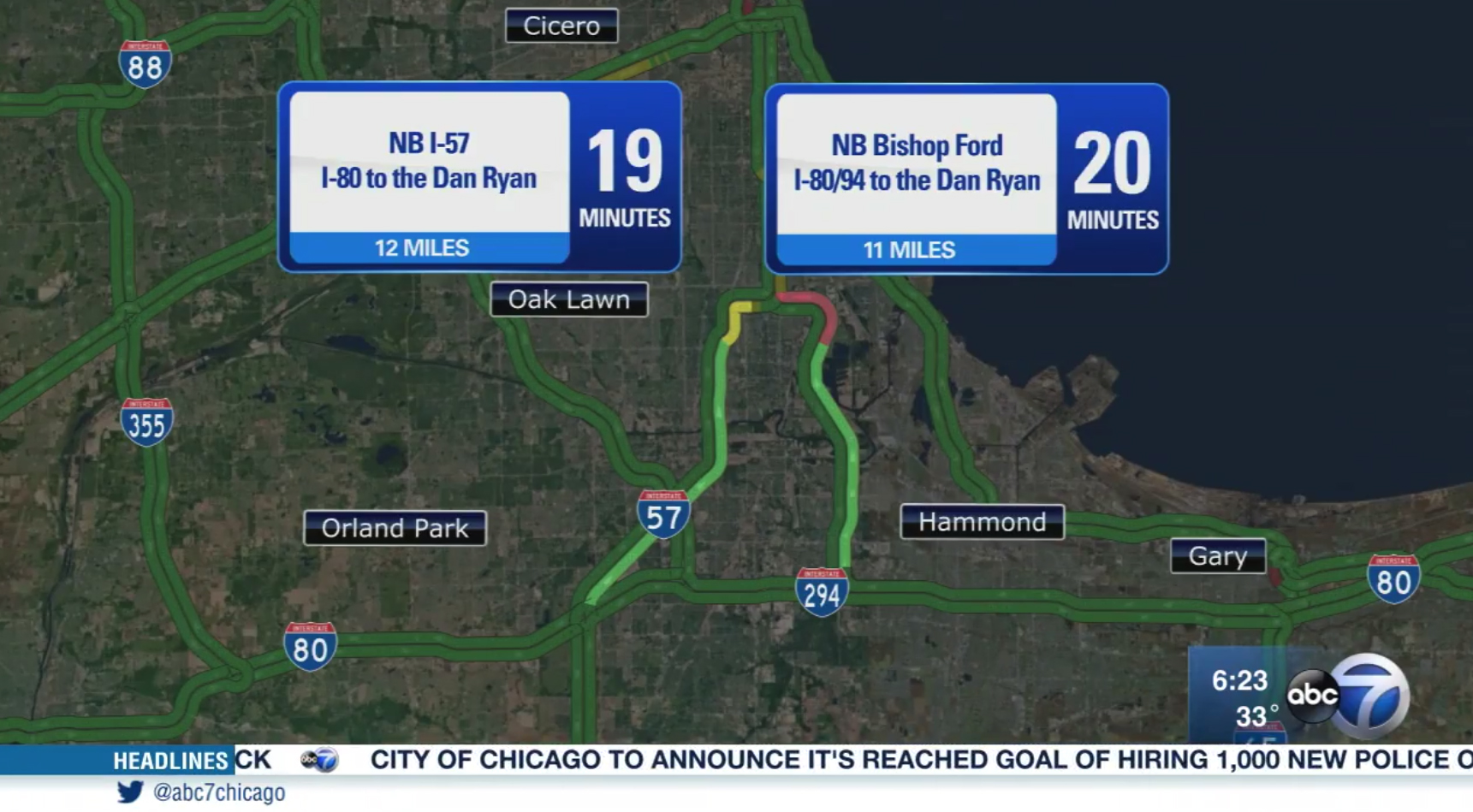
The new ‘travel times’ graphic.
Perhaps most significant, however, is how the key travel times are displayed.
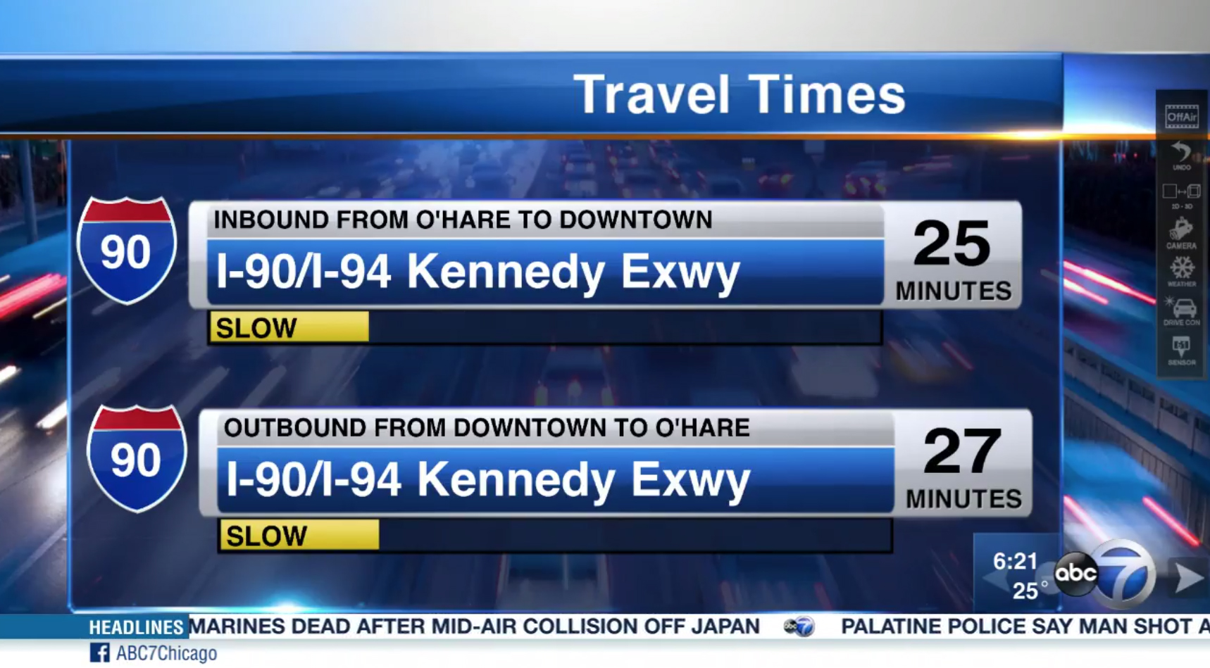
The old ‘travel times’ graphic used by WLS.
For years, ABC 7 has displayed travel times in essentially the same layout — horizontal bars featuring a prominent interstate shield icon, number of estimated minutes and a colored indicator bar — for both directions of the road in question (typically referred to as “inbound” and “outbound”).
The new look features two floating boxes with the drive time in a large condensed typeface. As each travel time is discussed, the map “fades out” the other roads to highlight the appropriate highway.
The new graphics also adds the number of miles between the two points illustrated, which is placed under a text description of the road.
While the interstate shields are still visible on the map itself, they are removed from the information boxes, perhaps making it harder to tell what road is being discussed at a glance.
The color indicators, which are also on the map themselves, are not included in the boxes either.
The update gives ABC 7 a unique look that stands out among the other O&O affiliates in the market:
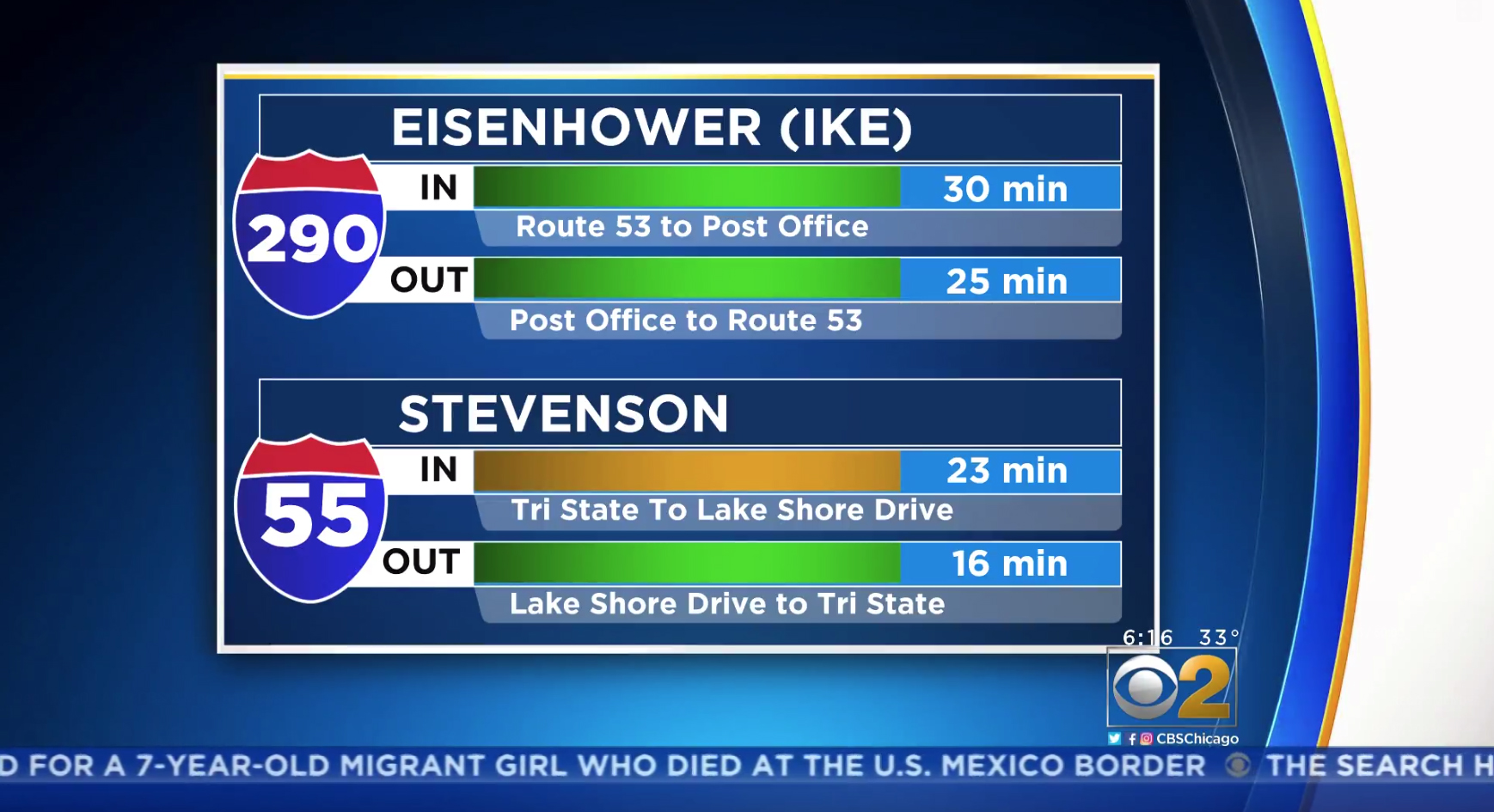
WBBM, the CBS O&O in Chicago, uses this look.
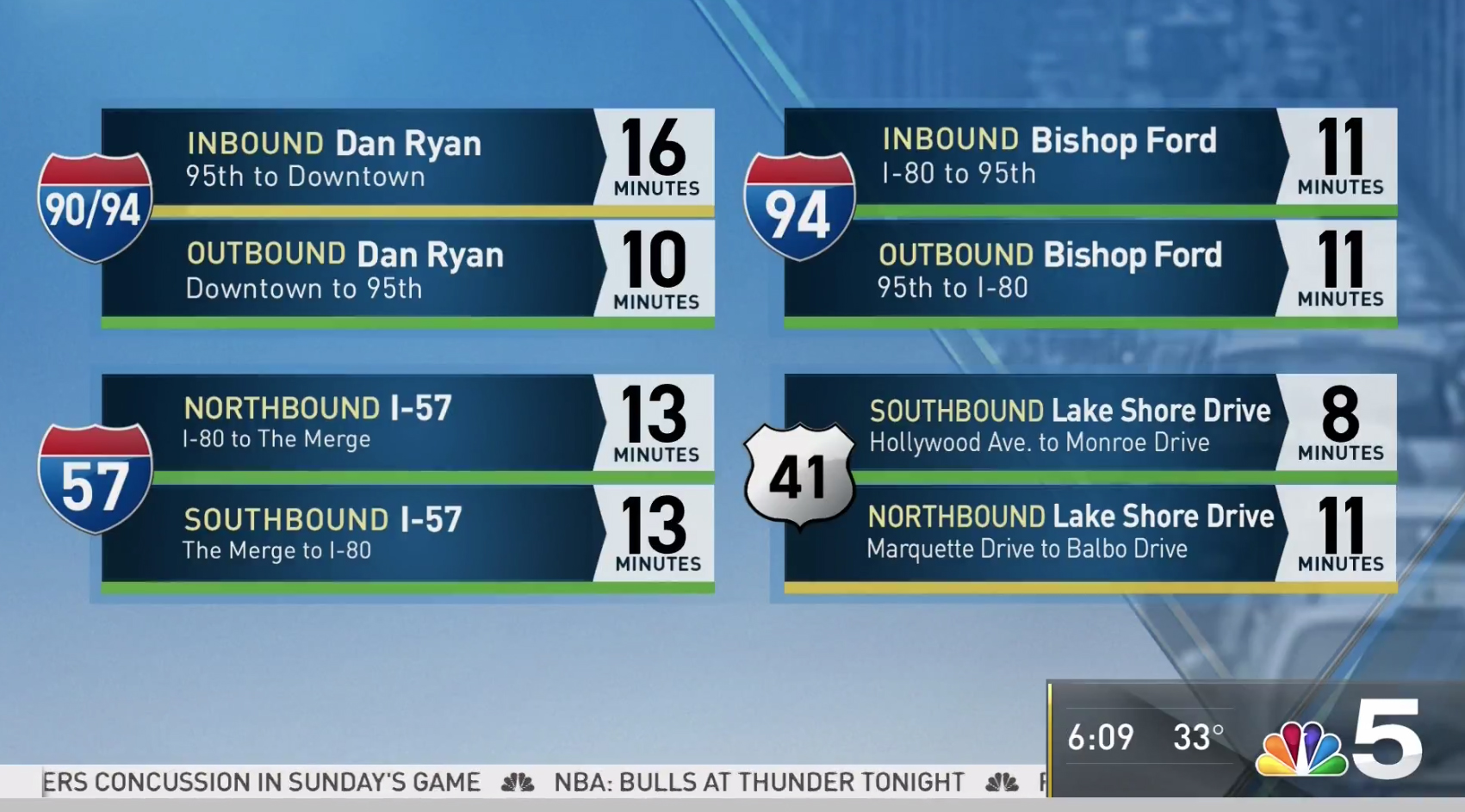
NBC Chicago, WMAQ, uses this design.
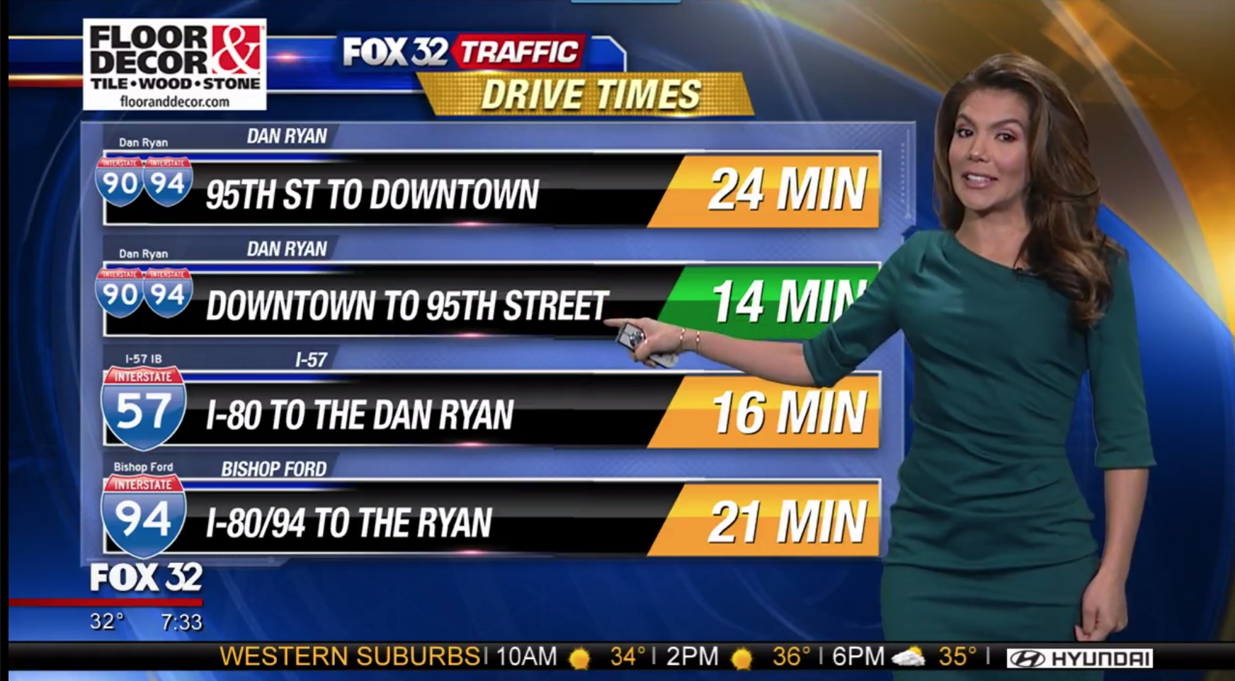
Fox 32 Chicago’s ‘Good Day Chicago’ uses this design.
Varon previously used a mix of video panels and the chroma key wall to deliver traffic reports, but since the station debuted its new studio in the fall of 2015, she has almost exclusively used the large touchscreen in the middle of a multipurpose area located to the far right of the studio.
The other Chicago stations mentioned here use green screens for most traffic updates.
We’ve reached out to WLS for comment.
Subscribe to NCS for the latest news, project case studies and product announcements in broadcast technology, creative design and engineering delivered to your inbox.



tags
Chicago, Roz Varon, Traffic, traffic maps, wbbm, wls, WMAQ
categories
Broadcast Design, Broadcast Industry News, Featured, Traffic