
TeenNick rebrand takes typography on new twists and turns
Weekly insights on the technology, production and business decisions shaping media and broadcast. Free to access. Independent coverage. Unsubscribe anytime.
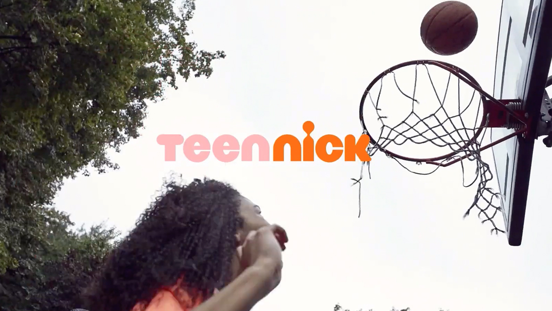
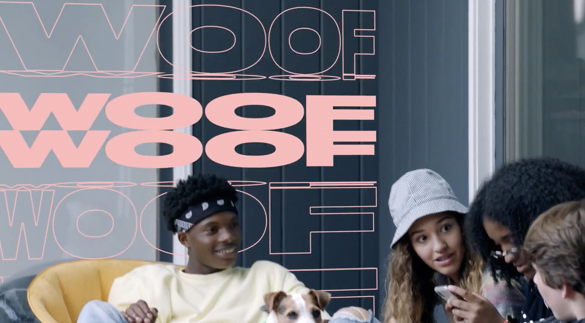
TeenNick, Viacom’s tween-oriented cable network, introduced a new look for its IDs and bumpers that combines imagery of real kids with an emphasis on dynamic kinetic typography and slick animations.
The network has kept the basic logo design it first introduced in 2009, with the updated version featuring orange and magenta that rolled out in 2016 kept in place.
However, the network’s new toolkit of branding elements from Trollbäck+Company combines active videography with bold colored shapes and icons with creative takes on kinetic typography.
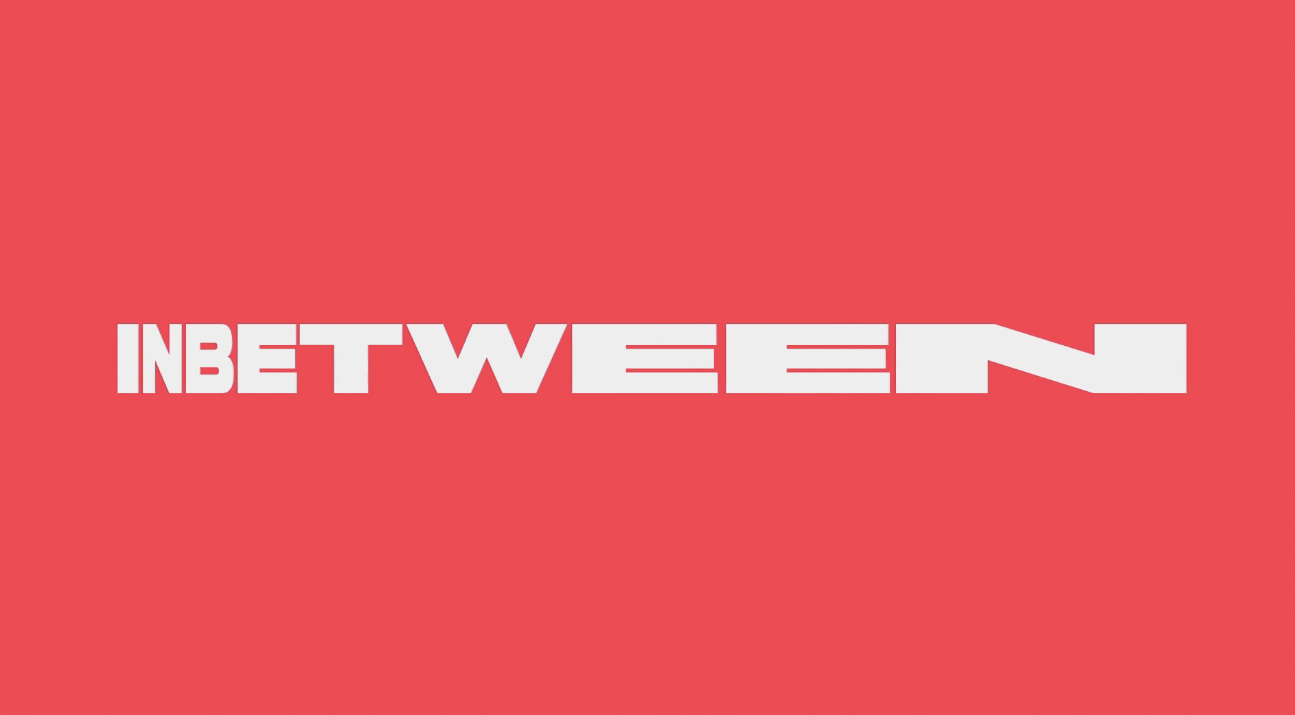
In the new brand identity, animated typography takes center stage, but in a unique way — rather than simply having words and letters fly in and out of the viewport, the new look includes eye-catching “shape shifting” in the width, height and spacing of the letters.
Some of the more dramatic options include stretching, pulling and squiggling across the screen.
While the idea behind the typographic was “old-school” public theatre brochures, the notion of internet swipes, scrolls and popups was blended in to suggest being “in between” two worlds — much like so-called “tweens” and Gen Z demographic, according to the agency’s case study of the project.
Another unique twist is that each letter can change shape in the course of a single segment while still maintaining the same footprint and being on screen the entire time.

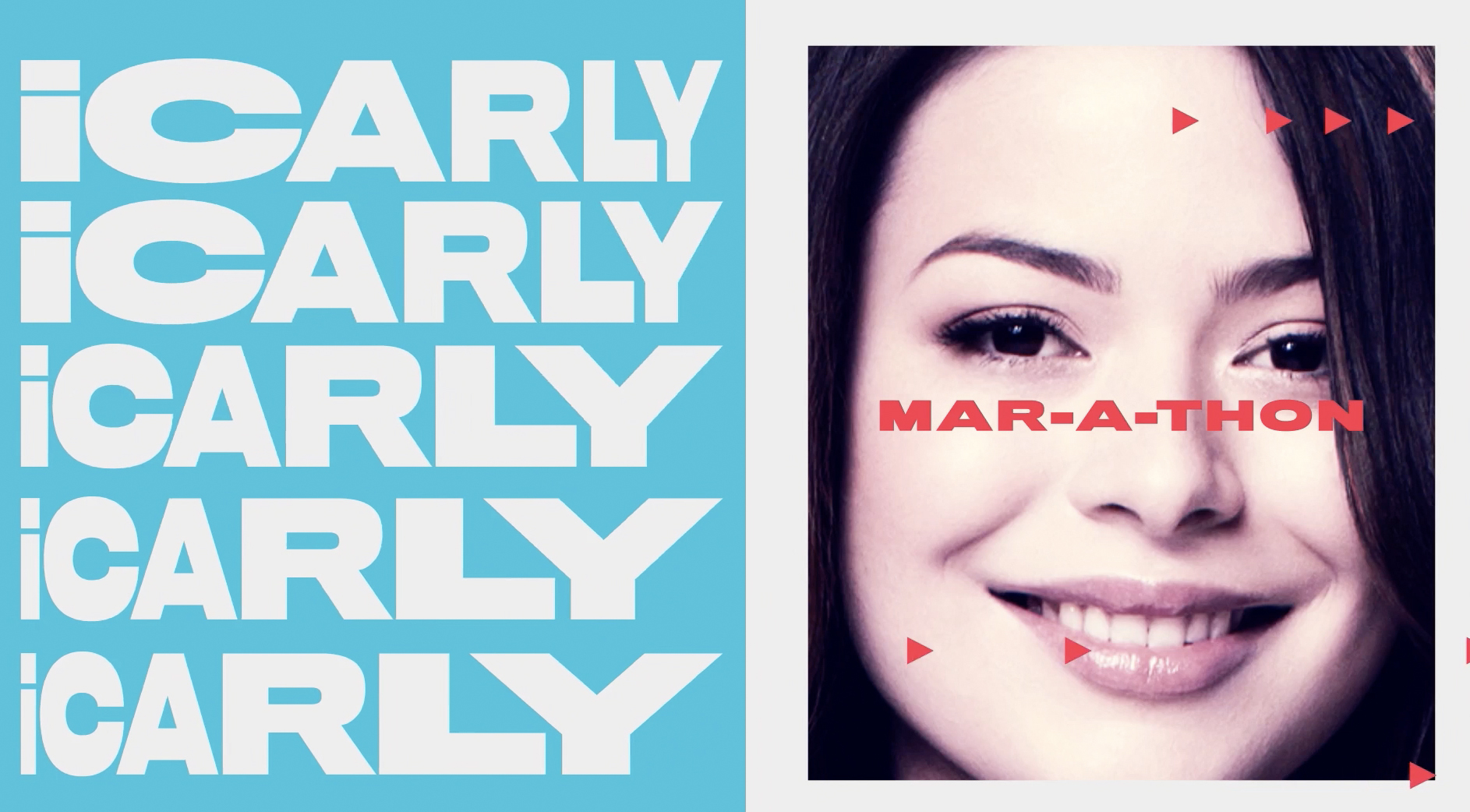
A similar take can also be used on the same word repeated over and over, like this example of an “iCarly” marathon promo, with each iteration of the word with different animation timing. This layout also spotlights the identity’s use of animated accents and icons, such as the right pointing arrows, as well as the use of photography.
While Instagram-style filtered images such as the one of former “iCarly” star Miranda Cosgrove can be used, much of the new look focuses on more realistic but informal still and video clips of real kids having fun.
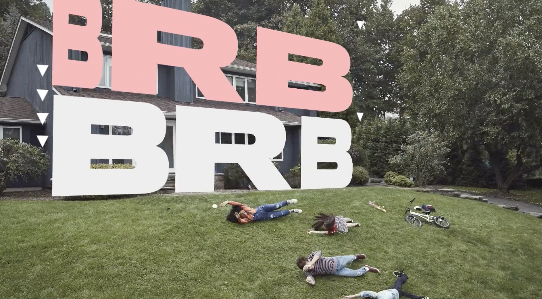
The brand’s various elements can come full circle in many of these scenes, with iconography and typography are “inserted” into the scene, often with dramatic skewing and perspectives applied to make it seem like the words are placed on a certain perspective within the image.
Other applications for the typography include only outlines or cutouts that reverse the words out of a background color and allow imagery to “peek” through.
Compositing is also used to tuck typography behind elements in the scenes, such as a person’s head.
It’s worth noting that the typographic elements also use the “shape shifting” animation technique within these scenes as well.
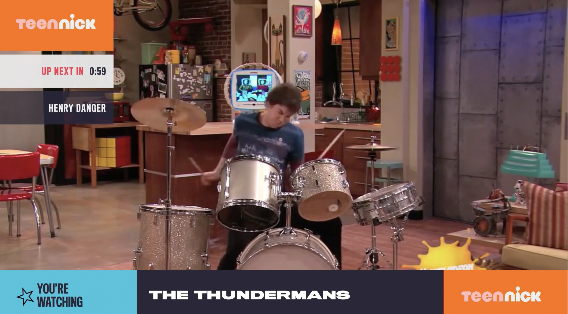
The networks “up next” graphics don’t, likely for clarity’s sake, feature as much typography animation, but the same movement paths are suggested thanks to rectangular and stripe elements that flow side to side and vertically.


tags
TeenNick, Trollbäck+Company
categories
Branding, Broadcast Design, Broadcast Industry News, Featured, Graphics, Network Branding