
Networks put Dorian in the corner
Weekly insights on the technology, production and business decisions shaping media and broadcast. Free to access. Independent coverage. Unsubscribe anytime.
With slow moving Dorian moving in on the U.S., the big question is where the storm will head — and networks are keeping
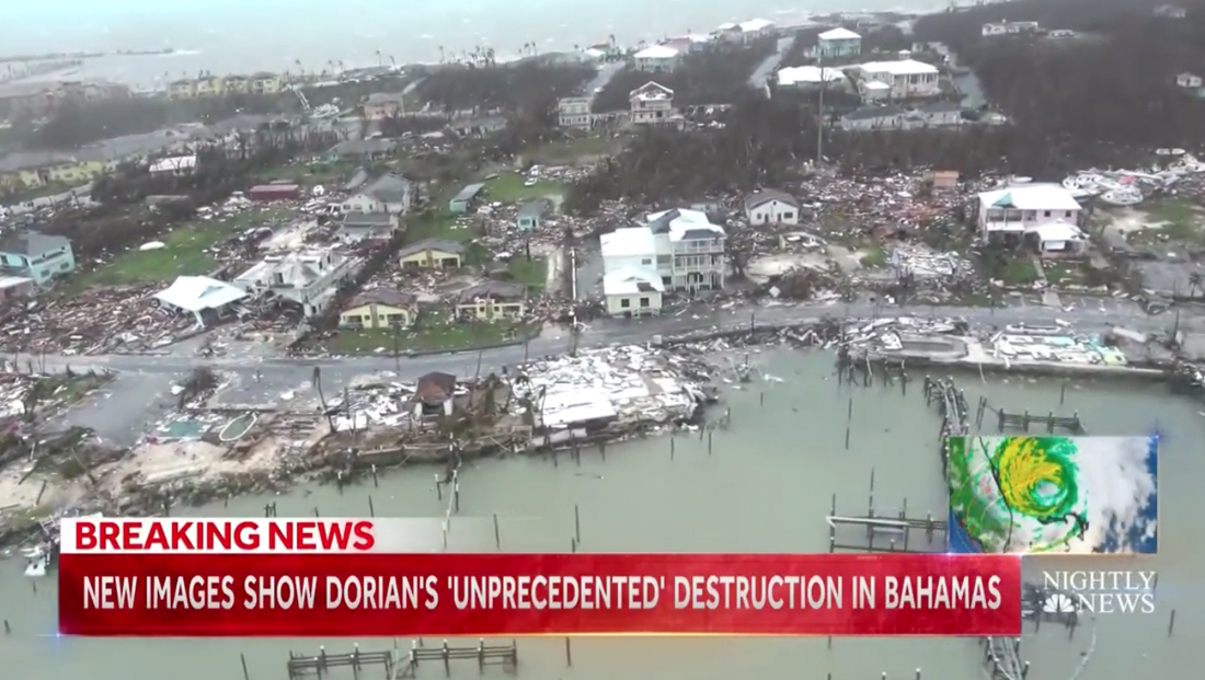
“NBC Nightly News” put a radar and satellite loop in the lower corner of its screen Tuesday, Sept. 3, 2019, just above the bug that rotates between the “Nightly” logo and NBC News one.
The box it’s in, which includes the broadcasts signature light burst corner accents, butts right up against part of the lower third banner, which is colored red with a storm motif.
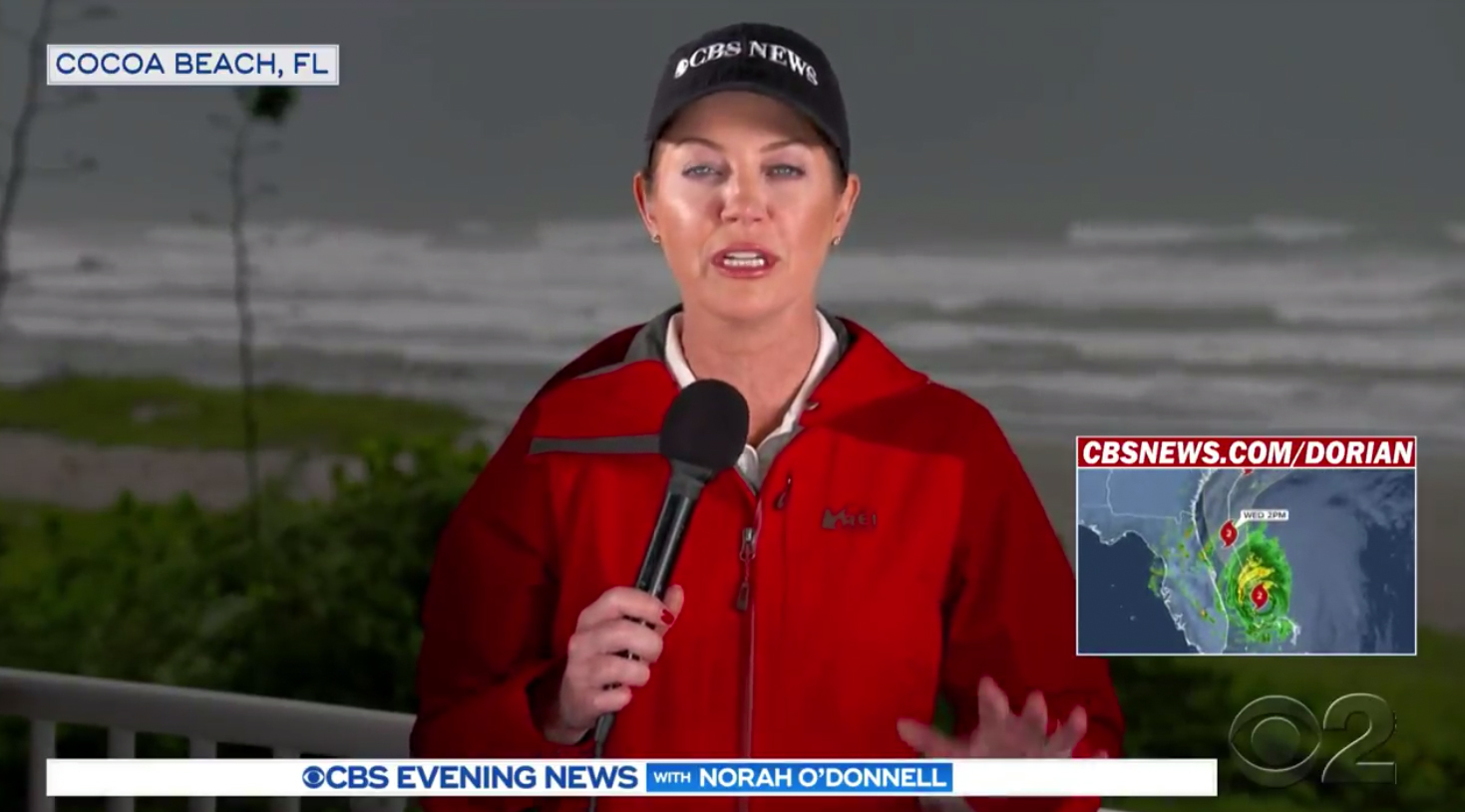
‘CBS Evening News,’ which was the only big three network to have its anchor in the storm path, added a radar loop and path trajectory graphic along with a website promo to the lower corner of the screen at the top of the broadcast Tuesday, but it did not appear during all Dorian related coverage.
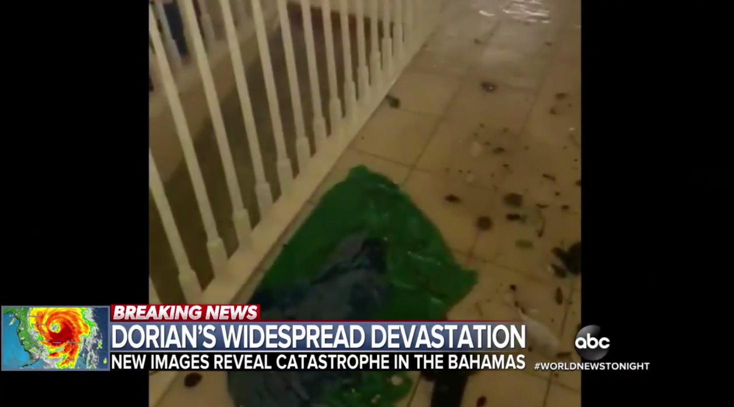
‘ABC World News Tonight‘ put a loop in the lower left, where it often puts branded or topical graphics next to its normal lower third banners.
NBC’s ‘Today‘ continued included a radar loop in the lower right of the screen Sept. 4. The graphic was tucked next to the square bug container that rotates between the ‘Today’ sunrise logo and NBC News one. It includes a red line along the bottom to match the ‘breaking news’ color scheme of the insert graphics to the left. The box with loop was slightly higher than the bug and lower thirds and was also a bit wider than the aspect ratios used on other networks, which was a bit odd given that the hurricane is traveling north along the very vertical state of Florida.
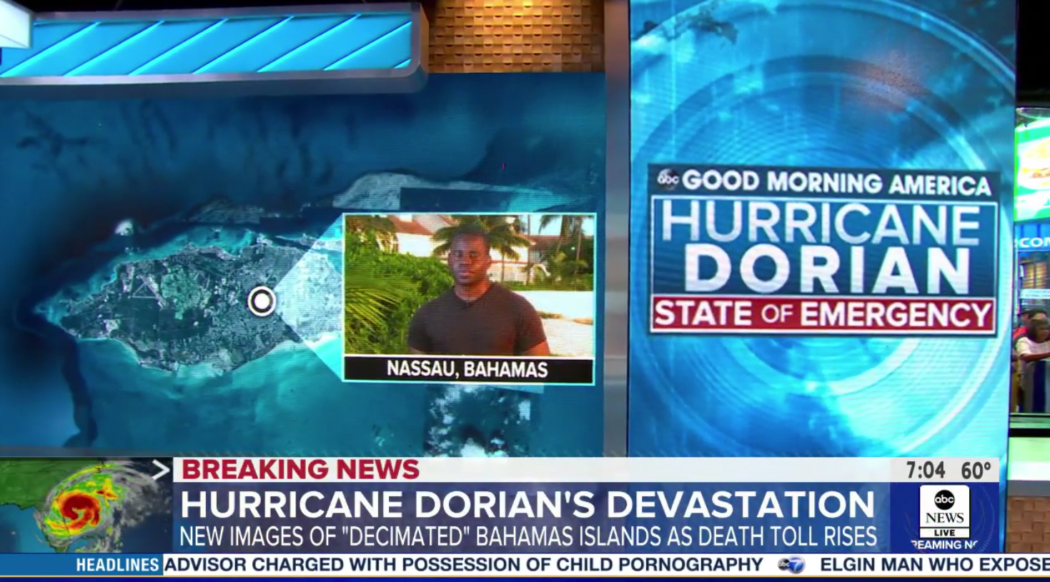
‘GMA‘ put a loop in the lower left, similar to ‘World News Tonight.’
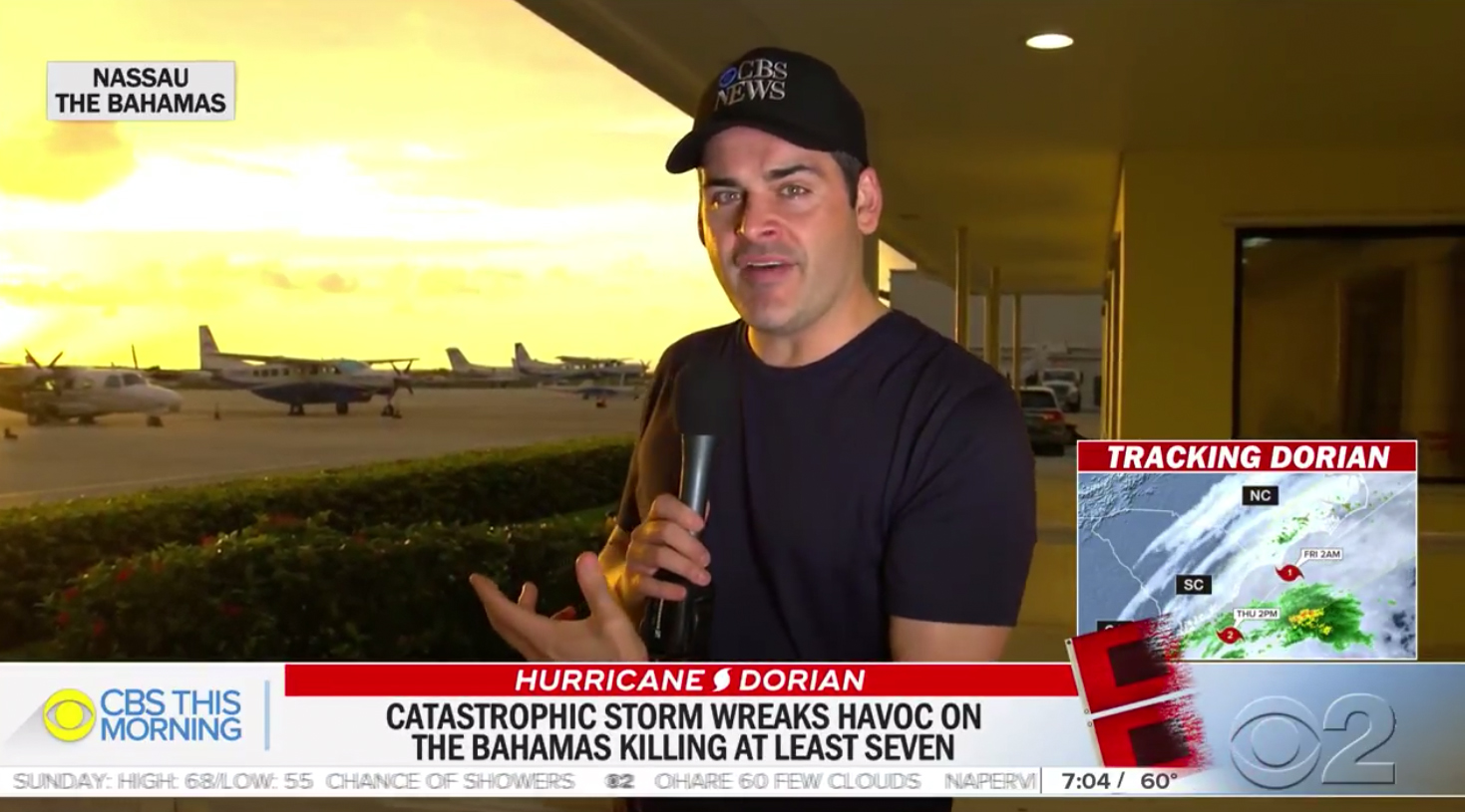
‘CBS This Morning‘ added two hurricane warning flags to the right side of its full width lower third with a series of alternating weather graphics above.
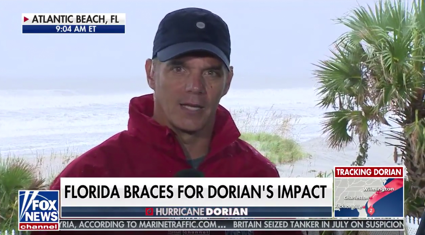
Fox’s cable channel put a tracking map in the lower right space designed to support the use of promos and live video feeds.
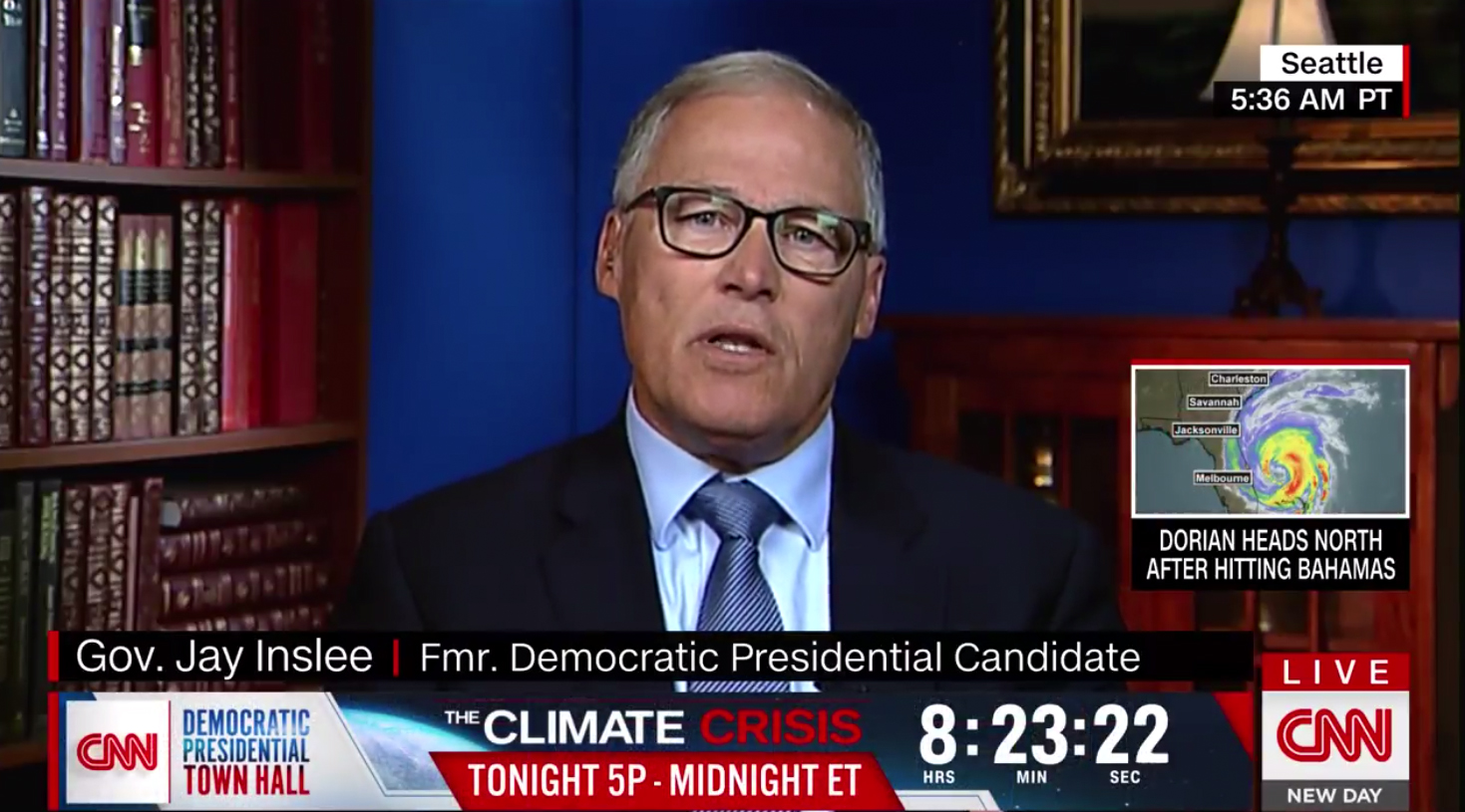
CNN alternated between showing loops and current statistics of the storm in a box inserted above the bug. The network was also running a promo bar for its Climate Crisis town hall during much of Wednesday, which added a significant amount of clutter to the screen.
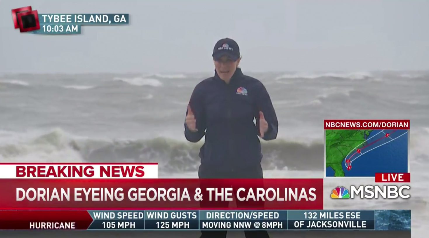
MSNBC provided a website promo and hurricane maps in the lower right corner above its bug. During select times, a banner with current stats was inserted below the lower third banners and bug.
While the bright colors and eye-catching rotation certainly are a good way to grab the eye and remind viewers of the continuing coverage, it’s worth noting that, more often than not, these boxes are so small it’s difficult to make out much of what’s trying to be shown.
For example, city names, timestamps and hurricane category numbering often becomes so small it’s hard to read even on larger screens — but especially on mobile devices or from a distance.
The maps also, with a varying degree of success, illustrate the relation of the storm to land — but again, the cloud imagery can often obscure much of that making it tricky to understand the geography of where the storm is headed.
In general, the graphics showing the path of the storm with high contrast outlines and larger icons seem to be easier to read and get valuable information from — as opposed to just a colorful swirl that looks just like many storms.
Fact boxes, meanwhile, are typically clearer and easier to read — though often the data in its is a bit obtuse — many viewers, especially those outside the immediate area, might find it hard to picture what “moving NNW at 8 mph” means or “132 miles ESE of Jacksonville” is.


tags
ABC, ABC News, ABC News 24, ABC World News Tonight, Cable News, CBS, CBS Evening News, CBS News, CBS This Morning, Fox News, GMA, Good Morning America, Hurricane Dorian, MSNBC, NBC News, NBC Nightly News, Today Show
categories
Broadcast Design, Broadcast Industry News, Cable News, Featured, Network Morning Shows, Network Newscast, Weather