Warner Bros. shield goes blue in update

Subscribe to NCS for the latest news, project case studies and product announcements in broadcast technology, creative design and engineering delivered to your inbox.
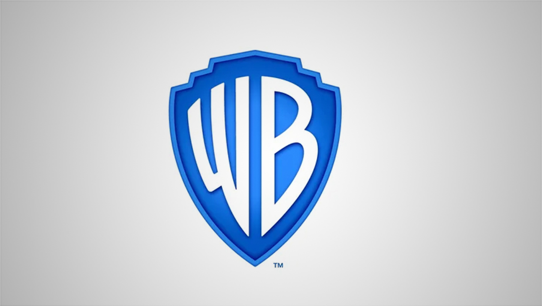
Warner Bros. has unveiled a redesign of its iconic shield logo design as part of an overall brand refresh.

The new logo design, from Pentagram, is rolling out ahead of the studio’s 2023 100th anniversary.
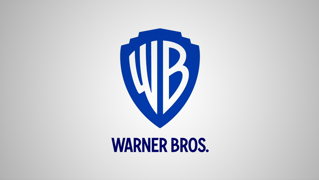
The redesign switches the logo to blue and white, dropping the previously dominant gold.
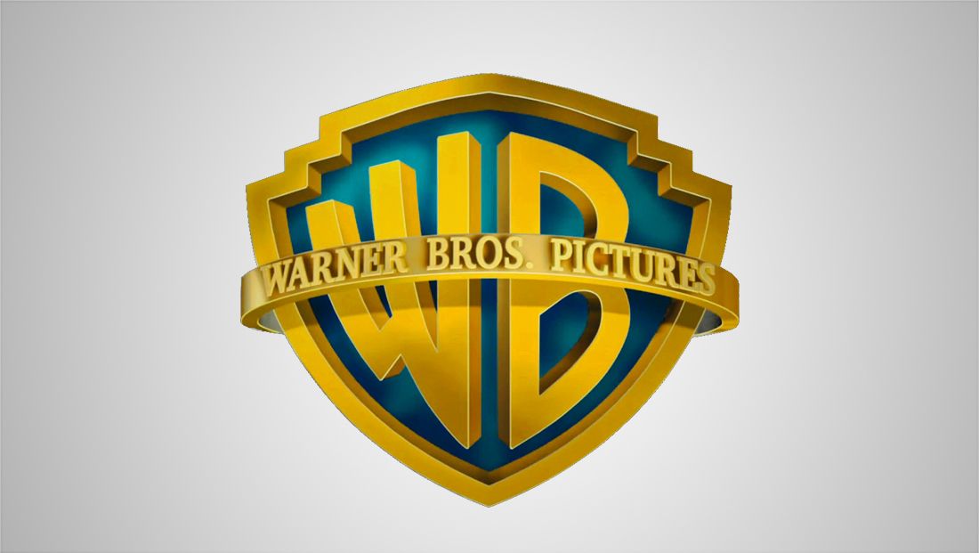
It also loses its “band” that reads “Warner Bros. Pictures” or respective division name.
Various versions of the gold and blue logo are used across Warner Bros. divisions and brands.
The designers at Pentagram also slimmed down the profile of the logo, while also smoothing out the “W” and “B” at the same time.

There’s also an option to include the full “Warner Bros.” name below the shield in a custom drawn typeface, Warner Bros. Sans, that uses distinct curves that mirror, at least to some extent, the letterforms in the shield.
It’s worth noting the “W” was drawn in a more traditional format, rather than the skewed version inside the shield, but the “B” has some hints of the version used in it.

Example of one version of the old design.
The new logo will start appearing in Warner Bros. films in 2020 and its television divisions will also make the switch.
Pentagram created two primary versions of the logo — a flat, single color version — as well as a “dimensional” look that echos the 3D look in the old locked, albeit in a cleaner format.
The flat version of the logo was designed to allow its styling, color and shading to be switched up to tie in to projects’ unique looks.
Pentagram also specified that the shield’s outline can be used as a “window” for the studios’ various brands and content.


Earlier this year, the company’s Warner Chappell music and production music brands unveiled a new shared logo design.
Warner Music Group has a separate logo, though its subsidiary Warner Bros. Records Group uses the “WB” shield as a base.
Subscribe to NCS for the latest news, project case studies and product announcements in broadcast technology, creative design and engineering delivered to your inbox.


tags
logo design, Pentagram, Warner Bros., Warner Music Group
categories
Branding, Broadcast Design, Broadcast Industry News, Featured